ROI of UX: Redesigning Culture.pl. How consistent design of user experience made the time spent extended by ⅓

This magic second when the old version of the portal was replaced with the new was of course preceded by months of work, and the road leading to the ultimate success was fraught with difficulties. So if we have finally arrived at the goal — it is primarily because we began with setting one. Ultimately, this should always be the most important thing: defining a goal understood by everyone, and therefore common to everyone.
What was the goal?
Culture.pl, an online portal founded in 2001, is a gateway to Polish culture — fascinating in its diversity and definitely worth knowing. It is an important place on the information map for specialists from around the world and an important tool for implementing Polish cultural policy abroad.
When we were entrusted with designing its new architecture, we asked ourselves, what are the most basic, measurable criteria for success for such a portal? Is it possible to quantify the effectiveness of information policy in the field of culture?
After long discussions we decided that the most universal formula of success would be to increase the effectiveness of content exposure. Fewer bounces, more views, longer time spent on the site — this is how, using the language of numerical parameters, we have defined our goal. More engagement. More texts read. More information learned. More knowledge about Polish culture circulating among people around the world. This is what we have decided to strive for.
What are the difficulties of a redesign?
Designing is difficult, redesigning is hell. Apart from the desirable features of the ideal product, it is necessary to recognize and incorporate the existing habits of key users and the organizational context — ruts carved with daily toil of many people. Changes in this area are always the most difficult. A revolution can destroy the maybe not optimal but also non-accidental order.
The difficulties revealed themselves immediately when we saw the site’s map and talked with the editors for the first time. What they called a portal was in fact a huge interface for communicating Polish culture. In addition to news, articles and essays it also contained information on events, permanent, cyclical and occasional programs, addresses of friendly institutions, reports on implementations, and lots of other content.
Problem: a complex structure in a complex environment
The most important difficulty turned out to be the complex internal structure of the organization, with its operations spanning across the globe: several editorial offices publishing in several languages, cooperating with several dozen people. Creating a process where everyone would have the feeling that their specific needs were taken into account in the project was a real challenge. If design is an art, it is the art of effective communication.
We started the process with a series of workshops in individual editorial offices. During the meetings we listened carefully to the editors consistently striving to summarize our discussion by creating lists of needs, which would present in neutral language what our speakers often described very expressively.

Thanks to the workshops, on the one hand, we managed to build mutual trust assuring the editors we are on the same team. On the other, we discovered that the diversity of languages comes with a variety of needs: each editorial team wanted to get their message across to users with different basic characteristics. What everyone simply called the portal turned out to be several portals under one name.
Problem: complex structure = complex architecture
Extensive structure and a very broad scope of activity translated, of course, into a complex information architecture of the portal based on a division into several thematic categories, each with a few to even a dozen or so subcategories. This structural richness was accompanied by abundant additional content, such as miniservices informing about individual programs and activities, implanted into the portal for lack of a better place.
The solution was to analyze and improve the information architecture keeping its basic assumptions. But we felt that it would be a conservative move that would not solve the real problem. We needed something more, real flexibility that would easily fit in both essays devoted to contemporary music, and a program of events accompanying the celebration of the Year of Joseph Conrad.
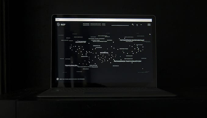
We opted for a semi-open architecture based on tags selected from a finite set, defined and kept cohesive by the interested editors. The individual editorial offices decide which tags have their own main pages. This way the part of the portal devoted to Polish cuisine in English is available on the #cuisine website, and #музыка indicates content dedicated to music intended for Russian-speaking readers. Any subject or event can get their own multimedia page defined by the editing team in a second: just give the selected tag appropriate attributes and the cross-section of the portal content defined by this tag becomes a self-contained miniportal.

Problem: how to promote readership in a world full of promotion?
Once we managed to create a good organizational framework for the process and the right basis for the product architecture we needed to answer one more question. How to effectively encourage our users to explore the content?
Many ideas that sprung up during a discussion at the end of 2016 were clearly rooted in the attention economy. If everyone uses aggressive pop-ups, maybe we should too?
Ultimately, we did not. Since everyone would aggressively claw at the reader’s attention, we decided to treat them with respect, suggesting carefully selected, interesting, high-quality content.
We have designed an article template with only three non-invasive suggestions to read on: one of them can be indicated by the editor, the other two are selected from the recent most popular thematically related texts. This very simple solution leaves humans in control and effectively uses data on the popularity of the texts to prompt those we know to be interesting.

Effects
Today, when the new version of the portal has been live for several months, we already know the quarterly numbers, and so:
bounce rate decreased by 38%,
time spent on the site extended by ⅓,
and the average number of pages visited during the session increased almost by ⅓.
As a result, with the increase in the number of users by 15% y/y, the number of page views increased by 43%.
The project is not complete, further improvements are under way, which we expect to boost the effects even more.
What we are sure of now is that setting the goals allows us to see the place we want to reach. The rest is just taking one step at a time on the shortest path leading there.