Rutgers Redesign Case Study
A college student’s redesign of their college’s major selection system.
Background
At Rutgers University, we students utilize MyMajor for changing our major, graduation date, or any certifications. MyMajor is a web application maintained by Rutgers university. It is defined as a “system designed to simplify the management of student’s requests for changes in majors, minors and graduate dates.”(Rutgers) MyMajor completes its purpose of simplifying management, but unfortunately, it becomes confusing for the student to use. My goal today is to maintain the ease of management but also provide students with a better user experience.
Project
Originally, redesigning this page was an exercise in one of our Designer Spaces at Rutgers Blueprint. From there, I decided that I wanted to expand on this topic within a case study and get experience with the research side of things. With my habit of trying to optimize everything, from how dishes are laid out to UX design, this site in particular left my senses tingling. I wanted to make this a much more fluid and visually appealing experience.
For this case study, I utilized Figma and Leonardo. I intended for this to be a short project and to exercise my research capabilities. Therefore, the scope of this project is simply redesigning the login page and main page by myself. Overall, it took around 3 days to complete. Not including my research into creating case studies.

Problems
Even upon opening MyMajor, the screen feels dated visually. Despite that, it is a simple user login page that accomplishes its purpose.

Upon going to the main page, this is where I start to see many areas to improve on.

UX/UI failings to be addressed:
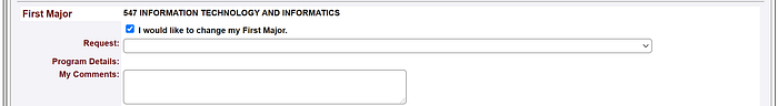
· There is a lone student tab, alluding that in this system there are other tabs that can be accessed. From a student user perspective however, this is unnecessary. This poses a problem due to possibly confusing the user.
· Users have the option to choose from up to four majors and minors, and two certificates. As a college student, normally students only have one to two majors. Listing the maximum causes the student to spend more time navigating the page.
· The major and minor declarations are alternating. This can cause a student to click on the first minor assuming it is a place to put a second major.
· Upon clicking the checkbox, the menu expands with further details and a request submission. I like how it expands, but for a user this can be a surprising or confusing event.
Visual issues to be addressed:
· Grey background but the text is white highlighted, unusual design wise because there are better ways to split elements, such as borders, boxes, or spacing.
· There is a lot of padding inside the groups as well as to the left or right of the screen, but the text itself feels compressed.
· Overall, the repeating majors and minors is very redundant when an alternate design can have the user add what they need.
· The submission buttons at the bottom of the screen are small and dated, posing an issue for users who are likely to miss it.
Goals
Proposed solutions:
· Removing the solo student tab
· Grouping majors, minors, and certificates so that the students themselves determine what they need.
· Allowing the ability for the student to choose to add a major or minor, then expanding the menu in a more natural way.
· Utilizing the white space at both sides better to provide a better-looking experience.
· Upgrading the buttons at the bottom of the screen or removing them entirely.
Overall, there are a few elements that start showing through these issues that we need to address. These elements help form some ideal UX goals to focus on.
· Clarity, focusing on removing redundancy.
· Modernity, upgrading the aged looked of the site.
· White space, utilizing the space provided for a better website experience.
Utilizing these goals and solutions, I have sketched out a few variations of possible alternative looks for this site.
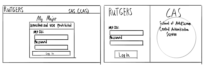
Login Page
I simplified the design and the amount of text for a simple, more modern login experience.
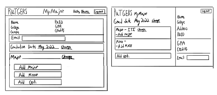
Main Page
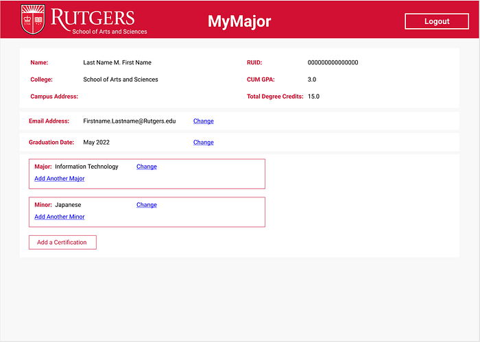
I kept the same idea regarding the information box at the top while slimming the overall design. The main point of focus is the majors and minors that have been grouped into easily readable categories. One option is to list only what the student has already selected, and the other is to have the option available and readable to begin with.
Overlay

The original design expands awkwardly within the box, pushing aside all of the elements. Using a overlay instead does not disrupt the site and helps focus the user’s attention.
Research

The audience of this website is strictly college students who are looking to check or change their major. The life of a college student is a hectic one. There is a lot of assignments to stay on top of, a social life to upkeep, eating well and getting sleep. Every moment counts, therefore, any product cannot afford to detract from that. Especially ones that are mandatory such as filling out a major. Luckily, most college students are somewhat familiar with their college’s online layout due to using many web applications prior to this one.
For my research, I decided to ask several SAS students who have used this application in the past. My goal is to focus on how quickly they completed their desired task and if there was any confusion in their experience. This goal helps me with creating a smooth experience.
User Interview Questions
· What was your experience with MyMajor?
· How much time did you spend on MyMajor the last time you were on it?
· Within your experience of MyMajor, did you encounter any challenges? What and why?
· Was there anything you liked about your experience? What and why?
User Interview Responses
· The site is only visited a few times and for brief amounts of time. (5–10 minutes)
· The options being checkboxes made it harder to click and use.
· Students were able to accomplish their goals although did not like the overall appearance.
· Students liked the quick experience and simple website.
· Being able to change multiple majors and minors at once is useful.
· Alternating the majors and minors is confusing and takes longer for the student to find what they are looking for.
Conclusions from the Data
· The site needs to be clean and easily readable.
· Replace check boxes with an easier to use system.
· Update the design to be more visually appealing.
· Remove the ability to add multiple majors and minors at one time to better serve the majority of users who only have one major and minor.
· The School of Arts and Sciences requires students to have a minor along with their major, so it would be best to have both easily visible.
Process
Based upon the prior designs and my conclusions from the research, I developed a few prototypes.
Login Page
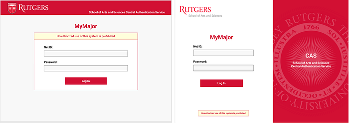
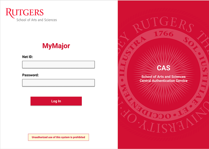
For the login page, I stayed close to my original design and kept the core aspect. This is mainly a login page, so all it needed was to be modernized since it was already working well.
Main Page
For the main page, I have developed two core designs, with one featuring three variations.


The first design is similar to the second login page, I feel like it is a very clean and modern look. I feel that the white text on red can pose some accessibility issues.
The second design resembles the original MyMajor site the most. I dislike the differences in the change buttons/words and will need to figure out which one is preferred by students.

The one on the left is my least favorite due to the chosen majors being far from the add a major button. It doesn’t feel grouped properly. The one on the right feels a little better but doesn’t quite align therefore creating an uneven appearance.
Submission Request
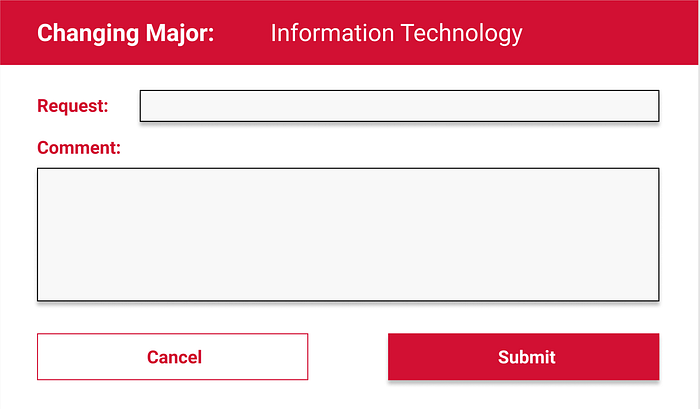
I simplified the overlay greatly, removing check boxes and the confusing request structure. This style should be easy to understand and utilize.
Findings
These variations developed due to trying to figure out what the best layout for the majors would be; whether grouping the whole major was better, separating the already chosen majors, or other designs. I personally liked the new modern and clean interface, but I felt somewhat bothered by the layout. I felt that it could be better. Therefore I went and consulted the students that I interviewed previously for their opinion.
· For the login page, the second style was favored due to looking more attractive.
· Students appreciated not having a redundant list of majors and being able to add what they needed.
· Students valued consistency in the links (“Change” underline versus button)
· For the main page, students disliked the red bar containing the student information taking up most of the page on the right.
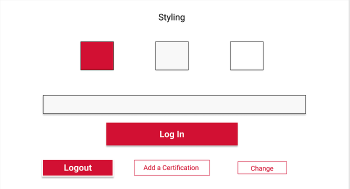
Style
Regarding style, I was not able create a lot of variation due to the Rutgers branding. I utilized the original red and white, and lightened up the grey a little for a more modern look.
After hearing the student’s opinions, I decided on the modern look with the red bar for the login page, and on the first variation for the main page. I went ahead and added some small changes from the student feedback.
· Added drop shadow to the login page to see fill ins better.
· Made the change links consistent on the page.

Deliverables


Goals Achieved
· Clarity- Easily understandable interface
· Modernity- An upgraded look
· White Space- Eliminated side spaces and added more space between elements
· Student Experience- Makes it easier to add what is needed and provides an enjoyable experience.
Outcome
To measure the success of this redesign, I would need to test the student population on:
· Time spent using the application
· Ease of use/Number of challenges
· General satisfaction with the experience
I believe that overall, this product is a success because it upgrades the student’s general experience and eliminates the confusion and redundancy of listing multiple majors and minors at once on a form. It benefits the student population by giving it a clean and quick interface for a website that they will need to utilize in their college careers.
Conclusion
What I learned
After this case study, I obtained a lot of experience connecting my research and thoughts into my interface designs. Before this case study, I would see what was wrong with a site but not necessarily understand it or apply it effectively during the redesign process. Planning and research is highly important in UX design and will greatly optimize the overall process as well as result in a more enjoyable product and design experience.
Areas to Improve on
This case study gave me a lot of experience in research, but I realized that I need to delve deeper into usability research in order to create better products. MyMajor is a website that has a small and focused audience. Other applications and websites will have a variety of consumers in their audience to research and keep in mind.
Next Steps
With the knowledge gained after completing this case study, I saw a few areas that I would have investigated and taken into account if I were to do this redesign again.
· Consider reactive design and how this site would look like on a mobile device.
· Create a large-scale survey of Rutgers students for user research.
· Explore interaction design and how it can factor into this design.