Science behind E-Commerce App : Checkout
Which is the most important e-commerce page? Is it the home page, listing page, product page, cart or checkout? Well, to be fair combination of all these pages make a successful e-commerce app.
But in this capitalist world, moneymaking is the most important and checkout is the moneymaking page and here we do not want to leave customers with a sour taste in their mouth.

Checkout is essentially a two step process:
1. Where to deliver product (name, address)
2. Payment Details.
With the above information, we can deliver the product. However, as a User Experience Designer, we wish to create something coveted by many people and ideally used by them on a regular basis without any hassle.
Now, let us get to actual process.

As the user hits Proceed to Checkout, we need to create a safe environment for our users. They should be informed all the time where they are in the process. We do not want users to be confused at any step.

The three steps are Shipping, Billing, and Confirmation. There are two types of users, those who have gone through the checkout process and others who are visiting/ buying for the first time. We need to be wary of those who are visiting it for the first time.
Enough rambling, let's get to the process.
Shipping : First Time Users
Sign Up
A major worry new users possess is what will the company do with my information. Explicitly state: We do not share your details with anyone. They will feel a lot better. You can also incentivise First Time Users to Sign Up.

There are 3 types of Signup: Email Sign Up, Social Media Sign Up and Mobile Sign Up. Email Sign Up are the worst.

User has to go back to their mail account to verify their Email ID. This is an extra hassle and distracts the user from their main goal.
Social Media media sign-ups are the quickest way, as users do not have to fill anything and are verified instantly.

Mobile Signups are better than Email Sign Ups because the user does not have to leave the app.

As the user hits continue, they are prompted to enter an OTP, it should fill automatically when the user receives OTP.
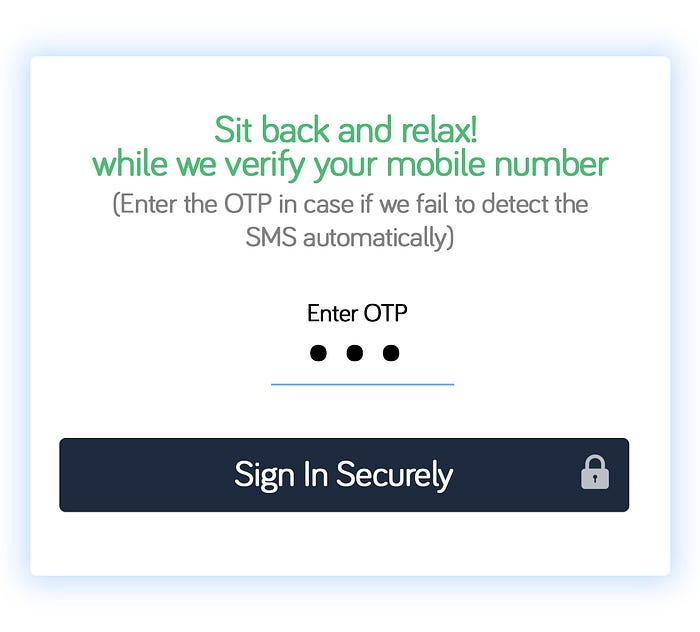
“Sit back and relax! while we verify your mobile number (Enter the OTP in case if we fail to detect the SMS automatically).”
Messages like these go a long way, they clearly prepare the user for what is about to happen and what is fail-safe.
After this user should be asked to enter the password. A few companies do not ask password and every time the user logs in, they are asked to enter OTP, many times users have bad experiences with OTP,
1. Sometimes, they do not receive them, even if the Internet is working on their phone, which leads to frustration.
2. While, logging on the desktop website, and they do not have their phone near them.
3. They lost their phone, which incidentally, happened to me, and I was not able to log on to my PayTm wallet, when you can log onto PayTm only via OTP, PayTm now supports password.
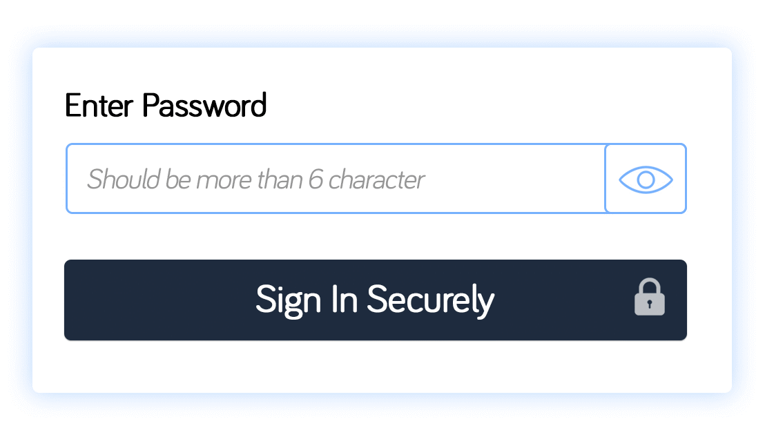
Placeholder, informing the user about the minimum number of character and letting users check if they have entered the password to their liking, is a good practice to avoid unnecessary errors. Many websites have confirm password which is an extra step for the user to fill, and it can be removed by introducing eye.
Where to deliver
No one wants to fill out a form, it’s boring, but we can help users at each step and make it easier and fun for them (who am I kidding :P).
For the customer to receive her items, she will have to fill her name, mobile no., shipping address, pin-code, city, state.
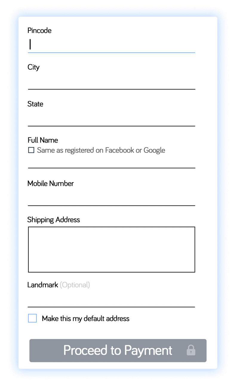
Start the form with pin-code because, with the help of google’s geocode API, pin-code can provide City and State automatically, two details in the form fills quickly(Good Start).
If user has the same name as on Facebook or Google, it can be filled on a click by introducing a checkbox, “Same as registered on Facebook or Google” after that user fills Mobile No., Shipping Address and Landmark is Optional field instead of asterisk(*) we should write optional in front of landmark, reason being, including the phrase optional is much clearer than using any symbol or icon.
The default address is the billing address and address used when the user goes for quicker checkout.
Proceed to payment should not be active till the user fills the whole form to prevent unnecessary errors.
There should be inline validation in the form
For e.g. if a user types 1234567890 as her phone number, and she goes onto next step, the error should be displayed as user progresses through the form, as opposed to checking inputs in lump sum when she submits the form.
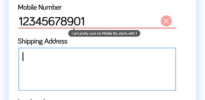
Great thing about Inline validation is that the user gets to know their mistake as soon as, an error has occurred their, rather than after filling the form. It is frustrating for anyone to be pointed out their mistakes after they have done all their work and during checkout, we do not want to irritate the almighty user.
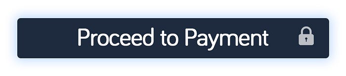
Showing a lock icon on proceed to payment is another way of assuring the user of safety during payment.
Billing: First Time User
Order Summary
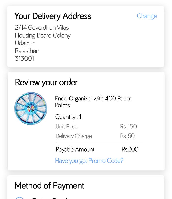
Upto this moment user has chosen what to buy and filled their address, just before payment, we can let the user review what they have done and give them a chance to edit address. Another reason to have order summary is that the user gets redirected to this part of checkout directly when they hit Buy Now on the product page(if logged in), more on this in future articles.
Promotional Code
Coupon codes are more business need then a UX need. In one usability test, removing the coupon code field led to an increase in overall conversion from 3.8% to 5.1%(Increase of 34%). In another study by PayPal, 27% of the users accepted that they were leaving the app to look for a coupon code, here we are distracting the user from their main task i.e. Checkout.

Instead of coupon codes, direct discounts can be given to users in their profile i.e. auto applying of coupons to targeted customers or on a particular product, category etc. But if the client wants coupon code in the app, instead of showing text box. We can ask user, “Have you got Promo Code?” and upon clicking it, text box will appear. We are trying to hide the coupon code box, those who have coupon code will try to find it.
Method of Payment

It is very important to give the user as many option as possible (Cards, Wallets, Net Banking, EMI, Cash on Delivery etc.). This is the step where user needs to feel most secure cause they are just about to give their hard-earned money to a machine. We need to assure our users, payments are safe and secure, even if they don’t like what they get, they can return it back and we are not here to dupe them, we only deal in authentic products. Above points can be concisely explained “Safe and Secure Payments. Easy Returns. 100% Authentic Product.”
Save details for quicker checkout: For returning users, this is a major help as they do not have to fill their card, wallet, net banking details every time they make a purchase while buying. It also reduces checkout time.
After payment from secure gateway, user will reach thank you/confirmation page, but before that I will cover cases of returning users(logged in users).
Shipping and Billing: Returning Users
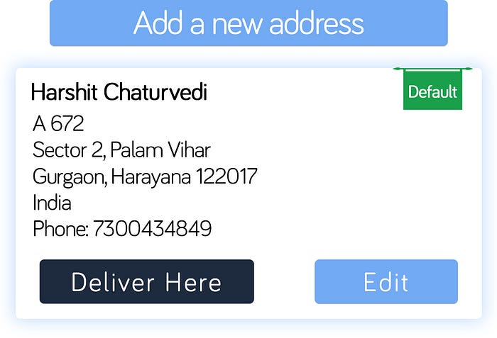
If the user has ordered before, they will have a bunch of addresses saved with one marked as the default address. A clear big button to add a new address and every old address from which they ordered.

After choosing the address to deliver, the user will reach the Billing page, here too their, payment details will be saved, they can select one of those and pay the amount.
Thank You Page
This should be a cheerful page. Customer has bought from the website so be grateful and tell them what they ordered.
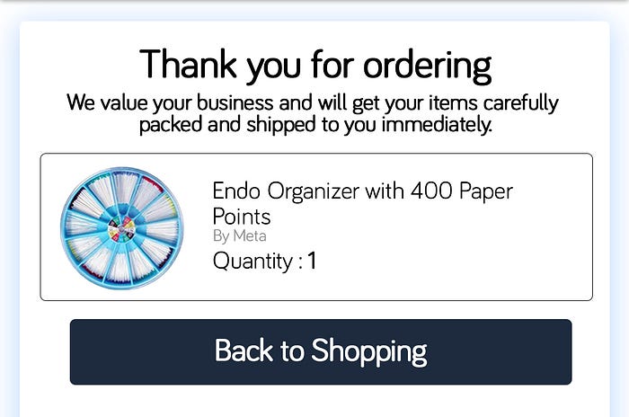
With the Thank You page we can create more leads and compel users to buy again.
Incentivise Users
We can have a referral program or can give offers on the page, so that users have another reason to buy the product, other than just willingness.
I worked on a Dental product, e-commerce app and this is how I portrayed Refer & Earn.

User feedback and User Data
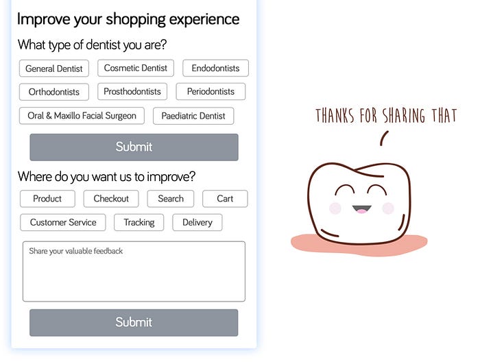
We can ask the user question to understand more about them. Here we are collecting data to understand what type of dentists buy from our website which can help us improve products and inventory.
The user has gone through the most stringent process, they went through its intricacies, and some active users can give really nice and insightful feedback which can help us improve the app immensely.
Humanising the app is very important that is why the user should be given feedback of their action in a fun and engaging manner.
Header

During Shipping and Billing, Header 1 should be used as the user is going through checkout, and therefore should not be distracted, all of their concentration should be on the checkout process.
On the Thank You page, Header 2 should be used as the user is done with buying and now she should be able to navigate through the whole app.
While designing, I always try to keep three principles in my mind Visibility, appropriate clues and feedback of one’s own action(Don Norman).
I will try to cover the whole science behind e-commerce app in coming weeks.
Up for a good discussion on how to improve checkout process.
If you are interested in User Flow Diagrams of Checkout you can go to this link.
