Should All Mobile Navigation be at the Bottom
Now that most digital industries have made the move from the infamous hamburger menu to the tabbed bar navigation, it leaves me asking what’s next on the mobile navigation horizon. Different phone sizes lead to more complexity. This means that trying to get a standardized way in which we place components on the screen are becoming more vital than ever.
How do we hold our mobile phones?
Over the years I’ve always found it intriguing how people interact with and hold their mobile devices. The one-handed hold still seems to be the most preferred method, but with plus size devices becoming more popular, the cradled-hold is not far behind. I have also found that while most people are right-handed some of them prefer to hold the device in their left hand or vice versa.

Back in 2013 there was a study conducted by Steve Hoober, with 1333 people. He found that most people use their mobile phones in the following ways. Since then these figures may have slightly changed with the rise of “Plus” sized devices:
- One handed: 49%
- Cradled: 36%
- Two-handed: 15%
Also interesting was the right vs left-hand comparison
- Right thumb on the screen: 67%
- Left thumb on the screen: 33%
Reach Area Zone
The image below is based on the one-handed hold. Notice the different reach zones for an average and plus size mobile device. By comparison, the plus size device has a more out of reach real estate zone.

Gesture Navigation
As seen in applications like Facebook, WhatsApp, and Instagram, with a simple swipe to the left or right, gesture navigation can be easy and comfortable for the user. In Facebook, users can easily swipe between different sections.
Design for the thumb
For some time now, most mobile devices would somewhat mirror their desktop versions when it came to the placement of UI components. The navigation, search or tab bars would sometimes appear at the top of the screen.
For example, if the user wanted to search for something, they would need to change their hold position on the phone to reach the search field located at the top of the screen. This impacts the hold comfort of the user.
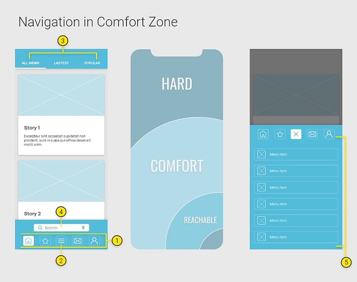
Perhaps a better approach would be to have all the actionable features within the thumb area zone as seen in the image below:

- These icons will remain at the top as a user does not have to tap on them. They can simply swipe to the left or right to access the content behind those icons.
- This entire row has moved to the bottom of the page for easy access.
- The homepage menu can now be reached in the bottom right corner.
Conclusion
What makes for great mobile navigation should be an integration of both bottom and gesture navigation. People are increasingly using their mobile devices as their primary medium for news, gaming, social and video content. The way people experience mobile devices should be ergonomic and less time-consuming.
Below is my solution for the ideal mobile navigation :

- The tabbed navigation will still be used as the primary navigational functionality between sections.
- The hamburger menu will be included in the tabs. This menu can be used for a more complex or layered app.
- The top headings can be used as subsections with a simple gesture swipe to the left or right.
- The search bar is now much more accessible.
- This is the new hamburger menu with the reach zone only covering three quarters of the phone real estate. There will be a scroll bar if there are more menu options necessary.


