
Skeuomorphic design: a beginner’s guide
Skeuomorphic design may be past its prime but all budding and seasoned UX designers should be familiar with this once ubiquitous way of designing
Even though it’s no longer as relied upon as it was, there is a case to be made for skeuomorphic design’s impact on usability thanks to its instant comprehensibility.
In this post, we’ll look at what skeuomorphic design is and whether it’s still relevant in today’s rapidly evolving design community.
What is skeuomorphic design?
Before we understand just what skeuomorphic design is, let’s just unpack what a skeuomorph is. Essentially, a skeuomorph is a copy of something else, an imitation, intended to represent the original.

A well-known example is a maple syrup bottle. Maple syrup bottles often have a tiny little handle on their side. This novelty feature isn’t for people with tiny hands.
In fact, traditionally, maple syrup would come in an old earthenware bottle — a type of ceramic — and so the glass bottles of today are attempting to mimic this old type of pottery which was used to store maple syrup.
Another old school example is American station wagons from the 60s and 70s with their imitation wood paneling. The paneling is an attempt at imitating wood, which was used in the 30s and 40s, even though it’s just vinyl.
These are examples of skeuomorphs. And skeuomorphs have been widely used within technology.
When technology and user experience design started to gain momentum, skeuomorphic design was used to help users who were unfamiliar with the technology. Cast your mind back to when you played pinball or paint on Windows in the early 2000s.
It wasn’t just Windows that used skeuomorphic design either. Apple really took skeuomorphic design to the limit and used it liberally throughout their renaissance in the early to mid-2000s.
When the iPhone launched, for example, it was a skeuomorphic graphic user interface that made the phone so easy and intuitive to use for newbies.
The calendar, for example, looked like a real-life calendar that you might have placed on your desk.
Why use skeuomorphic design?
Since skeuomorphic design is a derivative or an imitation of something else, it made sense for emerging technology and designers to use it in their designs.
Users would feel more comfortable using applications, products and services that imitated objects which they were already familiar with.
For example, a user would easily interpret what dragging a file into a trash can on the desktop would do: it would delete the file. Because in real life when you put something in the trash can, you basically delete it.
Skeuomorphic design transformed technology from something considered niche into something easily digested by the mass public. It facilitated the transition from physical to virtual and as such become much more popular.
It isn’t just graphics that are skeuomorphic. Even though skeuomorphic design did much for graphical user interfaces, sound plays a role too. Just try taking a picture on your camera phone. That click sound is an example of skeuomorphic design. Just like the crumbling of paper sound when you empty the trash can.
One of the most notable advantages of skeuomorphic design is that it capitalizes on a shared visual vocabulary between designers and end users.
This type of design offers the user affordances, a way of explaining how things work, that are already understood.
It’s also intuitive. A graphic representation of a calculator will be readily understood by even the most technophobic among us. These designs mimic reality. This instant comprehension is enabled by our experiences of the physical world.
Is skeuomorphic design relevant today?
We’ve come a long way since the prime of skeuomorphic design. It dominated the design world for over 5 years.
However, as time went on and technology took a more prominent role in our lives, there was little need to design in a way that imitated reality because our understanding evolved.
No longer did the calendar app on your phone have to mimic a real-life calendar.
This allowed for more interesting and newer design trends to emerge. Because of a wider understanding of technology and how it works, this meant user interface design systems could arise.
Take material design or flat design — two similar UI design systems which are flat and not 3D like much of skeuomorphic design. They use bold color choices in lieu of relying heavily on
gradients, textures, shadows and highlights. Or minimalism which is currently experiencing its 15 minutes of fame within the design community.
As our ability to understand technology progressed so did design language. But was skeuomorphic design’s swan song premature?
Return of skeuomorphic design
It’s projected that 2.9 billion people will own a smartphone in 2019. That’s a lot of people. More of us are now familiar, even if to a small degree, with technology so there’s less reliance on skeuomorphic design.
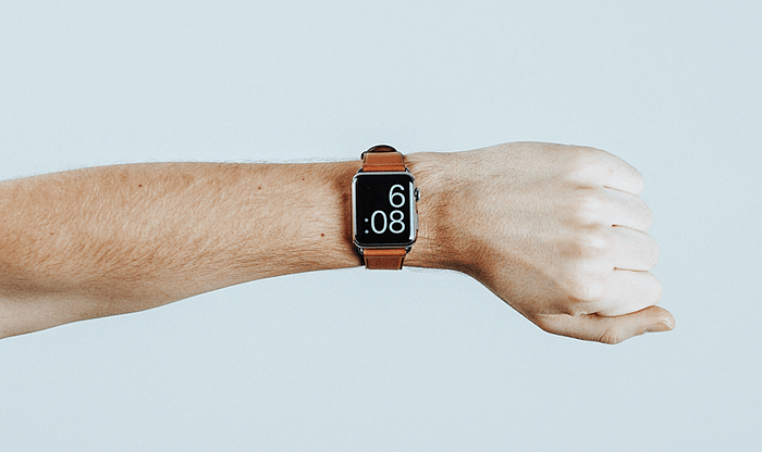
But this doesn’t ring true for emerging technology. Take virtual reality or wearables. A smart watch in and of itself is a skeuomorph. It isn’t really a watch but a computer that you wear on your wrist which imitates a watch.
Virtual reality brings a fresh perspective to skeuomorphic design. We interact with things which are virtual — that is to say, we can touch and move objects when we wear a headset which aren’t there but are an imitation of what is there. It remains to be seen how this interaction will develop as these technologies begin to mature.
Conclusion
Skeuomorphic design was a useful stepping stone as we ventured into unchartered territory. It acted as a useful guide as we became accustomed to unfamiliar UI components and design patterns.
As we’ve matured, so has our understanding of UX design and user interfaces. What remains to be seen, at least in the case of skeuomorphic design, is whether we’ll evolve beyond ever needing it or whether it’s something that we can rely on as new technologies emerge to help us come to grasp their inner workings.
One thing is certain, at least, is that skeuomorphic design has its place within UX design and should be something all designers are familiar with — even if they feel like it’s beyond its sell by date.

