I bet you are thinking right now, there are so many weather app concepts already, what new thing could anyone possibly come up with? After all, weather apps is one of the most popular topics in the design community. But most of the concepts I saw and existing apps I tested didn’t give me satisfaction.
For a weather forecast application, I decided to take inspiration from the sky. It is only natural. Think about it: When you don’t have technology to tell you the weather, how do you act? You look for the sky. Is it clear or is it cloudy? Is it light or is it dark? Is the sky an even colour, or do you see a large black cloud coming towards you in the distance from the way of Mordor?
Raw data about temperature, air pressure and humidity are, of course, all essential in making the perfect plans for the day, but making the application feel natural and organic goes a long way towards making sure that you made something people will consider an essential part of their phones. There’s also benefits to making sure even the people who never gaze up from their screens will also have an idea of what the sky looks like.
Weather App Concept
My idea of weather app is show sky on screen of the phone with information of daily temperature and precipitation. For example it it is a cloudy day, it could have a blue-gray gradient to remind us of the cloudy sky.
Fog in the morning looks so magic, it is usually a light blue, purple or pink combination. Sometimes when we walk in the fog, even if it is the same way we take every day, it just makes us feel like we are in some fairy tale. I want to bring this feeling to the weather app screen, I want to make it feel like a real sky.

When it is snow or sleet, the sky usually looks gray or white. It brings all sad feeling about this kind of weather.

How to Make it Work
The color of the sky depends not only on precipitation, but also on the time of day. It changes from light to dark during day. At dawn it is a gentle pink-blue gradient, at day it is blue or gray, sunsets are pink/orange or blody red and at night, the sky becomes a dark purple color.

For every city and region, we know the duration of the day and night, time of dawn and sunset. Also we can show dependence of temperature and precipitation to the color of the sky. For example, snow with rain is usually on a gray background of the sky, rain on dirty blue. Finaly we have gradient of the screen changing during the day depending of temperature, precipitation and time of the day. In this case we can most closely approach the sensation of the weather and the sky and show it on the phone screen.
Extreme weather

Bad and extreme weather can happen sometimes. Sky in this case looks very dramatic, dark and terrifying. My concept makes it very clear for users showing color of the sky and warning if it is dangerous for people to go out. For example storm has dark blue-gray or purple color, sandstorm painting sky in sand color, tornado or tsunami makes the sky really dark and terrifying.
UI/UX Design

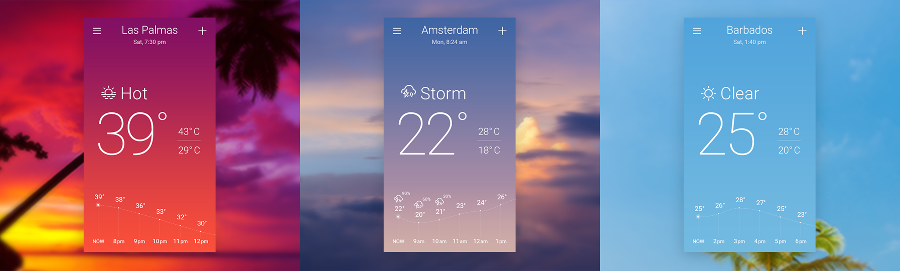
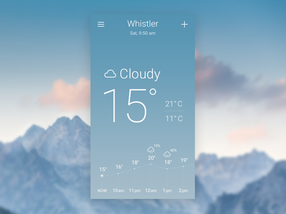
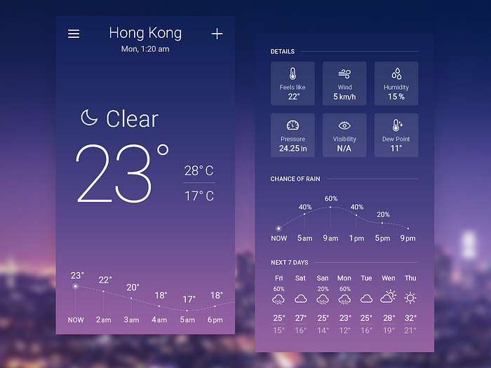
The first screen the user sees, contains the main information about weather: current temperature, minimum and maximum temperature, graph of temperature change during the day and precipitation. The menu icon opens menu right slider with settings information and a list of locations. Plus icon adds new locations. When you scroll down, you can see detailed information, chance of rain and weather in the next 7 days.
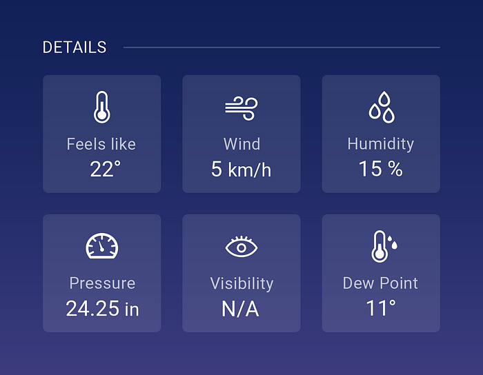
The detail section focuses mostly on important weather indicators: temperature, wind, humidity, pressure, visibility and dew point.
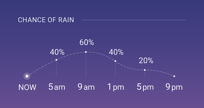
Chance of Precipitation/Rain ( in our case it is rain because it is summer) shows using graph and 4 hours between indicators, in this way you can see what the chance of rain is in the next 20 hours.
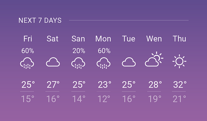
Extended weather shows maximum and minimum temperature and percent of precipitation in the next 7 days.
This UI Design looks good on all kinds of sky gradient backgrounds: from light blue to dark purple.
Maybe my idea of this weather application is just way too utopian, but imagine how amazing it would be to see exacly the same sky color on your phone screen as it is on the sky. I think there is a chance to create algoritm of gradient changing during the day depending of temperature, prescriction and time of the day. Let me know what do you think. Thank you for reading!
You can find more great natural color pallet combination in my previous articles:
Please follow me on dribbble

