Member-only story
Spacing guide for designers
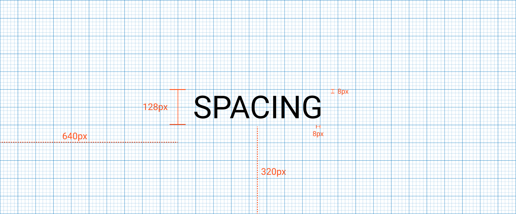
Spaces are the horizontal and vertical distances between two components or the viewpoints of the screen. All spaces are set to an increment of 8 (8, 16, 24, 32, 40, 48, … 128).
The “Spacing guide for designers” is part of a series of articles about design foundations to build better digital products — to the following article to learn more about Responsive Layout Grids
8px grid
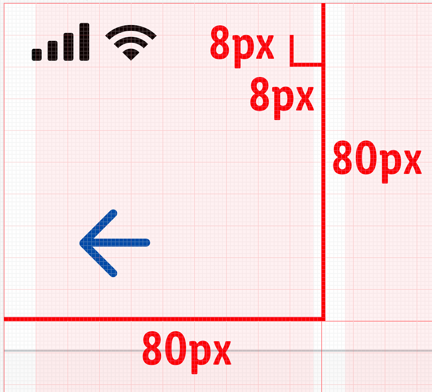
The most famous grid system is the 8px because an even number makes scaling your design much easier, and more consistent.All components align to 8px square baseline grid for mobile, tablet, and desktop.
Use increments of 8px to size and space out the elements on a webpage. This means that any defined height or width, margin or padding will be an increment of 8px. Fluid grids are built by division, whereas fixed grids are built with multiplication. Type aligns to the 8px baseline grid, so the line heigh of the text is calculated with multiples of 8 as well.
In some occasions you can use a 4px grid; when designing for small screens you may need a small number to create an icon or space two components or typos.
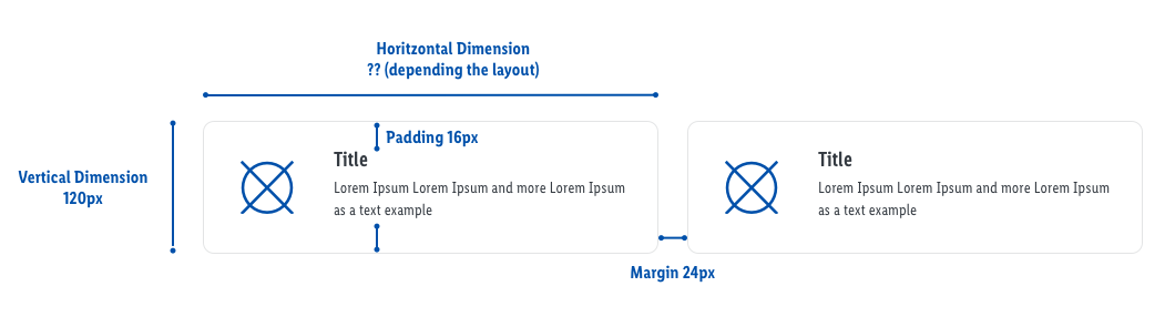
Terminology: Dimensions, padding and margins
Spacing is more detailed and granular (8px) than a layout (12 columns). When using spaces are a set of rules around how to place elements within layouts and components.
- Dimensions refer to the width and height of component elements. The heights of these elements should align to the 8px grid. Their widths are not specified because it’s responsive to a viewport width.
- Padding is the space between elements within a component. Padding can be measured both vertically and horizontally and does not need to span the whole height of a layout. Padding is measured in increments of 8px or in some cases of 4px.
- Margins are the space between components, the layout has…

