Specification System for Reporting— a UX design case study
About devising a system for specifying and signing-off content for a set of data tables. It’s also about handling challenges as a designer, recognising when the brief needs changing, and stepping out of our roles.

1. Context
My client is an e-gaming company that operates sports-book and casino products. They decided to launch a b2b service renting their platforms to new operators. They asked me to design a player and platform management system for this service, based on their current admin.
After exploring personas, user journeys, business model canvas and value proposition, initial user interviews, identifying jobs to be done, we prioritised features, and established that reporting was essential to the MVP.
Reporting is a set of data tables for checking player activity and statistics that drive daily business decisions. Each report or table is compiled to give a quick overview of different aspects of the business.
2. Original scope
The original plan was, that I design a neat table template that can be used for all the reports.
That content of the reports were to be copied as is from my client’s existing admin. However, we had to step up the design: the users of the current admin were paid to use it (being employees of my client), and we were working to get users who will be paying to use it.
The goal was to make the new report template a lot more clear, ergonomic, and offer customisation options.
3. User research insights
In preparation for designing the report template, I wanted to see how they are used, and why each piece of information matters.
I started conducting user studies with in house users: shadowing, and interviews. I printed every report, schlepped the sheets around the office to different users, took notes on them, grouped and regrouped them, and kept asking questions, almost to the point of coming across as dumb and annoying.
As I hoped, I did gain insights that were going to drive the design of the template, but something else really stood out.
The information in reporting was so unstructured, that it was causing more pain to users than the interface and interaction issues that I was preparing to handle.
4. A need to change the scope
After some investigation, I understood that a lot of details had been changed around in reports over the years. While each of them mostly made sense in itself, the whole set of reports as a whole had not been considered. We had too many reports on our hand, with too much overlapping and redundant information.
Since we were to build a product with reporting at its core, I proposed that we add restructuring reports to the MVP as a whole new epic.
5. Pushback due to time pressure
Although everybody on the project agreed that restructuring reports was necessary, the when was not so obvious.
Stakeholders were conscious of the deadline that had already been pushed back due of concurrent projects on the development team’s plate, and naturally they were weary of putting even more on it.
In the same time, the dev team were afraid that changing all reports would run into an endless logistical nightmare, despite the actual development time being manageable. I learned that changes to reports had so far been communicated via ad-hoc emails. Miscommunication and lack of formal sign-off were the cause of frustration and wasted time drawing energy from important work.
Although not a design issue, certainly a very real one that was in the way of the design making an impact, so I was motivated to find a solution.
6. Clear specifications would make the new epic manageable
I wanted to find a way of fitting the job of restructuring reporting into the first version of the admin. Launching a convoluted product, and later changing it drastically might even alienate users who do put in the work of learning their way around it in the first place.
So to make this change manageable, we needed not to just simply restructure the reports, but to have them signed-off and communicate it to development in a way that is clear and specific to the last detail, to minimise unnecessary rounds of changes.
So I developed a system for specifying and signing off the new set of reports.
7. Streamlining the specification and sign off-process
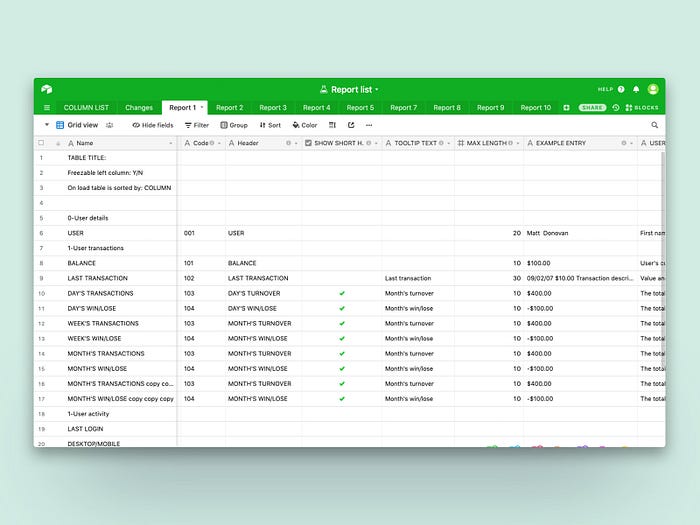
I have used airtable for compiling all the information and collaborating on them. We compiled the entire reporting specification in a single cloud based data table. The table had separate tabs for the specification of each report, and an additional one for listing all the row types used across reporting.
Column list
Before getting down to changing each report, I set up a tab to list and specify every column that appears in the reports. Discrepancies needed to be cleared up between column names, cell data, and formatting. So each column type got an identification number, and all the parameters specified.
The column list is a menu of columns that can be used to create a report.

This is the list of details that can be specified for every column:
- Header: column header
- Short header: the short version of the header to be used when space is tight
- Show short header: a checkbox to be turned on and off depending wether we want to show the short version of the header instead of the normal one
- Tooltip text: for when the header text is not self explanatory
- Example entry: an example of typical of the cell data
- Max length: in characters
- User story: specifies the cell data
- Cell type: text-free/text-option/text-entry/checkbox/date&time/number/percent
- Format: options for formatting date, time and numbers
- Sort-desktop: reports on desktop are always sortable by all of the date/time, number, and percent columns
- Sort-mobile: selecting this checkbox make this one of the columns to sort the report by on mobile. (not available for text fields)
- Link to: Some of the data is linked to the section of the admin where action can be taken on the new information.
Most some of the column specs can be changed at a report level (like formatting and length,) these are capitalised.
Once I set this template up, the UX researcher on the project compiled a full list of all columns based on the existing reports. She could use my notes, and the subject matter experts on the team to get more clarification.
Specifying reports
Reports are then specified on separate tabs. They can be populated with items from the column list.


Joining reports: Tabs
Too many reports were putting too much cognitive load on users. Some reports were almost the same so they could be merged. Tabs was a simple way to join related ones, when they could not be merged. The screenshot on the left shows the way columns are specified on the document.
Visual sign off
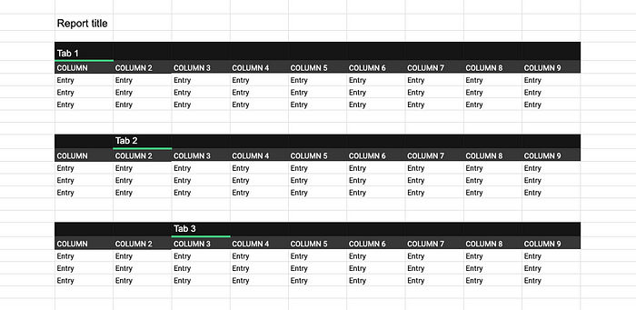
While the above specification format is very precise and leaves little room for misunderstanding, it was not easy to process visually, so I needed to support it with a simplified format. So I set up a google sheet with tabs for each report. This gives a rough idea of what reports will look like, and the information that goes on each tab.
8. Back on track
Also setting up a clear framework for specification allowed me to give a clear brief to the researcher, who then prepared the lion share of the specifications, while I could get back on track and proceed with the design.
Subject matter experts on the team assisted us in clarifying details and by doing first rounds of sign-offs. The restructure proposal was finally signed-off handed over to developers.
This framework enabled us to contain the additional epic in time, and minimise changes requested post development.
After getting past the initial concerns, the whole product team got behind the chore values of the product, even when they needed extra effort to maintain.
Conclusion
This was a big project, and I could have written about the more UX-y aspects, like wireframes and prototypes, and design thinking, and user testing. Yet I find unfamiliar challenges more interesting, as they offer more learning opportunities.
As designers we all have at some point realised that the job we‘re hired for is not exactly the right job for the goal, or even that our role is not right for the job. When this happens we all should be less afraid of rocking the boat and be more proactive in coming up with a different solution, even if it means stepping out of our roles, and act as business analysts, project managers, or whatever the challenge calls for.
I have redesigned the UI, and changed the data on the example screens in order to keep my client’s business information and identity confidential.


