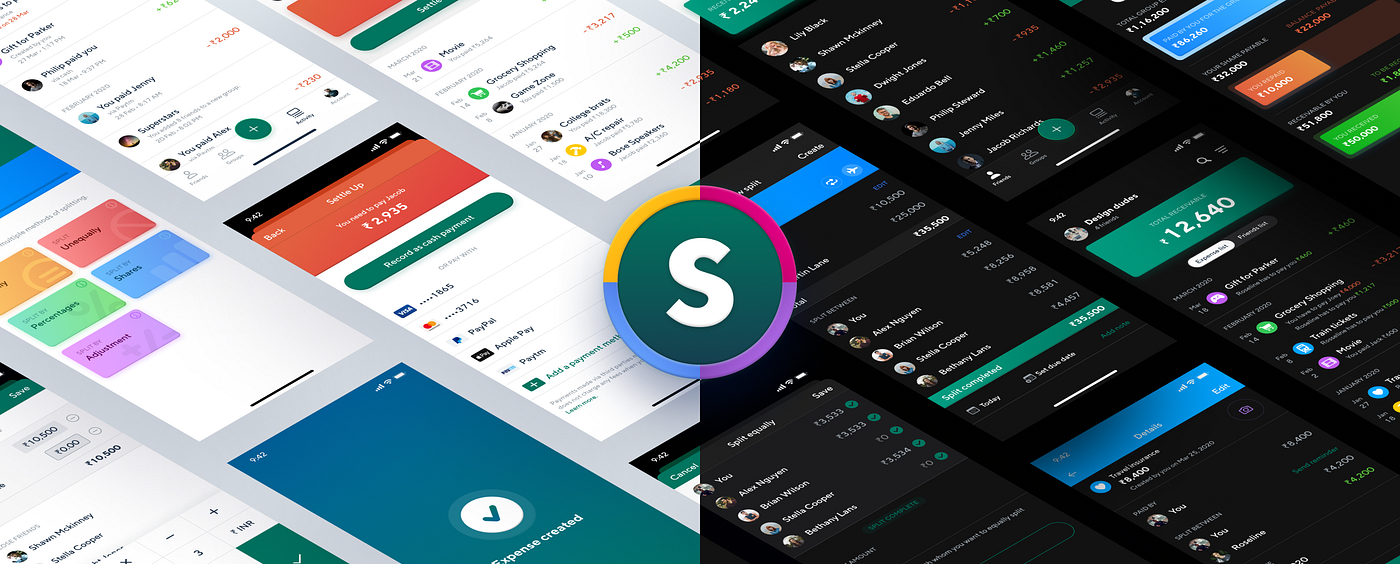
Splitwiser - The all-new Splitwise. Mobile app redesign — UI/UX Case Study!
Time for a brand new case study. In this case study, I am going to share insights on the design decisions I made when redesigning the Splitwise mobile app.
Now before we get started, I’d like to do a super small plug to one of my highly requested courses!
It’s Free! The Mega Product Design Course for Beginners!
If you’re looking to drastically upskill and change your career trajectory for the better, make sure to check out my Mega Product Design Course for beginners on my YouTube Channel.
I’ve had the good fortune of working with some of the biggest companies and startups and have learned a lot through that. And I share all the knowledge with you all for free on my YouTube Channel.
I cover everything from the core foundations of Product Design, UX Design and so much more. Get to see and learn what it takes to be a skillful product designer which can get you any opportunity you want.

Anyway, let’s get into the case study!
Disclaimer
This is a personal project. I was not commissioned by Splitwise to redesign their app.
What is Splitwise?
Before I get started, let me quickly explain something here. The name of the app is actually called Splitwise. But I redesigned the app and gave it a new name — Splitwiser. Why? Because…
Splitwise just got wiser. Get it? 😜
Anyway, Splitwise is a mobile app that allows you to track and split expenses with your friends. It’s a very simple concept.
Promo Video 🔊
Here is a quick promo video I made just for fun (and to show off my motion design skills 🌚). Have a quick look and come back right here.
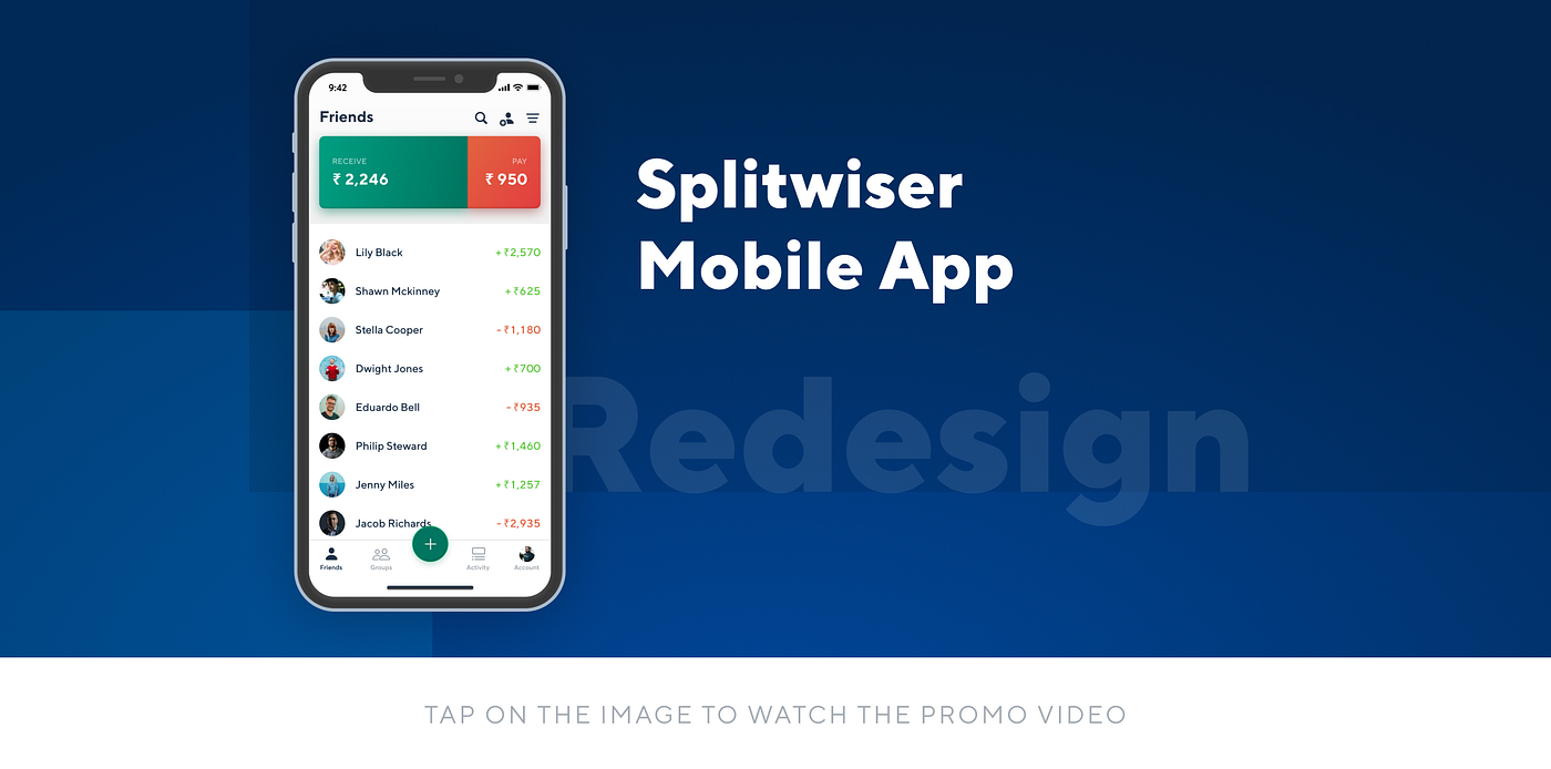
It took me around 6 hours to create this Promo Video. Do check out my beautiful Behance Presentation as well.
Alright then. Let’s get started.
Why did I choose Splitwise?
Hey, Chethan. I want to redesign a website or an app. Which one do I pick?
So a lot of young designers ask me the above question and I have a standard answer to this.
Pick an app/website which you think you would be an apt user for. That way, you can think in terms of the user and make good design decisions.
Wait up…Not so fast!
I DO NOT recommend redesigning popular apps such as WhatsApp, Facebook, Instagram or Twitter.
Oh! Why not?
These apps have been designed by more than hundreds of designers. And we have no idea what data they have, how they formed their decisions, or what the business goals were. Hence, refrain from redesigning these apps and pick up less popular apps. There are tons out there!
I guess now you know why I picked Splitwise. But, there is another reason. I've actually used Splitwise only 2 times.
Why?
Because it’s splitting mechanism does not meet my needs. The app allows you to split a single expense either equally or by shares or by percentage.
However, my expenses were made in such a way that I had to split a single amount in multiple ways. And this is something which Splitwise did not allow. As a result of which I decided to solve this big problem. And this is a really big use case. Not every expense needs to be split in a single way.
Let me share an example of my type of expense so that you understand the real problem 😭.
5 friends go for dinner. 3 are vegetarians 🥦, 2 are non-vegetarians 🍗, 3 of them drink 🍻. Out of these 3 who drink, 2 of them are vegetarians🥦.
🤯
That’s not all. The bill needs to be split 3 ways. Veg, Non-Veg and Drinks.
And there is no way you can split this bill equally or by percentage or by shares. Hence, I decided to take upon the challenge to fix this issue and also redesign the app from the ground up.
I re-designed more than 80 screens.
⚡️Bonus Tip
Here is a tip that I share with everyone when redesigning apps.
Take the opportunity to not just redesign the UI or UX of the app, but also find ways of improving the product as a whole.
After all, we are called Product Designers.
Not only did I give the app a fresh new look, but I also added a ton of new features, made improvements to notifications and gave high focus to copywriting. We will look at all these one by one.
Let’s get started!
The first thing I want to talk about is the new logo. I actually found the designer who made the original logo. Nicole Mercer says,
They wanted to stick with a concept of a house featuring an ‘S’ or ‘$’ inside. There is an envelope in there, too! Which was a happy accident I realized when finalizing colors.
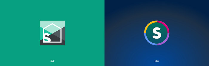
Now while Nicole’s ideology did make sense, I didn’t quite resonate with me. Since I was redesigning the app, I decided to redesign the logo as well. Here are a few other explorations I came up with.

- The new logo has a lot of saturated colors. I wanted the app to feel more personal and playful as you are splitting expenses with family and friends.
- I had to change the primary green color as it failed the WCAG accessibility guidelines.
- Rather than using a house as a logo mark, I went with a universal symbol of a coin.
Now, I do know that it does resemble a poker chip, but that's okay. Poker chips also represent money 😜
Behind the scenes
Now I’m not going to talk about my research or user flows or wireframes or user personas. I am going to dive right into the visuals and explain my reasoning along the way.
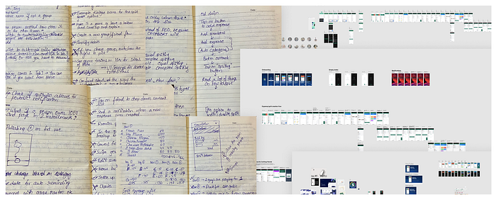
There is a lot more. But this is just a small part of it.
Anyway, let's get started!
Onboarding
Assuming that the new design would be implemented and shipped to the world, how would the app onboard the users?
Here is a quick visual difference between the old and new screens.
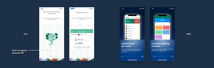
Assuming this would be an update to the existing app, I did not want to talk about adding expenses, settling and creating groups. I wanted to talk about all the new features that have been introduced.
One thing I really enjoyed when working on the redesign was copywriting especially because it was quite challenging. This is what I always tell designers about copywriting.
Our job as designers is to sell the design, to those who want to buy it. And copywriting plays a crucial role in that.
The 3 musketeers of design are UI, UX, and copy.
Anyway here is the list of 6 onboarding screens.
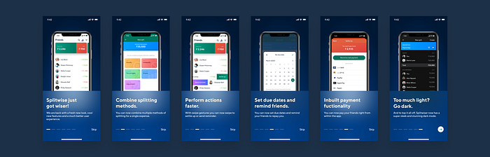
It’s got Dark Mode too 🖤.
Quick plug 🙈— Feel free to check out my Ultimate Guide on Designing Dark Mode for Android and iOS.
Expense creation flow
The first problem I wanted to solve was the expense creation flow. I felt that the user flow for this task was not quite optimal. Let me explain. I will be taking complex scenarios so that I can explain the real problem.
⚠️ Time to pay attention!
User Flow
Here is the scenario.
4 friends go for a movie 🎬. But only 2 of them pay for all the expenses. The expense has to be split between the 4. Maybe 1 pays for movie tickets 🎟 and the other pays for food 🍴.
Here is the current flow of just adding the payers along with the amount they paid. I am not talking about the splitting part. This is just the flow to add the payers.
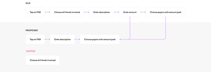
So what happened here?
- Rather than entering the amount paid and choosing the payers as separate steps, I combined them into one. This saves a few taps.
- I also removed the step which was to choose all the friends you want to split the expense with. Why?
Let me explain that by showing the screens.

The idea was to restructure the order of the tasks.
It made sense to start by adding a description of the expense, then choose the payers and the amount paid, and then finally make the split.
What’s wrong with choosing all your friends first?
The most annoying thing I found when adding friends was that Splitwise makes you enter email ID or phone numbers for all new friends.
And I believe that this is really bad UX as the priority is to set up the expense first and not inviting your friends.
The task of inviting friends to Splitwise can be the last step before creating the expense.
Here is the solution to that problem.
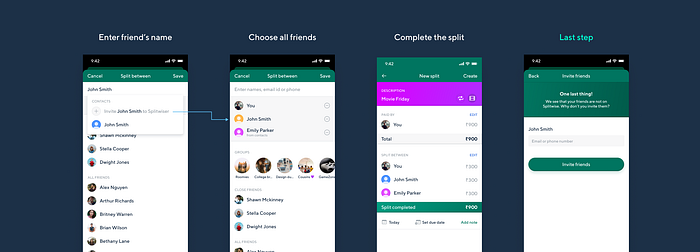
Splitwise categorizes friends into 3 buckets.
- Who are already on Splitwise.
- Who are NOT on Splitwise but in your contacts.
- Who are NOT on Splitwise and are NOT in your contacts.
In the above case, I have 2 friends who share the name, John Smith. One of whom is in my contact. But I want to invite the one who is not in my contacts. And so, when I tap on ‘Invite John Smith to Splitwise’, the app adds him to the list without asking for any details such as email ID. I can now continue with the process of splitting the expense.
The last screen is the one where you can enter the email or phone number and invite your friend onto Splitwise.
I see. But I have a question. Why was interchanging the order so important?
As I mentioned above, making the user perform less important actions (inviting friends) at the beginning of a task (creating an expense) is not great UX.
If you apply the same concept to a checkout flow of an e-commerce website, this can lead to dropoffs and that is bad for business.

As you can see, the current flow is to ask the user to enter an email address or a phone number right at the beginning of the flow.
And this is a painful process. Imagine doing this for a group of 8 new friends right at the beginning. It would be such a nightmare 🤦🏼♂️
Selecting payers
As I mentioned before I combined the steps of adding the amount paid and choosing the payers. Remember my first example where 4 friends went for a movie and only 2 paid?
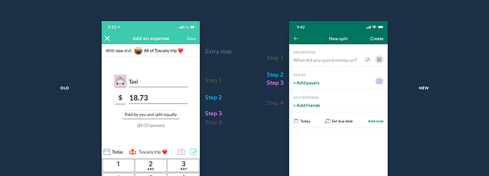
In the above image, you can see that I combined Step 2 and 3 into a single step. Let’s actually take a look at the task flow in the old app.
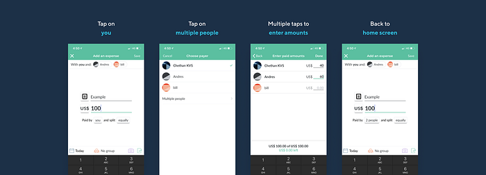
This whole process takes around 10–15 seconds and 5 taps. I intended to optimize it even though 10 seconds seems like a small number. Here is my proposed solution.

Here, the user combines the processes of choosing the payers and the respective amount paid.
Now does this make the process faster? Maybe. Maybe not. But it definitely makes this particular flow cohesive.
Choosing friends to split with
Alright, now that we have chosen the payers and the amount paid, it’s time to choose friends you want to split the expense with. Down below is the flow for picking the people you want to split it with.
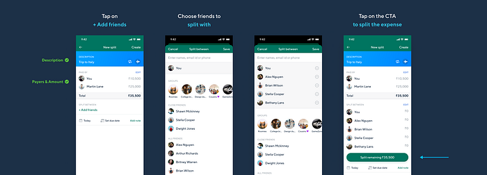
A few things to note are that,
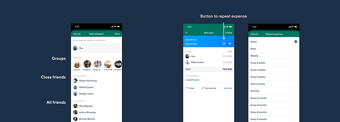
- I have neatly created sections called Groups, close friends and all friends. Close friends are those how frequently split expenses with. This break up of close friends and all friends does not exist in the current app.
- The functionality to set the expense to repeat itself is hidden away and many people might not even notice it. Hence I brought it out and made it more evident.
You can understand it better with the screens below.
Expense splitting experience
Okay. The final step is to now split the expense with your friends.
As I mentioned before, Splitwise does not allow you to split the expense multiple times in multiple different ways. But I wanted to have that functionality to split expenses multiple times.
The solution to this was very challenging to come up with as there are many places that users can go wrong and get confused.
Let me take you through the solution step by step.
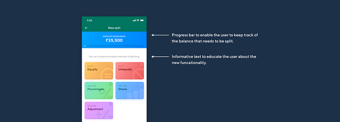
The first step of the process is to choose the method of splitting the expense. There is an info icon that explains the way the split works. But active users of the app would be very familiar with it.
Let’s remember the use case I initially spoke about.
5 friends go for dinner. 3 are vegetarians 🥦, 2 are non-vegetarians 🍗. 3 of them drink 🍻. Out of these 3, 2 of them are vegetarians🥦. And the bill needs to be split 3 ways (veg, non-veg & drinks)
Split 1
The total bill is 35,500. 🥦 Split 10,500 between 3 vegetarians equally.
(Ignore the intensity of the number. I know that 35,500 seems too crazy for a group of 5 people 🙄)
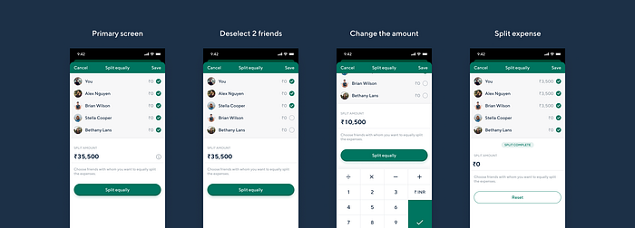
As you can see above, the flow is super simple and easy. It’s like completing the first section of an exam paper 🤣.
Now back to the Primary screen.
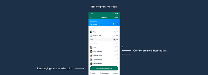
The app takes you back to the primary screen where you can see the breakup of the amount owed by each of the friends.
Now if we were to split the food bill between the non-vegetarians, we would repeat the exact same step.
Split 2
🍺 3 friends who had drinks decide to pay for their share and would not split it with others. Seems fair right?
Let’s see the process for that.
Super simple right? Just select the friends and input the respective amounts owed by them.
What’s next?
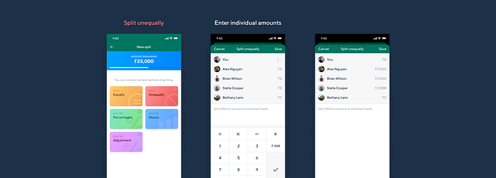
There is one small use case that I would like to address. Now I do know that it might be a bit absurd for this scenario, but I am sure it would be super useful for other scenarios.
Split 3
Let’s say that everything has been split except for the taxes and other charges. The most common way to split this would be to do it equally. But let’s say, we want to split the taxes based on our current share of food expenses. That way someone does not pay more tax and someone pays less.
Dude! That's absurd 🤦🏼♂️
I know. But as I said, this would make much sense in another scenario perhaps. Stick with me.
Let’s see the task flow.

So the default view is the same as the current app where you can choose the fraction of the share.
But the new addition is the switch where you can split an expense based on the current share on the expense split. And in our case, it is the taxes of the food bill.
Great! We have successfully completed the split.

Just tap on create in the top right and you are good to go!
Alright then! Now let’s take a closer look at all the small improvements and enhancements I made to the app.
Total balance
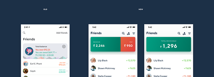
As you can see, my new design looks much better and less text-heavy as well.
- I refrained from using words such as owe and owed as I felt that few users might get confused with it or not understand it. Hence I made it simpler and used Receive and Pay.
- Users can tap on the big card to see the NET receivable/payable balance which the current design does not allow.
So what about multiple currencies? I can see a break up of that in the old design.
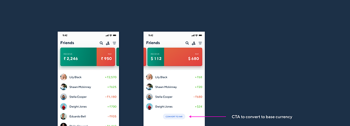
If there are multiple currencies, the cards turn into a carousel where you can switch between 2 or more currencies. The idea was to separate out the list items and group them based on the currency.
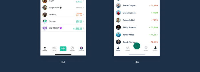
Bottom Nav Bar
It’s a very simple change to the old design. Nothing much to say here.
Anyway, let's move forward.
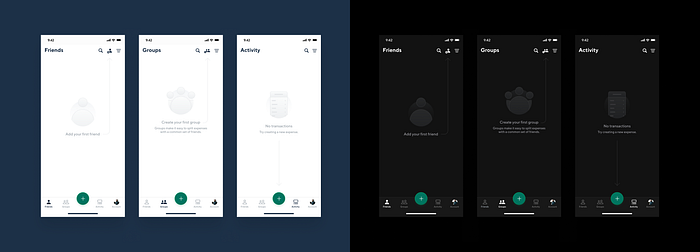
Empty states
Not that the old design was poor, but I was going for a very specific style with the redesign and wanted to keep that consistent across all screens.
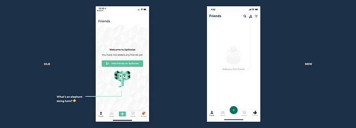
I also created Dark Mode versions for the same. Have a look. I hope you guys enjoy the illustrations.
Notifications
Even though notifications has nothing to do with UI/UX, I thought about how we can send timely notifications to users. At the moment, Splitwise does not do a really good job at notifications.
When redesigning an app or a website, always go the extra mile and think about how you can improve the overall product and not just the interface. That’s what sets you apart from other products designers.
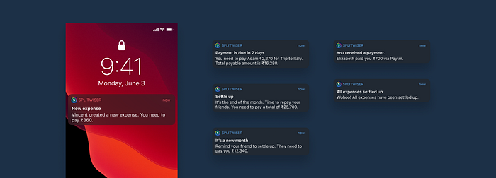
- When a new expense has been created.
- If a due date is set beforehand (new feature), the app sends a notification 2 days in advance to remind the payer.
- At the end of the month, the app reminds you of the balance you need to pay.
- At the beginning of the month, the app lets you know how much you are owed.
- When someone makes a payment to you.
- When you have repaid all your friends.
Expense category
I wanted the app to be very playful and colorful as we are after all dealing with friends and family.
Here is one of the ways I introduced color to be a significant part of the experience.
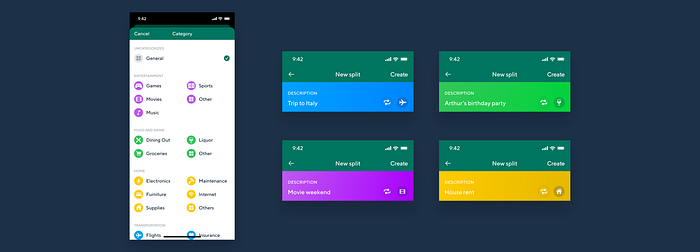
Each expense has a category and each category has a color associated with it. Once the user chooses a category the app changes the color of the description section based on the category
Smart calculator
There might be situations where you might have a list of bills and you paid for it all. Now you have to create the expense in Splitwise and enter the total amount paid. You would have to manually take a calculator and add the bill totals.
But what if that functionality right within the app?
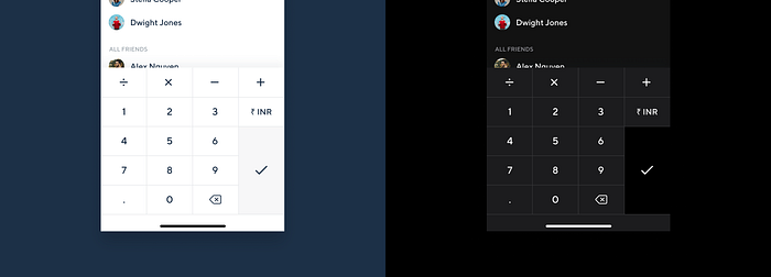
When inputting the amount paid, you can easily perform mathematical operations.
You can also change the currency right from within the number pad if you want to.
Split breakup
This might not be that big of a use case but is definitely a good feature to have.
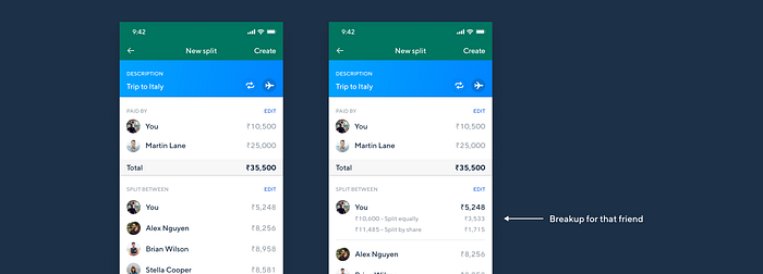
On tapping the list item of each friend, the app gives you a breakup of the split for that particular friend.
Save as draft
One really good feature that I expected Splitwise to have is to save an expense as a draft. Maybe there is a confusion, maybe you got interrupted or whatever may be the reason, you need to be able to save your progress.
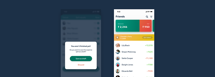
Here is a modal that informs you to save as a draft in case you choose to cancel the expense creation. And the screen on the right shows a touchpoint to resume editing.
Swipe gestures
Helping users perform actions faster is always a good experience.

Users can swipe left to settle up and swipe right to send a reminder to their friend for paying.
Due Dates
A new feature I introduced is to have due dates for a particular expense. If a due date is set, a notification is sent to the payee 2 days before the due date and reminds him to pay.
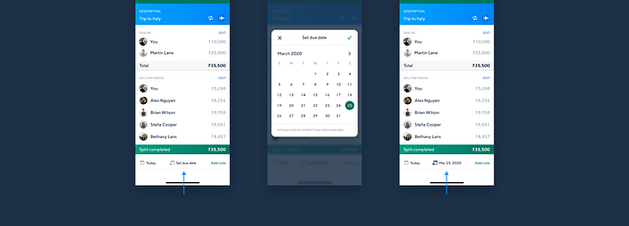
The above picture shows the simple flow for setting a due date. I hope you like the design of the calendar 😁
Expense breakup for each friend
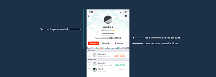
2 main issues I found with this screen were
- Almost 50% of the screen was being wasted. And this could have been cleaned up significantly.
- The most important information on this screen is supposed to be the total amount payable/receivable. And that was not given any prominence at all.
So here is my solution to this.

- The first thing you look at is the amount payable/receivable.
- All actions other than settling up are secondary. Hence I added that inside a menu.
Inbuilt payment
I think the most important feature that needs to be implemented is the ability to make payments right within the app. I am pretty sure this has been a highly requested feature.
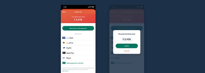
As of now in India, the only payment method available is Paytm.
If the user pays by cash and you choose to settle up, you can choose the amount you wish to settle. Tapping on the input field brings up the number pad where you can choose the amount to settle in case you are doing a part payment.
Groups Tab
My main objective with this screen was to clean up the interface. The content shown is perfect and I had no problems with that at all.
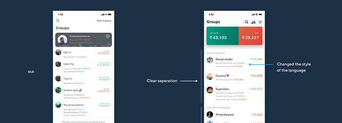
A few things I did to clean it up,
- I added headings for Group and non-group expenses. It makes it easier to differentiate the 2 sections.
- I changed the style of communication a bit. The words owe and owed can create a bit of confusion sometimes. Hence, I wanted to make it very simple to use the word pay. So rather than saying you owe David…, it's you have to pay David. It’s very simple English and can understand it very quickly.
Expense/Friends View
One thing I thought would be really helpful was to have 2 different views of expenses incurred by that group.
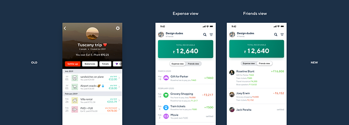
So as you can see above there is a segmented control that toggles between the list of expenses and list of friends of that group.
It allows you to see the break of the amount expense wise or see how much each friend of that group has to pay or receive from you.
Spending summary
The app provides a break up of the spending summary for a particular group. As you can see below, the old screen looks text-heavy and it takes a while to infer something from it.
This definitely needed a redesign.
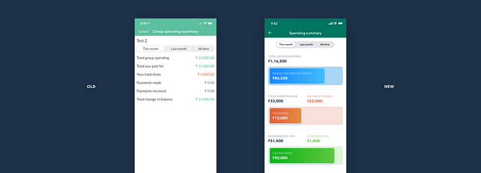
Introducing color and beautiful looking graphs was the way to go.
Having a super quick look at the graph, you can clearly see the status. They give a quick insight into how much more you need to pay/receive.
This makes it a lot easier to consume information.
Expense details
With regard to the expense screen, the only thing I wanted to clean up the breakup of the payers and payees.
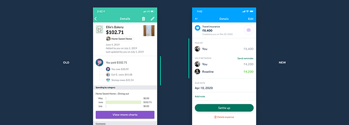
I felt that it was necessary to follow the same design language that I used all across the app.
I also added a small CTA to send a reminder to all the friends who might be a part of that expense.
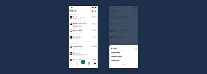
Activity Tab
This screen really needed some work. This screen just has text thrown all over. Extremely hard to search for the things you want to find and very hard to scan through.
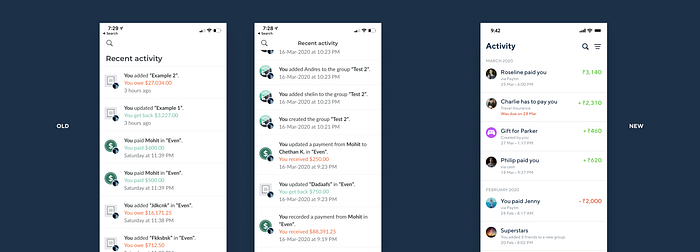
A few things I did,
- Followed the same design pattern where the numbers are on the right side. It makes it easier to scan each line item.
- Removed unnecessary words such as updated, recorded, you get back and made the language much easier and comprehendible.
- I also added the functionality to filter to specific types of list items so that it becomes even easier to scan. (Shown below)
- The app records each friend added to a group as a separate list item and hence makes is redundant. I combined them into one list item. (Check out the line item Superstars in the above image.)
Dark Mode 🖤
And finishing off this case study with the cherry on top!

And… That’s a wrap!
I hope you guys found it useful and informative. Feel free to hit me up on any social media platform if you have any questions. I would be more than happy to have a chat with you.
🔥 2 Free months of Skillshare Premium!
If you want to learn to build a fully functional website from scratch without using a single line of code in Webflow, make sure to check out my Mega Webflow Course for Beginners! You can find the course on Skillshare
Register with my link and get 2 free months of Skillshare Premium and watch it for free.

Thanks for reading!
To stay up to date with what I’m doing, check out my buy me a coffee profile, where you can also show your support for my work.
Check out my other articles on medium.
My socials
Portfolio | Instagram | Twitter | LinkedIn | Dribbble | Behance | YouTube