Checkout Form: Behind The Scene. Part 3/4.

Summary: this article is the culmination, or semantic conclusion if you may, of my two previous articles. In the 1st one, I described the problem behind the online checkout processes. In the 2nd, we looked at 16 must-know principles that will help you design a better experience for any form.
After you’re done reading this article, you will learn how to validate each field properly, how to minimize the number of errors a customer might make, how the differences between B2C and B2B markets lead to changes in your design, how to use input & visual constraints for the fields, and tons more insights about the “what and why”.
Be strong and brace yourself, this is a long read. 🖖🏼
Let’s Go ↓
Almost 6 months ago, I faced questions such as:
- How to design the checkout process for our B2B product called Fluix that uses a form with 15 fields? How it should work?
- How to make it clear and understandable for a customer?
- How to simplify the process, but still keep it informative enough and receive necessary data from a customer?
- How to increase success rate and decrease completion time?
- How to minimize the number of possible doubts while answering?
- How to make a customer feel comfortable and satisfied with the checkout process?
- What are the local differences between countries/nations/languages? Which of them should I cover?
- Is there any difference between B2C and B2B markets? If so, how do they work? How should I cover them?
With these in mind, I dove right into the research to find the answers I was looking for. I read a lot of observations, articles, and specifications; explored tons of checkout processes of some popular and not very online stores; analyzed their designs, their pros and cons, etc.

Powered by this research and new answers, I completely redesigned our checkout flow as well as the form itself. Besides, I wrote 7 pages of documentation for our dev.team, wherein I described:
- how the checkout process should work;
- what the dependencies between fields should be;
- what input and visual constraints we should use, and why;
- what we should validate, and how;
- and so on…
As you might have probably guessed, I’m going to share these insights with you.
Note that all of the information I’m sharing below is based on the checkout flow I designed for Fluix only. There are no other specific fields or additional steps in review. Just the ones related to Fluix form.
Before we begin, let me give you a little bit of context, so you can understand the flow better.
The form described herein is available in the customer portal, when moving to a paid plan or at the end of a trial. So it’s kind of the second step of the process of subscriber for the customer, since the account already exists during a trial. Hence, on this step we already know the following info about a person, which we ask while registering for the trial account:
- Full name
- Company name
- Phone number
Thus, we can pre-fill the corresponding fields on the checkout step to simplify a customer’s task (tip #2, remember?). But since we are dealing with the B2B market, there are the few pitfalls. I’ll tell you more about them in a moment.
The Structure

The Fluix Checkout Form can be divided into 5 main sections as follows:
- Payment Setup:
1.1. Chosen product name
1.2. Number of users
1.3. Payment Method
1.4. Payment Period - Billing Contact Details:
2.1. Company name
2.2. Full name
2.3. Email
2.4. Phone number - Full Address:
3.1. Country
3.2. Zip/Postal code
3.3. City + state (for US)
3.4. Address - Summary block with all calculations and total price
- Confirmation button + links on agreements and terms
- Bank Card Details (depends on payment type)
6.1. Name on Card
6.2. Card Number
6.3. Exp. Date
6.4. Secure code
At a quick glance, there is nothing special in these fields, right? But now let’s dive into the details of each of them and you will probably be a little surprised.
1. Number of Users

In the first iteration that I worked on, I used segmented control here to avoid a text field and give the user ability to choose a number of users in one click. As you can see, I gave a few segments 1–10 users, 11–50, 51–100, 101–200, and an Exact Amount, so the customer could manually enter an exact amount of users.
However, in our case, there are a few issues in using such control:
- The pricing for all our plans (a.k.a products) is based on the number of users, so the total price for the plan is directly proportional to the exact user count. So, each client who counts the money is going to select the exact number of users. Thus, there is no need for a segmented control, which only limits a user instead of speeding-up the checkout process.
- As I mentioned above, this is the payment setup when a client already has a trial account. And he registered a trial to test the product before buying it, right? Hence, this trial account definitely has some users already configured. Therefore, we should show them the number of existing users in this field. Also, w.r.t to our specific system, we should not allow the client to set fewer users that they already have.
- A segmented control, in fact, adds 5 actionable elements on the screen instead of 1 text field. The more objects that are on the screen, the higher the cognitive load is on our brain. Hence, it takes more time to concentrate and give a proper answer. And it’s even more relevant for this case because Number of Users is the very first question they have to answer.
Through various iterations, I came up with the text field in combination with steppers.

The benefits of such an approach:
- The stepper gives an ability to easily add just a few more users with fewer actions and less time than the text field might take. For instance, let’s say there are already 20 users pre-configured on a trial account. And the total amount of users should be 24. So in this case, a client should just click 4 times on “+” btn, BUT without changing the input source (mouse/trackpad on the keyboard), and probably without eye-shifting between the display and the keyboard.
- Besides, this will be easier to do so for some aged people, who just need to pay for the product and nothing more.
- In cases where the number of users needed significantly differs from the value in the field, a client can easily input the exact amount manually using the keyboard.
Constraints:
- Mandatory — obviously, because this number depends on the total price for the product and its future configuration.
- Numeric only — obviously, no need to type any letters or specific characters here. Hence, only 0–9 are allowed.
- Min value: 5 — we do not allow plans with less than 5 users.
- Max value: 9999 — no one will buy 10k+ users at once, especially at the beginning.
- Not less then already configured — as I explained earlier, we do not allow setting fewer users than already configured in the account, because there might be documents related to the users that cannot be removed.
- — + buttons
6.1. disabled, if it’s not allowed to increase or decrease the amount
6.2. one click, one user - Affects the summary in real-time.
2. Payment Method & Term

In the B2B market, it is quite common for a lot of companies to require the ACH/Wire Transfer payment methods. Obviously, we must support these methods. However, this type of payment can be made with Quarterly/Annually payment terms only. This is why the Payment Term selector is placed below the Payment Method selector.
After a lot of iterations, I came up with the segmented control for this selector as well as for the Payment Period. So, in just 2 clicks a user can select both Payment Method and Period.
But with a long-term perspective, this option has one drawback for us. In the future, we plan to offer discounts to the client to incentivize the use of ‘Quarterly’ and ‘Annually’ payment periods. That will lead to lower logistic spendings and we will spend less time and money to serve those clients. But there is no space to put such info in the current solution. So I came up with text-blocks, where we will be able to put info about discount + radio buttons for selection.
Constraints and Dependencies
• Bank Card → any payment period available
• Bank Card → the confirmation button label “Continue to Card details”
• ACH / Wire Transfer → Quarter / Annual payment periods only
• ACH / Wire Transfer → the confirmation button label on “Submit Payment”
• Affects the summary in real-time.
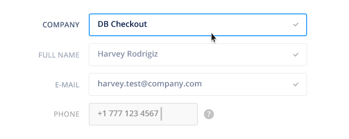
Billing Details

On the trial-registration step, the customer should enter the following mandatory fields:
- Email
- Full Name
- Phone Number
- Company Name
The last two fields are mandatory too because of the B2B market peculiarity. We need this information to be able to contact the customer directly and to know what industry he is working on.
So on the Checkout step, we can pre-fill these fields so a customer doesn’t need to answer the same questions twice. But, once again, due to B2B market peculiarity, we should leave them editable.
3. Company Name
The company name is vital information for us. Knowing the country that a customer has come from, their industry, etc is important, as we optimize our sales and marketing processes based on this information.
From a physiological perspective, if you want to offer a pleasant experience to your customers, localize your placeholders. For instance, if a customer is from Sweden, then the placeholder text for the Company Name field can be, for e.g., Volvo or Spotify. Both these companies are Swedish.
Of course, you can’t do that for all 190+ countries around the globe, but:
— firstly, I’m fairly confident that your B2B product is not targeting the whole world;
— secondly, you can divide countries into semantic segments like Europe, US+Canada, Asia, etc. and achieve similar results.
Constraints
• Mandatory
• Pre-filled (data from trial account)
• Any characters are allowed
• Placeholders: e.g. Apple (for US), e.g. Volvo (for Sweden), e.g. Fly Norwegian (for Norway), e.g. BMW (for Europe), e.g. Siemens (for all the rest) — depends on the country field.
• Min length: 2 characters
• Max length: 60 characters — this number is pretty imperative for now, because we have a lot of clients from Scandinavian countries and Germany where you can find companies with really long names.
4. Full Name

In our particular case, I do not split the name field into 3 separate fields (First/Given/Fore-, Middle, Last/Family Name) because we don’t really need to distinguish the first name from the last one for our purpose. Besides, and more importantly here, I saved the natural way that we are used to seeing our names — in one single line because it’s a solid entity. If I ask you to write your name on a blank page, you will write it in a single line without separations, right?
Yeah, in some rare cases, you might need to distinguish the First and the Last names clearly. And the easiest way to do that is to use 2+ fields. But it’s not really good from a UX point of view. Obviously, because it’s at least one more question, one more field, one more click, etc.
Of course, you can use the space between words as the trigger to divide parts of the name. For instance, ‘John¶Smith’ where ¶ is the natural divider. But the problem is, you can’t be sure where the first name ends and the last begins. It’s especially acute for people with the double or even triple names like Jonathan Benjamin Christopher Smith, for instance.
Constraints
• Prefilled (data from trial account)
• Alphabetic + space, hyphen, dot are allowed only
• Max Length: 70 characters (by UK Gov.Data Standards Catalogue)
• Min Length: 3 characters (at least 2 letters or 1 letter + 1space + 1 more letter after (e.g. Samuel L.))
5. E-mail

In many cases you, as the service provider, already know the customer email. He can come to your checkout form from the newsletter or from a trial account, as is our case. Hence, you can pre-fill this field as well.
Constraints
• prefilled (data from the trial account)
• mandatory 255 characters
• validation: browser validation or use js-pattern (/^[a-zA-Z0–9.!#$%&’*+/=?^_`{|}~-]+@[a-zA-Z0–9-]+(?:\.[a-zA-Z0–9-]+)*$/)
6. Phone Number

Many of online services typically leave the phone number field as optional info. In our case, however, it’s crucial info in the checkout process, just like the company name. Customers usually don’t expect that they have to provide such information, so we should explain to them why we are asking for it (principle #15, remember?). Right now, I’ve hidden the explanation under the ? icon but we are going to test this interaction. Depending on the user feedback, it would probably be a better idea to show this explanation below the field itself.
The field has auto-formatting — depending on the country, we change the mask appropriately and paste the symbols (+, hyphen, space) automatically. So a customer doesn’t have to think how to write the phone number properly.
Here are some great sources where you can find all the country codes: https://countrycode.org/ or https://en.wikipedia.org/wiki/List_of_country_calling_codes
Constraints
• Might be pre-filled (data from trial account)
• Mandatory
• Auto-formatting
• Validation: https://formvalidation.io/guide/validators/phone
7. Country

This field is a crucial one. Once a country is chosen, you will be able to localize the form in the right way:
- use the proper currency
- put the proper wording for labels
- use the proper masks and hints
For example, if your client is from Sweden, then the total price displayed in USD will not be relevant for him. It will be much more convenient to use SEK (Swedish krona) instead.
Here is the list of items we change depending on the country:
Labels:
• Zip Code <> Postal Code
• City, State <> City
Placeholders:
• Company Name
• Email
• Phone
• Zip/Postal
• City/State
Masks for:
• ZIP/Postal Code
• Phone Number
The country selector was redesigned as well, in order to avoid those ridiculously long and unusable dropdowns.
Here are the main changes:
1. Autocomplete
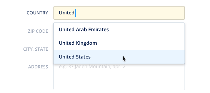
Autocomplete with the list of suggestions is the main improvement. It’s something like Google Search has. We show the list of suggestions related to what the user types in the field.
2. Auto-correction
We should also cover cases when the country has two or even more names and different ways of writing, including 2- or 3- letters standard abbreviations.
For instance, Great Britain/England/United Kingdom/UK/GB are all the names of the same country.
3. List
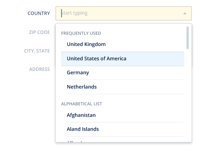
Of course, we should care about manual selection as well. But, there is one tricky pitfall.
Nowadays, many services make one critical mistake when displaying the list of countries in a drop-down menu. They put the most frequently used countries at the top, without any additional separation, in the alphabetically sorted list. Hence, if you’re looking for, let’s say, The United Kingdom in the alphabetically sorted list, you probably will immediately scroll to the letter U. But, your country is not there. Then you will think that authors called it Great Britain. Scroll back to G and… nope, nothing here either. And only when you’re back to the top of the list you will notice that The United Kingdom is there, just right after The United States… Or sometimes they might be duplicated on the top.
In out case, I separate the list into the following two parts:
- Frequently Used countries
- Alphabetical list of all countries
This way, the list covers all the cases and doesn’t lead to the confusion mentioned above. Besides, I use the fixed height for the dropdown in 7.5 cells not to overlay the entire screen with the unusable dropdown.
If you use jQuery in your project, you can try this plugin.
Constraints
- Detecting by IP address
- If it can’t be detected —use smart-defaults
- Mandatory
- Input: alphabetical, spaces are allowed only
- On focus, automatically select all the inputs in the field, and show the dropdown with the list of all countries + frequently used section.
- Changing the country leads to other changes like currency, labels, masks, placeholders, etc.
- Just right after the country has been detected/selected, automatically switch focus on the ZIP code/Postal Code field.
- Validation http://www.freeformatter.com/iso-country-list-html-select.html — plus 2, 3 letters abbreviations.
Now, let’s jump to the most complex and tricky field in the form.
8. ZIP Code / Postcode

ZIP (Zone Improvement Plan) Code — this is a system of post addresses. Made by USPS in 1963. Also, there now exists the ZIP+4 code — an expanded postal code system which defines not only the state, city and district, but also the exact house. US uses 5, or 5+4 digits in the ZIP code.
Canada uses ZIP Code as well, but it’s a 6-character alphanumeric string code (e.g. A1A, 1A1…).
Europe, Middle Asia ⤑ Postal Code. 3–4 character numeric codes
Australia ⤑ Postcode. 3–4 character numeric codes
Brazil ⤑ CEP (Código de Endereçamento Postal)
India ⤑ PIN (Postal Index Number) Code. 6 character, numeric only.
UAE ⤑ P.O.Box (Post Box Number). In the closer future, UAE is planning to switch to the Makani system.
Also, you might encounter the following abbreviations which are used for the customers that receive 200 items or more of Standard / Short and Long machinable letter-mail each business day:
• LVR (Large Volume Receiver) — Australia.
• CEDEX (Courrier d’Entreprise à Distribution EXceptionnelle (“special business mail”)) — France.
The systems mentioned above are only the most popular in the world. But there are even more. Anyway, I think you got the point. For a specific country there is a specific postal system with its own name, constraints and values. Find out more here.
In our case, 95% of the market for us is in EU and US. Hence, it didn’t make sense to spend a lot of time and efforts to find out everything about other systems and support them individually. That’s why we are going to cover only the following.
Constraints
1. US
1.0. Known as ZIP Code or ZIP+4 Code
1.1. Numeric + space or hyphen (“–”)
1.2. Min length: 5-digit
1.3. Max length: 10-digit + hyphen
1.4. If there was entered 6th character (this means that the user is gonna type in ZIP+4 code), use auto-formatting and put the hyphen automatically
1.5. Format: 12345 (ZIP), 12345–6789 (ZIP+4)
2. Canada
2.0. Known as Postal Code
2.1. Alphanumeric
2.2. Length 6 characters + space
2.3. Format: A1A 1A1
3. Norway+Switzerland+Austria+Liechtenstein (serviced by Posten):
3.0. Known as Postal Code
3.1. Numeric
3.2. Length: 4-digit
3.3. Format: 0001
4. Germany (serviced by Posten):
4.0. Known as Postal Code
4.1. Numeric
4.2. Length: 5-digit
4.3. Format: 00001
5. Netherlands
5.0. Known as Postal Code
5.1. Alphanumeric
5.2. Length: 6characters + hyphen/space (or without)
5.3. Format: 1000NL (does’t use letters combinations “SS/SD/SA” because of the associations with the Nazi occupation in time of WW2).
6. France
6.0. Known as Postal Code
6.1. Numeric
6.2. Length: 5-digit
6.3. Format: 12345
7. Sweden
7.0. Known as Postal Code
7.1. Numeric
7.2. Length: 5-digit + space
7.3. Format: 123 45
8. UK
8.0. Known as Postcode
8.1. Alphanumeric
8.2. Min Length: 6 characters
8.3. Max Length: 8 characters
8.4. Outward code format: AN, ANN, AAN, AANN, ANA, AANA, and AAA (letters I and Z are not used in the second alpha position (except GIR 0AA))
6.5. Inward code format: always NAA (letters C, I, K, M, O, and V are never used)
Obviously, the auto-formatting can be applied only after the answer due to the different formats of the first half of the code.
I don’t know about you, but I was quite surprised with this new information.

As you might have already noticed, by ZIP/Postal Code you can detect the city, state, and in some cases, even the full address. That might be a substantial time-saver for the user, especially for the countries where citizens know their codes pretty well. For instance, US and UK.
But that will not work for the post-soviet countries because their citizens aren’t really familiar with their postal codes. Hence, it makes sense putting the ZIP/Postal code field right after the country selector and before the City, the State, and the address line. After a user has entered the code, we can automatically detect the city, state, and the address line — it’s possible only when the user types in ZIP+4 or full Postal Code.
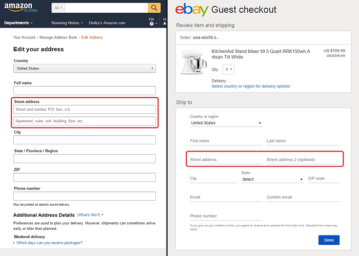
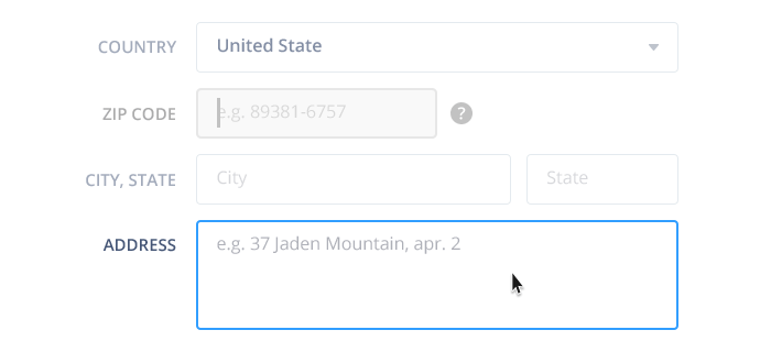
For instance, here is Apple’s Checkout form. After a user enters their ZIP code, Apple automatically detects your city and state, but doesn’t give you the option to set them without the ZIP code.

By the way, if we were to design a form for our consumer products, we could collapse all these Billing Address fields under only one — ZIP/Postal code. Because a complete customer address might be detected by a postal code. So a customer doesn’t have to fill out billing address manually.
Now, in both cases, the customer should save the ability to manually enter information into these fields without the mandatory need to enter ZIP/Postal Code first.
Now let’s review the City, State, Address Line fields.
9. City

Let’s take a look at an example of how ZIP+City+State fields work in combination, in this form by Apple. Yeah, yeah, them again, simply because of the “special approach” in this case.
Apple Checkout
They hide the City and State fields under the ZIP-code. So, the customer must type in ZIP-code first and without any additional actions, they detect the city and state automatically. If the system doesn’t recognize the code, they unhide both fields so a customer can manually enter the right city and state.
Besides, they swap the position of the ZIP-code field and display it in the 3rd position — because of the standard address format (e.g. Miami FL, 33131) — and leave it active.
It’s interesting to note here that they don’t parse the full address from ZIP+4 code. So, even if you know it, you still have to type in your street address manually.
I believe this approach is not convenient at all and here are a few reasons:
- In both cases, i.e. (a) when they detect the right city+state, and (b) they cannot detect the right city+state — you cannot expect what is actually going to happen.
- If you don’t know your ZIP-code or cannot recall it, or something else, there is no way to type in the city and state manually, because there are no fields for that. Yes, I know, you can type in some random zip-code to unhide these fields, but that’s not an obvious interaction at all.
- This form is not applicable for citizens of other countries.
In our checkout form, I leave both City and State fields always visible and active. Thus any customer, no matter what country he is from, no matter whether he knows the zip/postal code or not, may manually set his city and state (for US only, of course). Or fix them if the system made a mistake in detecting them.
Constraints
1. Mandatory
2. Alphanumeric
3. Min length: 2 characters
4. Max length: 24 characters
5. Placeholder: e.g. %Country Capital%
In an ideal world, it would be nice to make the country and the city fields dependent on each other for proper verification. But this task would take a lot of effort and time for the right implementation. So there is no sense spending time on this for now.
Instead, I chose to go for a simpler dependence. When the user types in the city, the system automatically parses and picks the state. Such dependence is a way easier for implementation. Firstly, it works for US only. Secondly, you can grab the official lists of cities for each state from here or here.
10. State

There are two ways in which this field might be designed.
- Rely on the user itself and his knowledge of how his state is spelled in a two-letters format (US states). And therefore, use this format as the constraint for the State field.
- Build the verification from your end depending on the country and city selected, and let the user make a mistake. Even if they do, offer suggestions so they can correct their mistake.
I designed State selector in the same manner as the Country selector: using autocomplete + auto-correction + the dropdown with the list of all states, in case of manual selection. For instance, if the customer types in ‘orida’, he probably meant the Florida state. Hence, we should suggest him the right, most relevant options.
The states in the list have the following formats: Florida (FL), California (CA), etc.
Constraints
- Available for US only
- Min length: 2 characters
- Alphanumeric
- Auto-format: 2 letters + uppercase
- Validation http://www.freeformatter.com/usa-state-list-html-select.html
- Placeholder: e.g. CA
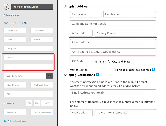
11. Address
The Address Line field is not so simple as well. In many services you may encounter two fields for the address with no standardized naming. Most likely, you deal with:
- Address Line 1 /Address Line 2
- Address 1 / Address 2
- Street Address 1 / Street Address 2
- Address / no name, etc.
Such separation and wording are always confusing for a customer (of course, if he is not a person who works with forms all day long), especially if hi fill out such fields for the first time. And there are a few reasons for that:
- The perception: it always seems like these 2 fields are for two different addresses. Something like one primary, and one secondary address.
- Possible questions arise, like:
- What should I input in the first one and what in the second?
- Is there any sense to separate the address on two lines?
- Can I input everything in the first one? Or second?
- Or duplicate the same info into both of them?
- What if I don’t fill out the second line?
And so on…
The primary reason why the two lines confuse us is that we are used to seeing, writing and reading our address — the full street name + house number + flat number —as one single entity. We separate only a zip/postal code, a city and a country onto next line. We do that for a better recognition and structure.
Now, as an obvious alternative, one may suggest offering one big field for the whole address, instead of 5 separate ones. This way, the user will be happy to enter his complete address in the way that they are already familiar with.
However, there are still some problems with such approach:
— it will be really hard to parse the data correctly.
— the formats of writing the address differ by country.
— the customer likely to make a mistake.
— practically impossible to validate.
So, why are the two separate fields used?
— First one is for the street address, P.O. box
—Second one is for apartment, office, suite, unit, building, floor, etc.
To sum up, guys from Baymard Institute are saying that if you really need to use two separate lines leave the label for the first field only. Name it ‘Address’. But you still have to mark somehow the second fields as the optional one.
Before I started working on how to deal with these fields for our form, I decided to look internally and find out how our existing Fluix clients filled out these fields in the old form. Here is what I discovered:
87% of our current customers don’t fill out Address Line 2 at all. 65% of them enter the data into Address Line 1 that should be in Address Line 2. Only 7 companies (7 people to be precise) fill out Address Line 2 correctly. The rest fill it in the wrong way or duplicate the data from Address Line 1.
As you can see, in our case there is no sense in using two separate fields for the address, thereby confusing the customer and getting the wrong data or simply no data at all. So, in our form, I leave only 1 field for the address but expand its height a little bit.
Constraints
- Mandatory
- Alphanumeric
- Min length: 5 characters
- Max length: 120 characters
- Possible validation: http://stackoverflow.com/questions/134956/how-do-you-perform-address-validation
Alright. I think this is enough material for this part 😁. In the next and the last one, we will learn:
- How the confirmation works
- What are the tricks behind the fields related to the card details;
- How to easily detect a type of a credit card
- Why it’s better to use ‘Name on Card’ and ‘Secure Code’ labels
- What types of validation can be applied on this step
And you will find a bunch of really helpful reference links! So, when you catch your breath and will be ready to continue, be my guest →

