Tables that aren’t boring: A guide to creating visually appealing and informative data tables

Data Tables are a staple of visualizing information but in today’s world of interactive dashboards and interfaces, tables can seem outdated and static.
This article provides a set of guidelines for designing data tables that are visually appealing, functional and not so boring.
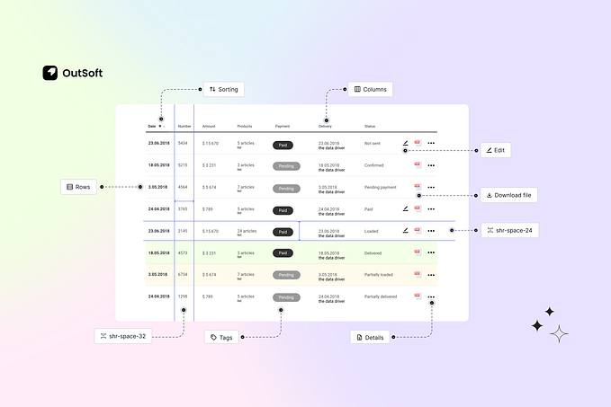
Horizontal Lines
Take your pick between Lines, Zebra Stripes or Stripes on hover. Don’t use freeform data tables they can be difficult to read.

Vertical Scroll
Make sure you add a 2–4px drop shadow to the header cells while scrolling to make it seem like the content is tucking under.
Horizontal Scroll
Align the first column’s style with the header cells while scrolling to make it appear cohesive, don’t forget the 2–4px shadow.

Resize Columns
Used to reveal any cropped content.

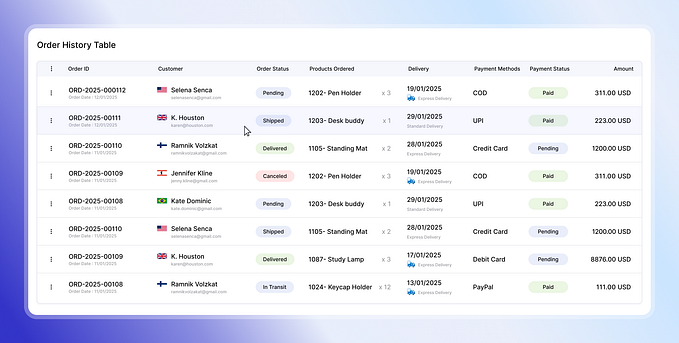
Action Buttons
Add action buttons on hover on the last column instead of giving them their own, this saves space and prioritizes data.

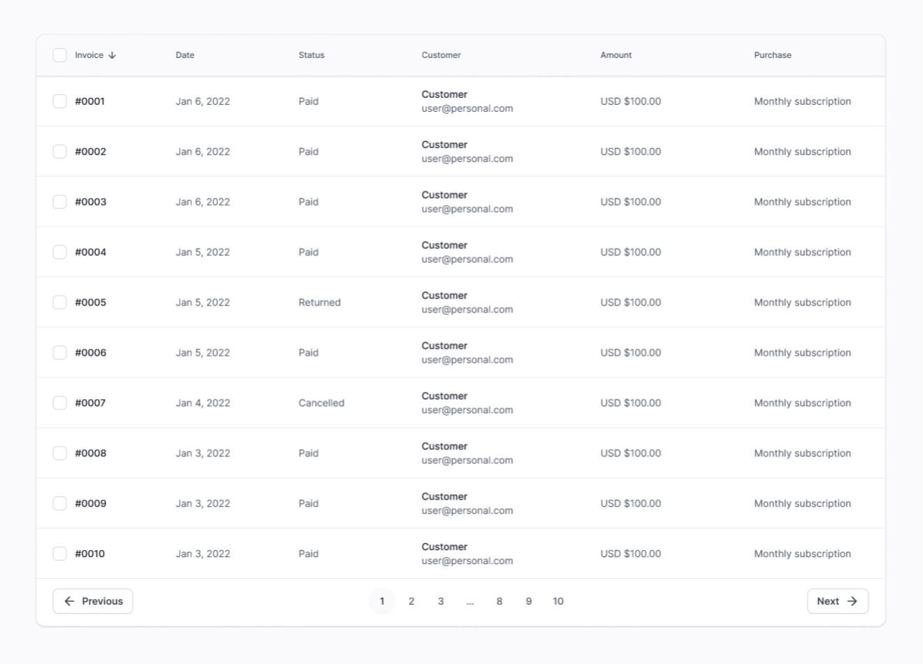
Status Labels
Color can be a powerful tool for improving the readability and understandability of tables, make sure you use colors that are meaningful to the data (e.g. paid, cancelled and pending status)

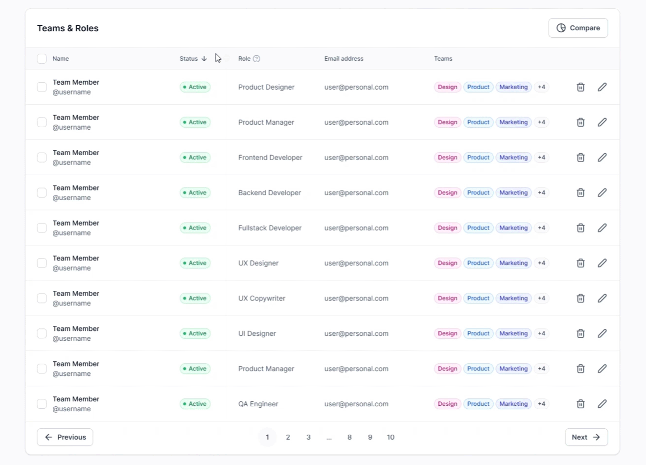
Team Labels
Make sure you use these colors consistently through out your project, this is especially useful for teams & roles.

Sorting
Descending/Ascending icon on header cell for readability.

Expand
Can be used for descriptive text or breaking down values of numerical data.

Pagination
The pagination controls should be clear and easy to use, I personally don't like using just arrows since they can be hard to click due to their size.

Data Table Features
The below features make it easier for users to understand and interact with the data in tables. Editing data easily should be one of your main priorities.
Add & Rearrange Columns
This allows users to customize the table by adding, removing, or reordering columns to suit their specific needs.
Side Panel
The side panel can be used to provide additional context and tools for editing data. This can be especially useful for tables with large amounts of columns.

Modal
Use a modal instead of a side panel for larger amounts of data, or just send the user to a different page depending on your project.

Filters
This includes Search bars, Date pickers & Save filter options. Filters are arguably the most important part of a data table.

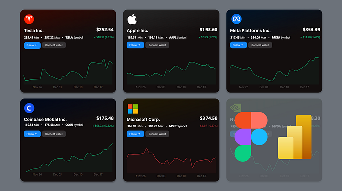
Compare Data
Use data visualization to compare different variables of your data table.

Download CSV
Download data for analysis, sharing or backup, this includes importing data. Adding a download complete indicator as well as an open file location button can be useful.

Visual Summary
Visuals can help users to see trends and patterns in the data, it can display growth or decline without searching through the data.
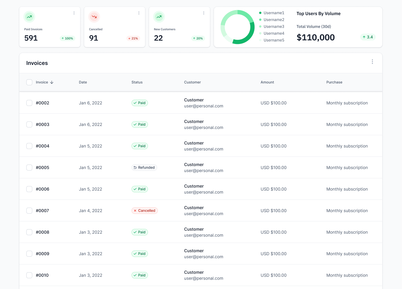
Volume Indicators
I’ve only had to use these once I started working in Fintech, they can be used to show limits of payment processors etc. which is very useful for the operators.

Final thoughts
The user is always the priority, understand their needs for certain features and keep reiterating. Make it fun, add some color, drag & drop functionalities or interactive visuals to keep the user engaged.