
Tabs for Mobile UX Design
by Nick Babich
Tabs are one of the most used components of mobile UIs. They allow users to quickly move between a small number of equally important views. When implemented correctly, tabs improve usability by making navigation experience more clear.
Excellent Metaphor
In UI, metaphors are ideas or objects that are used to facilitate the familiarity between the user and the application. The use of tabs in the interface is an excellent metaphor since the general idea of tabs comes from the interacting with index cards in a drawer of a card catalog, a real world object most people have some experience with.

Done right, tabs have a positive impact on UX:
- Make navigation predictable. Tabs are very intuitive and easy to use. They clearly indicate the user’s current location (visual design can set a particular option apart from other options in tab bar).
- Improve content organization. Tabs reinforces the idea of a connection between individual items. All items in the tab bar belong to the same category.
- Add visual consistency. The visual design of tab bar is the same on different parts of your product.
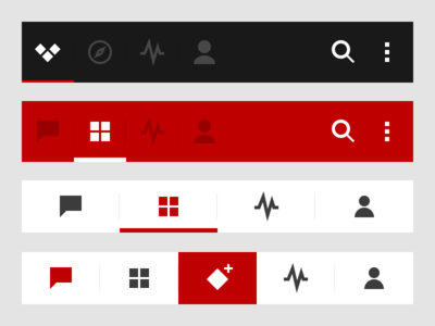
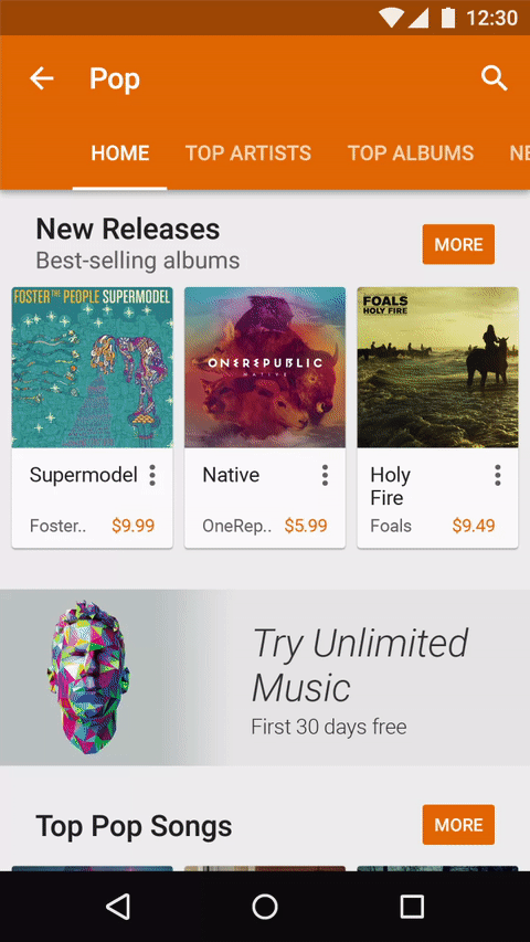
Difference Between Tabs and Navigation Tab Bar
While the two patterns rely on the same metaphor of tabs, they have a major difference in behavior. Items in tabs are related to each other while items in Navigation Tab Bar is not. In other words, when users click on a option in a bottom navigation tab bar they expect to be taken to a separate view which might or might not be related to the current view.

Same user for tabs, thinks that he will be in the same view but will see related data to the parent or the opened tab. He doesn’t expects to see a completely different view with no related data.

When to Use
Group of Sibling Views
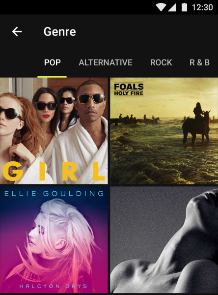
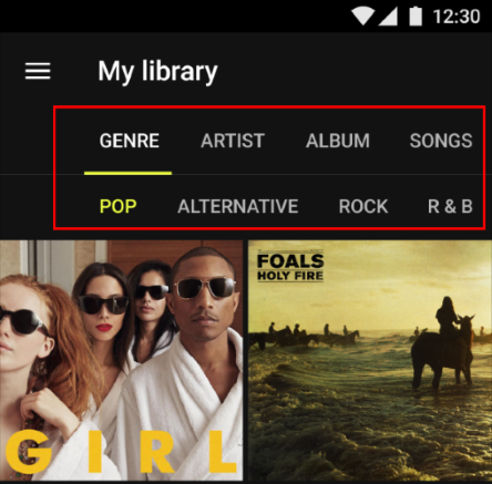
All content within a set of tabs should be related under a larger organizing principle, with each tab’s content mutually exclusive of the others’. For example, tabs can present different genres of music. They act as filters—the user can use tabs to select the type of content they like.

Parallel in Nature
As was mentioned above, tabs content different groups of content and most of the time users don’t need to simultaneously see content from multiple tabs. If your content requires people to compare the info from the different tabs, then better no to use tabs at all, because switching back and forth requires users to memorize things and increases interaction cost which ultimately leads to bad usability.
Scope Bar or Filter
It can be useful to introduce tabs as a scope bar when there are clearly defined or typical categories in which users might want to search.
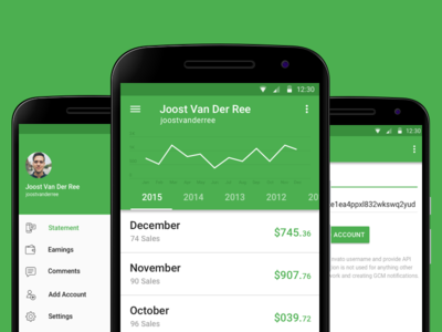
Also Tabs can be used to segregate data which are somehow related. In Apple AppStore each app’s view has Tabs with Details, Reviews and Related sub-views.

Tab Usability Guidelines
Place Tabs on Top
The row of tabs should be on top of the view — not on the sides or the bottom. People scan pages from top to bottom and the option to adjust content according to the needs should be at the top of the screen.
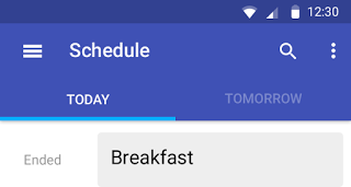
Highlight Active Tab
Failing to indicate the current location is probably the single most common mistake to see on apps menus. When users don’t know where they are, they cannot navigate successful.

That’s why the currently selected tab should be properly highlighted with a visual cue (for example, using underlining). In addition to highlighting, you can use bold font for the label.
Always Have One of the Tabs Pre-selected
If your app uses tabs one of the tabs must always be selected when the tabs are visible. There simply can not be a situation where the tabs are shown to the user but not pre-selected, because this will make your users feel lost.
Arrange Tabs in Order
Arrange tab labels in an order that makes sense for your users.
Use Meaningful Text Labels
Users should be able to understand what exactly happens when they tap on a element. Text labels should provide short and meaningfully definitions to the tabs:
- The labels should use plain language. Avoid jargon and special terms.
- Avoid long text labels. Long text do not truncate or wrap.

Be Careful With Icons
Tab labels may be either all icons or all text. Do not mix icons with text.

If you want to use icons, ensure that your users understand the meaning. Usually it’s very difficult to come up with descriptive icons for all the possible navigation option, so often text is much better.
Don’t Use Multiple Rows or Nested Tabs
There’s should be only one row of tabs.

Avoid nested tabs because they make it nearly impossible for users to track tab-content relationships (to remember which tabs they’ve already visited).
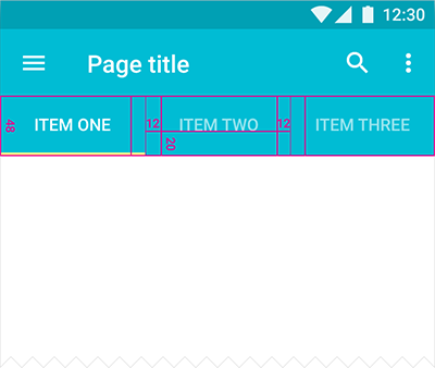
Make Tabs Big Enough
Tab items should be good touch targets —they should be big enough to be easily tapped. To calculate the width of each tab, divide the width of the view by the number of actions. Alternatively, you can make all tabs the width of the largest tab.
Android guideline suggest following dimensions for the tabs on mobile.
Be careful with scrollable tabs
Scrollable content is less efficient, since users have to scroll once before they will see the options. The users who skip scrolling might not discover the options.
Hide Tabs Based on Scrolling Direction
If the screen is a scrolling feed, the tab bar can be hidden when people scrolling for new content and revealed if they start pulling down trying to get back to the top. However, you must be sure that this behavior won’t limit users actions (you should A/B test it).
Use Slide Animation For Transitions
You can use sliding animation to reinforce the feeling that different tabs are on the same screen. This type of animation is delightful and encourages users to use swipe gestures to move between tabs.
Don’t Forget About Swipe Gesture
While tapping the tabs is OK swiping between them is even better. Support swipe gesture so that your users won’t have to reach to the top of the UI.
Strive for Consistency
Don’t remove a tab when its function is unavailable. If you remove a tab in some cases but not in others, you make your users think about the system behavior. Its recommended to keep all tabs enabled all of the time, but if some of tabs do not have a content you can explain the user why a tab’s content is unavailable. For example, if the user doesn’t have any posts, the Posts tab in the Modspot app displays a screen that explains how to add one. This feature called Empty state.

Conclusion
Tabs are great if implemented correctly. It is a relatively simple UI component but it is also very easy to get them wrong. Follow the guidelines and your app will look and function great. And a great app is one that helps users accomplish any task in the most efficient way possible.
Thank you!
Follow UX Planet: Twitter | Facebook
Originally published at babich.biz
References
Learn how to design better products
Interactions between computers and humans should be as intuitive as conversations between two humans. Interaction Design Foundation will help you to learn how to design for efficiency and persuasion.

