
Text fields in UI Design: 7 Common Styles
Text field is one of the most popular UI elements. Despite its a relatively simple object, it can have different styles. The style of the text field can vary depending on the data it collects and the context in which it is used. In this article, I will review seven popular types of text fields.
1. Standard text field
Standard text field is a text field that can be found in almost all digital products.
When to use:
A standard input field can be used for various types of data.
Tips:
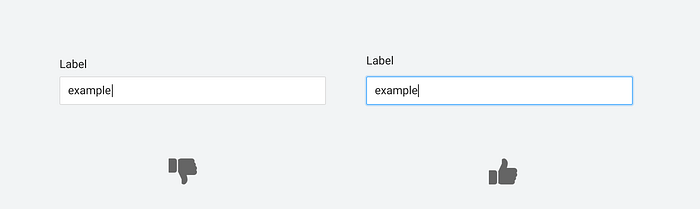
- Use the conventional design of the input field. A traditional design is a rectangular box with a label on the top or left. It’s better to avoid line-only design (popularized by Material Design) because it negatively impacts discoverability.
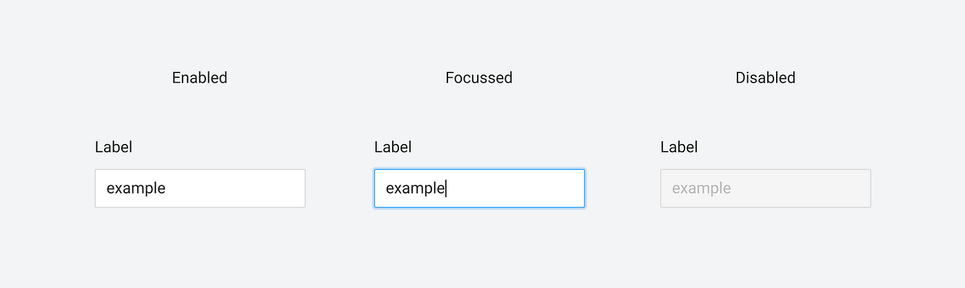
- Support different states. You need to design to support all the states. The input field can be in the Enabled, Hover (for desktop), Focussed, and Disabled state, as well as states required for the inline validation (Error, Warning, Success)
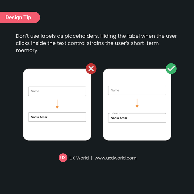
- Never hide input labels. Input labels should always be visible to the user all the time. Don’t hide it when the input field becomes focussed because it will make UI less usable (users will have to memorize the labels when they fill out the form). If you want to save screen space without scarfing usability, you should use Floating Labels.

- Use placeholder text to give the user a hint about the data they need to provide. For example, if you ask the user to provide a tracking number, you can add a placeholder with an example of a tracking number).

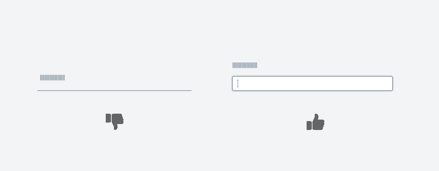
- Add a visual outline when the input field is active. Users rely on visual indicators like a blinking cursor to understand where they are in the form. It’s possible to make user’s life easier by using additional visual indicators. For example, when the input field is active, a contrasting outline can help users find the currently selected field much faster.
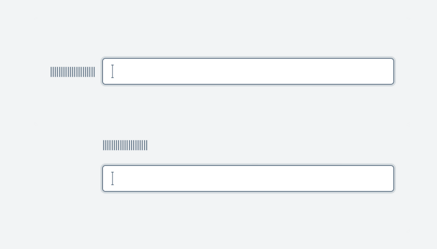
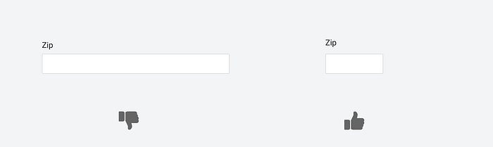
- Use the size of the field as a hint. The size of the text field can give users a clue about the length of the desired input. For example, if you know that the ZIP has a maximum of six characters, there is no need to make this field too large.
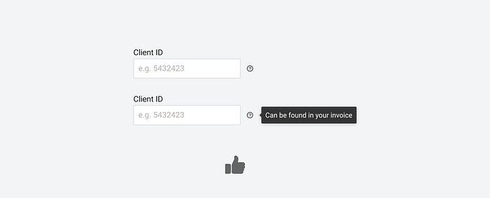
- Add a help icon (“?” or “i”) next to the field to help the user enter the data. A tooltip with helpful information becomes visible when the user hovers over the icon. This feature will be helpful when you want to provide a quick guide on data input ( i.e., you ask the user to provide social security number, but they might know where to find it) or when you collect personal information (i.e., you ask the user to provide a phone number, and want to explain how you will use it).
2. Text field for passwords
The key difference for this input field type is that the input data is hidden. Users see dots or stars instead of the characters they type.

When to use
For passwords, security codes.
Tips:
- Always offer Show/Hide functionality. The user should be able to click on the eye icon or “Show” label to see what they’ve typed and validate their input.

- Don’t use the “Confirm password” field. If you offer the show/hide functionality, there is no need to ask a user to type the password twice.
3. Text field with separated sections
This text field makes users break the data they want to provide into a few separate sections. A typical example can be a date of birth with a specific section for the day, month, and year or a phone number with a separate section for the area code. This input field type strictly dictates what format users have to use for each section.

When to use:
While this type of input field can help you avoid data formatting issues, it is better to avoid using it because it forces users to make additional actions (use the Tab button to navigate between sections). Most of the time, it is better to rely on auto-formatting.
4. Text field with auto-formatting
As the user types data, it auto-formatted in the field. A typical example of such a field is a phone number or credit card number.

When to use
Auto-formatting makes it easier for users to validate the provided information. For example, when it comes to phone numbers, it’s much easier to validate groups of numbers rather than the full number.
Auto-formatting also can guide the user during the data input and help them avoid mistakes. For example, once you start typing a ZIP code, you see that you need to provide six digits.
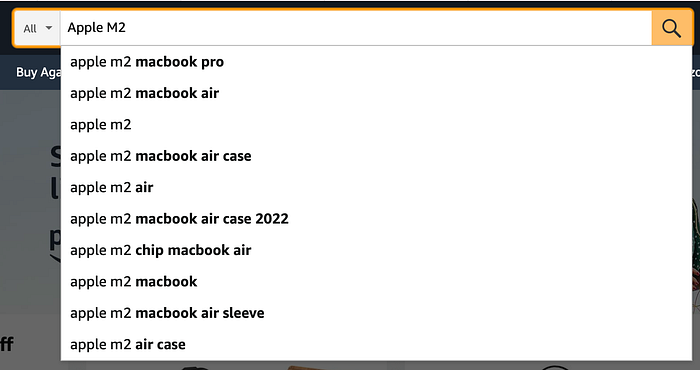
5. Text field with auto-suggesting
Once the user starts typing, the field opens a list of options that are expected to match user criteria.

When to use:
Text fields with auto-suggesting can work well for search functionality. When you want to narrow down the list of options that the user wants to search for, you can use this field.
It also can work well when the user provides a shipping address. Once the user starts to type the address, the input field can suggest the option.
Tips:
- Design a typo-friendly auto-suggestion mechanism. Users will make mistakes while providing input and can be easily frustrated if the system offers zero suggestions.
- Use different font styles for the part provided by the user and the part suggested by the system. Users should always be able to distinguish their input.
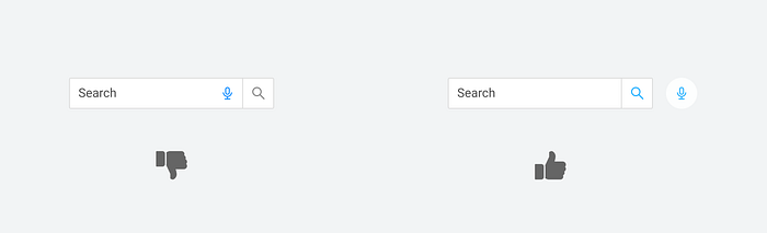
6. Text field that supports voice input
The microphone icon indicates that the user can enter data using voice.

When to use:
There are two main reasons why you might want to use this:
- Voice input can be a more convenient way of data entry for mobile users. Typing is less comfortable and more error-prone on mobile devices than on a desktop, so offering voice input might help mobile users.
- Voice input can be good for visually impaired users. People who cannot type might want to use voice for data input.
Tip:
Don’t make the mic icon a part of the input field; instead, add it next to the field. It will help you use the larger icon and make the interaction more comfortable for users (it’s easier to click/tap large targets).
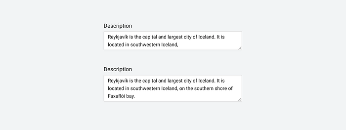
7. Text area
Text area is a multi-line text input for long texts.

When to use:
Use this field when you want to collect two or more lines of text (a line of text typically has around 60 characters).
Tips:
- The size of the text area should change dynamically, adapting to the user input.
- If you have a character limit, show it at the bottom right corner of the input container.

Originally published at babich.biz
Want To Learn UX?
Try Interaction Design Foundation. It offers online design courses that cover the entire spectrum of UX design, from foundational to advanced level. As a UX Planet reader, you get 25% off your first year of membership with the IxDF.
This post contains affiliate link(s)


