The 2-in-1 Guide to Autolayouts and Creating Resumes on Figma
Introduction
In the wise words of Sarah Doody, it is always good to have an ATS-friendly resume and a human-friendly resume (usually in PDF) so that you can send in the appropriate resume depending on who will be reading it.
(Feel free to click here to learn more about what she has to say about resumes)
What you can expect to learn from this article?
For designers who are looking to learn about auto layouts, I believe this is an excellent exercise to understand these concepts. In my opinion, a resume serves as great target practice that can let you practise as well as create something that will benefit your career.
While the intended audience is for designers with a foundational understanding of Figma, I will still explain things as simple as possible for the readers who are completely unfamiliar with Figma.
A Crash Course on Auto Layouts in Figma
While there are many applications of auto layout, I believe the main purpose of it is to let Figma know how to arrange text boxes within specified dimensions.
There are many functionalities of auto layouts so here’s a list of considerations to decide which function to use:
- Are you arranging your content horizontally or vertically?
- Is a specific gap size needed?
- Are you looking to stretch the content to fit the dimensions of the container or is there a specific dimension you are going for?
Let’s start!
Step 1: Download and create an account
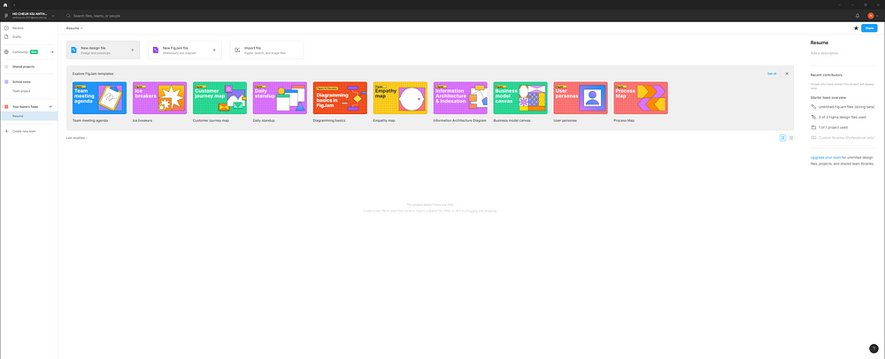
If you have not downloaded and created a Figma account, you can do so by heading over here. I also highly recommend downloading the desktop app. Once you are in Figma, create a new design file by clicking “New design file” (refer to where I am hovering over in the screenshot below).
Step 2: Create your first 2 text boxes and apply auto layout
Upon entering the design canvas I highly recommend you to on “Frame outlines” via the path in the following screenshot as it will make it a lot easier to visualise the sections we are creating. (I did not use it as I gathered the screenshots forgetting to turn it on).

Let’s start with your name and job title. Press “T” to draw 2 text boxes and enter your name and job title. Feel free to adjust the font style and size to your liking.
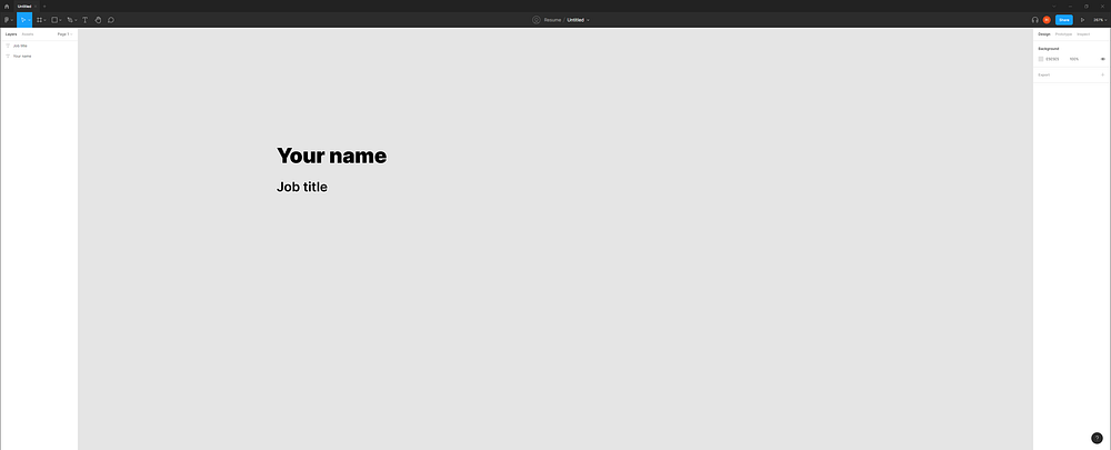
Next, select both text boxes (hold Shift and click for multi-select). After selecting, press Shift + A to activate auto layout.

If you look at the bar on the right, you will notice there is a new section called “Auto layout”. Let’s cover what these mean.

The arrows determine the direction in which content is arranged. The “down arrow” shows that the 2 textboxes are arranged vertically. We can arrange them horizontally by clicking the “right arrow”.
The 13 means that the 2 text boxes are separated by 13px. The 0 means that the gaps around the textboxes are 0px (basically non-existent). I will touch on more of this later.
The final icon determines the alignment, specific margins and how you want Figma to arrange your text boxes. This will determine whether you opt for “Packed” or “Space between”.
Don’t worry as we create the resume I will cover the considerations in more detail.

Step 3: Set the dimensions of the A4 paper
Since the dimensions of an A4 paper is 3508px x 2480px, let us now set the dimensions to that. First, click on “Frame 1” either in the canvas or on the left bar.
On the toolbar on the right, go to “Resizing” and change the options to “Fixed Height” and “Fixed Width.
After that, under “Frame” enter 2480 under “W” and 3508 under “H”.
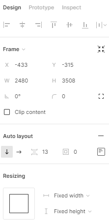
Here is what you should have by now:

What you have done created a background the size of an A4 paper. To make things easier, I highly recommend heading to the left bar and renaming “Frame 1” to “Background”.
Step 4: Enter your contact information
Going over to your left bar again, select your name and job title and apply auto-layout again.

Next, I like to have my contact details on the right of my name and job title so let’s create that. On the left bar, select the new “Frame 1” and press “Ctrl + D” to duplicate the frame. You should get the following:
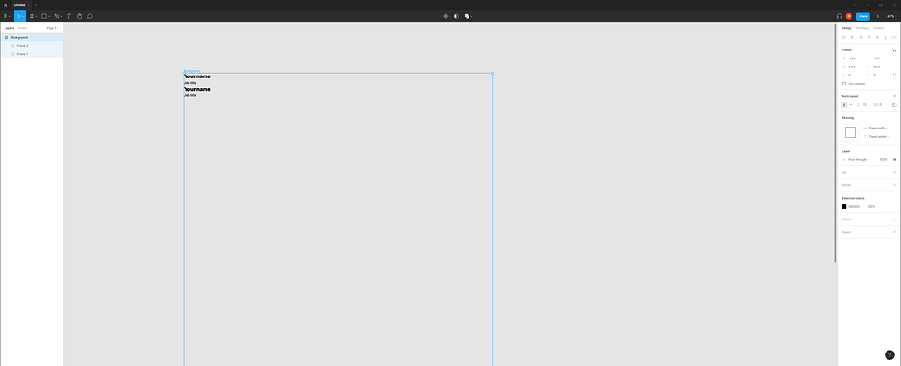
Since we want our contact details to appear to the right of our name and job title, we can change the vertical arrangement to horizontal by pressing the right arrow under “Auto layout” on the right toolbar.
You have stored these textboxes inside a frame. For easy reference, I have renamed the frames to relate to the relevant information.
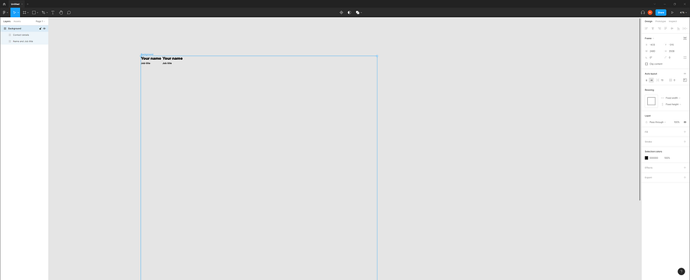
I would like my contact details to be flushed to the right of the background but I don’t know what width each frame should be. This is when we can leave the math to Figma.
Select the 2 frames and under “Resizing” on the right bar, adjust the width to “Fill container”.

Here is what you should observe:
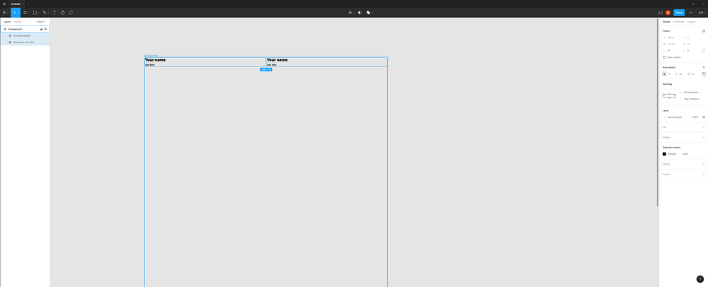
To make it neater, let us align our contact information to the right. We can do this by selecting the frame on the right, and using the re-alignment tool (refer to the screenshot below) we can align the text right. At this point, feel free to adjust the font styles as well.

Here is what we should have after adding our contact information.
(Recap: you can create as many textboxes we want in a frame by duplicating them with Ctrl + D)
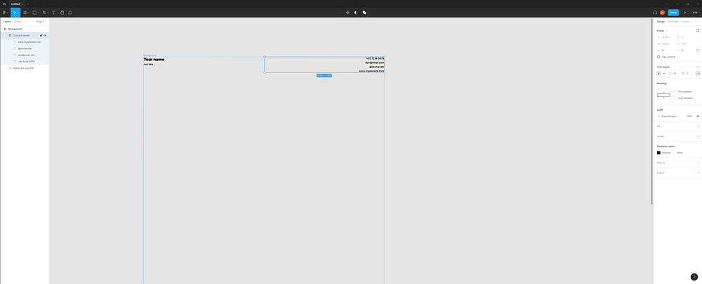
Step 5: Sectioning the resume
To finalise the first section of our resume, we can once again put the 2 sections into an auto-layout frame by selecting them and hitting Shift + A.


Before we move on, we need to re-apply “Fill container” widths to the content inside the “Name and Contact” frame. After combining them, Figma resets the constraints to “Fixed width”.

This section can serve as a template for us to make the rest of the resume with the power of duplication and auto layouts.
Step 6: Preparing the content section
Select the first section and duplicate it (Ctrl + D). You might notice that it duplicates the section horizontally instead of vertically. Why is that?
If we select the “Background” frame, we can see from the right toolbar that Figma is arranging the content horizontally. We can fix this by simply choosing the vertical auto layout option on the right toolbar.

This is what we should have after correcting the direction of content distribution. Again, I recommend renaming the new section to keep track of the frames you create. I renamed mine “Content 1”.
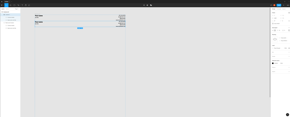
Extra information: You might notice that the section’s constraints are set to “Fixed width”. This is okay since it is the content INSIDE these sections we want to be set to “Fill container” so that they can be resized automatically based on the widths of the sections.
Since having our content stretch over the entire width of the A4 sheet is less readable, we can improve this by arranging the content horizontally under our “Name and Contact” section. Each content section will cover about half the width of the A4 sheet.
Once again, duplicate “Content 1” and rename accordingly (my equivalent is “Content 2”).
Select “Content 1” and “Content 2” and apply auto-layout (Shift + A). After that, on the right toolbar, arrange them horizontally since it is currently in a vertical format. You should have the result in the following screenshot.

Notice how there is a new “Frame 1” on the left. If we click on it, the constraint is “Fixed width”. This will not allow us to achieve the split width effect we want to get. Hence, let’s change it to “Fill container”.
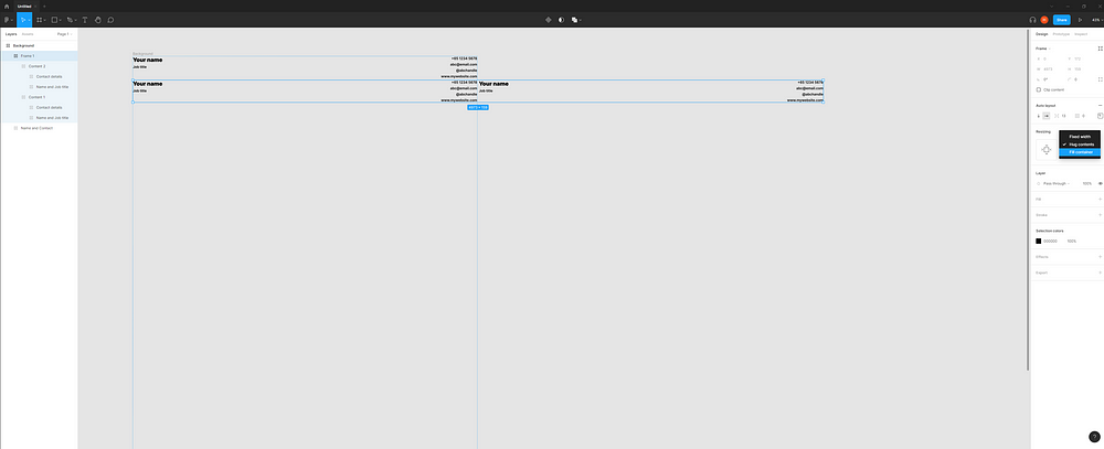
After which, we also need to fix the widths of “Content 1” and “Content 2” since their widths are set to “Fixed width”. Again, set them to “Fill container” so that we can automatically fit both sides into the width of the A4 sheet.
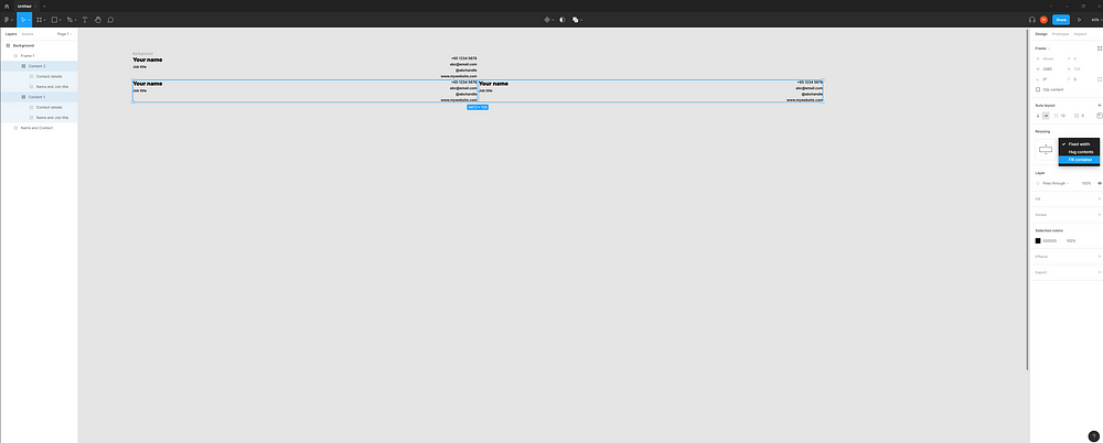
I also went ahead to adjust the spacing between the 2 content sections. You should get the following result below.

Congratulations! You have completed the most complex part of the guide and I hope by now you have a better idea of how the constraints work.
Step 7: Sub-sections
From here on, how you wish to arrange your content is up to you. Personally, I prefer having my skills and education listed on the left, while my work experiences are listed on the right.
Let’s start with the left section where I will be making my “Skills” and “Education” sections. Choosing one of the content frames, duplicate it and you will observe 3 items spanning over the A4 width (see screenshot below). I recommend renaming the middle frame once again (I did “Content 3” :D).
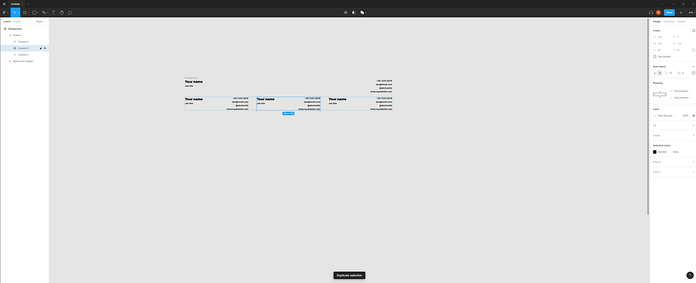
Since we want the left and right sections to be arranged vertically, let’s multi-select the left and middle frame and apply auto-layout again (Shift + A) and change it to a vertical auto-layout.

Remember, whenever we create a new auto layout frame, we will need to re-adjust the “Resizing” constraints of the new frame and its contents. With that, let’s change the constraints of “Frame 2”, and the frames within it to “Fill container”.
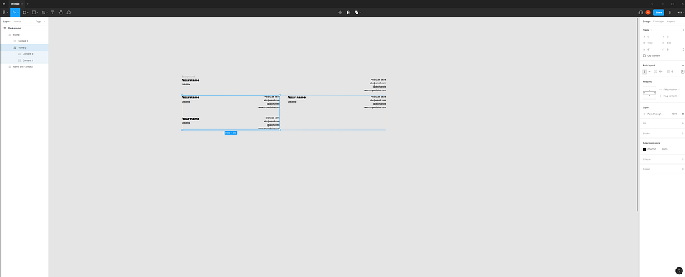
From here, you can simply edit the sections accordingly by selecting specific textboxes (not frames) by holding Ctrl and clicking on it. To add more, duplicate (Ctrl + D). To remove excess components, delete to your heart’s content.
Note: When deleting excess textboxes, I recommend adjusting the height constraint from “Hug contents” to “Fixed height” to prevent distortion of the alignment.

The same procedure applies to your “Work Experience” on the right. If you want to add bullets, simply refer to the path shown below after selecting the textbox containing your job descriptions.

I also recommend setting the textboxes on the left side of your “Work Experiences” to “Fill container” widths and the width of the right container in the same section to “Hug contents” so that you can allocate more space to enter details of your role. (You may refer to the screenshots below for clarity).

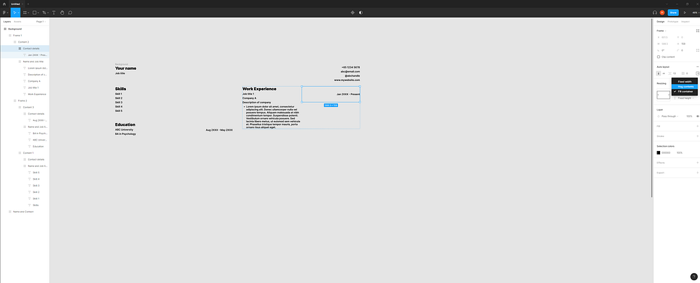

Have another work experience to add? Let’s do it! First, select the frame containing your work experience content (should be your equivalent of my “Frame 2”). Go ahead and duplicate it (Ctrl + D).
Similar to before, group the 2 frames in an auto-layout frame (Shift + A) and change the arrangement to a vertical auto layout. You might notice that some constraints have changed. Here’s a challenge for you, correct the constraints of the left frame. (I will present the solution below so feel free to pause and work it out :D).

If you look at certain frames, you may notice this:
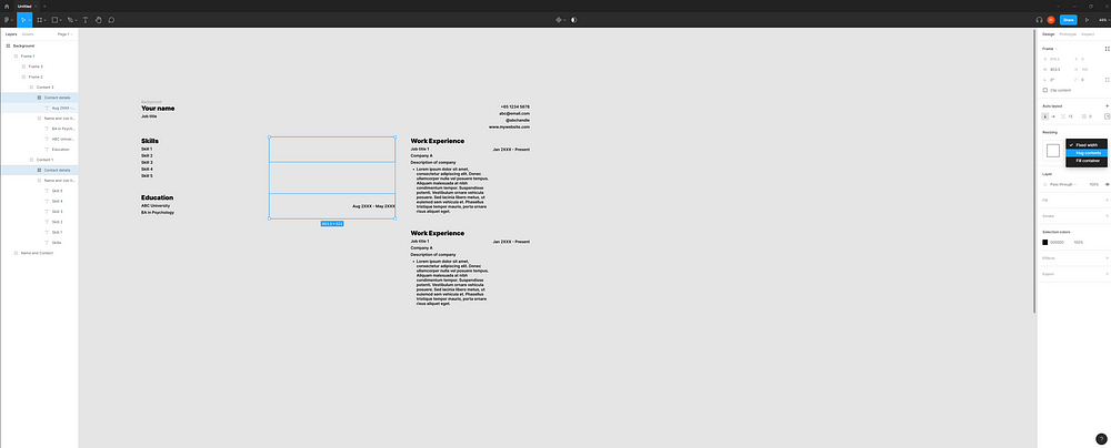
Let us fix this by re-adjusting the constraints to “Hug contents” and deleting the empty frame. After which, select the right section and re-adjust the width to “Fill container”.
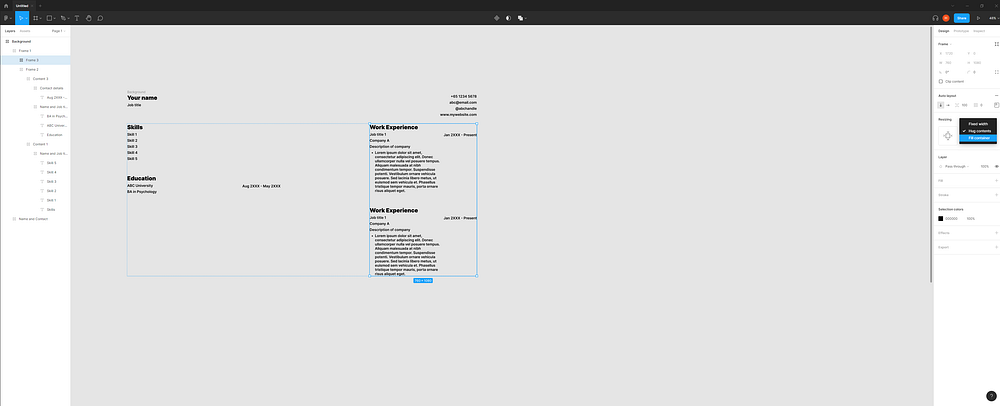
After which we can remove the 2nd “Work Experience” header and change the width of the “Work Experience” frame to “Fill container” in order to allow Figma to automatically resize the section to cover the rest of the A4 width.

From here on, simply duplicate the bullet points (Ctrl + D) as many times as you need to and you should have something similar to the screenshot below.

Step 8: Colour the background and add margins
Now let’s address the elephant in the room: our background has no colour. Let’s give it a splash of white by first selecting the “Background “ frame. Hit the “+” icon under the “Fill” section on the right toolbar. The background should be white.
Notice how all the texts are flushed toward the ends of the A4 sheet. Won’t it be nice if we can have some space around the texts and the edges? This is when margins come into play.

With the “Background” frame still selected, go to the right toolbar and on the 3rd input from the left, we can try a number like 100.


Step 9: Refining the design
We’ve come to the last step! From here on, you can simply adjust the font size, font styles of headers and descriptive texts to your liking.

Closing words
I hope from this guide, you managed to learn more about how auto layouts work and created a resume along the way :D! I understand there are many ways to make the process even smoother such as using components, but I believe that is a topic that should be dealt with separately.
Happy holidays!


