20 Kick-Ass Fonts for Web Design

Check out this list of modern, super-versatile fonts for your next website or app.
Abhijit Nayak
UX Planet

--

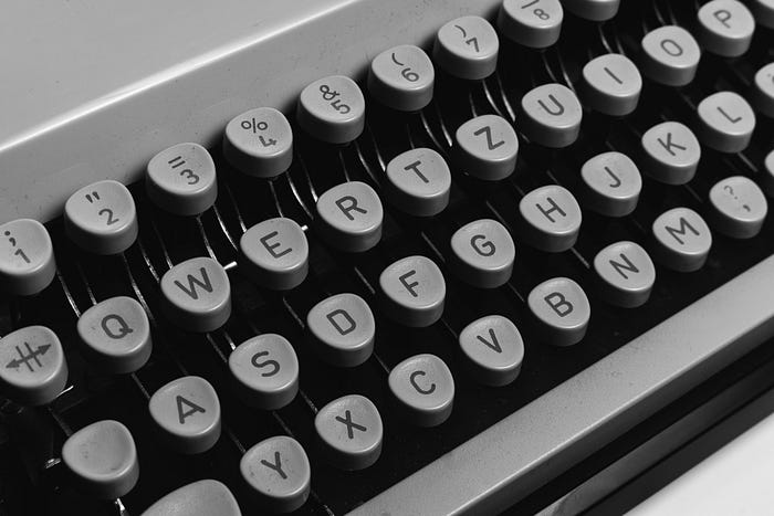
Image Credit: Markus Winkler, Source: Pexels.com

Have you ever found yourself trying multiple fonts in a design but none of them seem to be working?

I have.

And there is usually no good way to resolve this, other than trying out the next font. But the search doesn’t need to be random.

This post is my effort to streamline the choices and make the selection easier for you. I have used information from the best design websites out there and my own aesthetic sense to arrive at this list of 20. The fonts on this list are incredibly versatile and optimised for different web applications, be it a website or an app.

I have also made sure that all the fonts in this list meet the following 5 criteria.

  1. They should have a modern and minimalist look and feel, and not look like an overkill. This gives an uncluttered and clean appearance and ensures legibility, which is the primary requirement.
  2. They should be scalable enough to be used across different screen sizes and versatile enough to be used across different use-cases and industries.
  3. The type family should be openly and freely available online (not necessarily for commercial use!), and it should have multiple weights and styles for designers to pick from. I have added links for each family so you can download and use them for free.
  4. They should not be overused to the extent that they seem ubiquitous and boring (e.g. Futura).
    On the other hand, there are many popular typefaces that are used everywhere and still evergreen due to their supreme versatility. Ubiquity isn’t a deal-breaker when it comes to choosing fonts, and there are often good reasons why some fonts are uses so much.
  5. They should be usable as both display and body text. Picking a font design for your main content is very different from choosing a font for your title, and remains one of the major decisions for any design. Typefaces that can be used only in headers (and hence most decorative fonts) won’t make it to this list.

Historically, UX designers have preferred sans serif typefaces over serif ones on websites and apps. This is largely due to their legibility and easier scalability on digital screens (though it has become less relevant today as screen resolution has gotten better over the years and many serif typefaces have been optimised for screen usage). Also, sans serif typefaces typically have a more modern, informal and minimalist vibe. This is why you will find more sans serif typefaces in the list below.

In case you are not familiar with the basics of typography, you can check out this article.

When reading about typefaces you may come across terms such as humanist, geometric, non-grotesque and so on. Knowing these classifications will help improve your understanding of typefaces, but is too broad a subject to be covered in this post. To learn more about these classifications, check out this article from fontsmith.com.

Having set the context and expectations, let’s jump straight to the list of 20 (in no particular order).

Note: For the illustrations on this article, I have mostly used regular, medium or semibold weights. You can try out other style and weight variations by downloading the entire family using the links I have shared.

Sans Serif

#1. Gotham

Text in Gotham
Text in Gotham

No non-sense, minimalistic and kick-ass readability. Inspired by 20th century architectural signs, Gotham is a geometric sans-serif typeface with a reasonably good x-height, which ensures good readability.

Download the Gotham type family from Cufon Fonts.

#2. Proxima Nova

Text in Proxima Nova

One of the moser versatile and well-known typefaces, Proxima Nova is equally suited for both print and web usage, and has been aptly called ‘Helvetica of the web’ by designers. Much older than some other fonts on this list, its rise among web designers was aided partly by other simple, geometric sans-serif typefaces, most notably Gotham. Proxima Nova combines geometric shapes with modern proportions, and finds widespread usage both as display and body text.

Download the Proxima Nova type family from Adobe Fonts.

#3. Lato

Text in Lato
Text in Lato

Originally conceived for corporate usage, Lato features a sleek, neutral look which makes it a perfect fit for body text. At the same time, it retains some of the originality and shapes when used in uppercase and at large sizes, giving it a harmonious appearance.

Download the Lato type family from Google Fonts.

#4. Avenir Next

Text in Avenir Next
Text in Avenir Next

Avenir Next is one of the most popular geometric sans-serif typefaces, and the orignal Avenir was designed as a real alternative to the seemingly-rigid Futura (another ubiquitous font). Over time, the weights and styles were expanded upon, along with more changes to optimise the font for various interfaces. It is equally successful for on-screen and print applications, and Avenir Next Pro is the latest typeface in the series.

Download the Avenir Next type family from Cofonts.

#5. Source Sans Pro

Text in Source Sans Pro

Designed as Adobe’s first open-source typeface, Source Sans Pro was meant to be primarily used for UI projects. The typeface has a high degree of legibility, and is well-suited for long-form content as well.

Download the Source Sans Pro type family from Fontsquirrel.

#6. Open Sans

Text in Open Sans
Text in Open Sans

Open Sans is the second most popular fonts used on Google fonts, and for good reason. It is classified as a humanist typeface, rendering a neutral but friendly appearance. It boasts excellent legibility across print, web and mobile interfaces.

Download the Open Sans type family from Google Fonts.

#7. Roboto

Text in Roboto
Text in Roboto

If you’re a designer, you know Roboto. Developed by Google in 2011 for usage across Android OS, it’s not difficult to understand why it’s a killer font for digital user interfaces. It continues to be the default font for Android to this date.

Download the Roboto type family from Google Fonts.

#8. Nunito

Text in Nunito
Text in Nunito

A balanced sans-serif typeface, Nunito uses rounded ends on characters (see the endings on the lowercase ‘l’ and uppercase ‘N’) and was originally designed for usage as display text. A non-rounded terminal version, Nunito Sans is also available.

Download the Nunito type family from Google Fonts.

#9. IBM Plex Sans

Text in IBM Plex Sans

This typeface is probably best described in IBM’s own words: ‘It’s global, it’s versatile, and it’s distinctly IBM.’ It tries to strike a careful balance between the man and machine, the natural and engineered. Evergreen in its design, has been thought of as a modern alternative to the famous Helvetica Neue. It is also optimised for improved legibility at smaller sizes.

Download the IBM Plex Sans type family from Google Fonts.

#10. Exo

Text in Exo
Text in Exo

Designed as a contemporary geometric sans serif typeface, Exo renders a futuristic/tech-y look and feel to characters. With 9 weights, it boasts great versatility. The most common usage of Exo is in display text, but it also works well with text of small to medium size.

Download the Exo type family from Google Fonts.

#11. Ubuntu

Text in Ubuntu
Text in Ubuntu

As the name suggests, Ubuntu is the default font on Ubuntu OS and was first used in 2010. The font was primarily designed for use on digital screens, and the spacing and kerning is manually optimised for usage as body text. It employs curvy ends to letters and has a distinct, contemporary style.

Download the Ubuntu type family from Google Fonts.

#12. SF Pro Display

Text in SF Pro Display

SF Pro Display is most notable for being used by Apple on macOS and iOS. This neutral and versatile sans serif font features nine weights. It is a variable font that incorporates variable widths in conjunction with weights and optical sizes.

Download the SF Pro Display type family from Cufon Fonts.

#13. Corbel

Text in Corbel
Text in Corbel

Released for the first time in 2007, Corbel is a humanist sans-serif typeface that is specifically designed with UI in mind. It aims to give a simplistic, clean and uncluttered appearance on screens, and the softer curves ensure good legibility even at smaller sizes. An excellent choice for body text!

Download the Corbel type family from Dafont.

#14. TT Norms Pro

Text in TT Norms Pro

This is probably the most modern typeface (as per release date) on this list. The inspiration for the designers was to create something that will be extremely versatile across different applications and employs classic character proportions, while retaining a stylish, modern and neutral look.

Download the TT Norms Pro type family from Cufon Fonts.

#15. Montserrat

Text in Montserrat
Text in Montserrat

I deliberately kept Montserrat for the last. Designed in 2011 and taking inspiration from urban typography, this geometric sans-serif typeface has been incredibly popular amongst web designers and has been used across millions of websites over the years. But as stated earlier, ubiquity isn’t a deal-breaker when it comes to fonts. Montserrat is also frequently seen as an alternative to similar sans serif fonts such as Gotham and Avenir.

Download the Montserrat type family from Google Fonts.

Serif

Although relatively less common in web usage than their sans serif counterparts (especially in apps), the popularity of serif typefaces on websites has been slowly regaining popularity. Here are my 5 best picks (in no particular order).

#16. Playfair Display

Text in Playfair Display

Download the Playfair Display type family from Google Fonts.

#17. Merriweather

Text in Merriweather

Download the Merriweather type family from Google Fonts.

#18. Libre Baskerville

Text in Libre Baskerville

Download the Libre Baskerville type family from Google Fonts.

#19. PT Serif

Text in PT Serif
Text in PT Serif

Download the PT Serif type family from Google Fonts.

#20. Lora

Text in Lora
Text in Lora

Download the Lora type family from Google Fonts.

Like with anything in design, the usage and perception of a font on a website or app depends on the audience, the context and the nature of content or messaging. Of course, a one-solution-fits-all approach doesn’t work here. As a designer, you have to look at the context and pick the most suitable font.

As a last note, keep these simple tips in mind when applying a font to your designs

  • Limit yourself to 1 or maximum 2 fonts. If confused, use different weights from the same type family.
  • Set the line-height to ~150% of the font size for good readability. So if your font is 12 pt, the line height can be 18 pt.
  • Use modular scaled font sizes — these are a series of font sizes which give a more harmonious appearance to your design. These are 8, 16, 24, 32, 48, 64. 16 pt works best for body text.
  • Try to avoid over-used fonts (e.g. Futura or Helvetica) and use newer, similar alternatives instead.

Happy Designing!

Enjoyed this post? If yes, please show some appreciation by clicking on the “clap” button. Fun trivia — you can hit it up to 50 times! It helps the content reach out to more like-minded people.

Please share your thoughts and feedback in the comments below. This will help me improve and also inspire me to create more.

I try to publish regularly on Medium. Follow this account to receive similar content in future, and click here to get each post directly in your email. You can find me on Linkedin and Twitter as well.

--

--

I am a designer, story-teller, photographer and adventure enthusiast. Follow me for design-related content. abhijitnayak.framer.website