The 4 Things to Keep in Mind for an Enhanced User Onboarding

What is user onboarding? To cut the long story short, let me bring you an example. Imagine you have invited people to your home which is located in a forest deep in the trees and bushes. And you want to make sure your guests find the house and don’t leave without paying you a visit.
What can you do? Of course, you might try to show the shortest route to your home and mark it with a few nice road signs. You might also want to make those signs brief and fun so that it is easier for your guests to reach your place, right? Onboarding is just like this.
Your app is your home and onboarding is the route that takes the users (guests) to it. If the route is too complicated and/or full of unnecessary details (signs), the users might be bored and might leave without paying you a visit i.e. without actually using your app.
So, what does it take to turn user onboarding into a really pleasurable and useful experience? Let’s take a look at a few onboarding do’s and don’ts.
1. Highlight your value proposition
Diverse features and exciting functionality are cool, but showing users what they can do with those features is important. This is called highlighting your value proposition.
While many apps make the mistake of telling users about the awesomeness of their app, others show their users how the app can change their lives for the better. For example, the makers of Elevate know that people don’t care about features — instead, they care about what they can do with them. Thus, when you open the app, a simple value proposition tells you what the app is for — it is for personalized brain training.

Medium has another example of successful user onboarding. Here again, the value proposition tells it all, “Read the stories that matter to you. Anywhere, anytime.”

2. Keep it quick and fun
Users won’t like the idea of swiping through a dozen screens before they can eventually use the app. Hence, it’s important to prioritize and stick to the most important things.
Screens full of text, numbers, and illustrations might freak out the users. So, make sure to keep it all brief and fun. Stick to one feature explanation per screen in order not to overwhelm users. Incorporating progress indicators is a smart move. They usually come in the form of small circles that give the user an idea of how many screens there remains until they eventually get to the app. It is vital to let people know whether they are at the beginning, middle, or at the end of their onboarding experience.
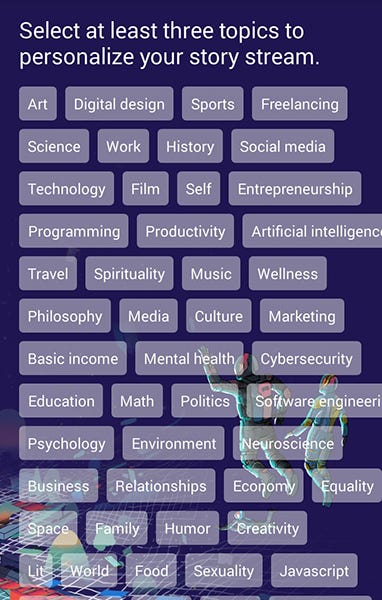
One of the best examples of onboarding can be seen on Medium again. Here, there are only two screens: one emphasizing the value proposition and the other one offering to select story streams.
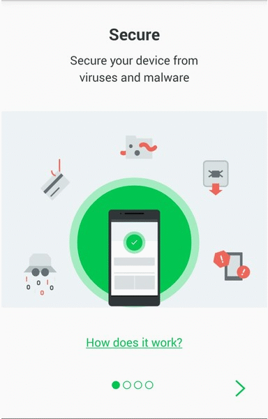
Lookout has one of the most gorgeous onboarding screens with progress indicators. There are only four screens each of which focuses on one feature explanation at a time. Note that the explanation is written in a way as to help the user get the idea of what they can do with the app: they can “Secure,” “Locate,” “Protect,” and “Back Up.” Each verb is then followed up with a brief sentence and a few minimalistic illustrations that help visualize it.
3. Emphasize core features
While you need to be as brief as possible, users still need to understand the key functionality of your app. Show users your app’s key features and then use a CTA (call to action) for them to learn the prices/learn more or just sign up.
Let’s take a look at Lemonade. You can see the value proposition which is quite intriguing, “Forget everything you know about insurance.” You already get the idea that Lemonade is an app related to insurance. Then come three screens with doodle visuals and minimal text explaining the app’s core features in the simplest way possible. The last screen offers a CTA “Check out our prices” which stands there to help users learn more about the app without getting overwhelmed with too much information.

And remember, you do not need to go into much detail. You can always showcase other app features (the less essential ones) later on. Let’s not forget about in-app messages that allow providing users with extra information about additional features or anything else.
4. Make the signing up process easy
Signing up should never pose any barriers to app adoption. This in mind, you should make it as easy as possible. It is a good idea to always give users the option to sign in to your app through existing social media accounts like Google+, Twitter, or Facebook. But remember that some users might want to sign up with an email address. Always leave the choice up to them.
Also, consider the timing: some apps ask users to sign up at the end of the onboarding process. However, other apps ask users to sign up immediately after they open the app for the first time. So, take your time to do A/B testing and decide which variant works best for you.
In the below example, PicsArt allows its users to opt for either Google, Facebook or email registration.

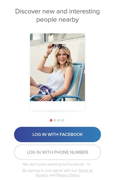
Tinder, on the other hand, allows signing up either using Facebook or a phone number.
Summing up
In some cases, you cannot explain everything through the onboarding process. However, it’s important to use onboarding to provide users with extra resources. Some of your potential users will find this educational information and will get back to you.
If you think your app has complex functionality, you can use video tutorials and place them somewhere within the app. They will be extremely handy as compared to coaching screens with brief texts and illustrations. In the end, it’s up to you to incorporate onboarding screens or not. Do your research, conduct A/B testing and see what your users think. If you ever opt for onboarding, make sure it’s intuitive, fun, and as quick as possible. Happy onboarding!
Found this post useful? Kindly hit the 👏 button below to show how much you liked this piece of content! :)
Follow Inapptics: Medium | Twitter | Facebook
Originally published at blog.inapptics.com
Read Next: 6 Proven Ways of Engaging Your App Users
About the author:
Anna is a digital marketing specialist and a storyteller with a passion for knowledge and a flair for writing. She strongly believes that knowledge is meant to be shared, for there is a lot we can learn from each other. Her hobbies include reading, photographing, testing apps, drinking wine, and traveling. She has founded the Anatown magazine.