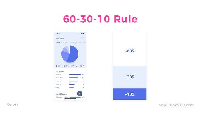
The 60–30–10 Rule: A Foolproof Way to Choose Colors for Your UI Design
Learn the Simple Formula for Creating a Balanced and Harmonious Color Scheme
Color is a crucial aspect of UI design. It can evoke emotions, set the mood, and guide users’ attention. However, choosing the right colors for your UI design can be challenging, especially if you’re not a trained designer. In this article, we’ll introduce you to the 60–30–10 rule, a simple formula that can help you choose colors for your UI design with confidence and ease.
What is the 60–30–10 Rule?
The 60–30–10 rule is a popular color theory used by interior designers, fashion designers, and graphic designers to create a balanced and harmonious color scheme. The rule states that a color scheme should consist of three colors in the following proportions:
- 60% of the dominant color
- 30% of the secondary color
- 10% of the accent color
The dominant color is the main color of the design, and it should be the most prominent and visible color. The secondary color is a complementary color that supports the dominant color and provides visual interest. The accent color is a pop of color that adds a bit of excitement and contrast to the design.
How to Apply the 60–30–10 Rule to UI Design
Now that you know the basics of the 60–30–10 rule, let’s see how you can apply it to your UI design.
Step 1: Choose Your Dominant Color
The dominant color is the foundation of your color scheme. It sets the tone and mood of your design and should be the most prevalent color. To choose your dominant color, consider the following factors:
- Your brand’s colors: If you’re designing a UI for a brand, you’ll want to use the brand’s colors as your dominant color. This will ensure consistency and reinforce brand recognition.
- Your audience: Consider your target audience and the emotions you want to evoke. For example, if you’re designing a health app, you may want to use calming and soothing colors such as blue and green.
- Your design goals: Think about the purpose of your UI design and the message you want to convey. For example, if you’re designing a travel app, you may want to use vibrant and adventurous colors such as orange and yellow.
Once you’ve chosen your dominant color, make sure it’s present in the most prominent areas of your design, such as the background, header, or main button.
Step 2: Choose Your Secondary Color
The secondary color should complement your dominant color and provide visual interest. To choose your secondary color, consider the following factors:
- Color theory: Look at the color wheel and choose a color that complements your dominant color. For example, if your dominant color is blue, you may want to use a complementary color such as orange or yellow.
- Contrast: Choose a color that provides enough contrast with your dominant color. This will make your design more legible and accessible. For example, if your dominant color is dark, you may want to use a lighter secondary color.
- Mood: Consider the emotions you want to evoke and choose a color that supports your design goals. For example, if you’re designing a fitness app, you may want to use a vibrant and energetic color such as red or orange.
Once you’ve chosen your secondary color, use it to highlight important elements of your design, such as headings, subheadings, or call-to-action buttons.
Step 3: Choose Your Accent Color
The accent color is a pop of color that adds a bit of excitement and contrast to your design. To choose your accent color, consider the following factors:
- Color theory: Look at the color wheel and choose a color that contrasts with your dominant and secondary colors. For example, if your dominant color is blue and your secondary color is green, you may want to use an accent color such as pink or yellow.
- Contrast: Choose an accent color that provides enough contrast with your dominant and secondary colors. This will make your design more visually interesting and dynamic.
- Mood: Consider the emotions you want to evoke and choose an accent color that supports your design goals. For example, if you’re designing a food app, you may want to use a warm and inviting color such as red or orange.
Once you’ve chosen your accent color, use it sparingly to draw attention to specific elements of your design, such as icons, badges, or links.
Tips for Using the 60–30–10 Rule
Now that you know how to apply the 60–30–10 rule to your UI design, let’s look at some tips to help you use it effectively:
- Experiment with different color combinations: The 60–30–10 rule is a guideline, not a strict rule. Don’t be afraid to experiment with different color combinations and adjust the proportions to suit your design goals.
- Use shades and tints: To add depth and complexity to your color scheme, use shades and tints of your dominant and secondary colors. This will create a cohesive and harmonious design.
- Use color palettes: Use online tools such as Coolors or Adobe Color to create color palettes based on the 60–30–10 rule. This will save you time and help you choose colors that work well together.
- Test your design: Once you’ve chosen your colors, test your design on different devices and in different lighting conditions. This will ensure that your design is legible and accessible to all users.
Conclusion
The 60–30–10 rule provides a simple and practical framework for choosing colors for your UI design. By understanding the roles of dominant, secondary, and accent colors, you can create a balanced and harmonious color scheme that enhances the user experience and achieves your design goals. Whether you’re designing a website, app, or product, the 60–30–10 rule can help you make informed decisions about color selection and create a design that is both functional and visually appealing.
Remember to experiment with different color combinations, use shades and tints to add depth and complexity, and test your design to ensure accessibility and legibility for all users. By following these tips, you can elevate your UI design to the next level and make a lasting impression on your audience.
👋🏼 If you found this article helpful and would like to stay updated on the latest design and productivity tips, be sure to follow me on Medium. I regularly publish articles on design, technology, and productivity, and I would love for you to join the conversation. You can click the “Follow” button on my profile to get notifications of my new articles, and feel free to share your thoughts and feedback in the comments. I look forward to connecting with you!


