The Aesthetics of Klarna
How aesthetics in design can be gestalted in form, but also in function.

There is something with Klarna. It’s hard to pinpoint, but they awake a certain feeling within me. When mentioning this to people near me almost everyone agree. It’s like Klarna has become an adjective of its own. “It feels very klarna”.
You know the feeling?
But what is Klarna? Of course you don’t know the feeling if you don’t know Klarna. Klarna is a digital payment tool, just like paypal. The product is simply the last step, the payment, in a webshop.
Aesthetics
The term Aesthetics was coined in a book named ‘Ästhetik’ (1750–58) by the German philosopher Alexander Gottlieb Baumgarten. Baumgarten tried to describe the “lower” sensual aspects of human experiences as opposed to higher realm of logics. ‘Ästhetik’ described the fundamentals in what evolved to Aesthetics — a philosophic branch that concerns beauty and taste.

Aesthetics in UX Design
But what role does aesthetics have in User Experience Design? John Dewey, an American philosopher from the early 20th’s century defined experience as “The irreducible totality of people acting, sensing, thinking feeling and meaning-making in a setting”. Sensing, particularly sensing of something described as beautiful is something that all of us UX designers strive for. In other words — creating an aesthetic experience is key when developing successful UX Design.
Form, function and meaning
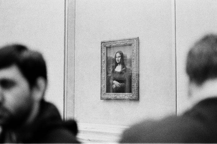
Design is often broken down into form and function. Function means the practical purpose or capabilities of an artefact, for example transport goods from A to B or the top speed of a vehicle. Form refers to the appearance of an object, such as color and texture. Many people will argue that aesthetics belongs to the latter. But in this article, I’ll take another approach. I suggest that it is possible to find ‘Klarna aesthetics’ both in the function and the form. In addition to that we’ll dig even deeper. As if one can try to find a deeper meaning in the smile of Mona-Lisa, is it possible to find a deeper meaning in the ‘Klarna aesthetics’ too?
I will end this article by suggesting an approach how to reproduce a digital product using the same aesthetic approach as Klarna. Let’s dig in.
Form

Visceral processing
There are three levels of processing in the human brain: The visceral, the behavioural and the reflective. This text will have an emphasis on the visceral level: the fast, rapid judgements that is common in all humans behaviour. The visceral level is quick and reacts on the appearance of what’s in front of us. The visceral level of the brain is particular sensitive to some specific conditions that are genetically determined. It’s in our DNA. For example, the reaction to harsh, abrupt sounds. Or the classic — the fear of spiders and snakes. All of us have the same intuitive reactions!
Attractive things work better
Emotion change the way the human mind solve problems and aesthetics change the emotional state. So, the attractive aspects of an artefact produce positive emotions, causing mental processes to be more creative and more tolerant of minor difficulties.
Klarna tries to cause these emotional positive feeling through their visual appearance — in their branding. If a user perceives the visual appearance as aesthetically appealing, the user will be more patient when interacting with the product. More patience will increase the probability of fulfilling the user’s goal — in this case to finish the payment. The user is left with appealing senses and has satisfied his or her goal. Talk about a positive experience.

Pattern matching
But how does the commercial I watched three days ago affect the interaction I have with the product today? The answer is called pattern matching. There is not only fear and horror that is encoded in our visceral DNA. Situations and objects that, throughout evolutionary history offer food, warmth or protection give rise to positive affect. Examples of such situation are: warm and comfortably lit places, sweet tastes and smell, smiling faces and rounded smooth objects. Rounded smooth objects. Smooth. Smoooth.
Here it becomes very interesting. The feeling of smooth, that Klarna is instantly repeating, is a human primitive feeling situated deep inside of our DNA. In their commercials they have reproduced visual metaphors of what creates the feeling of smooth. In addition to the visual metaphors they scream out the definition of the feeling. “Smoooth”. And in addition to that, they place their own brand name next to the definition of that feeling. “Klarna. Smoooth.”.
To evoke a certain human feeling and then connect something, such as a brand name, to that feeling is called pattern matching. By repeatedly placing the brand name next to a feeling that humans are programmed to like, humans will start to like the brand name. That’s why the commercial I watched three days ago affect the interaction I have with the product today.
Function

Ambiance
Aesthetics is not only created by visual metaphors connected to human primitive feelings. For example, it is vital for a chef that his or her cutting tool work efficiently. When the chef is in action, with the knife handle comfortably in the hand and the edge at its sharpest, the knife is like an extension of the senses and can become a source of great pleasure. The efficiency moves into a different level of response and meaning. An ambiance between the subject and object is created that is hard to define. Maybe the aesthetics of function? The same feeling appears when a race driver presses the gas pedal. The feeling doesn’t heritage from any visuals. The source is great mechanical engineering. It’s function!

How is this ambiance of functional aesthetic created? I suggest that there are no shortcuts. Through designing an experience tailored to the task. By engineering the design as effective as it ever can be.
In the case of Klarna this means that the interactions must be designed with as low complexity as possible. Reduce every situation where the user might stop and think. By implementing famous design guidelines such as Donald Norman’s principles and Jakob Nielsen’s heuristics. Listen to and observe the target audience and iterate. Iterate, iterate, iterate. Through extremely efficient coding that makes the system act exactly as intended with minimum delays.
Putting in a deep elaborative work to tailor the product for its purpose will create the feeling that the products is an extension of myself. And I want to argue that Klarna has put in that effort.
Meaning
Aesthetic coding
I mentioned earlier the ‘Mona-Lisa theory’ that there might be a deeper meaning, beneath the visceral senses and caused by the function and form of Klarna. I want to argue that there is. Let’s get back to the three levels of processing. The visceral level of the brain will notice the appearance of Mona-Lisa, such as her facial expression, compare it to previously encoded patterns and try to find a match. But if we start to reflect on the visceral feelings that appear, we suddenly go beyond the matched patterns and awake our reflective level of processing: The rational and intellectual thoughts and feelings. “Is she smiling? Or is she not? Maybe she tries to smile but it doesn’t reside from her heart?”.
So, what is the rational sense of Klarna? What is the meaning? If you start to reflect on that question, I’m certain that most of us will come to the same conclusion. They even describe it themselves in their ‘Get smooth handbook’: “The less time customers spend at the checkout, the more likely they are to complete a purchase”. By keeping the user at the visceral level and eliminate all possible obstacles that makes the user reflect, Klarna’s deeper meaning is to make customers consume.
This meaning, coded into a products function and form can be referred to as ‘aesthetic coding’. This encoded meaning could be positive such as “be kind”, “donate to charity” or “don’t consume, it’s bad for the environment”. Unfortunately, in this case, it is not.
Conclusion
The form
Klarna has found a primitive sensual feeling that humans are coded to like. They have constructed a world class visual identity and branding around that feeling. They have pattern matched that feeling to their brand name. That’s the aesthetics of Klarna’s form.
The function
Klarna is a perfect example of design and engineering for ease of use, eliminating all need of reflective thinking. The product itself, the last payment steps of a webshop, contains no form more than the brand primary color and typeface. The rest is white background, black text, black buttons and pure function. Function that is summarized in Klarna’s developer guidelines and ‘Get smooth handbook’, convincing developers why and how to implement the product to create a consistent appearance. The functionality is tailored for its purpose, creating the ambiance that the product is an extension of oneself, rather than a tool in use. Through excellent design and engineering they have not just met, but exceeded the expectation of the bold and quirky branding. That’s the aesthetics of Klarna’s function.
The meaning
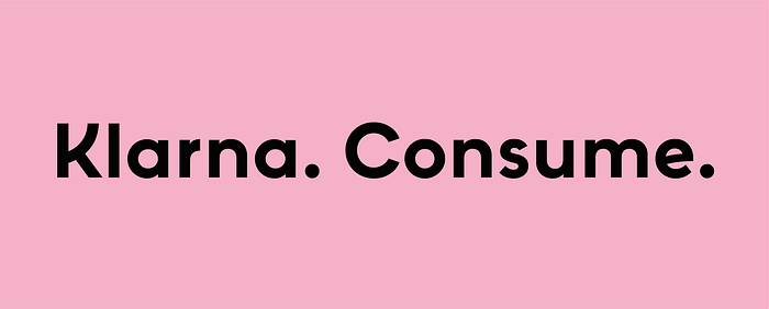
The magnificent form and function has aesthetically encoded the deep meaning of what Klarna in reality communicates. Consume. So, if we are going to follow the aesthetic footsteps of Klarna, let’s make sure that the bottom layer, the meaning, is something good.
Step-by-step: Create your own aesthetic the Klarna way
- Reflect on your product. Does it contribute to a better world? If no, start over. If yes, go to step 2.
- Find one primitive sensuous feeling that rhymes with the product.
- Put in deep elaborative work to create a magnificent visual identity that pattern match with the feeling in step 2.
- Extract one core functionality of the product.
- Take the core form from the visual identity in step 3 and the core functionality from step 4. Put in deep elaborative work to design and engineer the most efficient product to meet your goal.


References
The ideas of the human mind’s levels of processing, attractive things work better and pattern matching comes from Donald Norman’s book Emotional Design (2004).
The ideas of ambiance reside from Mads Nygaard Folkmann’s Evaluating Aesthetics in Design: A Phenomenological Approach (2010), Gernot Böhme’s The aesthetic theory of atmospheres (2017) and John Heskett’s Design: A Very Short Introduction (2005).
The ideas of aesthetic coding are from Nygaard Folkmann (2010) and his references to Maurice Merleau-Ponty (1964).
The ideas of meaning heritages from Heskett (2005) and Nygaard Folkmann’s references to Merleau-Ponty (1964).
Klarna’s ‘Get smooth handbook’
The rest is my reflections and ideas on those texts.

