The Art of design: History, Evolution and Everyday examples.
How did design come into existence?
Since humanity, art has always played an integral role. Either in the form of communication through paintings or stick figures or by expressing the inner emotions via dance, drama or imitation. Slowly and gradually, design came into existence without us being cognizant of the term. Design has always been our emergency equipment. E.g.: About 2.6 million years ago, humans in the stone age era used stones to hunt animals for their survival. To make their hunt more efficient, they sharpened the stones and attached a wooden piece to it, thus creating a hand axe.
Design had started just then and evolving thereafter. Another example is that of Stone age shoes. They were made out of one piece of leather that were sewn together with thin pieces of leather.

Now if we think about the old period it was a very useful, efficient and innovative way to make a pair of shoes. The product served its purpose i.e. to protect the feet. It was designed to cater to the different users be it any gender, age group or size. But if we look at it from a contemporary point of view, we might give this product a hard pass not only because of the material used but also its effectiveness. Perhaps the product was more user-friendly, effective and connected with the stone age people on a more psychological basis. Hence, design is subjective and a continuous process of creation.
Who decides which is a good design or a bad design? Is it some higher level people or perhaps the almighty?
You guessed it! It is us humans, our understanding, reasoning capability or the personal opinion described with logic that decides which is a good or bad design. Design is a perfect blend of art and science that improves the quality of life.
Let us see some examples of Good designs and Bad designs we interact with as we go through our daily life.
Good Design:
Let’s say I am a morning person (not that I am) and like to get things done early in the morning before my day starts. The first thing I interact with is the facewash bottle.

The liquid transforms into foam in just one press. The product itself is innovative and useful as it caters to my needs i.e. saving the hassle of rubbing the liquid into my hands to create foam and then applying it on my face. The product is aesthetic as well as honest as it describes the foam part right on the front cover. The product is true to its functions and the content can also be used till its last drop with the adequate size of straw in the bottle. The product ensures to use less liquid and is leak-proof. Smart, right?
Let’s jump to reading some books. Yes, I am a book geek. But living in a modern age has changed the traditional reading material. You know what I am talking about. Amazon’s Kindle.

The product equips us with millions of books at our fingertips. A representation of a physical world library even more massive than that. The product has taken into consideration almost every age group and offers various genres of books. The product is pretty unique, inclusive and self-explanatory. They recently added a new feature of ‘Prime Reading’ exclusively for its prime members. It also allows users to keep track of their reading with their new feature ‘Reading Insights’. This induces a sense of belonging and self-competence among users which makes their experience better. Except for the monetary aspect, the design does justice to the overall experience. The color palette evokes a certain emotion and in this case the blue shade promotes harmony, security and reliability.
I like to write my to-do list where it is easy to be noticed. Here comes the 2-in-1 board.
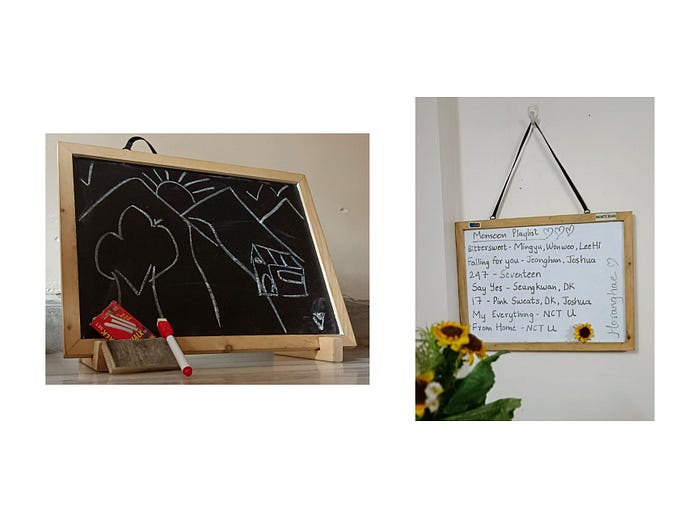
This product is a perfect blend of childhood and adulthood. If you live in a society filled with toddlers like I do then you are in trouble lol. The design is as little as possible, light weighted, has primary as well as secondary functions such as using it as a slate and white board, can be displayed as a sign board and can be hung around the house. The wooden frame is smooth enough for children to play with the board, thus ensuring safety. The design is understandable, unobtrusive and useful for all age groups.
While studying or working, it’s good to have a mini side table to place your things. Yes, it’s an antique furniture which comes with a special feature!
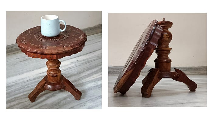
The table can be dismantled and rejoined within a few seconds. You read it right! This light as a feather table is true to its value not only functionally but also aesthetically. The design is easy to interpret and is sustainable as well as durable. It weighs on the eco-friendly side along with being mobile. It can be utilized for ’n’ number of things. It can be used as a coffee table, a height to rest your foot on or even to stack your books.
“Question everything thought to be obvious.” — Dieter Rams
If I didn’t analyze the product, I never would have discovered that the table can be dismantled and rejoined. Two people can analyze the same product differently and both can be right. It’s just about the perspective.
After a tiring day you need some entertainment, right? I was introduced to the Discord app 2 years ago.
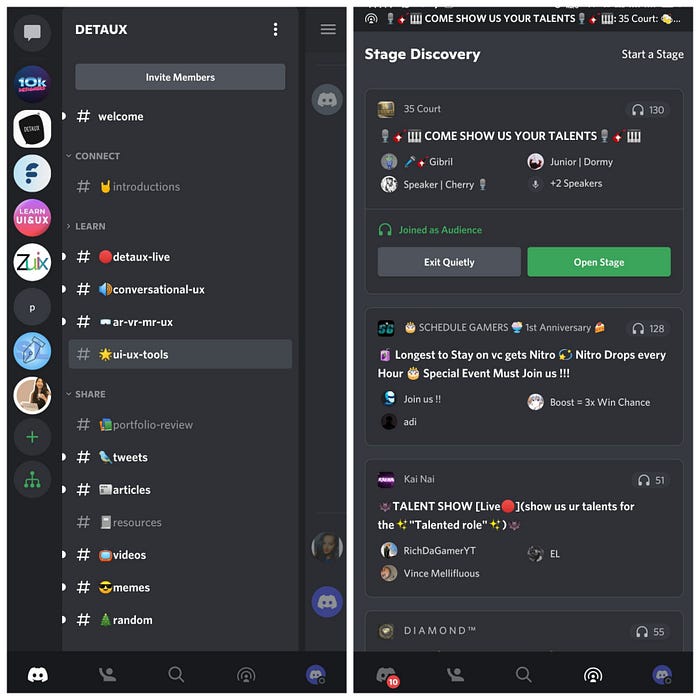
It’s a whole pack of entertainment. You can connect with people all over the world without revealing your contact details. The app is particularly useful in this pandemic where people could connect with each other without feeling alone. The channels are clearly defined leaving no room for confusion. The feature of ‘Stage Discovery’ is a perfect example of growth and acceleration. The design is pretty unusual yet remarkable. The stages are separated neatly despite the humongous amount of written content. You can showcase your talent and grab opportunities if you get lucky. The design is both neutral and restrained yet leaves room for user’s self-expression.
Bad Design:
Now let’s consider a scenario where you wake up and are surrounded by bad experiences throughout the day. Cringe alert!^^
The first thing I interact with is this microwave.
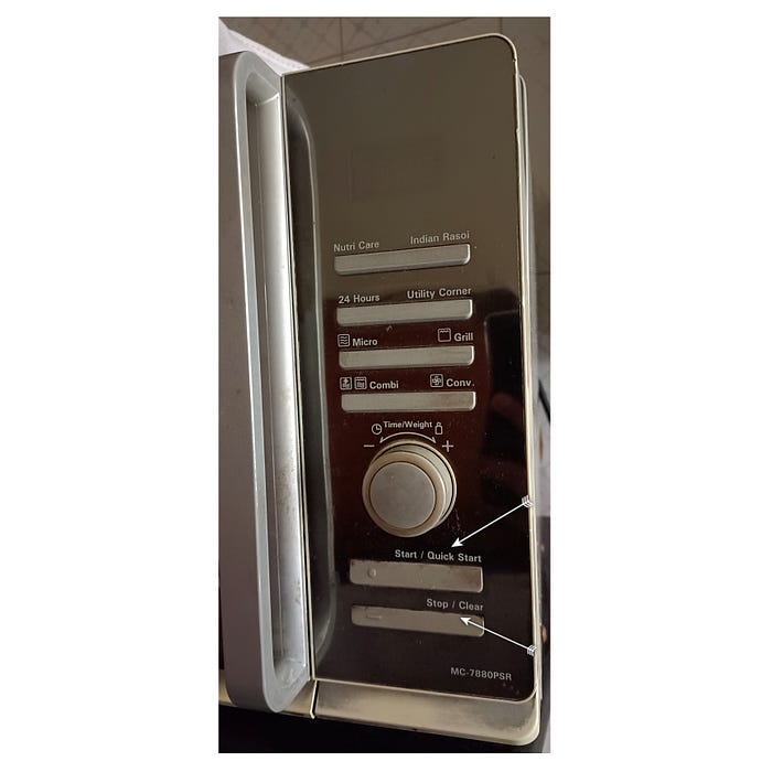
There is a clear indication of increasing or decreasing the time but I am not sure of the weight part. The design is obtrusive and manipulative. Even though they have precisely mentioned the start/quick start and stop/clear on the right side of the buttons, I actually have to press on the circle or dash on the left side for it to function. The description and button should be aligned vertically so that the user can understand properly; the description itself is vague on every button and functions are equally similar. Though the microwave gets the job done of heating food or drinks, the design is pretty inconsistent and dishonest to its users.
During my mini breaks, I prefer to read news articles to keep myself notified of the current situations.
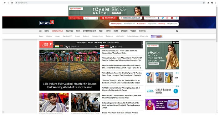
This news website has many unnecessary advertisements and is so cluttered that I couldn’t see the main content. The two toolbars placed one below the other go against the principles of usability. At first sight I was lost and couldn’t identify where to begin. There is neither an identifiable call to action button nor any hierarchy or categorization. Instead of placing the sub-sections randomly, there should be a few drop-down menus so the user has an interaction he desires.
Time to order some groceries. Dmart ready app allows you to order groceries and other necessary things at your convenience.
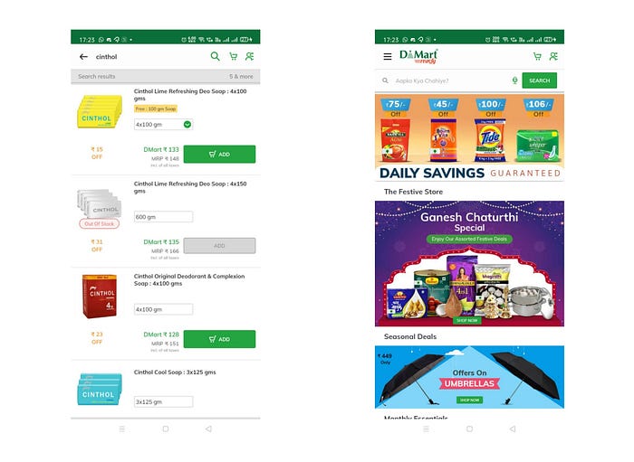
Despite being a beneficial application this app has its downfalls as well. Firstly, the Homepage consists of just swipeable pictures and offer’s images till the bottom of the page with 1–2 recommendations list. It is not organized categorically as an e-commerce app should and has unnecessary data which might hamper the efficiency. The user has to either type in the item or scroll down to the end of the page to look for the categories. There is no filter and sort option for when you search for a particular brand’s product.
As the day sets in I like to lighten up the mood with some fairy lights.

The design looks perfect and functions appropriately but has a life-threatening factor. After lighting them for even 30 minutes, they pass current and the person standing next to it gets mini shocks. It serves its primary function of lighting up and is unobtrusive but at what cost? The design is deceiving, dangerous and anti eco-friendly.
Research is a significant part of any field or domain and pulling an all-nighter for completing school/college assignments is something we can all relate to. Growing up, Wikipedia has always been a useful resource for any assignment. It can be considered a representation of physical Encyclopedia books.
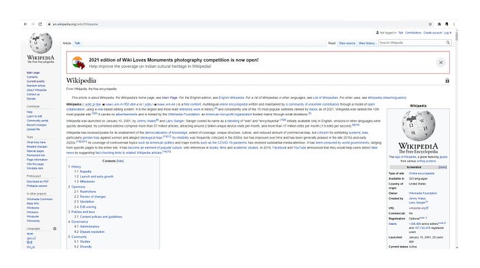
But little did I know the website is full of flaws. Anyone can post and edit content even if it is incorrect and plagiarized. Though the website provides tons of useful data, it may not always be true. Reading from the site can be tiresome for users either because of the small font size or the continuous long lines which covers almost the whole page. Concerns can be raised regarding the accountability of the product (also its primary function). Basically, the design becomes dishonest, obtrusive, manipulative and useless altogether.
Conclusion:
Just like a coin has two sides, a product can be good or bad. It depends on the needs of the users and their perspective. Both good and bad design has value attached to it which helps the users in their own way. A product has to evolve as the world evolves.
Hope you guys enjoyed reading this post!
Warm Regards,
Hiloni Shah

