The Basics of Typography
Typography is a crucial element of design. It helps convey information, set the tone, and enhance the user experience. Despite it, beginners often prioritize graphical aspects and overlook typography.
This article will help to master the basics and leverage your design skills.
Serif and Sans-Serif
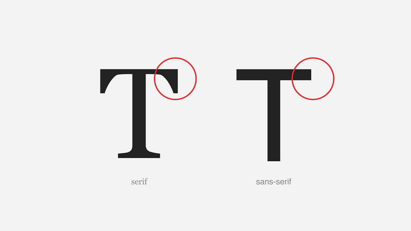
Serif and sans-serif are two distinct typeface classifications commonly used in typography.
The primary difference between them lies in the presence or absence of small decorative strokes, known as serifs, at the ends of the characters.
Serif Typeface
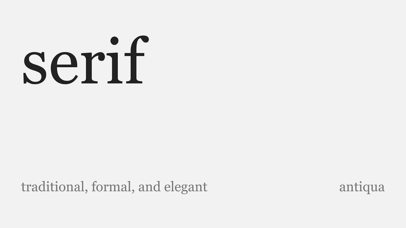
Serif fonts are generally perceived as more traditional, formal, and elegant. They are frequently used in print media, books, and lengthy text passages, as the serifs help guide the reader’s eye along the lines of text.
Some popular serif typefaces are:
Times New Roman is a classic serif typeface commonly used in print and digital media.
Georgia is a versatile serif typeface designed for on-screen reading. It was specifically created to be legible at small sizes on computer screens and has become a popular choice for web design and e-books.
Other examples, such as Garamond and Caslon, are also widely used in both print and digital design.

Sans-serif Typeface
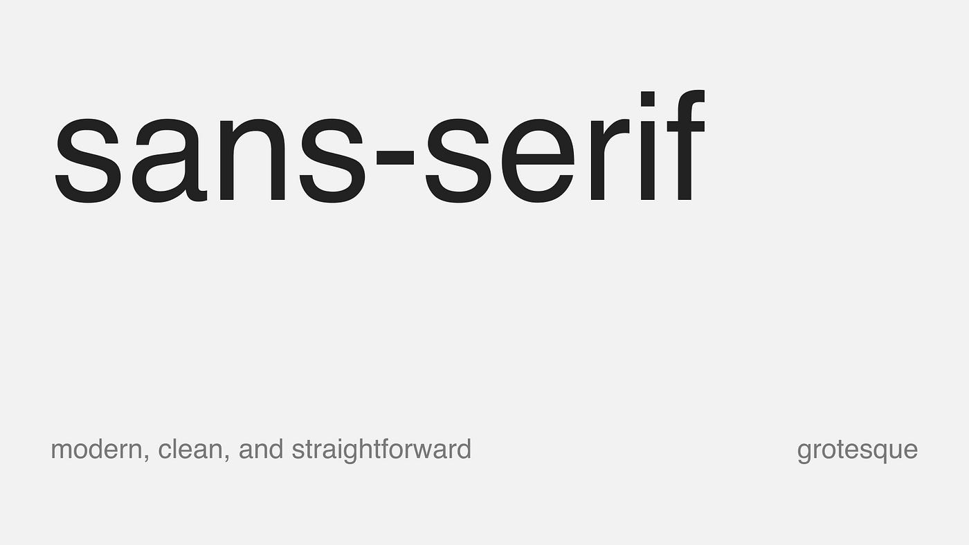
“Sans” is derived from the French word for “without.” Sans-serif fonts are often perceived as modern, clean, and straightforward. They are prevalent in digital platforms, websites, user interfaces, signage, and situations where readability on screens or at small sizes is crucial.
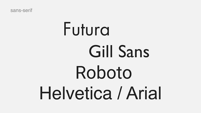
Some popular sans-serif typefaces are:
Helvetica / Arial. Helvetica is one of the most widely recognized and used sans-serif typefaces. It features a clean and versatile design with even stroke weights and a neutral appearance. Arial is similar in appearance to Helvetica. Monotype developed it as a substitute for Helvetica and became one of the default typefaces on Microsoft operating systems.
Futura is a geometric sans-serif typeface with clean, simple lines and a modern aesthetic. It was designed by Paul Renner in the 1920s and has a distinctive geometric construction. Futura has been widely used in various design contexts, including logos, advertisements, and print materials.
Besides style, mood, and cultural differences, Sans-serif fonts tend to be more legible on screens and at smaller sizes, as the absence of serifs simplifies the letterforms. Serif fonts are generally preferred for lengthy reading passages in print because the serifs guide the eye along the text.
The choice between serif and sans-serif typefaces depends on the context, medium, and desired aesthetic or communicative goals of the text.
Display and Body Typefaces
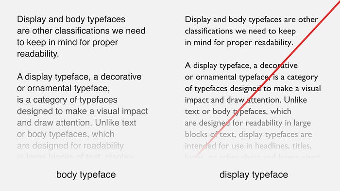
Display and body typefaces are other classifications we need to keep in mind for proper readability.
A display typeface, a decorative or ornamental typeface, is a category of typefaces designed to make a visual impact and draw attention. Unlike text or body typefaces, which are designed for readability in large blocks of text, display typefaces are intended for use in headlines, titles, logos, or other short and larger-sized text settings where legibility is still essential, but the emphasis is on creating a distinctive and eye-catching design.
The unique design of display typefaces can make them highly effective for creating visual interest and communicating a specific mood or message. However, readability should not be compromised, and it’s crucial to ensure that the typeface remains legible even in larger sizes or when combined with other design elements.
The example below illustrates how the use of a display typeface (Gill Sans) can significantly impact readability compared to a body typeface (Roboto).
Body typefaces for the marathon reading sessions and display typefaces for those quick and flashy moments. It’s all about finding the right fit for the length and purpose of your text.
Line-height
Determining the optimal line height involves carefully considering several factors, including the typeface, font size, and overall design context. Line height, which refers to the vertical space between lines of text, is critical in enhancing readability and achieving visual harmony.

According to Elliot Jay Stocks’ article, a commonly suggested guideline for body text is to use a line height ranging from approximately 120% to 150% of the font size. When working with smaller type sizes, being more generous with line-height values is recommended. Conversely, a line height smaller than the type size for a larger display type usually yields better visual results. For example, when dealing with 72px type, consider using a line height between 90% and 100%.
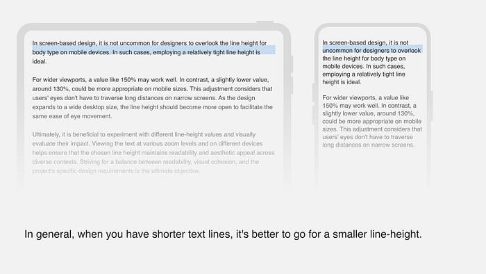
In screen-based design, it is not uncommon for designers to overlook the line height for body type on mobile devices. In such cases, employing a relatively tight line height is ideal. For wider viewports, a value like 150% may work well. In contrast, a slightly lower value, around 130%, could be more appropriate on mobile sizes. This adjustment considers that users’ eyes don’t have to traverse long distances on narrow screens. As the design expands to a wide desktop size, the line height should become more open to facilitate the same ease of eye movement.
It is beneficial to experiment with different line-height values and visually evaluate their impact. Viewing the text at various zoom levels and on different devices helps ensure that the chosen line height maintains readability and aesthetic appeal across diverse contexts. Striving for a balance between readability, visual cohesion, and the project’s specific design requirements is the ultimate objective.
Alignment
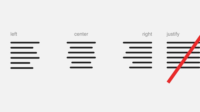
You can have a left, center, and right alignment for your text, but never justified.
Justified alignment has two main drawbacks: uneven word spacing and increased reading effort. Uneven spacing can create gaps or stretch in the text, distracting readers. Additionally, justified text requires more effort and disrupts the natural reading rhythm due to uneven spacing and occasional hyphenation.
Contrast
Type Contrast
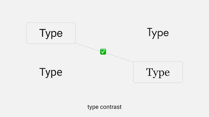
It’s generally best to avoid using two of the same type. For example, mixing two sans-serif, serif, or slab-serif fonts is not ideal. Instead, consider combining typefaces that have different styles. For instance, you can pair a classic serif font with a modern sans-serif font. This mix of contrasting styles adds a touch of visual interest, creates a clear hierarchy, and helps distinguish various levels of information or highlight specific elements within your design. So, experiment with different font combinations to achieve a more appealing and relaxed typographic design.
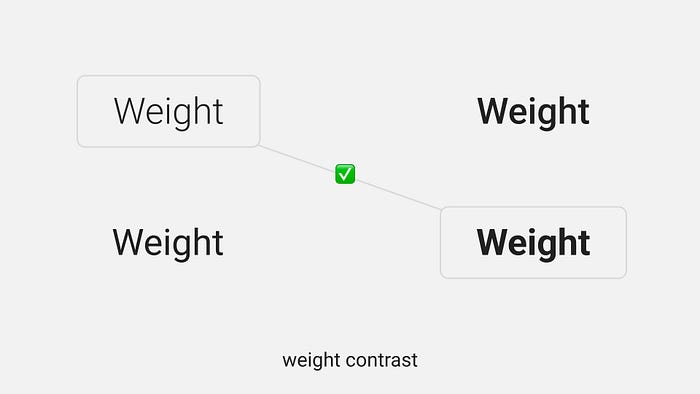
Weight Contrast
Contrasting the thickness or weight of typefaces in a composition adds visual interest. It enhances the distinction between different levels of information. Consider transitioning from lighter to bolder options or medium to extra bold when changing font weights. Subtle weight changes go unnoticed by the audience, so opt for noticeable differences.
Utilize bold or heavy weights for headlines and important text. In contrast, lighter weights work well for body text or less prominent elements. By leveraging these weight contrasts, you establish a clear hierarchy and ensure that your design captures attention and communicates effectively.
Applying these basics will make typography a powerful tool and enhance your designs’ aesthetics and communication.