The Basics: Proximity Principle
UI design is significantly influenced by the Gestalt principles of grouping, a fundamental set of laws and guidelines many designers rely on to create effective interfaces.
The term “Gestalt,” meaning “shape” or “form” in German, originated in the early 20th century. Developed by Gestalt psychologists, these principles explain how people visually group elements. The five key categories — Proximity, Similarity, Continuity, Closure, and Common Region — impact UI design by affecting user perception and interaction.
This article will focus on the Proximity principle, which is essential in UI design.
Proximity
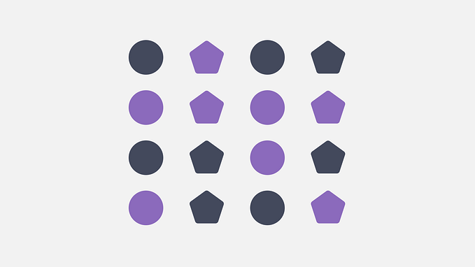
The principle of proximity says that objects close to each other are often seen as a group.
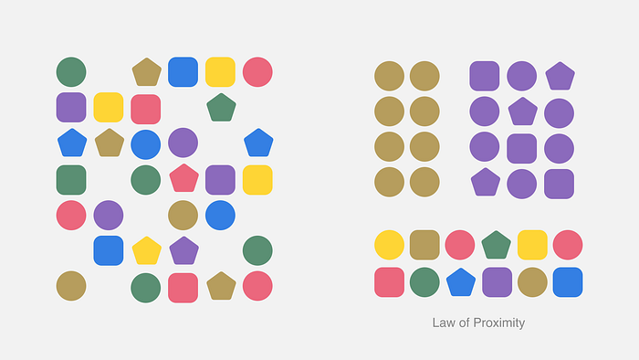
Even if the shapes and sizes differ, their closeness can make the viewer see them as part of a pattern.
In Photography

Take a look at the images of the penguins above. Both pictures feature two penguins, but in the left image, their closeness creates a connection between them.
In Typography
Grouping related information by their closeness is common in writing. Sentences form paragraphs, with spaces above and below.
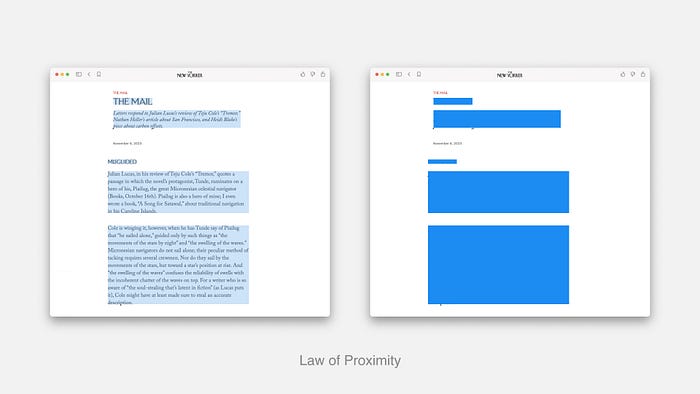
Well-designed headings also use space to indicate related paragraphs, with the text in that section being closer to the heading than to the previous section.
In Graphic Design
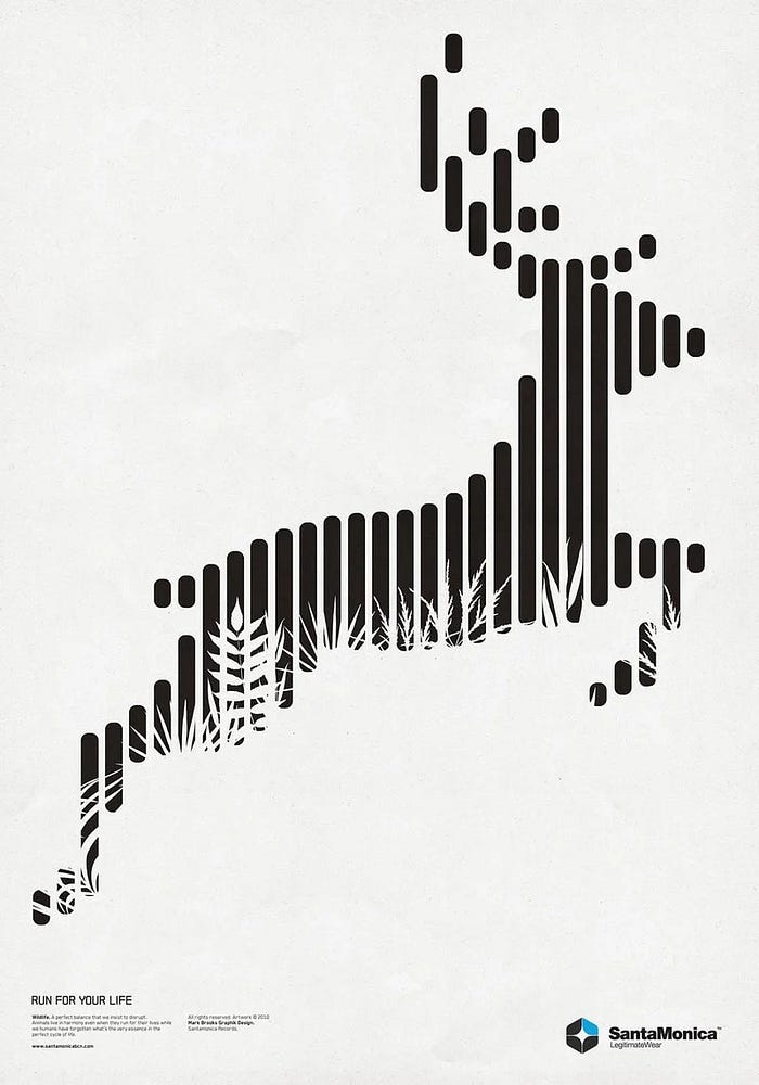
In the example below, our mind perceives the adjacent vertical bars as combining to create a singular image of a deer.
In Interface
When related fields are grouped together, it makes the form easier to read and less intimidating for users. This clear organization helps users quickly find what they need and improves their overall experience.
For example, a single form with 11 fields may seem overwhelming, while a form split into three sections feels simpler.
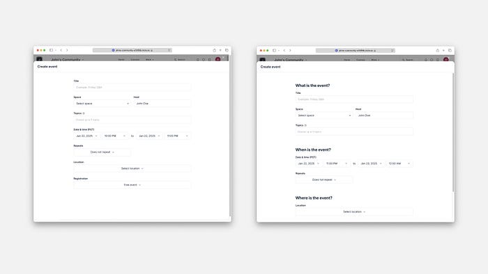
This clear organization encourages efficient scanning and improves the overall user experience.
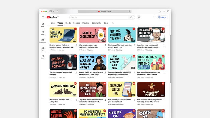
On YouTube, each thumbnail image is close to its title and details. This visual setup helps our brains see these parts as a single unit, making them stand out from other content.
When It Goes Wrong
Aurora Harley shows how mixing unrelated items can confuse users. On the California EDD website, the “Add” button for listing employer information is located among unrelated buttons like “Next,” “Save as Draft,” and “Cancel.”
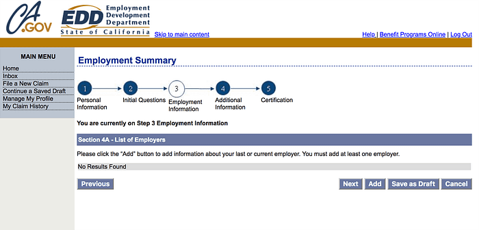
When users look at the page, they might focus only on one button and make wrong assumptions about the others. Instead, placing the “Previous” and “Next” buttons together would make it easier for users, as these buttons are related to each other.
Daria Krasovskaya shows that using Gestalt principles alone does not ensure a good user experience. Like many things in life, there are both good and bad sides to consider.
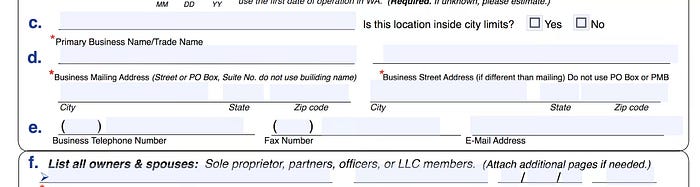
In this case, the principle of proximity helps design a form that guides users on what information to enter in each section. However, placing the elements too close together can also make it hard for users to read and complete the form effectively.
The proximity principle of Gestalt is key to effective design. It helps users quickly see how elements relate to each other through careful spacing and organization. By using this principle, designers can make interfaces that are easy to understand and navigate. However, proximity is just one aspect of design. Other Gestalt principles, like similarity, closure, and continuity, are also important for creating positive user experiences.