The Daily UX Writing Challenge
Back in my school days, English grammar was definitely not a subject I was fascinated about. In fact I hated it.
As I dove deep in the ocean called UX, I realized that just designing beautiful UI screens is only the shallow part of it. Being able to compliment the UI screens with meaningful words is a very crucial part of any development process. For someone who had detested grammar in school days, it came back in my mid twenties to bite me in the…..Let’s say it came back to hug me. Thanks to websites and apps that have bad copies, UX writing eventually grew on me.
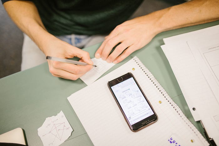
https://dailyuxwriting.com is a great way to kick start your UX writing journey. This a series of UX writing prompts spread over 15 days mailed directly to your inbox. It did take me a lot more than just 15 days to complete it and here is a peep into my thought process during the challenge.
Challenge 01 — Flight Cancelled

Thought process
Here, I wanted to be as straight as possible because it is definitely not a pleasant feeling to have a last leg flight cancelled. Although I took the liberty of making up for the loss by offering a free meal, I didn’t want to play around with words and try to sugar coat things to make them feel better.
I did make it a point to be specific about the cancellation reason and the flight number. The very obvious thing that the passenger would want to know next is how to go about the situation. So, the CTA for the pop-up had to lead them to the helpline. Showing a list of upcoming flights and allowing them to transfer the ticket without leaving the app was something I thought from the airlines POV for customer retention.
Challenge 02 — Sports app ad
Thought process
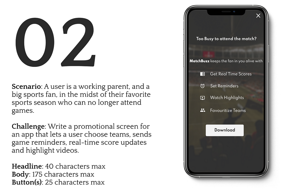
The main intention of this promo would be to garner the user’s attention and get them to download the app. So, I started the process backwards and CTA had to be a link to download. Now, the reason for them to download — bullet points was the best way forward except that I replaced the bullets with relevant icons. Attention span of the user is very low and I didn’t want the promo to be text heavy, that’s where the icons helped.
I had to grab the user’s attention. The persona being that of a working parent, them being busy was a given. And when I ask the obvious question in the headline, an affirmative answer will make their eyes roll down and I can get them to read the app’s selling points. With that, I complete the cycle.
Challenge 03 — Forgot Email

Thought Process
Forgot Email is a very common flow which almost every application has. This task has 2 parts. One, letting the user know that the entered email ID is wrong. Two, to give them a way out of it.
Instead of telling the user that the they have typed in the wrong email ID, I wanted the app to take the blame and let user know that such an email ID doesn’t exist in the database. Coming to the second part of the task, the user either doesn’t have an account or has forgotten or entered the wrong email ID. Each of these scenarios have their own flows in the app and trigger point for the flows had to be present in the same page . Hence the CTA and a secondary button.
Challenge 04 — Subscription promo

Thought Process
In my opinion, this task had to be dealt with care. Reason being the user is in the grocery store and the promo is about home delivery subscription. So the challenge here was to make sure that the store is not asking them to leave but make them aware of the delivery service and the offer that is available.
I made sure that the body or the headline of the ad did not contain words like ‘Why come to the store when we deliver it?’ . That’s a great way to advertise the delivery service offer but I did not want to demerit the effort put by the user to come to the store. The other annoying thing about such in app ad popups is the nano sized ‘X’ at the top right of corner to close it. Keeping my personal experience in mind, a ‘Remind me later’ option was placed adjacent to the primary button.
Challenge 05 — App crash and recovery
Thought Process
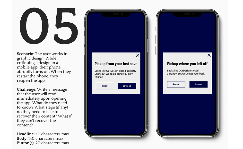
I came up with two copies for this challenge and couldn’t zero in on one. I have showcased both them above and here’s the rationale :-
There are going to be versions of the saved file and the app can only take the user back to the last saved version. Or the app’s auto save option is very powerful and the user can resume from where he left off before the crash.
Both the approaches are based more on the technicality rather than a better copy.
Challenge 06 — Road block
Thought Process
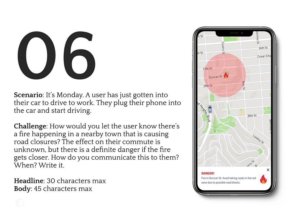
Here, the first goal was to gain the user’s attention asap. Red. The color of danger had to be used prominently to make an impact. Since only the place of the actual danger zone was known, I did not want to commit to suggesting an alternate route during an emergency.
Challenge 07 — Score update
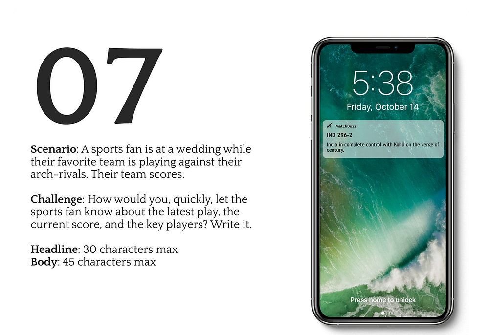
Thought Process
Here in India, cricket is a religion and cricketers are worshiped. If there’s an ongoing match which I am unable to see, I’d definitely keep up with the scores.
Push notification is undoubtedly the best way to grab the user’s attention even without them having to unlock their phone. So, my header here had to be the score. There will be a lot happening on the field that a sport fanatic might be interested in. Considering the scenario that the user is in, a one liner that describes the latest happening along with the score would be a good copy.
Challenge 08 — Concert Ticket
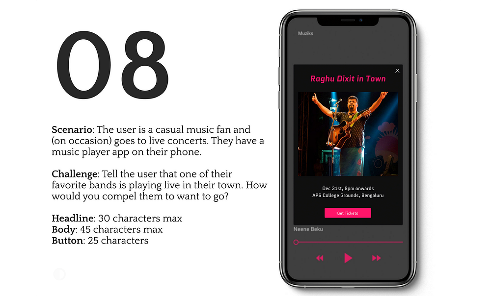
Thought Process
In my opinion, the best time to get a user to buy tickets is when he/she is in the app listening to music. So, a banner during their play time is what I thought.
Coming to the content of the banner, a high quality image from the artist’s recent concert piques the user’s interest. I added more information like time and location of the concert. Not being sure about whether the concert is free or paid, I chose not to use the word buy. I made use of Get Tickets instead.
Challenge 09 — Credit card expiry

Thought Process
Credit Card details usually comes in the final stages of purchasing. Every E-commerce organization’s biggest fear is cart abandoning by users. Providing an easy way out of this flow was the crux of this challenge.
Updating the existing details of the card, adding a new card and asking the user to try a different payment mode were some the possible way outs I could think of.
Challenge 10 — More Info
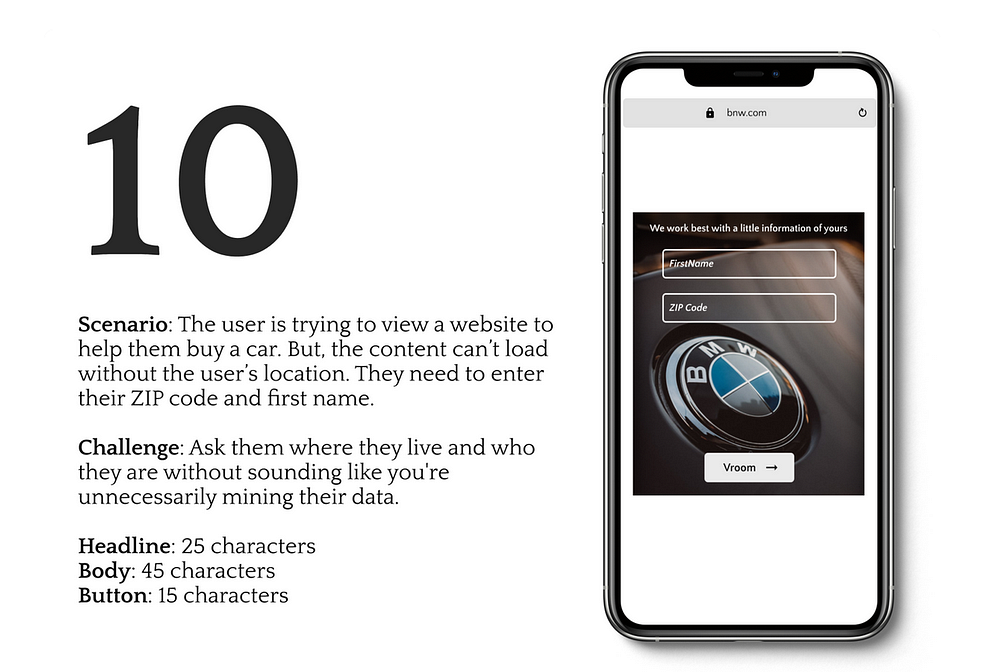
Thought Process
Probably every customer who visits the car’s website is considered a prospect. That is the only reason I could think of as to why the first name is required. Since the website is a global template, entering ZIP code would probably show location specific information.
No user would actually be willing to share their details upfront without taking a look at the website first. So, asking for such sensitive information without knowing the real motive of the company (in this challenge) was something that deserved some thinking. After pondering for a while, I decided to hit the middle ground without having to reveal the exact reason for such an ask whilst being polite about it. I made sure not to use words like Mandatory, Required, Necessary, Compulsory. In the pop-up designed above, you can notice that there is no cancel button or a cross-mark to close it. So, it acted like a dead-end indicating that the fields are required to go ahead. Just to add a bit of brand representation, I named the button text as ‘Vroom’ instead of Proceed or Next or Submit.
Challenge 11 — Meta Description

Thought Process
Meta description is the text you see under the URLs when you do a Google search. I too had no idea about this until I came across this challenge.
Here, I had to think from the company’s SEO and sales conversion (expected from the website) perspective. The one click that brings the users from a search engine’s results to the company’s website is most important in my opinion. Considering the limitations of the meta description title, I had to squeeze in the most important services and for this I obviously could not go with sentences as users scan through this page. The meta description in itself had a character limit of 160. I made sure users get almost all information that they see on the website’s landing page or the special service that is being offered now. My intention was to get them to click on the link without having any queries for more information and book the lenses.
Challenge 12 — Error Message
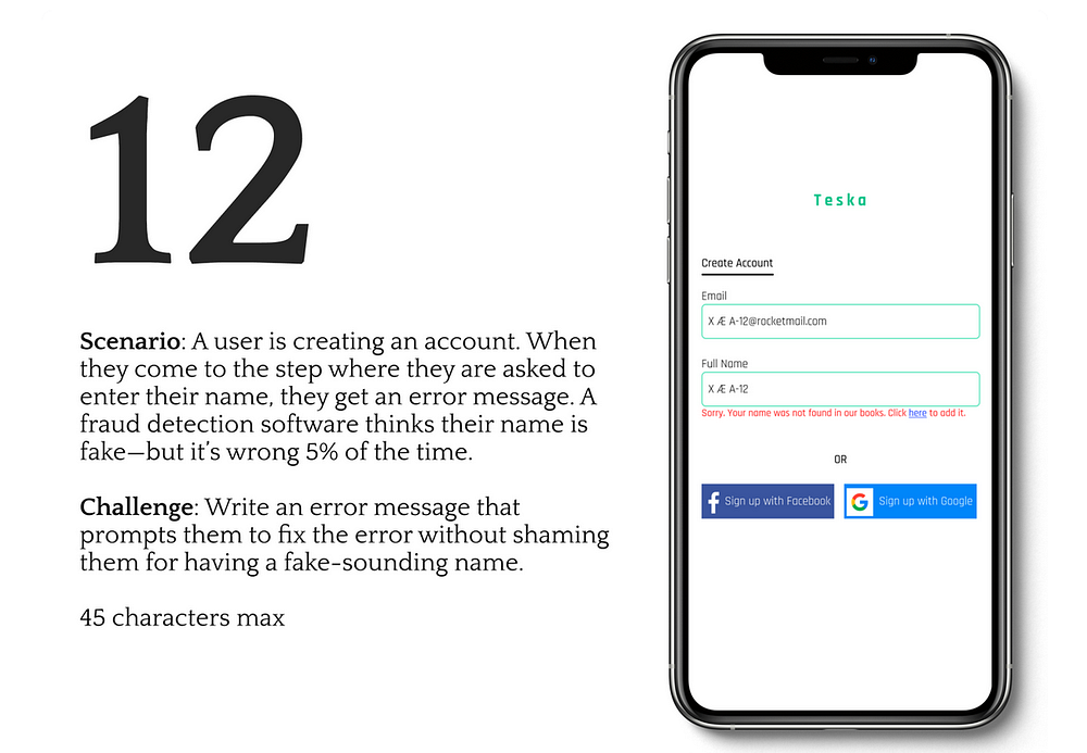
Thought Process
The name that occurred to me when I read about this challenge was X Æ A-12 — Elon Musk’s son. I am positive no database in the world will have such a name and every fraud detector would think it is fake.
This is the best use case scenario for this challenge. I used the principle mentioned in challenge 03. Instead of telling the user that their name is fake, let us take the blame. I did provide an option to add the name so that it registers in the back-end database. And here again, I did not use technical words like database or back-end. Giving the option of signing in from Google or Facebook was also one of the way out.
Challenge 13 — Fuel dilemma

Thought Process
Not many challenges here gave me the option to play with words. Here, I saw an opportunity and put in a quirky one liner along with buttons in the notification itself to Stay on Route or Fuel Up. Standard design conventions like notification header in red color to grab the user’s attention and adding an icon to give a visual cue were taken care of.
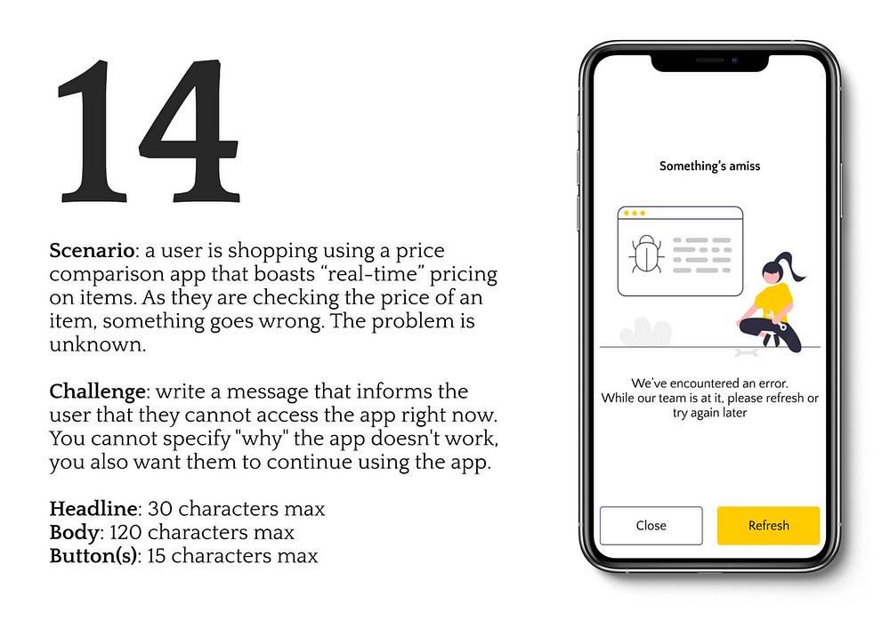
Challenge 14 — Generic error template
Thought Process
I believe this is going to be a generic template that the developers would like to use when something breaks. Without getting into the details, I let the users know that something was broken.
Making sure they stay on the app was one more task. Placing a refresh button was the solution I could think of. If something doesn’t work, people usually turn it off and turn it back on. When on website, they pull down and refresh. I wanted them to do the same here and keep them on the app if the break was a quick fix.
Challenge 15 — On-boarding experience

Thought Process
Starting off with the name of the app — I combined two words — Bill and List. An that keeps a list of your bills to be paid on time automatically. For splash screen — a subtle caption was needed to express the app’s identity and brand. Since its functionality is to pay bills on time without any human intervention, your billing partner sounded right to me.
Onto the second screen, I had to compliment the illustration with the right words. If the illustration depicted the list of bills it would keep track of, the words had to explain what will be done with it.
Scrolling down, I planned on representing how easy it was to set up the app and profile. Emphasizing on numbers, I was letting the user know that it is a 3- step process. Visual cue like a link/chain/sequence helped. A button to get them started was the end of the on-boarding screens. The user should have the ability to skip the on-boarding screen and that was included too.
Takeaway
I now have a better sense of what words need to be used when and where while designing toast messages, pop-ups, success and failure messages keeping in mind the situation the given persona is in.
I strongly believe designers should equip themselves with this skill and put an end to Lorem-ipsum texts because design needs to revolve around content and not the other way round. Designs can be beautiful but just imagine what users will have to go through if the right message is not conveyed at the right time. Well, after-all Writing is designing.

