The Do’s and Don’ts of UX Design

Design, in any form, can be an onus with multiple things to consider when creating the design. Design can be overwhelming for the designers as well as the users if the to-do list is not obeyed in lines to the problem statement.
To simplify the task, I’m listing down the basic, yet the very quintessential highly practical tips on what you should do and what you shouldn’t when designing the experience for your digital platform.

THE DO’s
1. Understanding Your Users

User Experience (UX) relates to having a deep understanding of users, what they need, what they value, their abilities, and also their limitations. User experience encompasses all aspects of the end user’s interaction with the company, its services, and its products. If you start designing before understanding the foreground and background of your users, their business model, the organic users, and their users’ behavior, motivations, goals, it is leading you nowhere:/
2. Responsive UX

Gone are the days of ‘mobile-friendly’ websites. In the rapidly expanding design business, it is quintessential to be Device Agnostic. It is no longer going to be a choice for businesses to design the UX for single platforms. Responsive UX is inevitable for businesses that want to succeed in the digital experiences race. The aim for UX Design in 2019 should be to deliver a seamless experience irrespective of the device it is being delivered for.
3. Single Locus of Attention
The digital age has a lot to offer to the users and the digital platform's creators often tend to incorporate a TOO much of information and points of attraction on a single screen. Contrary to that, design a screen that serves only one problem statement. Including more features without cluttering the viability is optimum. Design screens that your users are able to clearly figure out the flow on the app/website with a single point of focus.
4. Prioritize Features
“Features increase app sales”
A deadly misconception that employing more number of features can improve sales. Designers are often forced to add features even if the design is already over-loaded!! This can be somewhat overwhelming for new/ first-time users. For a design to be successful, try to have a focused limited set of features which are solving your major problem statement. Therefore, it is vital to prioritize what is important.
5. Clear the Clutter
Excess of anything is bad. And therefore, the emphasis must be laid on delivering the core objectives of the digital platform through an orderly, mess-free design:P The functionalities must be the features most important for the platforms’ proper functioning with a simplistic UX. Enlighten your users with easy navigation. The information must be in such a way that it requires a minimum number of steps to reach the destination.
THE DON’Ts
Quick content loading, legible typefaces, simple and minimalistic designs, theme-based color palettes, and some others to add are points every UX Designer takes care of these days. It’s time we move over designing screens and come to designing good user experiences.
1. Filling screens with irrelevant information
In the hectic human lives today, when even the breakfast is ON-THE-GO, the users are always in a hurry. They expect everything to be explicitly stated without wasting their time and energy. Giving irrelevant information will only frustrate them.
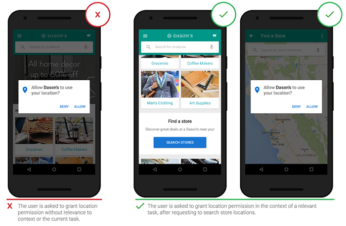
2. Asking Permission right at the start
Quite often as we just launch a just-downloaded app, there’s a shower of app permissions (e.g. “Allow app X to use your location?”). Unless we’ve used the app and become well-aware of the app environment, how do you give the permissions? This is sure to make the users hostile. Users often deny such permissions requests because, at the very beginning, the users don’t have any context to make a decision. They don’t know why your app needs those permissions.
To mitigate such behavior, it’s better to ask for permissions in context and communicate the value the access will provide. Users are more likely to grant permissions if asked during a relevant task. Request permissions at launch only when it’s absolutely necessary for the core app UX.
3. Don’t Use Too Many Gestures
A common practice amongst the majority of the mobile app designers: Avoid using personalized gestures as a primary way of interacting with the app. This limits the user interaction with the app. Sometimes these gestures can be the supporting mechanism for the mobile app. However, it is best to avoid too many gestures and stick to the standard ones, as standardization is the key to a good UX of the app. The mobile user needs to see standard symbols and controls for the common actions to be able to recognize them easily.
4. Say NO to Dead End Pages

UX is all about user flow; their interactions with every individual screen. A dead-end on the app/website is the biggest turn-off for a user. Dead ends act as blockers for user flow: they create confusion and lead to additional, often unnecessary actions.
What To Do? Just Get Them Movin’ 😄
5. Avoid Using Jargon
It’s all about making the users comfortable in their own skin. Unnecessary use of jargon to make it look oh-so-fancy can lead to the user not understanding what the app is trying to convey. The prime goal: the user must be comfortable with the language and the words used on the screen. The app must have only standard words that do not increase the cognitive load for the user. The UX free from jargon is obvious to look more appealing to the users, therefore.
Now, the next time you design user experiences, you know what to do and what not to!