Member-only story
The Google Homepage UI Story
Google’s Homepage has evolved a lot in the last 22 years. Let’s have a look at how its Interface has changed.
All images have been taken from waybackmachine.com.
1998

The Homepage in 1998 looks very crisp and neat. There are boxes and sections, typically created using the bare minimum HTML code. The buttons are normal buttons you any frontend newbie can create today. Notice the Stanford search and the monthly updates subscription button.
There’s the exclamation after Google(Yahoo had one as well). Overall, it is not as comfortable to be used as compared to today's’ version. A lot of links made it confusing.
2000
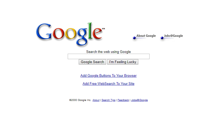
Not many changes there. The logo has changed. The exclamation mark is gone now. The not so important links — about us, company info, etc.have been made less significant and eye-catching. It has a Service Mark as well this time.
2001

We see the introduction of new features, Google Advertisements — now AdWords, Google Groups, and Web directory. They still brag about the number of pages the user can search through. The Trademark has made its way to the top right of the logo now.
2002

Let’s welcome Google Images and Google News this time. Still, a lot of options for a first time user. And not to forget the subtle “We search 2.47 billion pages” brag.
The buttons still look the same. There has been no major change in the graphics, to be honest. The features have changed; the position of buttons has changed while the overall look stays the same.