Case Study: The Importance of Paper Prototyping

Overview
Client: New York Cares — Team-Size: Four members. — Time-line: 11 days
My Role: UX Designer/ Researcher.
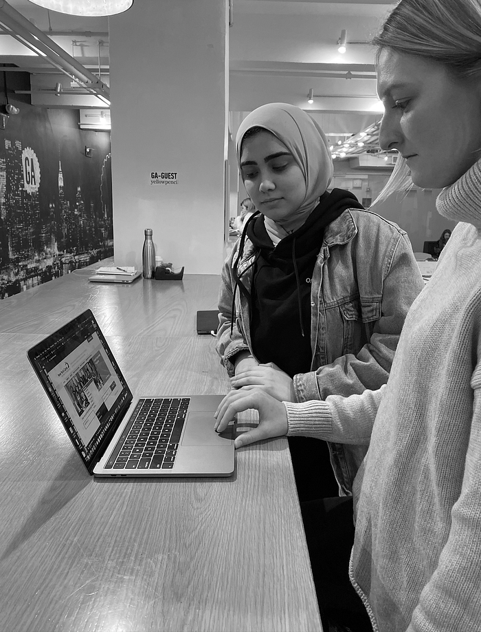
My team and I were hired by New York Cares to review and identify existing usability issues. We had eleven days to evaluate the site, research the problem space, conduct research, ideate solutions, and test these solutions. I speak about the experiences in identifying these issues, the challenges of working in teams, and the best methods to help manage these team conflicts. I also shed some light on the importance of paper-prototyping and its significance to this project.
About New York Cares:
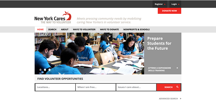
New York Cares is a non-profit organization focused on volunteer management. The organization helps take action against social issues in New York City; they offer a variety of different volunteering opportunities and help match these opportunities with potential volunteers.
1. Research
To approach this project from the right perspective, we needed to conduct research, just like any UX process. We wanted to focus our research on users who were living in the tri-state area, or have used a volunteering site in the last six months to sign up for a volunteering opportunity. To gather these specific users, we conducted a screener survey. The screener survey’s objective was to narrow down users to focus only on the target user-group, whether it was a NY Cares website or a competitor’s site. We still considered non-NY Cares volunteers, as they still gave insights on the goals they wanted to accomplish from a volunteering site. The screener survey was our funnel to get to our target users.
We wanted to focus our research on users who were living in the tri-state area or have used volunteering sites in the last six months to sign up for a volunteering opportunity. To gather these specific users, we conducted a screener survey. The screener survey’s objective was to narrow down users to focus only on the target user-group, whether it was a NY Cares website or a competitor’s site. We still considered non-NY Cares volunteers, as they still gave insights on the goals they wanted to accomplish from a volunteering site. The screener survey was our funnel to get to our target users.
We interviewed four users; two of the users were NY Cares volunteer users and were familiar with the site. The other two were volunteers from other competitor sites. Since my team consisted of four members, we each interviewed a user.
We asked non-leading questions like:
Can you walk me through the process of signing up?
Which website did you use? Was it through mobile or desktop?
How was your experience with navigating the website?
On a scale of 1–5, how easy was it to find what you needed from that website and why?
These questions helped us gain insights about the problem space and what issues to tackle and dig deeper into, we synthesize and make sense of our data gathered in research in the next phase.
2. Synthesis

We ran into our first conflict that affected our collaboration as a team. Two team members worked on the synthesis of data collaboratively in-person, and the other two were unable to join us due to outside commitments. We had complications between our schedules and deciding when to meet and work collaboratively. This resulted in our team not being on the same page and being less involved in this particular phase of the process. I noticed that the sense of mutual commitment to the project was in question, and team members didn’t communicate how that made them feel as an individual. Since this disagreement, we have been communicating via Slack to let each other know about any unexpected events that may alter our focus to the project. The team was ready to move forward with the synthesizing the data.
We had all our user’s interviews transcribed and digitalized which helped in synthesizing our data. We did this by writing observations with a sharpie on a post-it, each post-it color represented a user, and it could only be one observation per one post-it. This synthesis process is called “Affinity Mapping.” We kept writing down observations until common groupings between post-its emerged. Since it was only two of four working on it, we decided to digitalize this affinity map via Miro. (https://miro.com/)
After digitalizing our affinity map, The entire team was able to assist in forming the rest of the groupings. I learned that Affinity Mapping is best done with groups since it helps initiates brainstorming. “Miro” was also a free intuitive collaborative tool that can be accessed online with an invitation.

Under each grouping, there is an “I” statement. These “I” statement help humanize the data gathered and help you think of it in a more humanized way. It also helps with the next phase, which is the creation of the persona.
We had valuable learning in this phase, and it’s about the importance of planning and communication. Communication is a lot harder than it sounds, it’s a process, not just an action.

Keeping the synthesis in mind, as well as the user research we were able to form Alex. A representation of the problem in human form, she is a student from Queens. She wants more fieldwork and less paperwork, As well as she needs a streamlined volunteer sign-up process. We put our shoes in Alex and walked a mile in her shoes to be able to understand her journey and what she goes through.

We needed to understand Alex’s journey to be able to achieve her goals and needs, we luckily were able to create her collaboratively using “Miro”.
The end goal of creating journey maps was to solve Alex’s pain points and understand what the problem is from her point of view as a user. We decided to focus on the sign-up process since this is the point where Alex gets frustrated and is ready to give up. From there we created the problem statement we want to solve.
When volunteers select an event, they are required to sign up and go through an orientation process.
Alex wants less paper work and more field time, but finds the processes out-of-date and time consuming.
How might we help her have a streamlined volunteer process based on her preferences?
To begin solving this problem we conducted usability testing on the NY Cares site. We wanted to take a closer look at why the problem exists and dig into it more. We conducted usability testing on five participants who have used New York Cares to volunteer in the past. As well as users who have never visited a New York Cares website. We wanted a diversity of data to be able to asses from the view of current volunteers, As well as potential volunteers.
The takeaways we took from the usability testing was:
- Users appeared confused about the sign-up process, especially when they had to sign up for an orientation to be able to volunteer. They felt that the website was not informative and didn’t communicate that from the beginning.
- Users took multiple searches to find volunteer opportunities that match their preferences, that’s because every time they searched they would be redirected to a “no results page”, which made them go back and forth to reset preferences.
Based on these takeaways and problems we defined, we took these problems into the ideation phase.
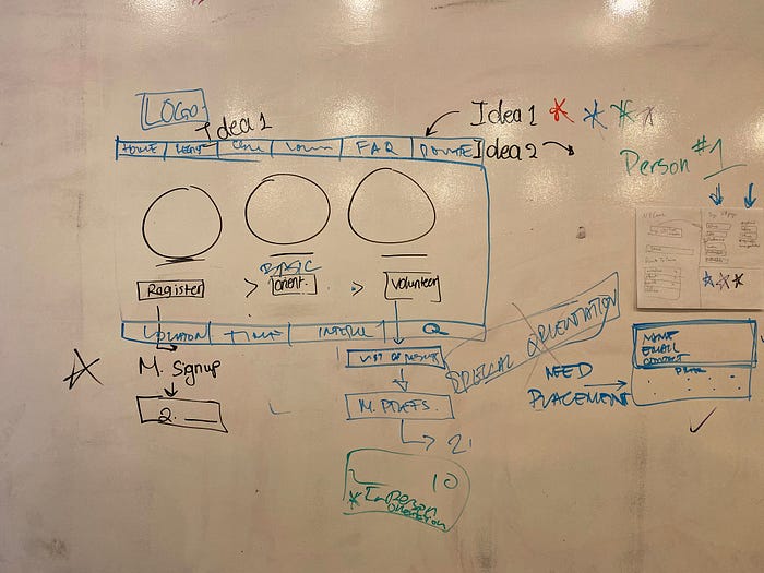
3. Ideate
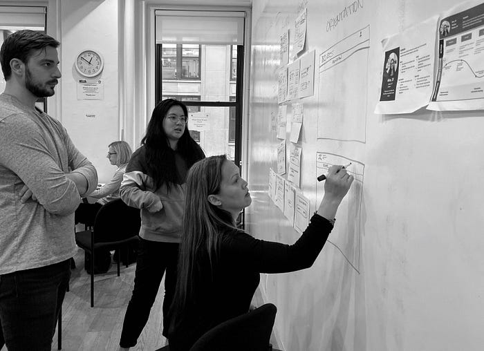
A pencil and paper are all you need to come up with the next big solution. We conducted a 45-minute design studio. A design studio is sketching out ideas in silence for five minutes, then speaking about each idea in one minute to your team members. Followed by a three-minutes critique in total from your team members, then refining those ideas into one solution based on your team’s ideas, as well as the critique received.
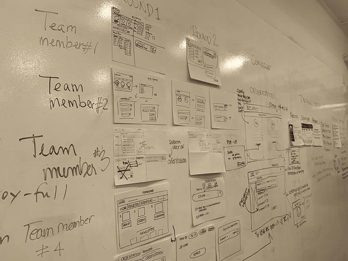
The design studio was the most challenging design task for us as a team. There was a lot of tension and frustration, each member advocating for their idea aggressively, forgetting what matters, which is the problem statement, the persona, and the data. That’s why it’s essential to have the persona, the problem statement, and the journey map printed and seen by all team-member to keep the focus on the data rather than personal opinions. There was a lot of miscommunication and no intentions to communicate. It was like as if communication was an ego buster, so team-members bottled things within.
Time played an important factor in this part because there was no time for arguments and tensions. There was no time for unnecessary or extra talking; we were on a time crunch. Since there was no team-leader to make final decisions, we had to vote on the ideas we wanted to move forward with to Mid-Fidelity and even voting was challenging since everyone wanted to agree on a design to move forward with. Group facilitation techniques like time-boxing, parking, and voting were hard to enforce at this point. The team was not on the same page, and it just became just energy-draining, as we passed the 45 minutes.
We conducted two of these design studios. My team wanted to figure everything from the solution from the first design studio. In the second design studio, we spent it in refining the layout of the sketch we choose to move forward with rather than testing it on a paper-prototype. Recalling back, I think that’s where we went wrong, and I wish I advocated more for this rather than some design.
We thought since we wasted a lot of time in the Design Studio 1, and went above the 45- minutes; Paper-prototype was just an extra step to do when we can just make it visually acceptable to usability testing in Mid-Fidelity. Taking the role of a UX Designer, you often forget that it’s never about you, it’s always about the user.
Overcoming Design Studio Challenges:
- If there is no assigned team-leader, try to step up and become a leader for your team. You don’t have to verbally say “ I am your team-leader” rather show your team actions and help them. After all, what you and your team members have in common is the goal.
I tried to follow up with each team-member via Slack and get to break the ice, to see if they needed help with a software or having problem in general.
2. Always gather your team before you start any work and talk about your feelings. A venting session about How they are feeling about the project?, What are their thoughts?, Comments?
After finishing the design studio and moving to the next phase, I gathered my team to talk about our feelings; I called it, “Feelings check.” Everyone started with small words and repeated the world fine repeatedly. I started to vent out and talk about how I felt about the design studio and my team member’s behaviors. This made other team members talk honestly, and accept constructive feedback from each other. This reveals more than you think.
3. If there is a morning check-in, end it with an end of day check-in. End of day is a summary of what you guys did as a team, discussing energy levels, the goals you have set were they achieved? As well this is an opportunity to check if everyone is on the same page.
The morning feeling checks, as well as end-of-day check, helped reveal that a team member misunderstood a sketch in the design studio, and based an entirely different scenario because there was not enough context given. This was a mistake from us as a team.
4. Have lunch together as a team, this goes a long way and help give your team the dynamic they need.
3. Design
As mentioned before, we dived into the Mid-fidelty without testing it on paper-prototype. We addressed the following issues.
- Site being more informative about sign-up process.
- A more seamless search function.
- A direct orientation process
We added a step-by-step guide to the volunteer sign up process for clarity and called it the “How to Volunteer” feature; added the main steps to volunteer like Register, Orientation, and Volunteer to the primary navigation bar for ease of access.
We added a preview feature for the Search bar to preview the volunteering event as you are typing them based on availability and color coded it. Green means available, gray means unavailable.
New York cares requires potential volunteers to attend an orientation session before volunteering. The user won’t be able to sign up for a volunteer opportunity until they create an account and attend an orientation. We wanted to present the users with their orientation options, an online one and an in-person one.
How we thought our sign-up process was going to be vs. how it actually went.
“How to volunteer” feature:
1/5 users completed the sign up successfully, most users didn’t even know what they were signing up for and the majority of them went straight to volunteer, although the steps were listed. This revealed that the sign-up process was still unclear and that users wanted the freedom to look at volunteer events before committing to the rest of the process.
“Search preview” feature:
5/5 users successfully used filters to search for volunteer events based on preferences and completed their search from one try.
“Orientation” Page:
5/5 users were confused when landing on this page, and they didn’t know whether they signed up for an orientation. They thought it was just one big blob of one type of orientation.
We took these failures as well as the successes and iterated them in High-Fidelity, but before doing so we learned from our mistakes and tested them first on paper-prototype.
4. Deliver
Based on the user’s feedback and usability testing, we removed the call to action buttons on the “How to Volunteer” feature as well as organized the orientation page to match the home page to provide consistency.
Based on the user’s feedback and usability testing, we removed the call to action buttons on the “How to Volunteer” feature as well as organized the orientation page to match the home page to provide consistency. When we tested it on paper, we noticed that some of the users didn’t understand why they were getting redirected when they signed up for a volunteering event without the site providing them any feedback.
We found that pop-ups would be the ideal solution to give the context needed to the user. We tested it out on paper-prototype and 4/4 were able to successfully complete their tasks.

A walk through of the Hi-Fidelity prototype
Testing the high-fidelity we have learned that 3/3 users were able to sign up for a volunteer event successfully. There was some feedback provided from users like the similarity between pop-ups, and they want to be given more information about the volunteering even before committing to it.
Since we were re-designing a responsive website, we created a Secondary BreakPoint. Where some of the website’s layout and content were changed. It was important to prioritize the features that were needed for a user to achieve their goal.


Next Steps
- While users found the pop-up feature very useful for saving time on navigating the site, we can further improve differentiation between pop-ups on the site to make sure users know whether they signed up for a volunteer event, registered a new account, or orientation.
- Consider adding a map feature to the site so users can know how far they are from the event, as well as locate events near them by using “current location.”
- When the user clicks on the opportunity they are interested in they can continue to do their volunteer requirement from a single sign up for both orientation and account. After they complete the sign-up process, they can then be confirmed for signing up for the event they initially chose.
- Conduct further usability testing to test these new changes.
Personal Learnings
- Team building activities are not things to be taken lightly.
- Always talk with your team about how you feel about them using the sandwich feedback method, whether its 1:1 or with the team.
- Try having lunch together and hold off talking about the project until after lunch. Lunch is a way to get to know the person you are working with beyond design decisions.
- This is the most important learning for me personally. It is to have Morning and End of day “feeling’s check”, to summarize and keep the team in the loop.

