The Indian Postal Service
For more than 150 years, the Indian Postal Service has helped the country to engage in communication and social-economic development. It has succeeded in touching the lives of people across the country from delivering mails to accepting deposits and providing retail services like bill collection, sale of forms, etc.
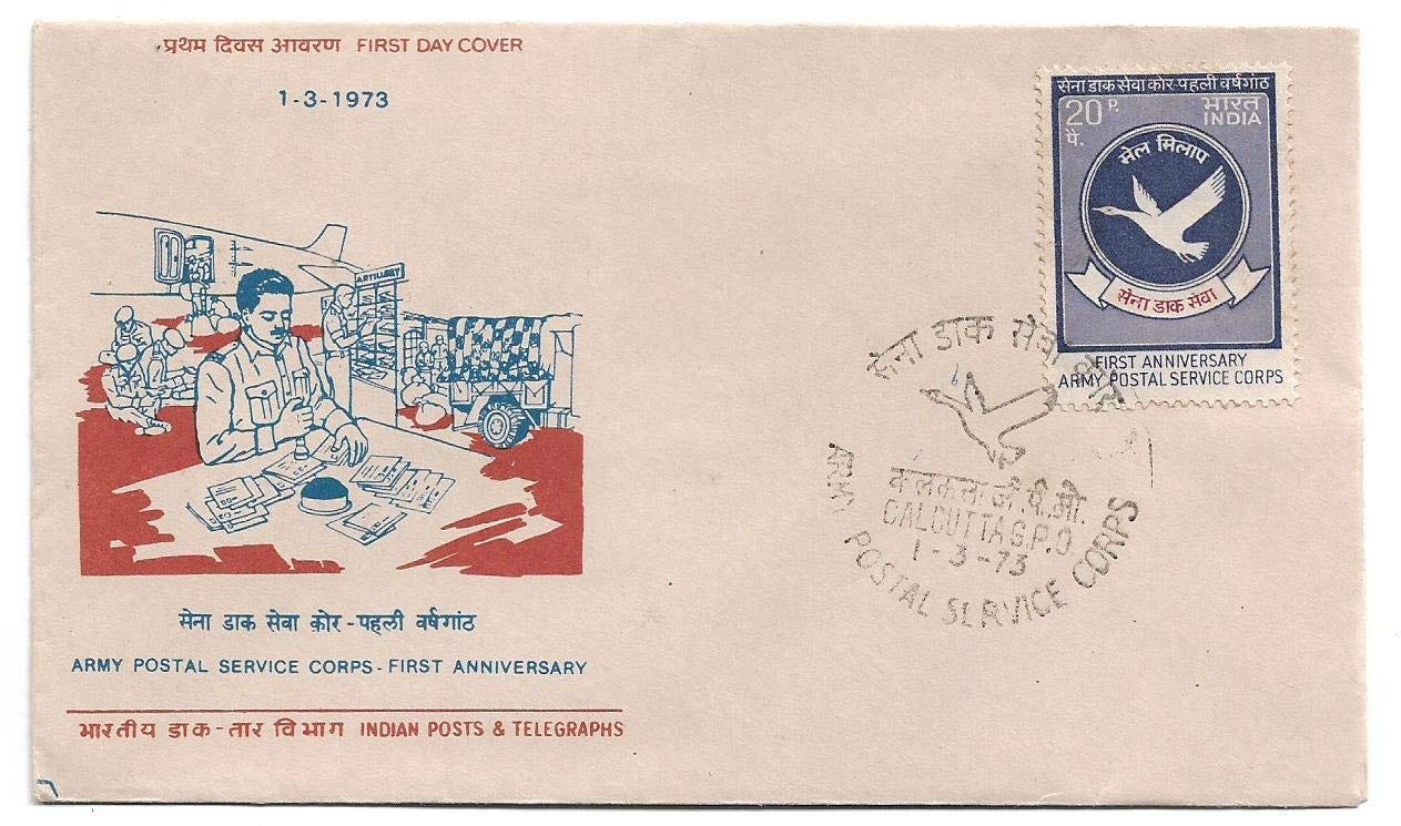
We’ve heard stories of 10 paisa postcards and yellow envelopes, about money orders being received by working people, farmers and parents. And we certainly remember the significance letters hold, soldiers in glacier receiving letters from their wives and children, reading words of love and wait, daily happenings and news, it would bring a smile to their faces and would keep them strong. And lastly, telegraphs remember that?
The Indian Postal Service is what we decided to work on keeping the history and relevance in mind. Here is what we learned, decided and performed.
WHY DID WE CHOOSE THIS?
While working on any project the first question we face is why do it?
Indian postal service has been an integral part of our county since 1854, that is a long time. It has a history, this has gone through the toughest times in the county. Nothing has stopped it from assisting the coming ages and the new evolving techniques. Today the Indian Postal Service is one of the best postal services in the public sector that stands unmoved around its competitors. We know how dedicated it has been, but, how efficient and popular is it now? With everything going online and people making decisions based on online presence and utility, the Indian Postal Service doesn’t hold a strong position in the market. There is a large chunk of people that still rely on it but what about the rest? Shouldn’t they choose the Indian postal service? Just like leading first world countries with a vast unbeatable postal service, we can learn and apply the same. With that being said, we as a team focused on the website and how we can improve it, we also realised it has a few strengths that could be amplified. The weaknesses could be turned into workable advantages.
HOW DID WE GO ABOUT THIS?
This being a team project, me and my partner did a lot of brainstorming, we gave a lot of thought to every tiny essential aspect that could either be an advantage or could help us turn it into an advantage.
We did an online survey to begin with, and recorded all the responses to find out whether people were aware of the website, what was the best thing about it, what could be changed and what do they choose for delivery and postal?
Next, we did a competitor analysis, companies such as DHL, BluDart, Delhivery, FedEx are a huge competition to the Indian Postal Service. Not only do they have a wide reach, but they also have a functional, useful, customer-friendly website. The websites all had a few things in common, they led people to their services almost immediately, they were to the point and that assisted with packaging. Since we cannot go into the packaging details yet, we decided to try our hands on the website design and a new style guide.
This is the research we did and the information we gathered, let’s take you through the whole ideation, process, wireframing and prototyping.
Vision
India Post’s products and services will be the customer’s first choice.
Mission
- To sustain its position as the largest postal network in the country touching the lives of several citizens in the country.
-To provide mail parcels, money transfer, banking, insurance and retail services with speed and reliability.
-To provide services to the customers on a value-for-money basis.
-To ensure that the employees are proud to be its main strength and serve its customers with a human touch.
- To continue to deliver social security services and to enable last-mile connectivity as a Government of India platform.
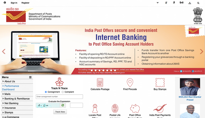
A quick view of essential items on the website
1. Ads on Postal schemes
2. Find Pin Code, Locate Post office
3. Track and trace
4. Calculate postage
5. Buy Stamps (E-Post Office)
6. News and Schemes
7. Postal life insurance
8. Postal savings
9. Helpline Number
SWOT ANALYSIS
STRENGTHS
1. The option of changing the language from English to Hindi
2. Instructions for braille postal services.
3. Right to information, users can access any kind of postal related information.
4. Frequent updates that might be relevant to postal service officials
WEAKNESS
1. Unsegregated information
2. No proper navigation flow (not user friendly )
3. The Website Redirects a lot
4. Asks for multiple sign up
5. Doesn’t gain the attention of the user
6. Does not help people find pin codes and track parcels accurately
OPPORTUNITY
- It can become the leading courier and postal service providing website if becomes user friendly. With improvements, people will be able to rely a lot more on government-provided services
- The website can be helpful and useful for people who want to work and search for jobs in postal services.
THREATS
- Being the largest postal network if the services are not good, it will lose its audience. Also, would lose on people’s trust from the government postal services.
UNDERSTANDING THE COMPETITORS
What makes our competitors better?
Services, Customer support, User friendly.
Competitors such as DHL, BluDart, FedEx and have a smarted easier website making it easier for customers to browse through services and book them as well.
They are to the point, easy and have a quick guide to services. They also have a very simple yet attractive online presence. They are very accurate in their track and trace service.
These companies have tools such as, pick up options, assistance for fragile packages, supreme packaging and containers and help for people with disabilities, special needs. Some of them also provide several languages. These brands also have a 24/7 support system to help them in case of any problem caused.
Also, many of these private services are reliable and fast in service for both international and domestic. As far as the design is concerned, all the websites work with the core colour the brand is made of such as yellow and red for DHL, Blue and green for Blue Dart etc.
CUSTOMERS / STAKEHOLDERS
- People with accounts in post offices
- People in tier-2, tier-3 cities
- Government employs
ANALYSIS
Problems: a deeper look into it,
-Doesn’t show pinches of small places
-Small text, unsegregated information.
-Needs a proper navigation flow,
-No use of grid
-Bad icons
-Stretched images and texts
-Doesn’t have a proper tracking system
-Awareness/promotion of postal service is needed
We surveyed to get a better understanding of what people feel about the website and how user friendly it is.
THINGS PEOPLE SEARCH IN A WEBSITE
1. Nearby post office
2. Finding pin codes
3. Checkout new schemes and policies
4. Postal savings
FEATURES WHICH PEOPLE SUGGESTED
1.Provision of online sending and home delivery
2. More customer friendly
3. Easy navigation
4. Secure user service
5.Easy access for senior citizen
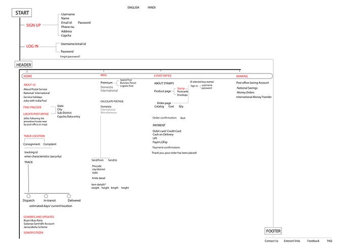
INFORMATION HIERARCHY
1. Find
-The Pincode
-Locate a nearby post office
-Track and trace
2. Schemes and updates
- KISAN VIKAS PATRA
- SUKANYA SAMRIDHI ACCOUNT
- JANSURAKSHA SCHEME
3. Language — Hindi, English
4.Sign in/log in
5. Banking and remittance
- post office savings account
- national savings
- money orders
- international money transfers
- payment PLI
6. Calculate Postage
7.E-Post
- buy online stamps, postcards, envelopes
- buy e-IPO
- buy philately products
- pay for a parcel, postage
8. Postal Holidays
This is the Navigation, this helps us arrange different items and place the right content in the right place. It’s an essential part of the website and it helps arrange menus, purposes and each page. This also helps us arrange pages and the content in it, helping us be more systematic.
Style Guide
The style guide consists of colours used, symbols, fonts, icons, buttons, logos etc. This talks about the minor details that are equally important in the making of the website.

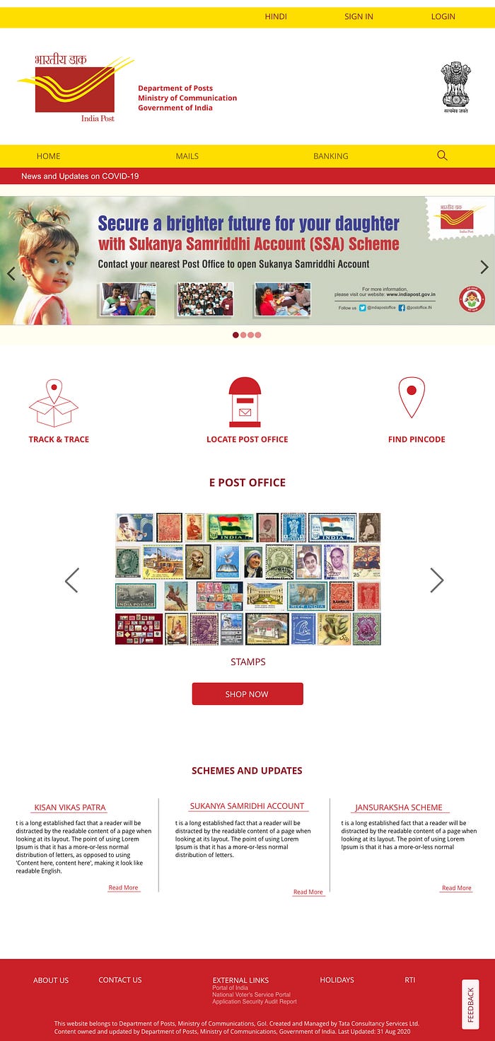
We redesigned the website (unofficially and for assignment purposes only), we made several changes and made it look a notch better than what it is. This is the Prototype,
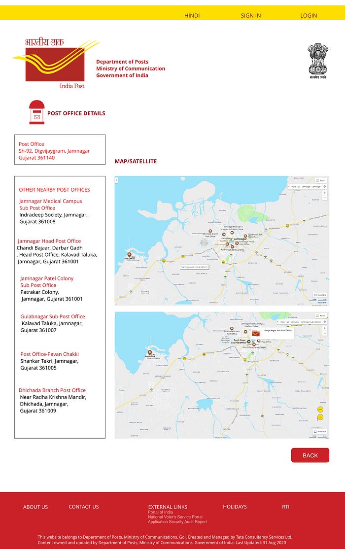
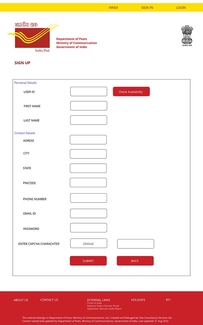

Here is the Wireframe for the website we designed.


This brings us to the end of our project, we experimented a lot with styles and designs and used the aptest ideas to create what according to us would result in a functional, easy and user-friendly website.


