
When I was an undergrad, the local pub had an Arkanoid machine. I was playing it one night, and I kept failing on the same stage towards the end of the game. For whatever reason, I decided that I was going to beat that level, no matter what happened.
I kept playing, and everything around me started to fade into the background. People came and went, but I was oblivious to it. I was so focused. When I finally beat the level, it was almost easy. It was like it was in slow motion, every move was on point. I don’t even know how much time had passed while I was playing that machine. I was in a flow state.
As first described by Mihaly Csikszentmihalyi, people are at their happiest in a state of flow, when they’re able to focus and be completely absorbed in the task at hand. Flow is one of the main reasons that people play video games, but it can happen with any activity, including work.
A friend recently asked me for some help. He wanted to know when he should use modal dialogs, and how to use them properly. A modal dialog, for anyone unfamiliar, is a user interface element that is not hidden by any other screen element, and keeps focus until the user takes an action.

It’s mostly understood in design circles that you shouldn’t use modal dialogs too often, but why exactly is that?
A big part of the reason is that modal dialogs are distracting. It’s well established in psychology that distraction hurts task performance. Remember that people can be at their happiest and most focused while in a state of flow, but you can’t reach that state if you keep getting interrupted by dialogs.
That can be very frustrating.
Here’s a concrete example. In 2009, Microsoft published a case study of their User Account Control (UAC) system. The UAC system is what managed user privileges and other security functions in Windows 7, frequently popping up a modal dialog asking the user to take action.

They wrote:
“A key metric…was the threshold of two prompts during a session (a session is the time from power up to power down, or a day, whichever is shorter). If people see more than two prompts in a session they feel that the prompts are irritating and interfering with their use of the computer.”
So, their users found that sometimes more than two prompts in a day was irritating and interfering with their work. It didn’t take a lot.
It’s not just the fact that modal dialogs can be distracting and irritating. If users see too many of them, they can become habituated. They start paying less and less attention to dialogs as they see more of them, and can start to blindly agree with whatever the modal dialog is saying. From that same UAC case study:
“We have learned from our customers…that the benefit of the information provided by the UAC consent dialog decreases substantially as the number of notifications increases.
But why are dialogs so distracting? Why do people stop paying attention to them? Well, that’s because attention is a limited resource. Distractions drain that resource:
“It has been proven for many years that we have attention limits that influence performance when we do more than one activity at the same time.
Attention is directly related to our ability to detect relevant information in the performance environment.”
There are a number of theories out there about how attention works, and how distraction impacts it, but I’m going to introduce a new one. Right now.
A new and (mostly) accurate model of human attention
Picture your ability to pay attention to information as a basketball game. When you’re using a piece of software, the different interface elements and pieces of information trying to distract you are the attacking players.
Your brain is trying gamely to defend against every attacking threat on the court and protect the basket, which we’ll say is your ability to stay on task. When you’re in a flow state, the defenders are moving in unison, focused, keeping the attacking players at bay.
Still with me? Good.
Remember that metric Microsoft found, where people couldn’t deal with more than two prompts in a session? Well, if you add too many prompts, dialog boxes, or popups, the attacking team becomes the 1999 Los Angeles Lakers, and your brain is the New York Knicks.
Suddenly, there’s too many talented attacking options on the court. The defence gets stretched, maybe stops paying as much attention. They fall into disarray, and suddenly Chris Dudley is isolated against Shaquille O’Neal. Then this happens:
That’s not a good user experience. Too many distractions, and your user becomes Chris Dudley figuratively throwing a basketball at Shaq.
It’s exactly like that.
So how badly can distraction impact user performance? Well, it can be quite bad, actually.
“Results show that when peripheral tasks interrupt the execution of primary tasks, users require from 3% to 27% more time to complete the tasks, commit twice the number of errors across tasks, experience from 31% to 106% more annoyance, and experience twice the increase in anxiety”
Remember how flustered and irritated Chris Dudley was in that clip? Getting interrupted can be a lot like that.
Popups have their uses (maybe)
Here’s the thing though. Modal dialogs, and particularly popups? From a marketing perspective, they can actually work. Sometimes they work very well.
Here’s what happened after SuperOffice added a popup banner to their site, asking users to check out their white papers and eBooks:
“Guess what? It converted. And it converted really well. Although the design is poor, it has quickly become the third biggest lead generator on the site, and 1 in 4 people who click the banner become a lead.”
AppSumo and MailChimp found the same thing, though MailChimp also suggested a number of ways to make the popups “not completely annoying”. As Steven Macdonald at SuperOffice put it: If people see the popup and fill out their information, how annoying is it really? It’s a fair question.
The Nielsen Norman Group are not fans. They argued that:
“Needy patterns like the please-don’t-go popover…chip away at the presentation of a professional, confident website. They also damage users’ perceptions of credibility.”
That may be true, but they didn’t share their data.
Using modal dialogs effectively
The key to using modal dialogs effectively is to avoid interrupting the user wherever possible. There may be some cases where you can’t necessarily avoid it, such as in the following scenarios suggested by the NNG:
- The user is about to take an action that has serious consequences and is difficult to reverse.
- It is essential to collect a small amount of information before letting users proceed to the next step.
- The content is urgent and users are more likely to notice it in the modal.
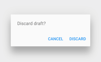
For example, if you’re working on a file and choose to exit the program before saving, the system could present you with a modal dialog asking if you’d like to save first. If so, another modal dialog could allow you to select a file name and location to save.

If the users aren’t presented with these interruptions, they might lose their work.
Additionally, if you’re displaying a modal dialog in between primary tasks, it may have less of a negative impact. In other words, if you wait until after the user has completed a primary task before presenting the modal dialog, it may be less distracting.
Alternatives to modal dialogs
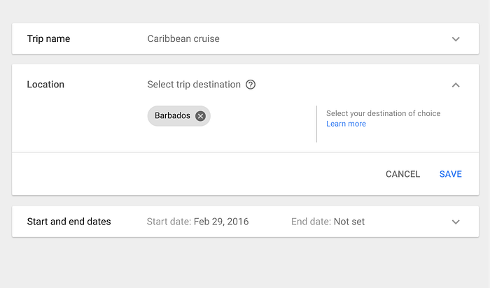
Even in the cases mentioned above, there are often nonmodal design patterns that could be used instead. Some good examples in Material design are snack bars and expansion panels.

Snackbars are handy for letting the user complete an action, and then correct themselves (undo) if they made a mistake. In some cases you can use this instead of a confirmation dialog.
If you’re thinking of using a modal dialog to avoid having too many interface elements on the screen at once, showing them only when the user is ready to interact with them, consider using a collapsible expansion panel instead.
The Takeaway
Understanding why modal dialogs can make for a bad user experience goes a long way towards helping to know when they’re appropriate.
People are at their most productive when they’re able to focus and become absorbed in the task at hand. If they’re faced with too many potentially distracting elements like dialogs, they can easily end up in a Shaq Attack situation.
Essentially, if the application can’t continue without a decision from the user, and it’s difficult for the system to recover from a mistake, consider a modal dialog.
If you’re considering using a modal dialog, first see if a nonmodal design pattern will work instead. If not, try to avoid interrupting the user during a primary task, and instead have the dialogs appear between tasks wherever possible.


