The paradox of choice: what UXers need to know
We tend to think that having choices and freedom is a good thing. After all, who doesn’t like going to a restaurant to find that everything on the menu looks great? If you were staring at that menu, it’s likely you would be overwhelmed by the number of viable options at your disposal. That feeling is a direct result of the paradox of choice.
Here’s the thing about humans: sometimes, more is too much. When confronted with a long list of choices, most people will take a long time to make a decision — and the longer they take, the more frustrated and aggravated they feel. The more options, the more our minds struggle with making a decision.
As a UX designer, you need to account for the paradox of choice factor in your design — suffice to say that an annoyed user is not a happy user. Let’s take a look at why we don’t deal well with too many options, and how you can reflect that in your designs.
What is the paradox of choice?
The term was coined by Barry Schwartz in his book “The paradox of choice — why more is less” in 2004. His research was all about how we perceive autonomy and freedom of choice — both of which are essential for human happiness.
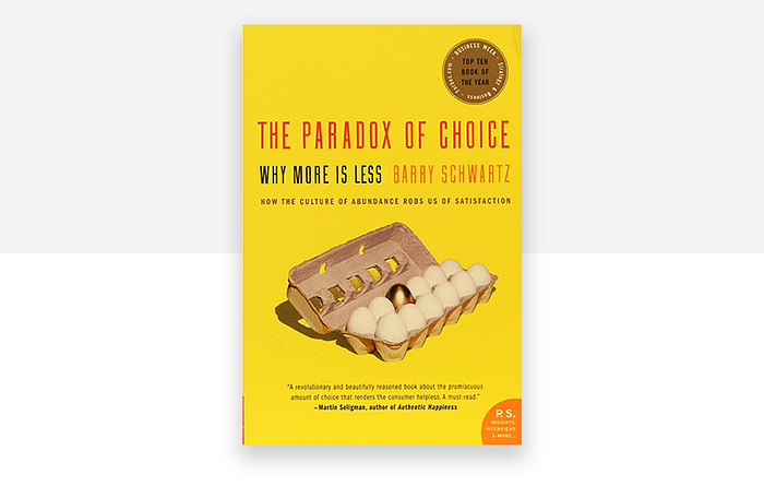
It was a normal and logical assumption that if you give people more freedom, they will be happier. A certain way to maximize freedom is to always give people all the options and give them space to choose. This was such a natural concept that it took a long time for people to question it — after all, do we feel better with all these options?
Schwartz was stunned to find that even though people had so many options available to them at all times, they didn’t seem to feel particularly happy. Several previous pieces of research had pointed out that consumers could take a long time to make a decision when in a fully-stocked supermarket, for example — but Schwartz went a step further with the paradox of choice. People don’t just take longer, their mental happiness deteriorates. Schwartz puts it quite simply during his TED talk:
“All of this choice has two effects, two negative effects on people. One effect, paradoxically, is that it produces paralysis, rather than liberation”.
Quoting a study, he says that a firm gave its employees a list of options for investment funds — and with every 10 funds they added on to that list, participation rate went down by 2%. People, it seems, actually don’t like having to choose.
Are we all destined to suffer?
Imagine a website that offers clothing. Large websites will offer thousands of viable alternatives when you search the word “dress”. Users can find themselves swimming in dresses that would bring them happiness or at least enjoyment — but according to the paradox of choice, even after the user makes a decision, they may not be happy about it.
The paradox of choice dictates that no matter what we choose, we won’t get the feeling of happiness we expected. We start to wonder how we would feel if we had gone for the second or third option — hypotheticals that only diminish the certainty in our decision. After all, what if the blue dress was in fact better than the yellow dress the user got, after a full 45 minutes of pondering among dresses?
It places some strain on our emotions, mostly because of our crippling fear that we might not get as much enjoyment if we don’t make the right choice. Regret is a powerful thing, eh?
Using the paradox of choice for better UX design
Now that we are clear on how and why people don’t necessarily feel happier with lots of options and choices, let’s see how that should affect your UX design along with some pitfalls to avoid.
Information Architecture
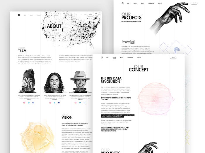
Before you start worrying about how you can make sure you don’t play to the paradox of choice, pay attention to how you present information to the user in every aspect of your product. One of the key principles presented to the world by Dan Brown (an authority on information architecture in his own right) is the principle of choice — which is directly based on Schwartz’s work.
Applying good information architecture to your product will force you to consider navigation, labeling, organization and search systems in your product. All of these dictate how your interface can be composed — which is the field on which you can reflect the paradox of choice in the product.
In this process, the main guideline is to always give users a certain degree of freedom and choices, but never overwhelming them. Respecting both the navigational needs of the product and the paradox of choice. Finding that acceptable margin, however, takes some work.
Information architecture is crucial if you want to make sure that users can understand how the product works, and can enjoy its features. But it is also the first line of duty to make sure that you feed information to the user slowly, in a way that people can digest easily. It’s the best possible way for you to make sure that your users don’t experience the paradox of choice first-hand.
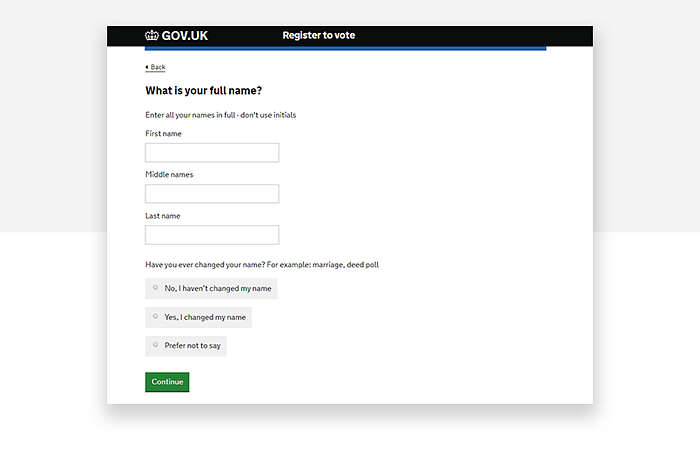
You want to carve a path that users can follow, so that they are confronted with a small number of choices. Even the most complicated product can break up decisions into smaller bits, so that users can use the product in a way that feels natural and effortless. We see a similar process of simplification when it comes to designing microinteractions.
Let’s return to the clothing retailer example. Instead of making users surf through thousands of options, most stores will allow for several ways people can narrow their search, giving categories people can follow according to their goals. Are you looking for a short dress? A work dress? A pink dress?
Information architecture of true quality makes users make those decisions regarding what type of content they want in a smooth, effortless way. People will decide what type of dress they want before moving on to the search results, where the decision-making process will be more difficult. But at least the number of alternatives will be reduced greatly — and with them, the user’s stress.
Aesthetics
Once you’ve got your information architecture down, it’s time to start composing what your interface will look like (with the paradox of choice in mind, of course). As the middleman between product and user, the interface will lay down that path you created with the information architecture in front of the user.
A good point raised by Just UX Design is that many clients ask UX designers to decrease the number of clicks users need to make to reach any page in the product. The London-based agency says that is a no-go — and we agree completely. Making people get to where they want faster is a good thing, but you can’t compromise the simplicity of navigation or the interface in general.
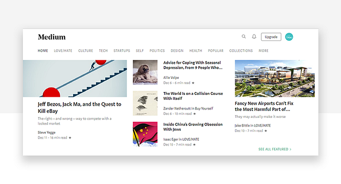
Listing out every single page or screen will get users there in a single click — but you’ll lose people as they get tired of pondering which link or button they need to follow. Navigation design works best when you let the interface gently takes the user by the hand on their search for the wanted destination.
Here are some handy tools in the fight against the paradox of choice, and decision paralysis:
- Narrow down the goals users have instead of their destination page/screen. It will increase the trip users have to reach their goal, but you’ll find it easier to break up big decisions/tasks into smaller, less demanding ones.
- Use plenty of negative space to give users’ eyes some relief from visual components or text. This will make it harder for you to fill the page with links and buttons — especially in mobile devices that have so little screen real estate. Use your negative space to guide the user’s eye to what really matters — it can be a powerful ally in improving the readability of your product.
- Ensure a clear visual hierarchy in the content you present, so you make sure people understand the scale of importance of each element. That way, the broader or most commonly searched links can be seen straight away and users can later specify what they want from that broad category.
- Don’t force CTAs down users’ throats. Remember the example of the employer and hedge funds? Burden your users with too many CTAs and they will likely abandon your product because of the negative way it makes them feel, even if their goal lies just ahead of one CTAs on their screen. Have no more than two per page (one if your product is meant to be used on a mobile device).
Be smart about guiding users on decision-making
This can relate to your navigation system or the way you present users with search results. The paradox of choice clearly illustrates that people just get stuck when they have too much on their minds, so make it easy for them to find some traction and get started. Some products are very smart in this sense — like Amazon Music, or Spotify.
Imagine having all the songs in the world in the palm of your hands. What do you want to listen to during that bus ride? Many people will take a long time to come up with a choice or just give up and go to a platform that is more narrow, like the local files of music in their phone.

Spotify and Amazon’s response to this fact was to recommend pieces of music that each user is likely to enjoy at any given time. This way, even if the user doesn’t feel like listening to any of the recommended songs, they might find an artist that fits their mood and make the call right there. The paradox of choice leads us to get stuck and freeze in a moment of doubt, so guide the user out of that fog by giving them a small number of starting points, guiding them through their doubt and stress.
Did it solve the problem for the user? Not necessarily, as users still will feel at a loss the next time they open the app. But it did get the juices of inspiration flowing and that’s enough to get the user past the decision paralysis and back to using the product. All you need to get the ball going is some form of recommended content, or starting examples.
Wrap up: don’t fear the paradox of choice
The paradox of choice is a human characteristic that we won’t get past. As the world evolves, humans are likely to be required to make more decisions, keep getting more options to each decision and have less and less time to do it all.
This isn’t something that should damage the creative side of your product — but it is something that you need to reflect in your design.
Much like designing a product that has a good color palette requires you to consider the human eye and the cultural connotation those colors have in different cultures, the human brain and psyche is something you should aim to understand. To work with, never against. The psyche is the landscape of your users and the paradox of choice.
Take a page from the ancient Greek architects’ book: work your way around geographical landscapes by using them actively in your creation. Instead of wasting time and effort removing or ignoring those landscapes, turn them into a strong point in your product — resulting in a strong base that will uphold your product for a long, long time.


