Member-only story
The Rounded User Experience
Ever wondered what the fuss is with the rounded corners on buttons, cards, and other UI components? Read on to find out.
This article entails the What, Why, When, and Where of Roundness in User Experience.
What?
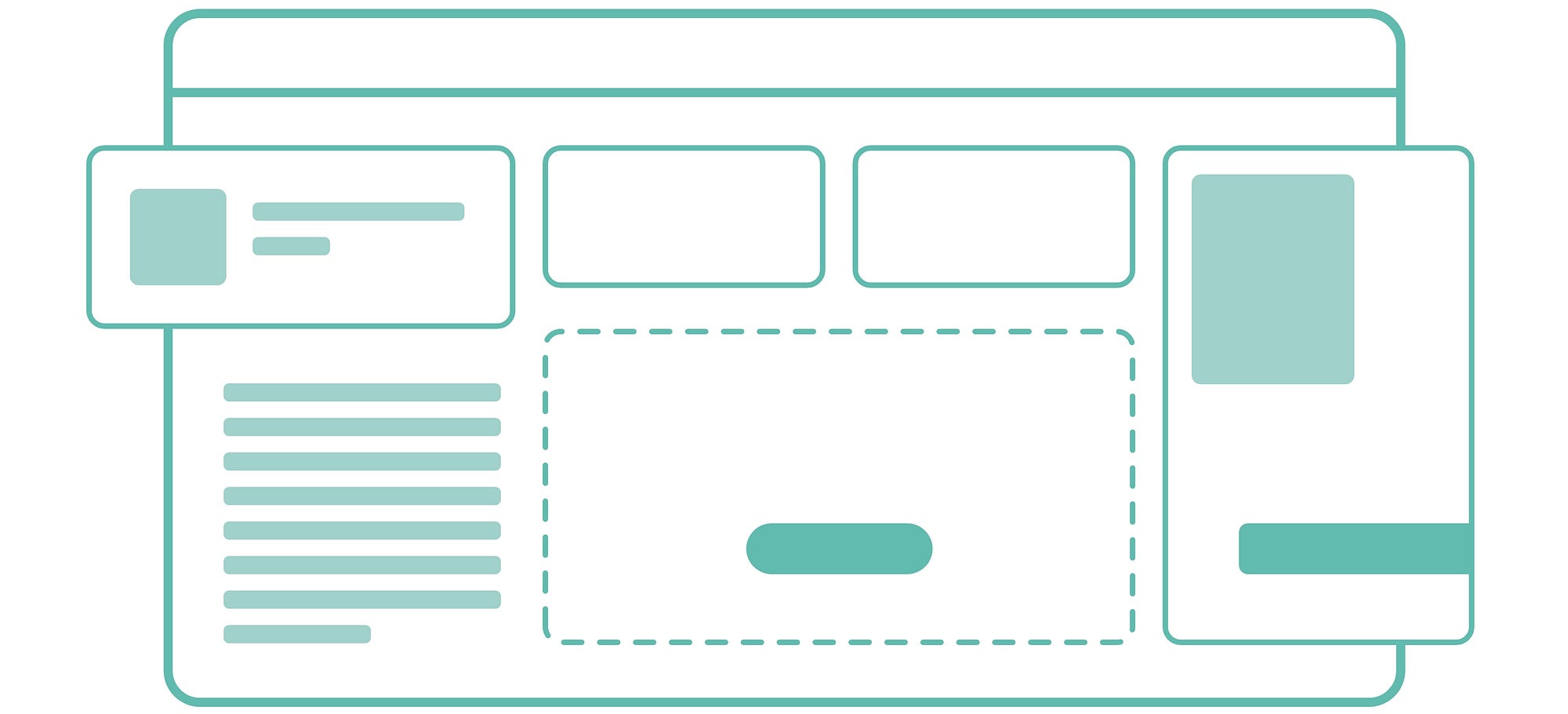
By Rounded User Experience, I primarily mean rounding off corners in UI objects that are sharp by default. The most predominantly rounded off objects are cards and buttons, especially CTA (Call-To-Action) buttons.
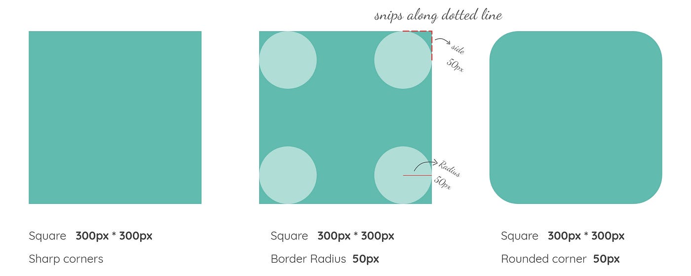
A rounded corner is usually achieved by using a border-radius. Basically, you use a circle to mask off a sharp corner, so it appears rounded. This is better depicted in the graphic.
Why?

Right off the bat, rounded corners look visually appealing but did you know that there are actual psychological studies to back this theory?
This is a classical conditioning principle where our brain is conditioned to think sharp objects can be harmful. A real-life example where sharp corners are considered harmful is when you’re baby-proofing your house by using rounded fittings on sharp table corners.
Since the human brain attributes this condition to everything it experiences, rounded corners give off the following vibes — safe, friendly, and hence, approachable. So the human-centered design should incorporate these attributes over the sleek, sharp corners.

When and Where?
Now comes the question of whether to use rounded corners or fully rounded components.
Rounded corners are perfect for grids,
- They help with a friendly interaction
- They are space-saving
- They draw attention to the content and not the component

