Finding videos made simple — Toggle App
UX/UI Case Study and Re-design of a video content app

This case study documents the design process of the project. The re-designed app includes several interface and features revamp, and was submitted to the UXDI course at General Assembly, Singapore.
The Mission
Work in a team to identify problems and/or opportunities with an existing mobile application and utilise your knowledge to design a solution.
The Scope
11-days sprint, produce a digitised interactive prototype + a 15-minute client facing presentation.

So what the heck is Toggle?
Toggle is an online video streaming service of Singapore based television and radio broadcaster, Mediacorp.

Basically, it’s a Singaporean version of Netflix, but free.
Why Toggle?
Last month, my team and I admitted guilty of binge watching TV series from Netflix, Viu and other video content apps, except Toggle; a stark realisation on how it is becoming obsolete over the past few years. We genuinely think that Toggle is an amazing app with amazing content for Singaporeans. Curious, we wanted to find out why, and help bridge that gap.
Now that we have a mission, let’s get toggled on.

Understanding Toggle
Brand Research
Before we dived to understand the users, we wanted to understand the brand’s business goals, so that we can better foster the connection with the user’s needs later on.
Summary:
- Runs with a freemium business model and makes money through advertisements and paid subscriptions.
- Specialises in local content (about 85%) from Mediacorp. The rest are international content.
- Wants to enhance digital only local content through Toggle Originals.
With that, we have a business goal in mind; Toggle wants more users to subscribe to Toggle Prime (Premium).
Customer Feedbacks
To understand the general sentiment on the most neutral of platforms, we kicked-off the research by reviewing Toggle’s user ratings and feedbacks on both Apple App Store and Google Play Store.


Interestingly, most users vote either 5 stars or 1 star, but the app generally has bad reviews.
We’ve noticed a trend, that most of the 1 star feedbacks revolves around usability issues and hardware issues.
Content Audit & Sitemap
Next, we conducted a content audit of the app to understand the information architecture of the app, and presented it on the sitemap below.
With this, I realised that there were many repeated contents and entry points that i thought was redundant and might confuse users.


What They Say vs What They Do
I’ve noticed that there is a difference between what people say (to understand or measure people’s stated beliefs) and what people do (focus on behavioural traits and how they go about achieving their goal). With this, we’ve decided to conduct both User Interviews and Usability Tests.
Of course, to eliminate User Research Bias, all of user research were voice recorded and screen recorded (with consent). Results are shown towards the end of the article.

User Interviews (What they say)
We recruited and interviewed a total of 12 participants, 5 of them regularly uses the Toggle App. This is to find out their attitudinal characteristics.
The questions we asked were centred to various touch points common to video content apps. For example, some of the questions were about:
- Context of use
- Frequency of use
- Motivations for using the app
- Process of using the app
- Other apps they’ve used/are using
- Reasons for using Toggle over the other apps
User Interview Summary:
- 90% of users use Toggle for the catchup-tv feature.
- Users will only download the Toggle app to use it on the go, or to help someone that is not well versed in technology (e.g. Elderly)
- Users will use the Toggle app to cast it on TV via Chromecast, as they prefer to watch on bigger screens.
- Users will only use Toggle if they really want to watch a very specific local content they like that cannot be found anywhere else. (e.g Toggle Originals)
- Users are skeptical about Toggle’s content, and there’s no quick way to judge their content.
- Users are annoyed by the ads that interrupt the navigation and video watching process.
- The main motivations of getting Toggle Premium is to get rid of ads and Toggle-It-First (a feature to watch content before it gets released)

Usability Test (What they do)
Now that we know their binge-watching insights, we wanted to find out the truth on how they’ll go about using the app to complete certain tasks.
We came up a short usability test of 8 tasks for the users to complete after conducting the interview. This is to find out the behavioural characteristics.
Interestingly, these are some of the common characteristics amongst the participants:
Usability Test Summary:
- All users will search for contents via Channels or Search Bar.
- Users Categorizes shows either by TV Channels or by Genre
- Users struggle navigating through the Channels page.
- The search bar doesn’t help much, no smart feature (auto-fill etc)
- Information on Toggle Prime(Premium Membership) is hard to find.
- Users struggled the most on navigation as the contents are too cluttered.

We pasted, repasted and summarized our insights from the affinity map:
User Goals
- Users want to search for their content as fast and efficient as possible.
- Users want an interface that is intuitive and teachable.
- Users want a quick way to judge the content.
- Users don’t want to feel overwhelmed by the amount of contents and how cluttered they are.
- Users doesn’t want to be interrupted by ads.
Business Goals
- Toggle wants more users to sign up to premium.
- Toggle wants more users to recommend them to others.

Personas
Based on the summarized insights we got so far, we’ve crafted personas so that their needs and pain points can be more relatable in a personal level.
Introducing the Mother and Son duo:


Aunty Rosie
Chad’s mother. She is not very proficient in English. She struggles using the app, needs help from her son Chad but he isn’t home to help her most of the time, so she has to rely on herself. She search her shows mostly via TV Channels. She wants to get premium because of Toggle-It-First, but she can’t find information about it.
Chad Chew
A businessman, Aunty Rosy’s son. He wants the app to be less overwhelming from content, and needs a quick way to judge the content in the app. He has a hard time getting his mother to understand how to use the app. He uses the app on-the-go, searches his shows mostly via the search bar, and his favourite show is “Tanglin”, but has trouble finding his last watched episode. He thinks the ads are annoying.
Potential solution approaches:
- The redesign should focus on the base level of customer success; the Utility level, which is the functionality of the app. (Simplifying the interface)
- Users should be able to quickly preview new contents for quick judgement, and resume last watched contents as quickly as possible.
- Users should be able to access contents via ‘Channels’ quickly and intuitively since it is a major feature of the app.
- Finding the necessary information for Toggle premium should not be difficult.
Now we need to prioritise what we want to change based on our Persona’s needs and our potential solutions. We did this using the MoSCoW method of feature prioritisation.
Feature Prioritisation


Wireframing
With the prioritised features in place, we proceeded with the wireframes and concepts for our new app re-design concept!


Our Findings
We tested our prototype with 4 users using the same usability test script we did with the first round. Though there is a significant improvement, on the channels page, we found out users will search for content to catch-up chronologically. They’ll search shows to catchup based on dates and time. (In-depth explanation towards the end of the article)
Based on this, we’ve made some iterations for our design.


The Re-Designed App

Bottom Navigation
I personally think that hamburger menus on apps that rely heavily on content should be banned. The first major change was to remove that and replace it with a bottom navigation instead.
Other video content apps such as “Netflix” and “Viu” have this as a standard feature in their apps.
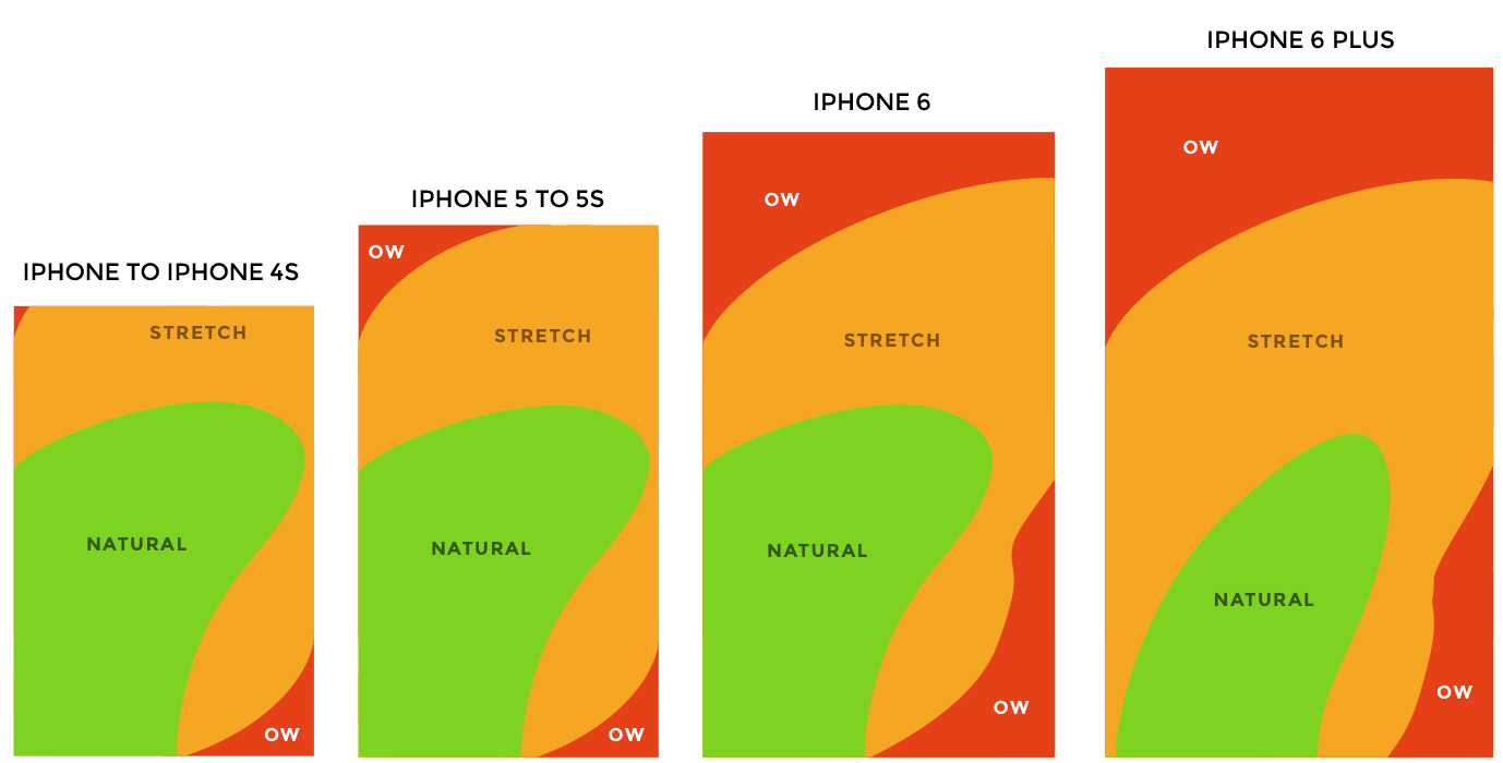
Ergonomics was a huge deciding factor for this interface change. The green areas are where the thumb feels most natural, but the current app has the hamburger menu on the top left on the “ow” section. A good area at the bottom fits in the green spot, hence making the bot-nav more user-friendly.

Channels Page
We did not think that the current design was intuitive enough, and it sparks confusion. From our research, this is one of the most important page (from the hamburger menu) that I’ve decided to include in the bottom nav. For android users, the channel contents don’t even seem scrollable to the side, and the display is pretty dull.

I remembered snatching the newspaper from my Dad as a kid, just so i can look at the the programme timetable of Cartoon Network. They’ll display this on a section listing different TV Channels and their programmes chronologically. I wanted to bring this familiar experience into Toggle, as i thought it would be an intuitive experience.
I’ll now break it down to pieces on the changes we’ve made:
- The different channels can be changed at the top of the page
- The dates of the content can be adjusted on the highlighted dropdown just the channels display
- Programmes are displayed chronologically, with “Now Showing” being highlighted
- Whatever ABOVE “Now Showing” are content that has been shown, providing a link to “Catch-up TV”
- Whatever BELOW “Now Showing” are content that has yet to be aired, providing a new feature “Remind Me” where they can receive notifications
- Play button on display icons prompts the content detail page with the video player.

Search Bar
From research, we know users almost always use the search bar, but it wasn’t very helpful. To tackle this, we transferred all the categories from the hamburger menu down to a list-like format. Users can now search based on genres or channels here, on top of using a blank search bar, and not removing the original content of the app. Win-win.

Other Features
- Left: I’ve included a quick preview feature that allows users to view content overview quickly. I’ve also added a language toggle feature.
- Middle: An sample navigation through the channels page.
- Right: The steps needed to take to find information about Toggle Premium.


Usability Test
To see the impact of the redesign, we wanted to measure it once more. We conducted another usability test using the original script with another 5 participants, measuring the time on task.
The results in summary:

There’s a notable improvement in all 5 users who tested our new design. The decrease in amount of time spent completing the task and achieving their goals means potential increase in value of the app.
What’s Next
As user experience designers, we would love to build better prototypes, measure the success by actionable metrics, conducting more usability tests/AB tests and iterating them based on the feedbacks given.
My key takeaway for this project is time management, and prioritising what needs to be done first. For 11-days, we wanted to do everything that we thought would help the project, but it was near to impossible. If i could tackle this project again, I would want to have a proper research plan to set the direction, with the right methodologies to drive the most impact. This will streamline the research process a lot.
“A messy mind will result in a messy product.”
Toggle is an amazing app, but it’s a shame that the app lacks intuitive interfaces that allows users to use it seamlessly. We hope that the re-design we will help foster a connection between the app and the users, even at the slightest bit.

If you’ve come this far, Thank you so much for reading! Hope you enjoyed this case study. You can find me at Linkedin | Instagram | Email
Special thanks and shoutout to Angela and Lynette, my lovely teammates! It was a privilege working with you guys.
P.S. We’re not affiliated with Toggle! We’re just a bunch of curious designers.

