Member-only story
The ultimate guide to choosing fonts
Improve your type skills with these tips
Typography is a key part of communication in design. Understanding the fundamentals of type and how to choose the best font pairings can improve your designs dramatically. After reading this guide, you’ll know more about typography, and choosing fonts will be a breeze.
Is it a font or a typeface?
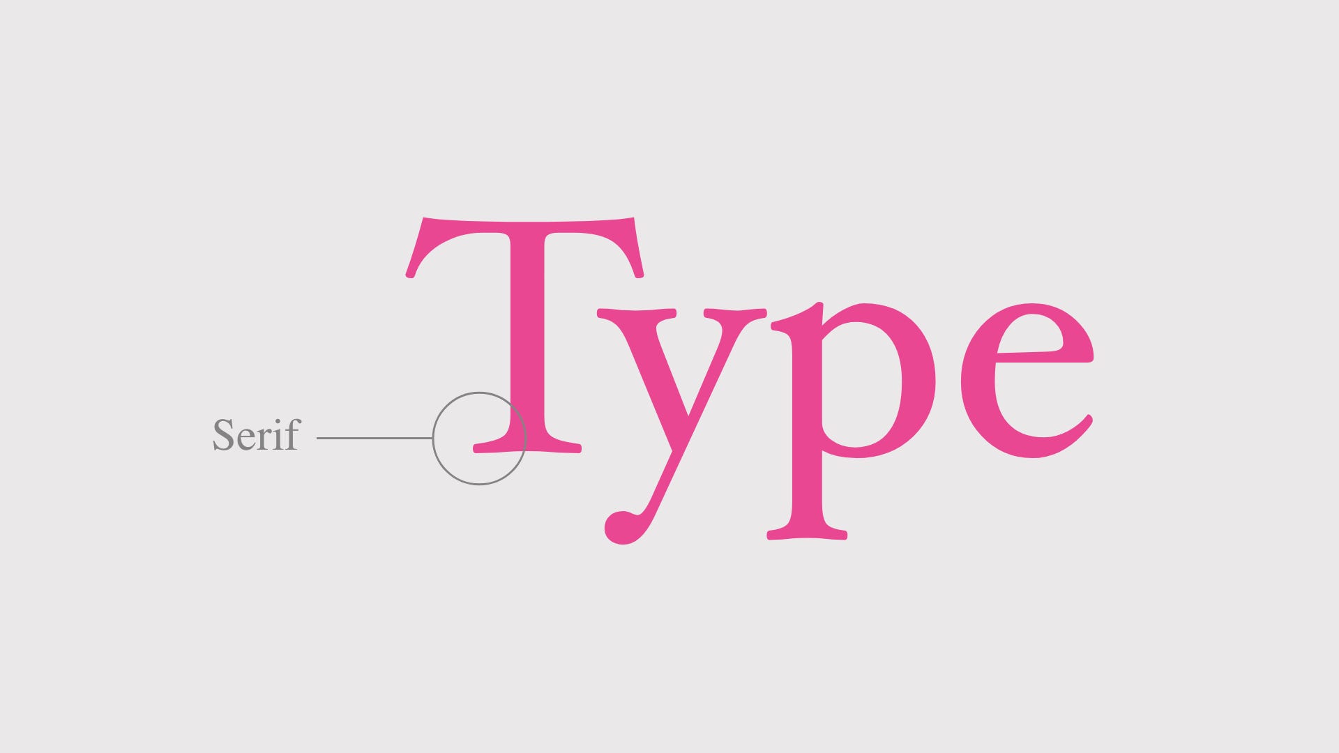
Let’s talk about the elephant in the room first. Font vs typeface, what’s the difference? Which is correct? The terms typeface and font are sometimes used interchangeably which can make it a little confusing.
A typeface is a collection of fonts while a font refers to a specific style or weight within a typeface family.
Let’s put this into context with an example. Helvetica is a typeface. But Helvetica Bold is a specific font within the Helvetica typeface family. Here’s a visual example so you can see the difference between a typeface and fonts.

What is typography?
Typography is the art and technique of arranging type. Whether you’re designing a poster, a website, or an app, you’re using type to deliver a message.
Typography serves two main purposes. The first is it must be legible, can a user read it? The second is how you use typography to create a mood or design aesthetic to attract a specific audience.
Learning the fundamental rules of type (so you can break them later) will help you become a better designer. It just takes practice and a little knowledge, which you’ll learn as we go.
Categories of type
In order to know how to choose fonts, we need to understand the various categories of type, the characteristics of each, and recommended usage. In this guide, we’ll refer to three different categories of type when choosing font pairings.