Thoughts on Cred’s UI revamp — NeoPOP (Apr 2022)
Cred is an exclusive members-only app that rewards you for paying credit card bills. Over the time, Cred has grown and has implemented several payment and finance related features within the app. Widely known for its in-cred-ible design, Cred recently shifted to a new design system and revamped the entire UI of its app. I explored the latest version of Cred app on iOS, and in this article, I present my views on the new UI.
Note: The comments in this article are my personal opinions. Cred is still a great app to use! And to be clear, this is all about the UI, not UX.
Splash Screen
The first noticeable thing on opening the app is a revamped splash screen. The animation of logo has changed, and is more minimal than before. The logo breaks into its forming lines and zooms in during the process, until finally presenting the user with the touch ID prompt.
Look and feel
The visual design of the app takes you back to the old days. The overall look and feel of the app oozes the feeling of retro theme. With the combination of typographic styles, colours, and icons, Cred seems to have completely changed the visual perception of the app. In most places, the corners are now rigid without any border radius. The design is in complete dark theme, which is consistent with the previous version.

Typography
Unlike most of the apps today, this time Cred has used a serif typeface for headings and titles in the app. Rest of the content continues to use a sans serif typeface. The use of this combination of typefaces dramatically impacts the overall visuals of the app. This is one of the key factors that gives it a retro look. This might look unconventional, but I would say it is good for a change.

Colours
The app follows a dark theme throughout. A decent colour palette of whites and greys is used for elements across the app. Since the app has many illustrations and images, most UI elements stick to monochrome. In addition, there are several colours such as green, yellow, pink, etc. that highlight various UI elements, including icons.
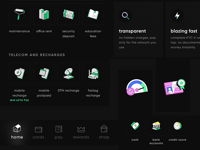
Icons
Cred has used a variety of icons in its app UI. Most icons have a 3-dimensional look. While some are monochromatic, some others follow a dual-colour tone, and rest others are even more colourful. The containers of icons largely varies based on their placement — sometimes in a box, sometimes in a circle, and other times without any container. Though this might seem to be inconsistent, the overall effect that the icons reflect throughout the screens is clear.
Some things that I could not miss…
Bottom navigation
The bottom navigation now has six elements in it, which is a lottttttttt. This is clearly against the industry standard and conventional UI patterns. Personally, it feels like there’s a lot of clutter in the bottom navigation bar. Interestingly, the active item has a 3d icon, while others remain 2d. There is also a soft glow behind the active item, which looks amazing. And the transition from one item to other is worth watching — the 2d icon converts into its 3d version, and vice versa.
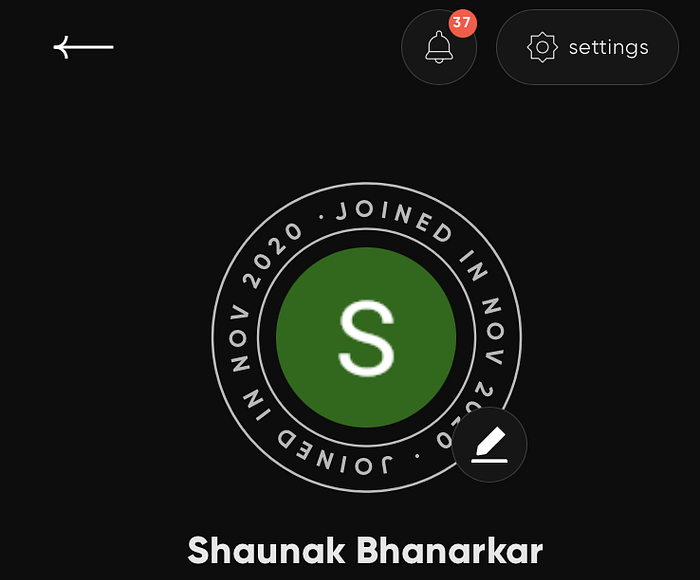
Profile section
The profile picture/icon in profile page has a new rail around the circle, which indicates when you joined the app. Though this might not be a necessary piece of information, the way it has been represented visually is really cool.
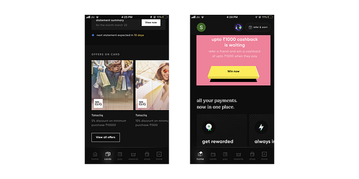
Boost offer section
While the entire app flaunts the boxy (no curves) design, there is one section which unexpectedly has a strange design. The boost offers widget does not fit well with the huge radius of its elements, in my opinion.

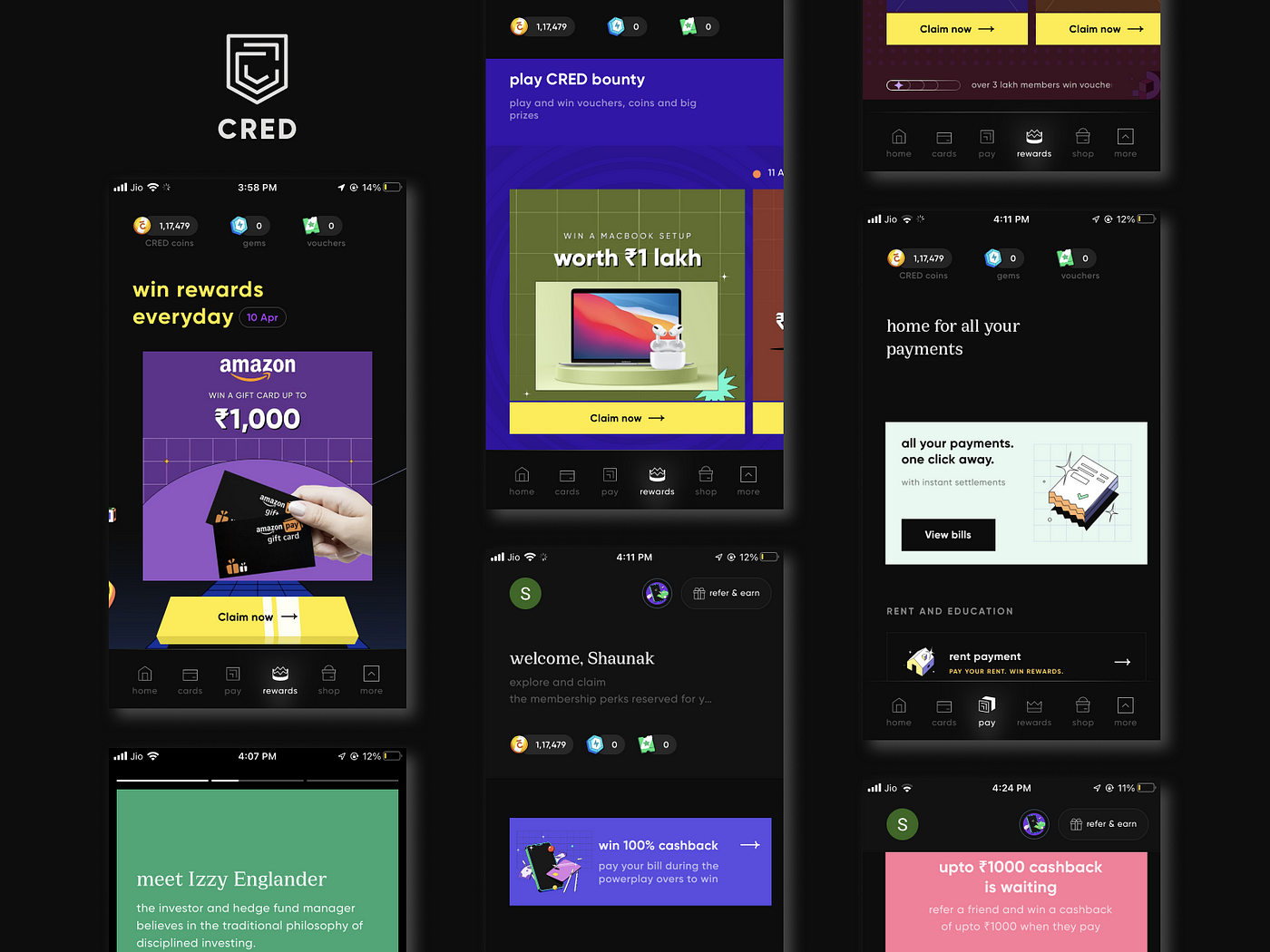
Rewards page
The rewards page is absolutely fantastic, and it completely feels like a gaming zone, which is what exactly it is supposed to be like. The entire essence of the retro theme oozes out of this page. Very impressive!
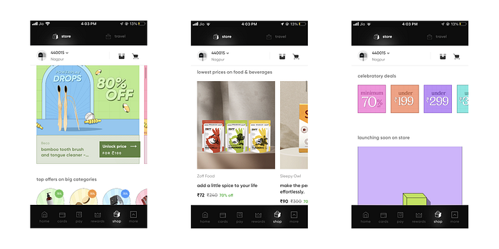
Store page
For some reason, the store page has a light theme, which looks different than rest of the app. The only logical usage of light theme in Cred is for bottom sheets, which technically are above the dark surface of the app. By that logic, I do not see any rationale for light theme used by the store page.
Stories
Though the entire app flaunts boxy design, the stories section does not really look appealing in the no-curves pattern. It feels strictly rigid, something a lot of us are not at all used to.
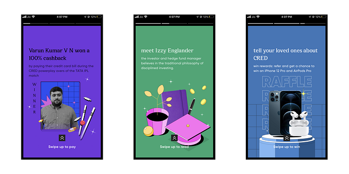
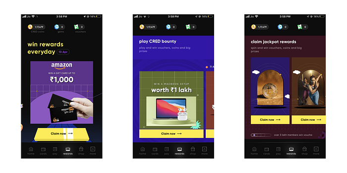
Banners
One thing that instantly stands out of the UI is the banners. They are very catchy and pop out distinctively. While some might say it is good for grabbing attention, I think banners should inherently feel a part of the app, which is not the case here.
Responsiveness
With this UI revamp, I feel that the responsiveness of the app has taken a hit. There is a slight lag after clicks — new page or bottom sheet takes a minor delay to open up. And this is very evident with the haptic vibration associated with the clicks. The issue might get fixed with upcoming updates, but this is something that has come in the package with the new design.
Final verdict
Overall, I feel the Cred UI revamp takes you back to the old days. The visual style guide that applies to the interface is definitely very different than any other app. Personally, I felt it was slightly difficult to use initially. But, after a few days I am getting a hang of it.
Cred is known to break stereotypes in design and take steps that are considered unconventional. Few years back, when neumorphism faced a lot of criticism for its accessibility issues, Cred took the world by storm and introduced a neumorphic design. And it eventually worked out well for them.
Will this new design also impact the design community and the general users positively? That, we will have to see.


