Thoughts on Material Design

Material Design is a design language developed and announced in 2014 by Google. It makes more liberal use of grid-based layouts, responsive animations and transitions, padding, and depth effects such as lighting and shadows. (Excerpt from wikipedia) You can find more information and examples on its official website material.io.
While being undoubtedly popular and broadly adopted, Material Design might have brought a thought-provoking stir to the industry as well. This article is a collection of my personal thoughts and reflection from discussions with peer designers.
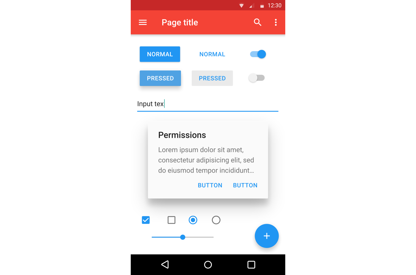
The Good
There is reason why Material Design is so popular. The guidelines lay emphasis on legibility and accessibility. One of the most important applications is —
Layering and shadow

This is actually what the “material” is about in its title. Material design makes a clear usage of layering and shadow, which receives consent recognition over the industry. Since material design tends to make the interface elements flat, by creating layers and shadows designers can create hierarchy among the digital flat elements, boosting contrast and legibility. You can find shadows all over the interface from header to windows to buttons. Usually important / newly appearing elements are assigned with a shadow.
The “Bad”
These are mostly my own opinions and are not necessarily downsides of Material Design. You are welcome to reserve your opinion and leave it in the comment section below.
Let’s first go through some material design examples.

Color
The first thing that came over my mind is the color. At material.io you can find the color tool which contains “Material Palette” — selected colors by Material Design.

While they work perfectly fine in terms of accessibility, in my opinion though, they are not simultaneously friendly to non visually impaired users.
The colors are striking indeed, yet nearly all saturated; the contrast is great, yet the variation of colors makes the interface busy. Personally I would never adopt more than 3 colors in an interface (among the 3, one is black or white). I often find myself lost focus in these interfaces.

Additionally, to ensure all colors on an interface fall into the same color theme, sometimes buttons are assigned with colors opposite to users’ common sense.

Oversimplification
This one is mentioned by more people. Material Design adopts Minimalism and make enough use of icons to replace text as much as possible.


Yet this dependence on icons actually takes longer for users to interact with the system. Most of these icons are recently or even uniquely designed for one particular App and are not widely recognized. In order to understand what the icon means, users would have to hover the mouse over them and read the indication text. Mobile users don’t even have this option since there is no hover function on a touch screen. Designers have come up with solutions such as long press / tap to show the text of the icon. But isn’t all this an unnecessary additional effort?
Compared with the built in Apps in iOS, Material Design removes the text from the icons.

The “Ugly”
Flatter
I know, how could I, right? How could you criticize a designer’s work as “ugly”? Well it’s not necessarily ugly. The following content might offend some people but I’d like to hear you defend yourself in the comment. If you think I’m wrong about this, correct me. Although this is not really Material Design’s fault, the implementation of flat elements starts to “flatten” something else than buttons. Graphics, illustrations, for example. I don’t hate flat graphics — I have created such illustrations myself. But as the graphics become “flatter”, problems starts to emerge from the surface.
The “flat illustration” started just fine.


But as time goes by they start becoming weird.


From my discussions with some peer designers when the flat illustrations are paired with other flat elements in an interface, sometimes they do create a futuristic, minimalism feeling. Yet as this trend goes on, the “human touch” in the design becomes more invisible.
Conclusion
After all is said, Material Design undoubtedly is and will be the most popular design language in the near future. We as designers should utilize every good aspect of Material Design but be careful with it at the same time. Are there ways to bypass some of these concerns discussed above and make the design better? That should be the content of another article.
Find me on LinkedIn: https://www.linkedin.com/in/darrench
My website: https://darrenchang.myportfolio.com