
Tips for better 404 error pages — with examples
Your 404 not found error page is a landing page no one wants to land on. Do yourself a favor and make it work for your website. We’ll show you how.
You know the feeling. You click an interesting-looking link to a blogpost that you want to read, and Bam! 404. Page not found. It’s an automatically annoying and negative experience. But how does that 404 page talk to you? Is it helpful? Delightful, even? Think of 404 as essentially a landing page, albeit a landing page that no one really wants to land on. And then think about how much more work goes into a regular landing page than an error page. A well-designed 404 page can make a huge difference in how a user experiences a brand. A bad one is a missed opportunity.
In this article, we’ll cover all that and look at some great examples of well-designed 404 error pages. We might even get a glimpse of an exotic 500 server error page, in the wild. So hold on to your hat: this could be a bumpy ride.
HTTP Status codes: a brief history of the 404 page
So why is it called a 404 page, anyway? As usual, the explanation is rather arcane and takes us back into the dark ages of the internet (sometime around 1990). Despite popular myths about 404 referring to an ancient server room, or world wide web inventor Tim Berners-Lee’s office, it turns out that 400 was an arbitrary label attached to client errors, which included 404: Page not found. A 404 error is a client-side error because the client (your web browser) is considered to be asking for a resource (the URL you clicked or entered) which does not exist, or cannot be found. So now you know.
What’s important to remember is that 404 errors aren’t always your fault. A badly copy-pasted link on someone else’s site could point to a page you never had online in the first place — and that’s completely out of your hands. It’s what you do with them when they happen that counts.
Competing philosophies of the 404 error page
There are two main approaches to 404 error page design: the bare bones page, and all the others. The rationale for a no-frills 404 page is typically pretty technical: the page is only supposed to serve notice of an error, and shouldn’t do much more, other than provide a link to the homepage. Google’s 404 page is a classic of the genre.

We tend to disagree with this approach — in fact, so does Google in its own advice for creating 404 pages. A good 404 error page should show your user that even when things aren’t going right, everything’s going to be fine. Error pages should reassure, delight and guide the user to interesting content. Taking the time to craft an awesome, memorable 404 page is a worthwhile investment. Remember: in reality, this is a type of landing page.
What should a 404 page include?
Your page may change according to your brand, but at a bare minimum, we’d recommend including these elements:
- An error message
You need your user to recognize immediately that they’ve landed on an error page. - Your brand logo
Own your mistakes. Even if they’re actually not yours at all. Make sure your branding is front and center on your 404 page. - Brand look and feel
In the same vein, make sure your 404 page matches the look and feel of your site. - A light touch
A little comic relief is always welcome on an error page. Don’t overdo it, though. - Link to your best content
3 or 4 links to great content on your site should help lost visitors to something they find interesting. Try to avoid losing traffic, even from an error page. - Call to action
Remember what we said about your 404 page practically serving as a landing page? So apply some landing page logic: add in download or sign up button or at the very least a search box. - Keep it simple
No one wants their 404 page to end up looking like a Neil Patel blog post. Also, your 404 page shouldn’t be crawled by Google, so there’s no need to hit that 1,000 word goal.
7 awesome 404 page designs
A lot of brands still go for something unadventurous and frankly boring with their 404 page. We prefer something which shows a little more effort. Here are some of our current favorite 404 error pages.
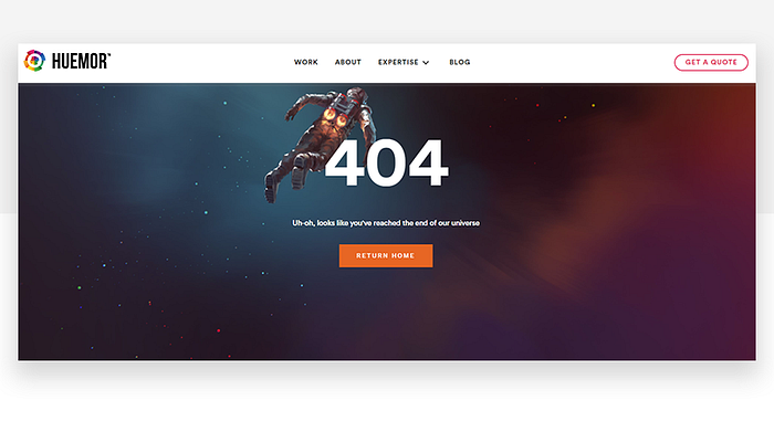
NYC web-dev agency Huemor has gone for a 50s sci-fi aesthetic which continues on to their 404 page. The brand’s rocket man hero (excuse the pun) is seen blasting off into outer space. Time to turn back, intrepid explorers.
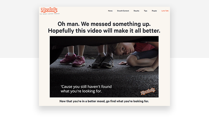
Verging on too much, this content agency’s video 404 page is so well done, that you just have to hand it to them. Even if you can’t stand U2. A lot of effort clearly went into crafting a full music video, and the guy got his family involved too. A really nice approach.
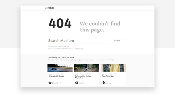
Medium’s 404 error page is light, bold and clear. After a simple 404 message, there’s a big search box and a simple link to the Medium homepage. Afterwards, there’s a nice touch: links to three articles about getting lost, losing things and finding something you didn’t know you were looking for. Clever.
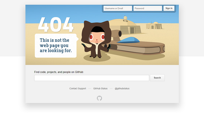
We promised ourselves that we would avoid any references to Obi-Wan and these not being the pages you were looking for in this post… but dev platform GitHub gets it right. They even use a nice parallax effect when you mouse over the graphic. And their 500 page is a delight too!
Online infographic service Canva service plays to its design strengths with a fun interactive 404 page. After a brief error message and a link to the homepage, Canva’s 404 page offers up a neat little sliding puzzle to while away a few seconds before you get on with the rest of your life.

OK, so web developer Klaus’s 404 page breaks all the rules — there’s no branding, no call to action and actually no way out of the page. But you know what they say: rules are for fools! This 404 is fun because it shows a Commodore 64 Basic loading screen, which appears to search for the URL you were looking for. After finding no results, it lists the directory of a Test Disk and finds two files: FOO and BAR. Get it?!

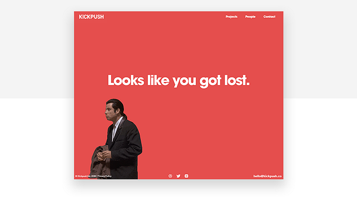
It doesn’t get much simpler, and let’s face it: you’ve probably seen this one before. London-based product design studio Kickpush maintains its branding, adds a quick message, and throws in one of history’s finest GIFs, the Vincent Vega lost in Mia’s place GIF. Truly, a 404 page for the ages.
The takeaway
Your 404 error page is an opportunity to showcase some creativity and get the user on your side. Something went wrong, but everything’s fine. Treat this page as a sort of landing page and it could end up helping to build your brand and deliver conversions.