TOP 30 Case Studies of Customer Experience in Banking and Fintech Design

This collection of the best UX case studies on creating and researching the customer experience in digital banking and Fintech apps. These articles are collected from Medium and arranged based on the amount of applause in 2023. This banking apps collection offers an excellent opportunity to get instant inspiration from 30 insightful UX case studies demonstrating how to design modern digital financial solutions.
Post by Alex Kreger, financial UX Strategist/Founder of UX Design Agency
1. Islamic Bank in Qatar: Creating Omni-Channel Experience
👏🏻 3.7K applause
Case study by Atishay Goyal
A team of 8 developers, 1 Business Analyst, and 1 UX designer was setup onsite in Qatar to execute the revamp of CB’s digital presence and an Omni-Channel experience to its customers. This included retail, personal and corporate banking over web, mobile, ATM, call centers, and marketing channels.
We were not too focused on the competitor analysis as CB was one of the best apps in Qatar / Islamic Banking. Our major aim was to innovate and build something which ensures CB maintains the legacy.
In close collaboration with the marketing team, the design team came up with 7 factors (short-term and long-term) that would define the success of the new experience which CB offered. Initially was considered the HEART framework from Google and then cut short the parameters so that they can be measurable for an MVP.
2. Light Bank App: 10 Steps to Luxury Mobile Banking
👏🏻 3.3K applause
Case study by UXDA | Financial UX design architects
UXDA team spent several months designing Light Bank. The end result is based on experience gained by solving financial design challenges daily and driven by their passion to disrupt the financial world in order to make it all about the users and their needs.
We dared to create the simplest, most beautiful and delightful banking UI experience in the world, while maintaining the full-scale digital banking functionality.
The story about Light Bank has become one of the most popular banking customer experience case studies ever made, reaching more than 50 000 views on Medium alone. It has been awarded by globally famous international design awards such as International Design Awards (IDA), London Design Awards, A’Design Award, DNA Paris Design Award, and also nominated for one of the world’s biggest and most prestigious design awards─the iF Design Award 2019 and the Red Dot Award 2019.
3. ITTI Digital Back-Office: Complete Digital Transformation
👏🏻 1.2K applause
Case study by UXDA | Financial UX design architects
The main challenge of ITTI Digital when they started working with UXDA was to disrupt the banking industry by creating a never-before-seen core-banking solution 100% focused on the employees: a solution that would take into account all bank employees’ pain points, needs and daily tasks, thus making their job easier, enjoyable and more meaningful from a banking end-customer perspective.
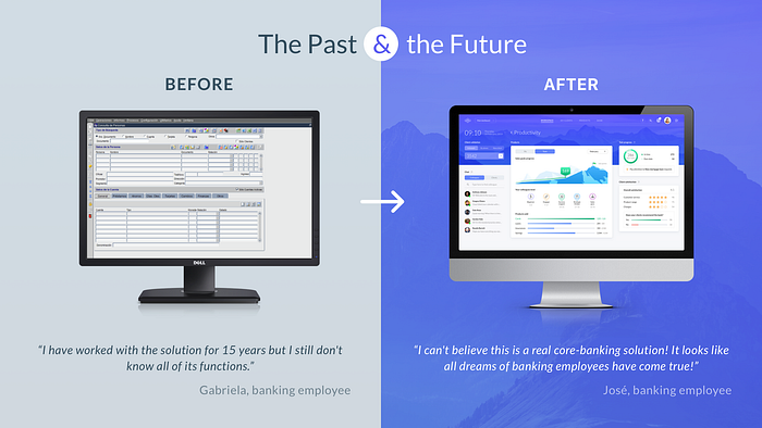
Most banks reveal they are very afraid of making such a huge and revolutionary shift, changing a structure that has been working for decades, but ITTI Digital is living proof that it’s 100% worth it.
During the project, ITTI Digital learned to make users their main priority, and their perception changed dramatically. It felt like they had finally opened their eyes to what has always been right in front of them─their users.
4. CashMetrics: Finance Management Service
👏🏻 880 applause
Case study by Tubik Studio
CashMetrics provides support for retailers, mainly in the fashion segment: it helps to organize their operations and monitor cash flows. It is aimed at simplifying operational processes, with a key focus on tracking profits, shipping costs, and fees.
Mobile and web applications help to effectively manage financial and communication issues and this way design directly supports the business.
When it comes to financing, the first idea that immediately comes to mind is boring tables and complex calculations. So, the primary goal was to step away from dull, unclear, and overwhelming data presentation and make the service eye-pleasing and easy to use.
5. Banking as a Game Saving Children’s Financial Future
👏🏻 825 applause
Case study by UXDA | Financial UX design architects
Adults struggle with finances but want their children to be successful people with good financial habits. Almost 60% of all working-age Americans have no retirement savings. At the same time, 49% of parents don’t know how to discuss finances with kids in an understandable and enjoyable way. Four in ten adults couldn’t cover a $400 emergency expense in the U.S.
We have to expand the horizon of banking apps by focusing not only on standard banking features and functionality but also on connecting finances with relationships between family members.
How could parents ensure their kids’ financial future? UXDA explored this challenge with a research-based kids’ banking app concept. It provides insights on how an app could impact family relationships, create a good foundation for their kids’ financial future and ensure a successful inclusion of children in the modern digital economy.
6. How We Designed AI-Powered Spatial Banking for Apple Vision Pro
👏🏻 813 applause
Case study by UXDA | Financial UX design architects
With the launch of Vision Pro, Apple intends to shift the digital world from mobile computing, in which they have become trendsetters, to revolutionary spatial computing. Wizards from Cupertino offer a mind-blowing spatial experience on the visionOS platform. But how could spatial banking look and feel?
It looks like Apple is once again poised to take humanity to a new experiential frontier ahead of the next digital revolution. Vision Pro is just the first step toward mixed reality, testing technology and user experience. How should the banking industry prepare for this, and what should we consider?
Imagine a digital bank of the future. Unlike the traditional one, this future bank will be in constant dialogue with the user and take maximum care of the user’s financial life. At its heart will be an AI-powered advisor that constantly analyzes a multitude of data to find the best solutions for the user.
7. Banking Super App: Hundreds Of Features in One Mobile Solution
👏🏻 791 applause
Case study by UXDA | Financial UX design architects
The presence of a large number of products and the flow of big data passing through the bank can become a promising basis for building a highly personalized banking ecosystem around a specific user. And, today, there are more and more advanced technological solutions of data processing and personalization through AI in banking accessible on the market.
However, despite the technological opportunities, the key challenge is delivering the super app experience in a clear and user-friendly way.
When considering how to create a banking super app, there’s an important question to answer: how will it work technically? As this kind of financial digital product is complex, a banking super app could rely on 10 digital banking trends.
8. Fintarget Trading: How to Attract Newbies
👏🏻 690 applause
Case study by Purrweb
The BCS team suggested the hypothesis: the company will attract more customers if it proves that investing is easy — even for those who don’t have any experience. To quickly test the hypothesis, the BCS team decided to get started with an MVP.
BCS had a perfect tool for newbies — auto-following. The service was popular among current BCS clients but no one from the outside world knew about it.
The team found a perfect balance between deadlines, complicated topics, and agreements — this was the block-by-block UI/UX design for MVP. As a result, Fintarget released an investment platform within 1.5 months instead of the predicted three.
9. Metaverse Banking: First VR / AR Design Concept
👏🏻 687 applause
Case study by UXDA | Financial UX design architects
True mixed reality potential lies far beyond games; it’s a new digital platform that provides a revolutionary user experience. VR and AR technologies will merge digital content with the real world to create one constant reality.
We could say that the modern digital world as we see it today is only the basic preparation stage for the immersive mixed reality that we will fully experience in a few decades.
The only way to be ready for the revolutionary switch to VR/AR digital reality is to start generating ideas and concepts today. With this case study, UXDA team encourages the industry to view financial products through the lens of the future. As technological advancements are rapidly developing and bringing more and more benefits for the customers, this is a must for any company that strives to become more successful, not only today but also in the future.
10. Next-Gen Hedge Fund UI for NBA Players
👏🏻 635 applause
Case study by UXDA | Financial UX design architects
Magma Capital Funds, a Chicago-based private hedge fund investment manager hired UXDA to design a next-gen investment platform, Magma, for high-net-worth individuals. The aim was to create a quantitative hedge fund product to simplify and enhance the investment experience with cutting-edge technologies. The team has incorporated machine learning and artificial intelligence technology into the core of its back-end, and they needed an equally advanced client dashboard.
Magma Capital Fund’s challenge was to invent a digitally-driven customer-focused solution that makes the abstract concept of investment real and clear to digitally-native users. They needed a Magma product to wow the new generation of HNWI investors with luxury aesthetics and a simple and fully digitized onboarding experience while empowering them with a sense of control, sophistication and affiliation.
The traditional world of hedge fund investing is known for its high risks and requires an analytical approach with careful decision-making, which is what makes it so conservative. To create an innovative product in the conservative hedge fund industry, you need courage and a progressive mindset.
11. Applying ChatGPT Experience to Conversational Banking
👏🏻 622 applause
Case study by UXDA | Financial UX design architects
AI-powered solutions such as ChatGPT could fuel new types of products in banking, more personalized and more connected to users, but integrating innovative technologies often causes complications in terms of user experience. And here, the methods of financial UX design are very effective, as they help to imagine the unimaginable and create a digital solution, focusing on the needs of users. Let’s explore how it works with designing ChatGPT-like conversational banking products.
BELLA’s founders aimed to design their app as the heart and soul of their brand, to fulfill their mission and bring a breath of fresh air to the industry. They set out to bridge the emotional gap and break down the barriers of traditional user experience models by treating users like family members.
This case study illustrates an example of how disruptive AI technologies, such as ChatGPT, could be integrated into the banking experience with the help of customer-centered UX design.
12. Banking Super App Design to Modernize Mauritius
👏🏻 607 applause
Case study by UXDA | Financial UX design architects
Mauritius Telecom (MT), the largest telecommunications company in Mauritius, had the vision to ensure a powerful digital future for Mauritians. To achieve this, the MT team needed to expand their digital ecosystem by reinventing the existing my.t money app and transforming it into a digital bank. To open up new digital opportunities for the people of Mauritius, the MT team has moved beyond a regular service app and introduced the first financial Super App in Mauritian history.
Privacy is a crucial concern for users, and we addressed that in the design approach. The aim was to ensure a safe and secure experience for users, providing the option to hide sensitive information.
With a customer-centered mission, MT aims to modernize the islands of Mauritius Republic and make the lives of its 1.3 million inhabitants much more convenient and advanced through innovation and technology. As telecom leader MT uses its power to bridge a financial and payments technology gap.
Rich but well-balanced information architecture and a frictionless user journey were crucial to ensure easy access to essential everyday tasks while exploring multiple opportunities of the my.t money Super App. That required careful planning and continuous user testing and improvements throughout the user experience design process.
13. Purpose-Driven Financial Investment Platform Design
👏🏻 604 applause
Case study by UXDA | Financial UX design architects
The Runrate app challenge was to seamlessly combine planning, budgeting and investing with a philosophy of manifesting the future. And, to create such a never-before-seen product, the project team needed the courage to change their mindset and enter the unknown.
Developing a new type of product always runs the risk of being unclear to users. As we implement non-standard features, user interaction may get complicated because of the need to learn and adapt to an unfamiliar mental model. To seamlessly integrate that unique model, we focused on researching user scenarios, prioritizing features in line with the business purpose and developing intuitive user flows.
We all get inspired by many different things ─ art, music, philosophy, movies, etc., and we don’t even think about how these things can sync with the financial industry. But, all of this relates to the human experience, to our emotions and the meaning of life. And we need the courage to shift our mindset and bring all of that into the financial world to put real meaning behind the money!
14. MasterCard: Pre-Paid Card Management
👏🏻 600 applause
Case study by Davide Tremolada
MasterCard wants to allow users to manage their cards and solve problems in-app. To do that, they requested a redesign of the card management section, which would provide a clear and simple flow, where users feel secured.
We were able to work closely as a team, prioritizing a supportive approach to ideas and sketching instead of endless debating.
Using research and testing were fundamental steps into understanding the real needs and pain points of the users. More importantly, they gave us the knowledge to solve each step in an effective and smooth way.
15. Akuna: Personal Budgeting Reimagined
👏🏻 586 applause
Case study by Denislav Jeliazkov
On average, millennials who carry debt report owing to a total of $27,900 (excluding mortgages), slightly less than baby boomers and about $8,000 less than the average amount Gen Xers owe. 34% of Americans don’t know how much of their monthly income goes toward paying down their personal debt.
I led efforts to evolve the service and address customer pain‐points related to the spending and planning experiences.
The team was focused on features related to solving some of the major desired outcomes found in the initial research. The app should be simple and easy to understand. Also, encouraging them to build financial habits.
16. Bank of Jordan: From 2,8 to 4,7 App Rate in Six Months
👏🏻 563 applause
Case study by UXDA | Financial UX design architects
It took six months for the Bank of Jordan’s mobile banking app to go from a 2.8 to 4.7 star rating on Google Play. How? By teaming up with UXDA to create a comprehensive UX transformation. This changed the app dramatically, making banking more accessible and convenient than ever before for millions of customers in the Middle East.
In a step-by-step UX case study, we guide you through this unique digital transformation that completely changed the way so many people view their banking.
In the last couple of years, there’s been a “spring” of rapid banking digitalization in the Middle Eastern regions. Many huge and influential market players have launched new mobile banking apps for their retail customers. One such success story comes from a well-known and respected Middle Eastern bank─the Bank of Jordan.
17. Bitex: Chinese Stock Analysis App
👏🏻 520 applause
Case study by Tubik Studio
The task was set to make a complete redesign of a live application Bitex oriented initially to the Chinese market. The application is an aggregator that collects data from world exchanges, processes it, builds the necessary charts and diagrams and displays this information in a user-friendly and digestible way. The main goal of Bitex is to help the trader decide on investments.
The fact is that many users from Asian countries believe that the more information is shown on the page, the better.
An interesting feature was discovered in the subconscious perception of color-coding. Here’s the simplest example: in Western resources about finance, the rise in the share price is indicated in green and the drop in red. Meanwhile, in Asian countries, everything is the opposite. Since investors planned to enter the Western market, we were forced to add a switch “color growth price” to solve this problem.
18. iGTB: Corporate Banking With 5,000+ Screens
👏🏻 512 applause
Case study by UXDA | Financial UX design architects
In the world of banking, there are a lot of complex digital solutions. Among them are some truly exceptional ones, such as Contextual Banking Experience (CBX), a corporate banking product by iGTB (Intellect Global Transaction Banking), part of Intellect Design Arena. It consists of 5,000+ screens and is continuously growing. An outstanding effort was needed to integrate Design Thinking principles and UX design approach into such a huge banking solution development.
Working with Intellect Design Arena has been a remarkable experience for UXDA in many ways. It’s a unique opportunity to get a chance to work closely together with one of the world’s leading banking software vendors.
If we use the analogy with spaceships, mankind dreams about spaceships that are easily able to travel billions of miles through our solar system. Unfortunately, existing spaceships weren’t constructed for multiple takeovers and landings on other planets until the “SpaceX” program appeared, with an ambitious mission to land on Mars. iGTB has a similar mission in corporate banking to ensure huge, corporate, multi-account budget management with ease. Hence, the innovative iGTB solution was built.
19. Monese: Smart Transactions and Spending Breakdowns
👏🏻 493 applause
Case study by Monese
For the spending management features to be understandable, Monese needed to get the clearest data out of the raw, original transaction data. Using location databases and online resources, Monese was able to match the name of the merchant, the address and a lot of other details. In addition, Monese built a merchant service in-house, to show the right logo for most merchants and treat chains and stand-alone businesses differently. The result was a drastically improved look and feel, with richer, smarter insights.
Since we are not the first company to offer spending features, we didn’t want to just do what others are doing. We wanted to create the best solution, one that will fix the pain points of other services.
Monese took a lot of inspiration from music charts. Not just because “top lists” are amazing but also because they are built to keep you engaged and excited. A music chart, just like the Monese merchant chart, is always updating and can point out changes and trends.
20. BKT: Turning a 100-Year-Old Bank into a Digital Innovator
👏🏻 491 applause
Case study by UXDA | Financial UX design architects
Banka Kombëtare Tregtare (BKT), the largest and oldest operating commercial bank in Albania, recognized that their digital offerings have lagged behind and needed a revamp to adapt to present-day service requirements. They challenged UXDA to update the bank’s legacy operations by designing an app that would enhance customer service and empower clients to make smarter financial decisions. The goal was to change the perception of the brand from complex and formal to friendly and pleasant.
The existing app had functionality problems, with users finding it difficult to perform certain tasks, such as easily accessing transactions, resulting in confusion about their financial situation. The outdated design also strengthened their perception of BKT as an old-fashioned and complex bank, which was not reflective of the bank’s brand identity and value proposition.
Embracing change in a large financial corporation can be a daunting task, but BKT demonstrated that even big, established 100-year-old banks can successfully update their legacy to keep up with the digital age. They recognized that the banking app was more than just a digital channel — it was a product in its own right. Therefore, they directed increased attention and funding to turn it into a key asset to execute the brand’s mission.
21. United Arab Bank: Transition to Next-Gen Experience
👏🏻 458 applause
Case study by UXDA | Financial UX design architects
United Arab Bank (UAB) is an established, leading financial solutions provider in the United Arab Emirates (UAE), offering its clients tailor-made financial services in corporate and retail banking in the UAE. However, they felt that UAB’s mobile banking does not entirely reflect their brand’s values and mission of providing an excellent customer experience for digital banking in the UAE. UAB wanted to serve customers with a full range of digital offerings, but, for some tasks, people were still visiting the physical branch.
The UAB team faced a challenge in enhancing the mobile banking experience for its users. They viewed the existing app as having a complex, confusing flow and an outdated design, which made it difficult for users to perform tasks and left a negative perception of its functionality and even the brand. Users were presented with a lot of information and description of details before performing the action. As a result, many users preferred to visit a physical branch rather than use the app.
UAB team achieved a customer-centered design for the most important user flows in the app and make improvements in line with the established bank brand and digital strategy. These adjustments helped the bank enhance the customer experience and digitize financial behavior patterns. With the help of UX, the UAB team was able to reinvent traditional bank services and bring a breath of fresh air into its digital ecosystem.
22. budgit: Made with Vulnerable Customers in Mind
👏🏻 438 applause
Case study by Jaymie Gill
budgit is a money management app that empowers and encourages vulnerable customers to control, maintain, and track their spending. Customers can get control of their money with a budget, gain awareness of their spending habits with insights, and access tools that assist them with financial management.
This project was created as my submission for D&AD’s New Blood Awards 2020 ‘Barclays UI/UX/IxD Digital Service Design’ brief.
Offering adaptive & accommodating digital banking tools and services, budgit supports vulnerable customers with everyday banking, helping them manage their money better, and in doing so, improve their mental & financial health.
23. InstaDApp: Blockchain Decentralized Application Redesign
👏🏻 425 applause
Case study by ULTIM STUDIO
InstaDApp is a decentralized application that allows individuals to track their distributed blockchain assets over a range of products and move them around based on real-time market data.
InstaDApp is a fairly new product and even though the overall product brings value to users, we‘ve spotted some UX issues that are undermining the user experience for power users.
If you are not familiar with what decentralized applications (dApps) are, dApps exist and run on a blockchain network in a public, open-source, decentralized environment and are free from control and interference from any single authority, unlike standard apps such as Airbnb or Uber that run on a system which is owned and operated by an organization giving it full authority over the app and its database.
24. bKash: Redesign of the First Mobile Banking in Bangladesh
👏🏻 409 applause
Case study by pixorus studio
bKash is the very first mobile banking service provider in Bangladesh. People who have a mobile and a bKash account can utilize all of the facilities provided by bKash. This app is a simple, easy-to-use and highly secure mobile money app for sending cash quickly to people, recharging mobile balance, paying at your favorite stores and shops, making utility and other bill payments from home, and so much more.
Understanding the audience is the main thing to know, that is needed to develop something that works for users.
The challenge was to find out the proper number of active app user, interviewing them to find out more problems, make a solution, exploring new ideas/features and finally design something that really solves user’s problems.
25. Accountable: a Better Solution to PFM
👏🏻 368 applause
Case study by Timothy Ogundipe
Accountable was designed to solve the problems around tracking of finances, access to financial records, spending analysis, budgeting and financial education.
Millennials want services that are immediate, reliable and offer a wide range of convenience.
We make use of money in our day to day activities. We spend money on what we want and what we need. Subscriptions and recurring expenses are ever-increasing due to our wants and needs. They begin to accumulate and get difficult to manage.
26. Monzo: Designing a Better Borrowing Experience
👏🏻 344 applause
Case study by Juliana Martinhago
There are cemented mental models around credit. Especially when it comes to loans. Some people are averse to the idea completely. This is often because of previous bad experiences of their own, or relatives. It doesn’t matter how well you build your product, some people just don’t want to use it.
We want to ensure that if anything goes wrong, we’ve got our customer’s backs. Human customer service is one of Monzo’s key attributes and it’s not different with Lending.
Designers will always strive for straight-forwardness, speed and simplicity. However, in Lending, you might want to reconsider. Monzo’s loans flow has always been incredibly smooth, but during some of user testing sessions, many people felt it might be “too easy”, and that can be scary. You might not want to offer people a loan in a couple of taps, but you still can keep it simple, of course.
27. InstaDApp: Blockchain Decentralized Application Redesign
👏🏻 425 applause
Case study by ULTIM STUDIO
InstaDApp is a decentralized application that allows individuals to track their distributed blockchain assets over a range of products and move them around based on real-time market data.
InstaDApp is a fairly new product and even though the overall product brings value to users, we‘ve spotted some UX issues that are undermining the user experience for power users.
If you are not familiar with what decentralized applications (dApps) are, dApps exist and run on a blockchain network in a public, open-source, decentralized environment and are free from control and interference from any single authority, unlike standard apps such as Airbnb or Uber that run on a system which is owned and operated by an organization giving it full authority over the app and its database.
28. Loan Management System Redesign
👏🏻 180 applause
Case study by Julia Bondarenko
The old Loan system had an outdated UI and couldn’t support new business flows, which have developed over years in the industry. It was a stand-alone system, not included into the whole core banking system, which led to inconsistencies in the UI and data architecture.
The UI design was made to be easy for an eye, because users would typically work with the Core Banking system for majority of their work day.
The team updated the UI according to the new standards, also enhancing UX by intuitive flows and appropriate system feedback. New business flows were added to the system. The loan system was integrated into the complex architecture of the whole core banking system, accessible from multiple browsers.
29. Jenius Redesign: Solution Toward A Cashless Society
👏🏻 65 applause
Case study by Floater
With Jenius, you’ll have full control of how you want to transact and manage your finance with your smartphone in a safe, easy, and smart way, just from the tip of your finger toe.
According to The Jakarta Post, the top five e-wallets based on monthly active users is GoPay, OVO, Dana, LinkAja, and Jenius. With the demographic users ranging from 20 to 35 years old.
Sometimes, with the redesign, there are remained new problems that may occur according to users. An in-depth interview may gather insights provided by users so that we can make our design better.
30. Erste Bank: Simplify Banking for 300k Seniors
👏🏻 43 applause
Case study by Madesense Digital
Erste Bank wanted to offer to people in their senior years smartphones equipped with our senior launcher and the new simplified banking app which is the subject of this case study.
Our screen design changed several times during testing, quite radically. The size of the font needed to almost double, seniors were not able to see the bottom navigation panel and they did not understand the chart on the main screen.
It works something like a visit to the doctor. We asked a lot of questions to better understand the needs of the business and its users. We dig deep for the reasons Erste Bank would want to create an application in the first place and how its functionalities should look to provide real value for older people.