Top 3 Visual Design Anti-Trends
And how to make the most of them
Not all trends that we have in visual design aid to good user experience. Sometimes designers follow trends just for the sake of creating a trendy design, not to create good functional products.
Today, I want to review some of the recent trends that gain a lot of attention at Dribbble and Instagram. I will explore the problems related to the trends as well as solutions for the problems.
1. Neumorphism
A skeuomorphism is an imitation of an object intended to represent the original. Similar to skeuomorphism, neomorphism (or neo-skeuomorphism) visual style uses design elements and textures that mimic the physical world. It uses a lot of purely decorative forms to remind users about the physical origins of interactive elements (i.e. digital buttons that look like physical buttons, etc.)

Problem: overuse of purely decorative elements
Neomorphism has one key difference from skeuomorphism: designers who apply neomorphism mimic the physical world for purely aesthetic purposes. This visual style does not have much impact on the usability of a product because users are already familiar with what each element on the screen does. In fact, it can have a negative effect on accessibility because it can be hard to find a proper contrast ratio for textual content and iconography.
Similar to skeuomorphism, neomorphism makes it challenging to adapt the design to different screen sizes (UI elements aren’t naturally scalable). Thus, if you want to follow this visual style, you need to consider whether or not you want to scale your design across multiple platforms.
Solution
While it’s better not to rely on neomorphism to create entire UI, yet it is still possible to use in some parts of your product. For example, create some buttons in a neomorphic way.

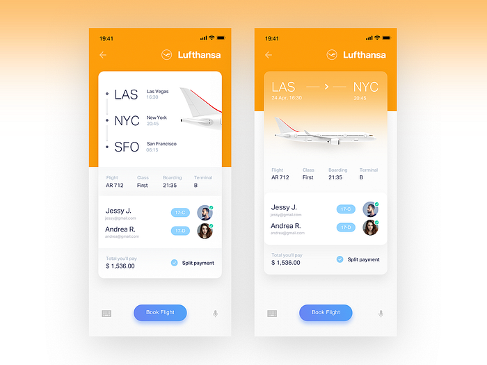
Take a look at the following example. Notice how the neumorhism style is applied to the input field.

2. Flat illustrations
When flat illustration became popular a few years ago, it was a fresh way to create visual interest. Unique custom-made illustrations help brands to distinguish themselves from the crowd, and well-crafted illustrations created a very personal connection with users.
Problem: lack of personal style
Lack of personality is the typical problem of flat illustrations. With the rise of popularity of this technique, it became evident that too many digital products rely on the same illustration techniques in their design — illustration shows people doing something, usually working with a product.
As a result, illustration from different brands look similar, and it became hard for users to match the particular illustration to a particular brand.

Solution
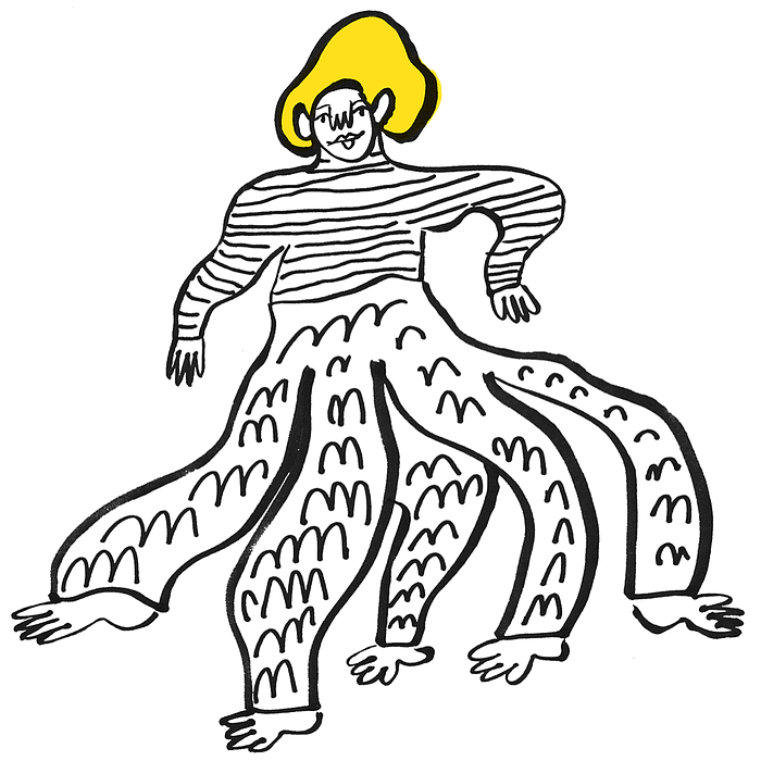
Today, designers need to invest more effort in creating a truly memorable experience. For example, Mailchimp introduced an unusual visual style that pairs illustrations with vibrant color accents. The fact that drawing looks a bit weird, create a better chance to stay in human memory.
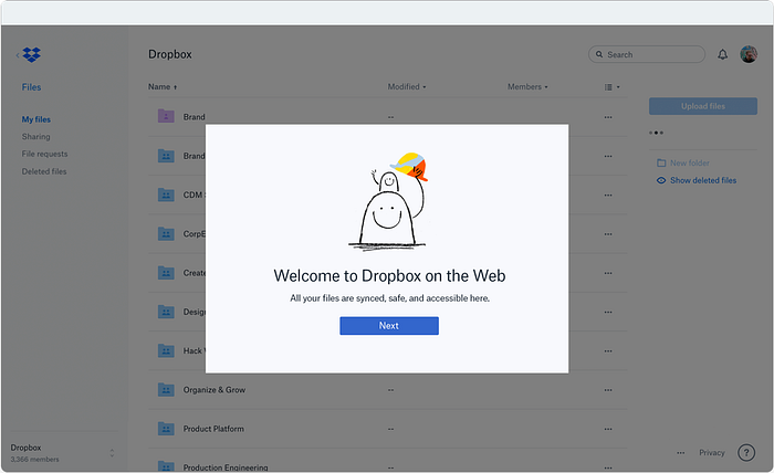
Dropbox is another excellent example. Witty drawings deliver the key message and create a truly memorable connection with their first-time users.
3. Gradients
Just a few years ago, gradients were a no-no in design. Designers tended to avoid gradients because they created a strong impression of design from the 90s.
But the situation changed with the rise of flat design. Flat design’s major limitation is the significant limitations is in the context of colors and styles that designers can use. It’s hard to name more than 10–15 colors that you can use for flat design. Plus, designers cannot rely on heavy shadows to convey a sense of depth. Designers started to use gradients because they help to introduce depth and dimension to design. Gradients solve the problem of ultra-flat design (designs that look ‘too flat’).
Problem: overuse of visual effects
The overuse of gradients is a typical problem for many designers. Everything can be good in moderation, and gradients are no exception. The overuse of gradients makes UI look heavy in terms of visual weight and can lead to bad visual hierarchy—users will have to hunt for the content and functional controls.
Solution
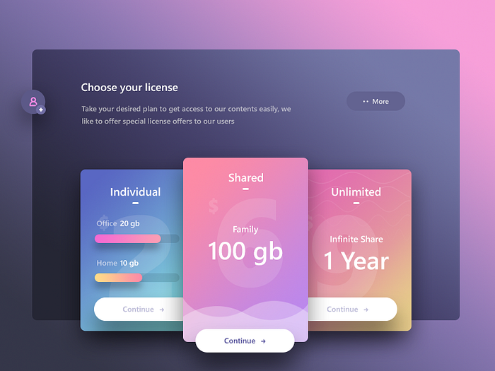
Follow a balanced approach. It’s recommended to use gradients to direct the eye to a specific part of the screen. You can use a gradient to create focal points. It’s especially helpful for smaller elements such an important section:
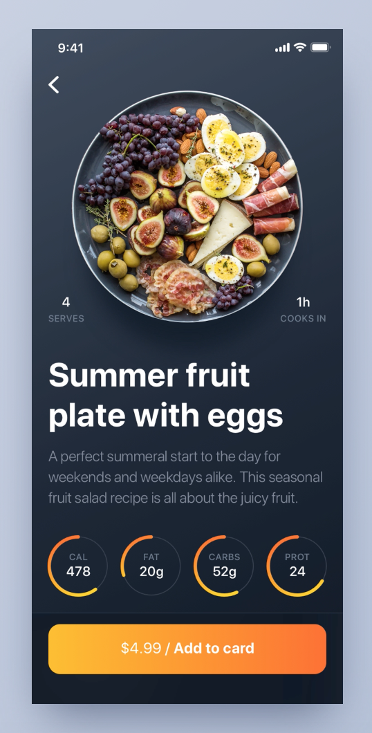
Or for a call to action button:
Learn how to design better products
Interactions between computers and humans should be as intuitive as conversations between two humans. Interaction Design Foundation will help you to learn how to design for efficiency and persuasion.

