Top Industrial Machinery Manufacturing Websites — UX Design Best Practices
Discover the best UX design practices from our benchmarking of machinery manufacturing websites.
The Creative Navy team of researchers has thoroughly analysed 33 websites of the best industrial machinery manufacturing companies offering their services internationally. Digital presence is not to be dismissed, it’s vital in this day and age.
Industrial machinery manufacturers are essential in the landscape of several industries. It is without doubt that the services and products offered by these manufacturers keep many companies moving and working efficiently. While the importance of their craft cannot be denied, their attention must also touch upon their presence, and their identity as a brand/company. The B2B sales environment is competitive, especially since many established manufacturers are offering their products.
Today, word of mouth does not keep up with the competition. The digital age has brought a new set of challenges but also many benefits. As a result of the ease of finding a manufacturer online, companies have to maintain a strong presence.
The website is, as a result, the face of the company. Prospect clients see the website first and then the quality of the services or the products. This means that the website of an industrial machinery manufacturing company needs to be top-notch. If we were to think about this digital image as something closer to business interactions, then it would be something like this:
Your online presence is a global handshake.
A weak handshake is no good. A handshake that is too strong is not good either. Balance is key.
Creative Navy has had the privilege of building custom websites for important industrial machinery manufacturers. From these projects, we have gathered much insight into what it takes to remain constant in this industry — and how this translated to digital presence (website).
We have benchmarked the following sections in this article:
- Hero
- News & Events
- Join the team/Careers
- Portfolio
- Renewable Energy/Sustainability
- About
- Investor
- Contact
Hero Section
The hero section is extremely important in the structure of the website. It is the point of contact between the user and the company. As a result, building a great hero section is not merely an option but a necessity.
Best practices:
- Use high-quality visuals for the hero section but do not sacrifice contrast in the process.
❗️Always ensure that the photo's colour scheme matches the brand’s primary colour. Also, avoid choosing visuals that are too busy from a chromatic point of view, these will only increase cognitive load.
- Accessibility is key. This statement is applicable in almost all contexts but it is especially important when it comes to this section. Usually, the Hero section marks the spot where companies state their main value proposition — that is a crucial set of info — do not mess it up.
- Make sure the visuals used are not distorted on responsive design, otherwise you will ruin the experience.
- If you choose to implement a carousel view, make sure you do it right by including progress indicators, and functional buttons (preferably leave the control with the user rather than making the carousel automatic).
- Stick to proven basics like a short, effective copy, and properly styled CTAs.
❗️ Avoid using more than one CTA.
- The Hero Section is a good place to feature events, documents, or anything the company wants to showcase.
❗️ Avoid getting the section too busy — it can quickly become overwhelming.
We separated the two distinct methods of crafting a hero section into categories: Large visual + Statement and Smaller visual + Snippets of other content.
These are the most common Hero section design types found on the benchmarked websites.
Large Visual + Statement
Most websites choose to employ a large static (or dynamic) visual, usually a video, for their hero section. However, there are certain things to take into consideration with this approach.
- Most of the visuals are shown in a carousel format, utilising the available space to showcase different types of content such as recent highlights, best products/solutions etc.
- Using heavy visuals (especially videos) should be done with a certain degree of caution — these visuals might impact the website’s loading time and/or adaptation on other devices (e.g. mobile).
- Accessibility is often an issue since large, high-quality visuals are used. This makes it very difficult for the overlayed text to pass contrast checks unless the background image’s transparency is increased or extra care is taken to ensure appropriate accessibility.
The websites analysed below use high-quality images, videos or other graphics that resonate with the target audience while also reflecting the brand’s identity.
They also display a clear value proposition to communicate the core value or purpose of the website succinctly and prominently.
GEA showcases a carousel of 3 highlighted blog articles that are relevant to both the current times and the brand’s values.
- The brand’s motto, “Engineering for a better world” is present in the visuals and reiterates GEA’s core value proposition.
- The hero section aligns with the brand’s primary colour (blue) which contributes to a unified user interface.
- The carousel controls are situated next to each other, which can make navigation quite easy, especially on larger resolutions (e.g desktop computers.
- Whilst the progress indicator is useful, it has a low contrast with the background visual, which makes it less accessible in general.

FLS chooses to highlight their products in the hero section, stating their main value proposition — “Maximise your milling efficiency”.
- A blue gradient filter is applied to all visuals on the carousel, tying the section together from a style point of view and maintaining the brand's visual identity despite the larger visual colour variety.
- The carousel is user-triggered, which puts the control back to the user and allows them to take as much time as needed to scroll through the visuals.
- The carousel control arrows are aligned to each edge (left and right), which increases the effort of the users (they have to reach and switch on larger resolutions with their mouse).

Trane Technologies showcases a modern, dynamic hero section, pairing bold, well-crafted copy about their values and intentions with a short video overlayed with a stylised animation of their logo.
- This simple, yet unique and effective approach sets them apart from competitors, allowing them to make a lasting first impression on a site visitor.

SPXFlow chooses to highlight an upcoming webinar on the first hero page.
- This could be considered a good strategy for gathering additional participants.
- The carousel is automatic, which might be annoying for some users and reduces accessibility, especially if not timed thoughtfully.
- The user can still jump to a specific carousel page if needed, via the progress indicator at the top left.
- This might not be obvious which means that most users will be stuck with an automatic carousel. This can harm the overall user experience.

Wärtsilä uses a large, high-quality visual with contrasting colours for their hero section.
- They chose to display a brief copy of the company’s offer alongside some main statistics — a simple yet effective way to attract attention.

- The hero section feels more modern and attractive — the company used a simple yet powerful image with a short CTA rather than displaying their desired content via a classic carousel.
- There is, however, a problem found in this hero section. The text and background image contrast is poor, making it difficult to read. As seen below, both small and large text on the hero section failed both AA and AAA contrast checks.


SKF also goes for a looped, high-quality, full-width video for their hero section, alongside a short, interesting copy that summarises their added value “Life with less friction”.
- The smaller text on the bottom left reads “Have you ever stopped to think about everything that spins, turns, rotates in your everyday life?” — this comes off as a witty way of reaching users and making a lasting impact by arousing their curiosity and interest.
- The SKF hero section is unique, modern and impactful. However, the contrast between the copy and the background ought to be improved.

Rolls-Royce uses an unconventional approach to the classic hero carousel by implementing tabs, each showcasing either core products or values for the brand.
- The website follows the basic hero recipe, including a short title, brief, compelling copy and a CTA to learn more.
- However, the hero section texts do not pass either the AA or AAA contrast tests, making the visual much too overpowering over the text.
- This taints the user experience and might lead to frustration. Some might even abandon browsing the website because of this.

Desktop Metal offers a crisp, highly accessible hero section — they combine a large, high-quality visual with a neutral, solid background for the top to ensure great contrast with the text.
- The primary colour is used sparingly for the logo, main CTA and their trademark in the title — this effectively ensures visual brand identity.
- The reason why this approach works so well is this — regardless of the looped video frame on the bottom side of the section, the menu and the text always remain visible and readable.
- Overall Desktop Metal’s hero section makes for an attractive, simple, clean yet modern design that makes users want to scroll below for more.

Timken also goes for a carousel hero approach, choosing to display a certificate for one of “America’s Greatest Workplaces for Diversity”.
- This is a strong statement and clearly expresses the brand’s devotion to diversity as a core value.
- The visual to the right displays different employees — this visualisation helps users relate to the brand by feeling included regardless of background or ethnicity.
- The hero section also uses the solid primary brand colour, reinforcing the brand's visual identity.
- Despite using a carousel component, the website does not include any progress indicators or other similar components to hint at how many pages the carousel has.
- The left button is not functional (except for on the first page). This can be frustrating and on top of this, proves a lack of attention to detail on the company’s part.
- The carousel component also only seems to have 2 pages — but due to a lack of a progress component, there is no way of knowing that for sure or suspecting a website/browser error.
- This is thus a good example of a poorly designed and implemented carousel hero section.

Valmont goes for a scroll-based, visual-heavy homepage and hero section.
- Both the video playing/pausing, as well as the sections are scroll-activated, which gives the user control and can be impressive and eye-catching as they set themselves apart from the traditional hero/homepage look and feel.
- However, this also means that the experience might be impacted by slow load times, scroll lag, as well as information overload.

- As you can see in the image below, the website takes a few seconds to load even with an excellent internet connection — this isn’t ideal considering the high-performance expectations users have nowadays.

- Nevertheless, the visual transition coupled with compelling text is eye-catching and intriguing, altogether adding to the uniqueness that the brand promises.

General Electric has a brand-focused hero section, showcasing a custom, attractive visual of different styles of their logo across time.
- Their annual report is highlighted as a CTA, which can improve company transparency.
- A carousel section is used, with functional buttons that allow the user to cycle through the component at their own will.

- No progress indicator is used, which could improve the user experience given the fairly large number of pages to switch through (6).
- The visuals are high-quality and compelling, each page following the traditional hero recipe of title, brief copy + CTA.

- However, as evident in the images below, some of the pages have slightly different spacings, which becomes evident especially when switching from one to the other.
- Even if this is a minor detail, it can still be noticed by the average user and affect the overall experience and appreciation for the brand, especially if such an inconsistency is repeated throughout the website.

IR’s hero section is also a vertical carousel that’s scroll-controlled.
- There’s a position indicator component on the right side, which is vital for navigation.
- The opening statement and visuals are strong, expressing the brand’s history (”For 160 years…”) and core value proposition “help make life better”), alongside a relatable image that alludes to growth, care, and productivity.
- However, as we scroll down we see the image quality lowers, topping it off with an enlarged, pixelated logo that has very poor contrast and readability with the overlayed text.
- The low contrast is what harms the user experience the most, as some pages are very poorly designed (e.g., white font on the background including white bits).


General Motors’ hero section features a looped, short video of their products as a background for their highlight copy and a CTA.
- Whilst the copy and CTA are well written and thought through, the contrast and readability are poor, especially against a dynamic background that features a variety of colours (including white, which makes the copy almost impossible to read at times).
- Also features such as the camera changing angles, can be confusing and overwhelming for some users.
- Using a single, clear and high-contrast CTA is a pro that can direct users to additional, more detailed content.
- GM also chose to use the visual as a background for the entire page, including the menu, which is a risky choice that further impacts overall accessibility.
- Although the menu background colour becomes a solid blue on hover, initial readability is still affected. The website would highly benefit from including a solid menu background at all times, not just on hover.
- The visual is also not HD quality, which is a common downside with using large visuals like this one, alongside effective overall website performance.
- A solid blue strip at the bottom of the hero section states the main value proposition “We pioneer the innovations that move and connect people to what matters”, which is a strong statement that might benefit from moving up in the visual hierarchy, as it’s not very visible at the moment.

Daikin keeps its hero section very simple, rocking the value proposition against a high-quality photo of one of its main products.
- The arrow on the bottom is animated, prompting users to scroll to find out more.

Smaller visuals + Snippets of other content
Carrier’s hero section highly resembles TV advertisement, containing a montage that switches between statements representing the brand’s value and images/videos of their products, people or efficiency.
- This approach isn’t very attractive or modern, especially since the visuals themselves aren’t top quality.
- This can also get overwhelming for the user very quickly, especially as they have no control over pausing the video.
- Repeating the word “confidence” in several moments of their hero video, as well as in the copy below feels forced and repetitive, rather than reinforcing the brand value.
- Below the video, some short copies and a couple of links are provided to further content.
- It is generally recommended to provide a single CTA in the hero section, however, Carrier fails to do that or establish a clear visual hierarchy between the links at the bottom of the hero section, resulting in a busy, low-contrast section that may have the unfortunate effect of losing users along the way.

ST Engineering splits the hero section between a traditional, title, copy, CTA + image and further content at the bottom, as well as information for investors like current share price and volume.
- The section’s simplicity brings in advantages like a lighter cognitive load, content that’s more spaced out and quality visuals.
- Including investor information like share price in the hero section isn’t uncommon, especially for companies that mainly work on a B2B basis.

Thermax is a good example of how the quality of a visual can make or break a hero section.
- As evident in the screenshot below, whilst the company used a custom image and text for the hero section, the image is stretched with the resolution and becomes distorted after a certain point.
- As you can see in the second screenshot, the image looks ok when the window is resized, proving that cautions weren’t taken upon implementation for the image to look good regardless of resolution.
- Furthermore, the distortion is possibly most evident in the text, which is generally recommended to be added as a separate layer rather than as a PNG because of issues like this one.
- Below the main image we can find several links towards their main products next to a custom illustration, which improves the visual appeal of the page. The illustration is animated and dynamic based on the icon that’s hovered on, which is a nice, original touch.


Kone retorts to the classic hero carousel but instead of making it full width like the majority of previously analysed websites, it keeps a generous amount of left/right padding.
- This helps with keeping the content together despite various resolutions — and might also improve the overall experience.
- Kone follows the standard hero section recipe — but the text/image contrast is yet again, lacking.
- The CTA is nicely styled.
- There’s a progress indicator present, and carousel buttons are appropriately placed and designed so as to become unavailable if the user reaches the end of the carousel.
- Some simple, yet elegant cards provide quick links to essential content underneath, such as Products & Services and Investors pages.

Trane goes for a less innovative yet timeless approach to hero design.
- They choose to maximise accessibility and rely on simple components.
- This sets them apart — the asymmetrical card stack underneath the hero section which adds visual interest to the otherwise plain section.
- Trane chooses to highlight its main product — rooftops — as the core value proposition for the hero, providing a brief description of their other solutions in the copy below.

- Despite styling the hero images with a solid gradient that matches their primary colour palette, the carousel controls have such poor contrast against the background image on the right side that it’s easy to miss the button.
Xylem chooses to showcase upcoming events, products and important documents in their hero section, catering to several user intents.
- Depending on the user’s IP address, the closest office details and contact info are also displayed underneath — this is a nice detail that customises the user experience.

Emerson chooses to include 2 CTA’s in the hero section, which is generally not recommended.
- The section ought to be optimised by keeping one primary CTA and styling the secondary CTA accordingly.
- Beneath the hero section, Emerson includes a search bar for exploring products, as well as some quick links for main product categories users might be interested in.

3M uses an old-school approach to layout meant to be suitable for lower resolutions back in the day.
- However, whilst still an effective approach, this gives the website an archaic look and feel that might drive some users away who have expectations of a more modern design.
- Regardless, the hero section has excellent contrast, the best amongst all websites we’ve researched, as the company chose to overlay the text against a solid background, deeming the overall hero section highly accessible and effective.
- Instead of displaying information regarding 3M’s core values or main value proposition, they chose to highlight important recent news with a relatable visual.
- Underneath we can find simple, yet clear cards with featured content like blog articles.

News & Events
This section appears under many names, some of these are Newsroom/Newscenter/Press Releases. However, what they have in common is providing a snippet of currently relevant content about what the company has been up to. This can be highly relevant from both an investor and customer point of view.
Best Practices
- Make sure the section fits the general homepage layout.
- It’s recommended to include links to “view all” content. This kind of internal linking can boost discoverability for the users and also increase SEO.
- Make sure the section does not become too cluttered (with content or other functionalities).
❗️Remember, this is supposed to show merely a snippet of the actual content and it holds second-place importance on the main page.
- You can use visuals to make the news cards more appealing — However, make sure not to overshadow the rest of the page.
Donaldson opts for a simple News section featuring 5 cards with the most recent events of the company.
- The cards used are simple yet provide a large visual alongside some descriptive text.
- However, the user cannot access “all available news” or sort through them. As a result, users can only see the latest 5 articles with no path towards reading more being offered.
- This lack of internal linking not only hurts the user experience but also impacts SEO negatively.

GE features a GE Today section in the form of a carousel component which showcases the latest news about the company — with the additional option of navigating horizontally (even visiting the Newsroom is possible here).
- This is a good example of a News section — it provides a snippet of information with the possibility of reading more if the user is interested.
- The carousel controls are also properly designed, with the left arrow being inactive for the first page of content.

Johnson Controls also uses a brief, horizontal strip to display the latest company news. Whilst effective and simple, a button leading the user to “all news” is also missing here. The divider between the descriptive text and the cards is also confusing, as it looks like a progress bar, but it’s actually just a static component.

GEA uses a simple yet effective card design to link to the most recent news, choosing appealing visuals for the cards. The text has good contrast and the CTAs are styled well, however, the section is also missing a “See all” link to direct the user to all available content of the same type.

FLSmidth features different types of content instead of only news snippets, using one card for each content type: News, Discover and Customer Story.
- This comes as a compact way of featuring more info.

Parker employs a split-screen layout to display both news and events.
- This can work because it saves up space while leaving the possibility to view all existing news/events via the “view all” button.
- The two sections are not properly aligned at the top — as a result, the section looks sloppy.

Join the team/Careers
Depending on the personnel necessity a company has at a given moment, they might choose to push harder on recruiting people or not.
- Highlighting a call for applications on the homepage is a sign that the company is actively recruiting at a given time or is very interested in increasing its workforce.
Best practices
- Use genuine visuals that represent your employees — this allows potential applicants to relate to those working there.
- Use brief yet smart, well-constructed copy. This can make a difference as it allows the company to express their uniqueness and their values via words.
❗️Be sure to include hints of company values that are currently highly sought after by applicants, like equal job opportunities, diverse teams etc., all of these can increase the section attractiveness and application rate.
- Avoid generic CTA labels like “Learn more” or “Find out more”; using unique calls to action that are specific to one company can increase the look of the section while showing that a high degree of effort has been put into the website.
- Depending on current company needs (actively recruiting or not), place this section in the appropriate place in the visual hierarchy; this will help you decide if you need it to be just below the hero section or if it is not even needed on the landing page at all.
GE not only features a call for new applicants on their homepage, but they do it several times as users scroll down.
- There is both a general button for open vacancies and a specific one for “power roles”.
- Choosing to pair those CTAs with employee visuals can help potential applicants relate to the company better.

- Overlaying the text against a solid background colour — high accessibility. The short and concise title “Join the team”, brief description and clear CTA amplify this, making the section very straightforward for the user.

Valmont, on the other hand, integrates the “Careers” card alongside other types of content like Sustainability, Company and Investors as a secondary content area.
- These are still accessible and reachable for a first-time user who lands on this page and might be interested in joining the company.

Thyssenkrupp takes a similar approach, integrating the recruitment card in an asymmetric layout on the homepage area above the fold.
- They chose to go for a catchy, custom visual and an attractive copy (“Small CO2 footprint, big career plans”) to catch potential applicants’ attention, which works well and sets it apart from the other content around it.

Trane Technologies uses large fonts and good contrast to make their recruitment copy stand out.
- When scrolling down, the two smaller employee pictures jump in a small animation, which is a nice detail that gives the landing page more dynamism.
- The bold copy “it equals opportunity for everyone” sends a message about the company’s commitment to fostering an equal working environment, which can be very attractive to potential applicants.

Wärtsilä includes a career strip in their landing page alongside other secondary content like Sustainability, Investment and Contact.
- They also choose to go for a component made of a predominant visual of their employees next to a title, brief copy, and a call to action.
- More effort could have definitely been allocated to wording the CTA differently than just “Find out more”, but this kind of section is usually good enough.

Parker is not doing anything different in terms of layout, but put more thought and care about crafting each component.
- The visual is a collage of employee pictures, which simultaneously expressed diversity and relatedness.
- The copy title is unique and eye-catching, signalling that they are both not your average company, but also they are making a difference in their field (and you could too, if you join).

GEO also relies on a simple, clean section to catch users’ attention and nudge them to apply for a position.
- Their carefully worded copy (“Make a positive impact”, “Are you curious, highly motivated…”) make their call to action more specific and clear to site visitors, which can be very helpful deciding whether applying would be of interest for them or not.
- The copy also has excellent contrast, which ensures high readability and accessibility.

GM also follows a safe approach to the career section, moving it up the landing page so that more visitors come into contact with it — and crafting well-thought-through copy to attract curious users into reading more about their vacancies.
- Their smart wordplay “There are jobs where you earn a living. Then there are jobs that help you make a life.” hints towards the meaning behind working at GM and how potential applicants can make a change at the company through their work.

- They included a message from the Vice President — this is a unique touch which makes the section more personal.

Portfolio Section
This section encompasses different types of content depending on each company, like the current markets they operate in, their brands, industries, products, services, solutions etc.
- The way they are organised and presented depends on the company’s main target customers and/or markets.
- This also depends on whether the company does B2B or B2C business.
Best Practices
- Include information depending on your main business model (B2B vs B2C)
- For B2B — focus on current markets, industries and brands (these are key). Products, solutions, and services are generally of more interest to customers.
- If involved in a large number of industries, presenting only a crafted selection is a good approach — it keeps the section simple yet interesting.
- Getting a bit technical when it comes to B2B is acceptable. Users will most likely be looking for very specific information when coming to your homepage.
- Keep it simple and non-technical for B2C and focus on allowing the user to explore the entire range offered via search or internal links, as well as read more about it.
- Using visuals can be powerful, however, this has to be done well. Adding too much will overcrowd the homepage — this leads to user frustration and overall bad design.
- Include internal links to further read more about your portfolio. This provides context and further information for users who want to learn more.
GE showcases their current businesses in a carousel component, grouping them by categories.
- This can be a compact manner of giving the user a general idea about the company’s areas of involvement.
- Since GE is mainly a B2B company, the information is highly technical and does not directly link to products or services.
- Clicking on a card leads the user to a more detailed page where potential partners can learn more about how they could collaborate with GE in specific industries/fields.

3M caters both to businesses and customers, therefore they have each of these represented on the homepage, below the hero section.
- Depending on the type of users visiting the website (professional or consumer), they can access the relevant section and get an overview of the company’s current portfolio (alongside brands).
- All of these link out to more detailed pages where more can be learned.
- However, the area is quite overcrowded, with misaligned icons and an overall disorganised look.
- The user ought not to be overwhelmed with links that have no visual hierarchy.

- Although the simplicity provided by only using text helps lessen the visual noise, the section has little visual interest to it. Links to “View/explore all” are helpful to direct the user to pages with the company’s exhaustive portfolio.

Emerson includes a compact section for their current products alongside a search bar, which allows them to highlight specific product categories whilst still enabling users to search for specific ones. Each section expands on hover, revealing a short description and a CTA.

Xylem showcases their solutions in the form of cards, adding visuals to better represent them. However, the overlayed text does not have sufficient contrast with the background, making it difficult to read.
- Xylem also offers a carousel with features of Products & Services, a section mainly targeting consumers.
- Getting a quick gauge of their offer is helpful, although the cards are not that appealing and the visuals are not properly aligned.

Donaldson adds visual interest to the page and breaks the layout by using round-shaped visuals for their featured industries.
- High-quality visuals alongside a short description can offer just enough information to help the user decide if they’re interested or not.

Johnson Controls groups all their products, technologies software and services together, adding some links to pages that provide more context.

Timken uses a large, high-quality visual and some brief copy to present their main industry — food and beverage — and how they’re making a change by reaching technological breakthroughs.
- This visual is also used to help them stand out from their competition — by having won awards for their solutions.
- This section is friendly and non-technical which means it is suitable for the homepage, being pleasant for all types of potential visitors.

Desktop Metal also goes for a collapse/expand approach when presenting their portfolio, horizontally stacking up Platforms, Materials, Applications and Technologies alongside a brief description.
- Upon expanding, several cards appear showcasing specific items from a certain category — paired with very high-quality crisp visuals and a short description.
- This approach can ensure scalability for the future, as the company is expanding their portfolio, whilst keeping the homepage compact, yet informative.

Flowserve takes a very organised approach to displaying their portfolio, grouping them in cards by Products, Industries and Services.
- The simple yet elegant card design gives the section a modern, clean look, whilst keeping it uncluttered and easy to analyse.
- This approach definitely contributes to having a homepage that is not overwhelming. It also directs users to sections that are relevant to them — which is a big plus.

IR includes a classic brands strip, showcasing their logos and including a nice animation effect on hover.
- This is a clean and simple way of featuring all the brands without overwhelming the user (by showing different logos and colours — all the cards are black and white unless hovered on).
- The company also features some industries in an automatic carousel.
- While we’ve discussed the implementation of carousels and concluded that they can be an effective way of presenting a large amount of information, in this case, in many industries where the company is involved — the majority of the visuals are low quality. The section seems carelessly done.
- The hover animation is quite old-school, yet effective, keeping the section less cluttered.


Rolls-Royce’s homepage includes a section dedicated to Products & Services with a brief description and 3 simple cards for the main industries.
- The custom icons and high-quality visuals make the section attractive and enticing, however, the text and icons have poor contrast with the background — making it difficult to read.
- Each card increases in size and displays a “See more” CTA on hover. This is a nice touch.
- However, the CTA is poorly styled — it’s barely visible.

SKF employs a clear and straight-to-the-point section that informs users of “What they do” by simply listing links and short descriptive enumerations of their Products, Services and Industries.

Markforged goes for a different type of approach, using tabs to display 3 large categories in their offer: Industrial 3D Printers, Performance Materials and Enterprise Software.
- This allows for a more compact section, as each category is displayed once at a time, with only the necessary information for the user to decide whether it’s something of interest to them or not.
- Each category contains the following info: a short description, a CTA to “See all” and a high-quality visual.

Bühler takes a unique and ingenious approach to the portfolio section, choosing to display an interactive, beautifully animated illustration.
- As the user hovers over different areas of the illustration they zoom in to find out the diversity of products offered by the company, ranging across various life contexts and applications.
- This is definitely a unique section that uses metaphor to stand out and make a lasting impression on the user.

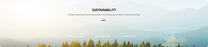
Renewable Energy/Sustainability
As environmental consciousness has considerably increased, industrial machinery manufacturers face the challenge of aligning their online presence with sustainability principles.
Some websites choose to make this one of their core values and thus highlight it in the hero section. Some only include a dedicated section or do not include it at all.
Best Practices
- The section’s placement in the visual hierarchy (or inclusion or lack thereof on the homepage) can send a message about the extent to which sustainability is a priority for the company.
- As environmental concerns shape customer preferences and industry standards, prioritising sustainability in digital representation is crucial for industrial machinery manufacturers.
- As time passes, companies’ commitment to sustainability will quickly transition from “nice-to-have” or “preferred” to mandatory, as the world as a whole becomes more conscious of the difference big companies can make, especially in the manufacturing industry.
- Concrete proof about a company’s actions towards sustainability (e.g., links to articles about steps they’re taking towards that) is preferred over mere words/visuals.
- A carefully crafted copy can make the difference between a generic, good enough sustainability section and a powerful part of the website that will make a lasting impression on a potential client who might be environmentally conscious.
GE makes renewable energy a promise central to their offer.
- Not only do they highlight that in large, bold font on their homepage, but they also include links to a dedicated renewable energy newsroom, as well as some featured news pieces in the form of a carousel.

- This shows that they’re not just saying they are trying to be sustainable, but actually taking concrete steps towards that, as evident in the recent news.

SKF goes for a more compact approach, including the Sustainability topic in a card alongside Careers and About Us.
- The good quality visuals alongside nicely worded copy and a direct link to more details about the company’s sustainability efforts is a good approach.

Mitsubishi overlays their sustainability section over a nice, full-width image.
- However, the poor contrast between the copy and especially the CTAs makes it barely readable.
- This is a shame since the company links to the full array of projects and sustainability initiatives they have going on, which gives them a competitive edge.
GEA has a different approach to showcasing their commitment to being a sustainable company, celebrating one year of innovation in sustainability with a special video and a custom illustration.
- This adds interest to the section whilst not obstructing the copy.

- Below that they also include another section that sums up their concrete actions for “Engineering for a better world” against an appealing, high-quality background image.

FLS introduces sustainability in a more indirect manner. They do this by showcasing their “green cement” and providing links to a dedicated website for more details.

Wärtsilä includes a very basic section with a brief title, copy, visual and a CTA.
- Such an approach will do, but it feels low effort and doesn’t include any solid proof of the company’s sustainable actions unless one clicks on the “Find out more” link.

Trane Technologies’ large copy about sustainability and their commitment to sticking to sustainable practices is well-worded, which makes it stand out.
- Their secondary call to action “Let us convince you” sends a powerful message, letting a potential client know that the company is responsible for proving their value and is ready to do so already, from the very first section of the website landing page.

Kone has a dedicated section for stories on sustainability, which is a good way of showcasing the actions they’re already taking to building the future they promise.
- The carousel is well designed, with horizontal scroll controls and a page indicator, to hint towards the content that’s available.

Trelleborg takes a similar approach to SKF, including sustainability in a card section alongside other topics like careers and solutions.
- This approach may also send a more subtle message about how the company doesn’t prioritise sustainability, which is risky in today’s business environment.

Valmont shows their commitment to renewable energy by including a large visual and some copy in the hero section.
- They also include a sustainability section card further down the page alongside others like Careers, Company, Investors etc.
- This shows that sustainability is a priority for Valmont, with the card being useful for linking to further information.


About Section
This section comes under different names such as Company, About Us, Culture, Learn More About Us, Key Stats, Meet the Team etc.
Essentially, this is a brief section found on the homepage that sends a message about the company (what they believe in and what they do).
Best Practices
- Make sure to highlight your company’s top strengths — be it long, established history in the business, unique approach etc.
- Keep in mind this is not the hero section, so you want the main value proposition to be reserved for that.
- Instead, add more details/talk about other aspects of how you’re making a difference.
- You can use stats but they are quite impersonal. Still, they might be impactful, especially for longstanding businesses.
- Make the user relate to your company’s culture/mission/purpose; make them care about what you do.
- Make this more personal, by including people you’re impacting/personal statements from executives etc.
- Avoid some impersonal, technical statements as they’re quite basic;
❗️Keep it simple!
Flowserve goes for a symmetrical card layout for their Culture section, talking about their core values and how they make an impact to the community.
- Adding two links to more in-depth articles is also a good idea.

Desktop Metal chooses to display some key stats about their company, showcasing an impressive history of customers, patents and materials.
- This can be an effective way of establishing trust with potential customers as it proves the company has been in the business for a while and has achieved a great deal since.

GE makes a strong statement on their homepage about their long-standing history in the business with simple, yet powerful copy and a couple of links to more industry-specific pages.
- This simple section keeps the homepage clean and uncluttered while delivering the promise of over a century of experience and expertise.

Mitsubishi Heavy Industries pairs impressive, yet mediocre-quality visuals with their brand description.
- This section is a bit disorganised, as images aren’t the same size, the text is weirdly aligned with the visuals, and the CTA “More” is not properly styled and not that visible.

SKF takes a unique approach at this section, displaying a large, high quality 3D visual of one of their products while describing what they do in a concise, but interesting manner.
- “Our world revolves around rotation” is a smart copy to quickly describe the company’s main offer.
- The section below describes the company’s team and highlights the importance of their expertise, which is a nice personal touch.


Daikin Applied goes for more dynamism, implementing a slow, looped animation in the chart visual on the left side.
- This adds some visual interest and movement to an otherwise static page.
- The title is smartly worded to express Daikin’s contribution to the HVAC industry, catching the user’s attention and encouraging them to read more.
- The section is strictly informative and lacks a CTA, which ensures the homepage as a whole is decluttered and only includes the primary CTAs of interest.
- There’s also a faded, watermark-like large text in the background, which can add to the visual diversity, but is so muted and light that it’s very easily missed.

Carrier displays their main principles alongside a text description and visual to help build more trust in the company.

Investor Section
This section is meant for stakeholders and investors (as the name clearly entails). While this is not for every company website, including such a section (when possible) can bring a lot of value and highlight professionalism.
Here are more reasons as to why to include this section:
- It builds trust by signalling transparency with stakeholders.
- It ensures easy access to financial data for shareholders, analysts, and potential investors.
- It showcases stability and performance through key financial metrics like stock performance, dividends, and earnings reports.
- It ensures compliance with legal obligations and facilitates access to required disclosures.
- It attracts potential investors and analysts by highlighting financial highlights and investment opportunities.
- It empowers stakeholders to make informed investment decisions based on up-to-date financial data and insights.
Almost all companies researched include at least a share price in the header.
Best Practices
- Include a simple share price + trend component in a traditional location like the top right part of the page.
- Make the trend icon clear enough (use red/green colours, don’t make it too small).
- Include links to the dedicated investor area on the website (if available) on the homepage to direct interested users.
- Keep the rest of the info brief.
Bilfinger chooses a carousel component to display some concise information about their company, including financial data like revenue for the past year, number of employees, and CO2 emissions, as well as a preview of stock exchange data alongside a button for more information.
- This approach is useful since it provides an overview of the company for potential or current investors to quickly gauge the company’s current status.
- The stock exchange graph could, however, be optimised, as it’s currently quite small and difficult to read.
- What’s nice about the graph is that it’s interactive, so users can see the stock price evolution for the current day since the opening of the stock market.
- Further links are included on the bottom, underneath the cards.
- However, being so small and having so little contrast, they’re very easy to miss.

Trelleborg also includes some brief investor information in a couple of cards, highlighting the current share price, as well as the evolution compared to the previous day.
- The visual hierarchy is well thought-through, with smaller text providing additional details.

GE goes for a common approach of including the current share price in the homepage header, alongside an indicator of the current trend (increasing/decreasing).
- This is a very compact, yet informative way of displaying share price without dedicating a specific section to it.
- The top right corner is a typical location for this component, as we’ll see in other examples below, it seems to be an industry standard that many companies adhere to.
- Thus, potential investors already have some expectations about where to find this type of information.

Valmont displays their share price in the top right corner.
- However, due to the general low contrast of the header section, coupled with a not-very-legible font, the component itself is easily missed and difficult to read.

IR displays the share price in the top left area, which doesn’t align with industry standards and might make it more difficult to find for some users.
- However, since their CTA occupies the top right corner, this layout makes sense for their specific situation.
- IR displays the current share price, as well as trends and changes compared to the previous day.

Rolls-Royce also adheres to the same practice.
- However, compared to the previous examples, the trending icon is not as visible, which might be intentional as they don’t want to make a decrease in share price too obvious.

Kone has a dedicated link towards an Investors section of the website just underneath the hero area.
- This is another approach that allows for a better separation of information that is of interest to potential investors vs information for a general audience.

Trane Technologies includes several sections dedicated to investors on their page, alongside the classic share price display on the top area of the header.
- What is worth noting is that the trend icon (decreasing — red arrow pointing down) is much more visible and allows for more transparency towards a negative trend in share price.
- Further, down the homepage, we can find a larger card displaying the company’s share price and trend at the market closing time of the previous day, which is definitely good to know for the interested user.
- Several links to more detailed financial information are displayed, as well as recent financial news about the company, which provides a more detailed, specific overview compared to the minimum included by other competitors.
- Including recent news, alongside a link to viewing all announcements is a transparency practice that helps paint the company in a positive light.
- Further below we can find a highlight of their current steps towards tackling social and environmental challenges alongside a link to Investor Relations — this is also useful and helps a potential investor gain a better understanding of the company’s involvement in giving back to the community and of general CSR.


ST Engineering chooses to highlight the current share price in the header area rather than keep it minimally visible, which creates a good visual hierarchy for the top menu.
- Just underneath the hero visual, they include an information strip that provides additional details about the share price at market closing time for the previous day, as well as the current volume of shares.
- This brings the share information to the forefront of the website, however, it’s nicely integrated into the layout and only aims to inform the site visitor.

Contact Section
This section can appear under several forms like “Get started/Contact us/Subscribe”:
- It drives potential sales and business growth by capturing visitor interest and inquiries.
- It encourages interaction and feedback, enhancing the overall customer experience.
- It provides easy access to assistance and information, especially for technical inquiries.
- It instils confidence in the company by demonstrating availability and responsiveness.
- It facilitates targeted marketing efforts and keeps visitors informed about company updates.
- It offers insights into customer needs and preferences through feedback collection.
Best Practices
- Keep it as simple, short and straight to the point as possible.
- Offer several options. Simply having the option of contacting the company directly is not enough.
- This can lessen the weight on the team dealing with email inquiries by redirecting them elsewhere if a resource/option is available on the website.
- Avoid adding visuals if they don’t bring much to the section.
Carrier includes a generic “Ready to get started” CTA that leads to a contact page.
- Including this at the end of the homepage is typical.

Trane includes a full contact form, which is the more traditional approach.
- This may be a blocker to some interested users who aren’t willing to put in the effort of filling out a long form or who just want to see their options but aren’t committed to speaking to a representative just yet.
- This type of approach also uses up more space on the homepage and contributes to the visual noise.

GEA uses some simple cards to promote their newsletter or encourage users to contact them.
- The CTAs are well styles, with enough contrast to stand out and make clicking on them very easy.

Markforged offers several options to interested users, which can be great as users’ inquiries are very different and might not even require a call at all.
- Clearly displaying all the available routes with direct links and no unnecessary text makes this a useful, yet compact section at the end of the homepage.

Trelleborg displays a basic Contact Us section alongside an image meant to reinforce their standing as a company.
- Whilst the visual doesn’t hurt, it’s generally recommended to keep these sections as brief as possible so that they don’t clutter the screen.

Desktop Metal offers the possibility of joining their newsletter, which can be a good way of keeping in touch as an interested user who isn’t yet sure if they want to take the next step just yet.

Key Takeaways
The importance of the homepage in regards to first user impressions cannot be doubted. Here are some key takeaways to keep in mind when building your homepage.
- Showcase your company portfolio + expertise & knowledge.
- Create a digital identity that highlights reliability and trustworthiness — your homepage either makes users leave or stay.
- Effective brand storytelling will contribute positively to your digital image. Build a connection with the user and make them care about what you do.
Paying attention to details is worth it. Every time. Users nowadays have much higher expectations when it comes to the quality of a website, especially since the online world is much more intertwined with our lives.
Check out some more of our recent research & benchmarking articles:
Medical Device Manufacturer Websites Best Design Practices
Chemical Manufacturer Websites Best Design Practices
Law Firm Websites Best Design Practices