Tradition vs Innovation in UX Design
In the face of design decisions, why should we value standards?

“On the landing page, all images must be shown, no pagination, no side scrolling (…). If a buyer needs to click on something to see more images, he bounce off and leave… Maybe you need to readjust the design, think outside the box..”
This was the comment of my client — for whom I am developing a product still in the prototype phase — that inspired me to write this article.
The landing page was not static and therefore the number of images would be unpredictable, there could be 10 or 100 images. The problem was relatively simple for me. A photo section on a landing page that could be solved in several ways. I suggested a vertical slider, a “load more” button to load more photos or even create a page dedicated to the gallery where the user could access it if he wanted to see more photos.

When he said “If a buyer needs to click on something to see more images, he bounce off and leaves” he was stating a myth that is unfortunately widespread among popular knowledge about usability problems. As Steve Krug said in his second usability law: “It doesn’t matter how many times I have to click, as long as each click is a mindless, unambiguous choice”. But I will not stick to this problem, my focus here will be on the risks and benefits of innovation / tradition.
Back to the problem …
Showing all of the photos at once could extend vertical navigation too much while it would increase the page load time. One of the best solutions, in my opinion and according to this article by the Nielsen Norman Group, would be to show part of the content and load the rest of the content on demand according to the user’s wishes.
But he didn’t like my alternatives and told me to think outside the box. In other words, he was asking me to innovate, to create a new solution (at least new for me).
You reader may be thinking of different solutions than the ones I suggested, and that’s okay, it’s not my goal here to tell you that my solutions were the best. For all life’s problems there are innovative solutions that would revolutionize a traditional way. And it was there that I remembered an old nuisance in my life:
I can’t create anything from scratch
I remembered when I started designing interfaces many years ago. I spent hours with Photoshop opened trying to create something cool and getting frustrated a few times. I will not exaggerate and say that nothing flowed. Sometimes I did something interesting. But some senseless ego inside me told me that I needed to create something “from scratch”. Something that was born 100% of my ideas and was good. At that time I had difficulties in finding inspirations to create. I thought that by doing this I would somehow be copying someone else’s work and losing my authenticity. I almost gave up being a designer at the time and started to focus more on the front end development.
If I can’t create anything from scratch, then I can’t innovate?
If we consider innovation as the invention of something absolutely new and without “pieces” of things that came before, no human being has ever innovated. It turns out that innovation is much more a transformation process than of creation process. And understanding that, I was able to resolve my conflicts as a designer.
Nina Paley in The Cult of Originality wrote: “ Nothing is original. For a work to have meaning, it must use language — it must “make sense.” It needs to work with memes already living in the host mind: language, images, melodies, patterns. It can’t be wholly original. It can hardly be original at all.”
You don’t need to reinvent the wheel
You may have heard this phrase before and it is an important truth when it comes to user experience.
If we analyze the various interaction interfaces that currently exist in different devices and compare them with the interfaces of the past, we will realize that what happened was a gradual transformation, an evolution that happened to adjust the systems to our needs. We can agree that some changes may have occurred more quickly than others, but that does not take away the fact that they are derivatives.
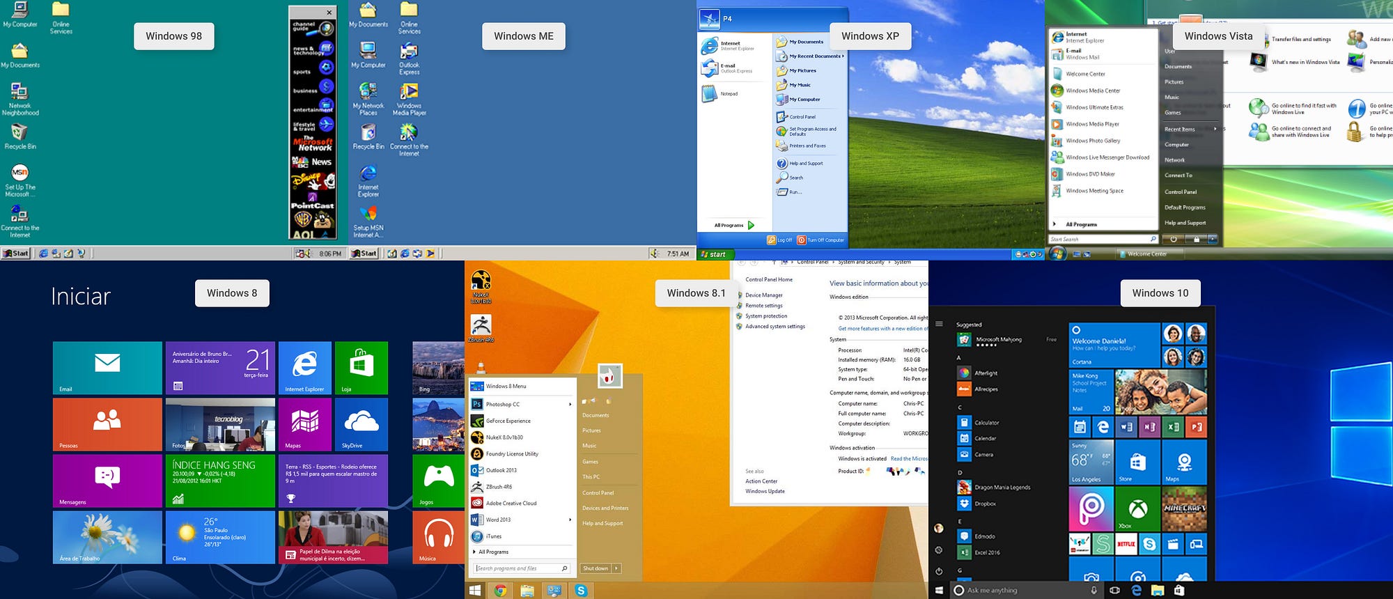
See how the Windows desktop interface has evolved gradually. There is, however, a curious fact in the evolution history of Windows when it comes to the version of Windows 8. See how there has been a drastic change in the design of interaction in relation to the other previous versions. The impact of this change teaches us a lesson:
Radical innovations are risky
Version 8 of Windows marked a wave of disappointments for Windows users. This is because the change in the desktop did not please users at all. Microsoft was betting on a screen aimed at touch-screen devices and forgot that tradition is also important, as familiar users do not have to deal with a large learning curve.
“Consistency is the curse of innovation in design. If you’re convinced that, once your users will have learned the interface, they will save time over the status quo, then it can be worth trying. But remember that the path to innovation is circuitous and costly, and if your users won’t have many learning opportunities, they may never reach that optimal-performance plateau accessible only after learning has happened.” — The Power Law of Learning: Consistency vs. Innovation in User Interfaces, Nielsen Norman Group
Beyond the learning curve, I venture to say that many users just prefer that some standards to be maintained. Not because they find learning difficult, but simply because they prefer it, in a generic and complex way, with sentimental variables that are very difficult to measure here. Personally speaking, there are several things in my day-to-day life, far beyond software, that I would like from the bottom of my heart that would not change radically. Others, obviously, I still wonder how they didn’t make a better version. And in the second option, there are great opportunities for innovation.
Does this mean that I should always keep the same old designs?
No. As in the Windows example, starting from 8.1 version, Microsoft maintained certain standards regarding the desktop but was able to innovate in several other aspects in order to improve the experience and also innovate in the visual aspects of the operating system. In other words, the lesson I learn from Microsoft is that you can innovate with caution, maintaining some standards, always listening to your users preferences.
“Conventions are our friends”
In “Don’t Make Me Think” Steve Krug talks about the importance of standards: “When applied well, Web conventions make life easier for users because they don’t have to constantly figure out what things are and how they’re supposed to work as they go from site to site.”
And what happened to the problem with my client?
Going back to the beginning of this article, where I introduced the case that inspired me to write it… My position in relation to my client was to convince him to use a pattern recommended by the nngroup article. I made it clear that I didn’t want to contaminate his product with personal opinions, but to help him create something that, at the same time, was authentic and also familiar, to provide a better experience for his users.
Conclusions
- Nothing is created, everything is transformed : all creative work is derived.
- Innovation occurs through a gradual transformation.
- Standards are important and caution when innovating. Radical changes can undermine the user experience by increasing the learning curve.
Thank you for reading it! If you have suggestions about this topic, feel free to comment here. Let’s talk!


