Transforming Healthcare with MEDIC Doctor App: A Case Study
“Here is a case study of designing a Doctor App featuring Consultation, Lab Test Booking, and Healthcare E-commerce”
As a child, I observed individuals traveling great distances to different states to seek treatment from a specific medical specialist. Initially, I wondered why they wouldn’t simply contact the specialist by phone and request that the necessary medication is sent. However, I later came to understand that health is an incredibly important and delicate matter and that it can be challenging to provide treatment without a face-to-face examination of the patient.
Although we now have the ability to connect with doctors online in this technologically advanced world, many individuals still prefer the traditional method of visiting the hospital, often wasting time making appointments and waiting in line.
You may ask why?
Ultimately, there is no straightforward answer to this question. However, by the end of this case study, all the answers will be revealed.
Overview🥸
Nowadays, the world has become increasingly digital, with online shopping for everything from clothing to groceries. Despite this, people are still cautious about using digital medical services as health is a crucial aspect of our lives. In an effort to address this issue, I am creating an application that offers various features such as virtual doctor consultations, lab test booking, and an e-commerce platform for purchasing healthcare products. The design of this app presents a challenge as the target audience is broad, ranging from ages 18 to 65. To ensure the best possible user experience, it is crucial to consider the problems faced by users with existing apps and design an app that has a user-friendly interface.
What’s the Process?🧭
For this case study, I have chosen to utilize the Design Thinking process. This approach was selected as it is an effective methodology and mindset when tackling complicated issues, especially those that are centered around human needs. By using Design Thinking, I aim to find the best solution to this challenge in a user-centered manner.
There are 5 Stages in the Design Thinking Process:
Empathize →Define → Ideate →Prototype → Test
Let’s Get Started🚀
I will explain each and every phase in detail and try to elaborate on research I have done to improve the experience of Medic.
Phase 1: Empathize
I have done User research in this phase to understand what are the pain points that users are already facing in other apps and to understand what they are expecting in the Medical App.
I have done research in two ways:
A. User Research
B. Market Research
A. User Research:
There are two types of User Research methodologies, those are Qualitative and Quantitative Research. I have chosen Qualitative Research because I had a time constraint.
These are the Questions I asked in the User interviews:
- Tell me about yourself.
- Do you have any family member who visits the doctor frequently?
- How do you usually book the appointment?
- Have you ever done consultations with doctors online?
- When would you prefer for going online consultations?
- Have you ever booked lab tests from home?
- Have you ever booked Healthcare products online?
These are the basic questions I started the interview with, and every question has many follow-up questions based on their answers.
User Personas
- Persona 1 — Single mother
Aarushi is a 35-year-old single mother who has used online doctor consultation apps in the past, but she found it hard to find a good doctor who could help with her child’s needs.
Basic Data: Age: 35, Gender: Female, Occupation: Freelance Writer Challenges in online doctor apps: Lack of transparency in terms of doctor qualifications and availability.
PainPoints: Inadequate support from doctors, and difficulty in navigating the app.
Looking for: An app that can connect her with experienced pediatricians and provide healthcare products and lab tests. - Persona 2 — Senior Citizen
Manoj is a 65-year-old retiree who has used online doctor consultation apps in the past, but he has difficulty navigating the app and managing his medical records.
Basic Data: Age: 65, Gender: Male, Occupation: Retiree
Challenges in online doctor apps: Difficulty navigating the app and managing medical records
Pain Points: Limited access to healthcare products in his area, lack of support from doctors.
Looking for: An app that is easy to use provides access to a wide range of healthcare products, and allows him to manage his medical records with ease. - Persona 3 — Rural resident
Shreya is a 45-year-old who lives in a rural area and has limited access to healthcare services. She has used online doctor consultation apps in the past, but they did not provide the services she needed.
Basic Data: Age: 45, Gender: Female, Occupation: Homemaker Challenges in online doctor apps: Limited access to healthcare services Pain Points: Inability to access and manage medical records and history.
Looking for: An app that provides easy access to doctors, affordable healthcare products, and lab tests. - Persona 4 — Working professional
Vinay is a 30-year-old working professional who has used online doctor consultation apps in the past, but he found it difficult to schedule appointments around his work schedule.
Basic Data: Age: 30, Gender: Male, Occupation: Marketing Manager Challenges in online doctor apps: Difficulty scheduling appointments Pain Points: Lack of transparency in terms of doctor qualifications and availability, Insufficient information about the clinic or healthcare facility.
Looking for: An app that allows him to schedule appointments at a convenient time, provides access to a range of healthcare products, and allows him to manage his medical records with ease. - Persona 5 — College student
Pooja is a 20-year-old college student who has never used an online doctor consultation app before. She is interested in using one to manage her health needs but is unsure how to navigate the apps.
Basic Data: Age: 20, Gender: Female, Occupation: Student
Challenges in online doctor apps: Difficulty in navigating the app
Pain Points: Limited access to healthcare products, lack of information about healthcare options
Looking for: An app that is easy to use, provides access to healthcare products, and offers reliable information about Hospitals.
Key Insights from the user interviews
- Difficulty in finding and selecting the appropriate doctor or healthcare provider.
- Lack of transparency in terms of doctor qualifications and availability.
- Insufficient information about the clinic or healthcare facility.
- Difficulty in canceling or rescheduling appointments.
- Inability to access and manage medical records and history.
- Poor user interface and navigation.
- Limited access to customer support and assistance.
- Inconsistent pricing and billing practices.
- Insufficient options for follow-up care and monitoring.
- Limited ability to receive and give feedback on the quality of care received.
- Difficulty in obtaining necessary prescriptions.
- Inadequate support for individuals in remote or underserved areas.
B. Market Research
I have done desk research which gave me many insights from a different point of view. I have seen a lot of statistics regarding the Medical industry and online medical services. So that I can get involved completely and understand the problems from the majority point of view.
Key Insights from the Market Research
- The number of doctor consultations crosses 4 billion in India in FY21, spending a total of $26 billion on outpatient prescriptions. “It is likely to grow at 13 percent over the next three years,” said the report.
- Before the pandemic, 3.5 million households were ordering medicines online, that number increased to 8.8 million after three months of the lockdown. (Report, the Federation of Indian Chambers of Commerce).
- PharmEasy which became the first Indian e-pharmacy start-up to enter the unicorn club has 25 million registered users and claims to service more than 18,000 pin codes. Its acquisition of Thyrocare brought into its fold a chain of 3,300 diagnostic centers across 2,000 towns and cities in India.
- Analysis indicates that 1 in 35 consultations will happen online by FY24.
- Practo, 1Mg, Pharmeasy, Mfine, Apollo, Netmeds, and a few apps are mostly used in India.
Phase 2: Define
I have got all the key insights from the User interviews, now let's understand all the points and define the actual problems that a designer can solve.
I have asked a lot of people why they haven’t tried Online Doctor consultation, and the majority of people answered “We can’t trust Online Consultations”.
Storytime: Do you know that when online e-commerce started in India people didn’t trust it much and always gave the offline market priority?
So Flipkart understood that we need to make people trust our platform, that’s how COD(Cash on Delivery) started in India in mid-2010. Still, the shocking fact is 70% of shoppers prefer to pay via Cash even today. So the catch is, people always go towards the Safest side. I think there is a same problem with today’s online consultation services.

Let’s elaborate on these points and try to understand them in detail.
- Old people can’t book the appointments by themselves: People of age 40–65 will really feel hard to navigate the new modern apps. So it’s better to create a user flow that can be very easy.
- Unable to select the Doctor: Normal people don’t know the specialization names for the problems they have. So they are unable to select a doctor.
- Unable to see all the information about Doctors: Customers can’t see data about the doctor's qualifications and history.
- Limited Customer Service: It’s too hard to connect to customer service.
- Inability to access past consultations report: All the users in the interview said that they are unable to find all the past consultation reports.
- Insufficient information about the clinic or healthcare facility: In other apps, there is no sufficient data regarding the hospital or the healthcare facility. So it becomes terrible to book an appointment from that hospital which doesn’t give all information.
- Facing issues while booking a slot for follow-up sessions: Unable to get the slot on the same day when the doctor states the follow-up session.
- Facing problems while trying to reschedule the Appointment: Customers are unable to cancel or reschedule their booked appointments, which is a red flag.
This is detailed information about where the users are facing the issues and what they need in a better Doctor App.
Phase 3: Ideate
Brainstorming the Solutions 🧠
Let’s take all the problems and ideate about the solutions for all the problems that are mentioned above.
Problem: Old people can’t book the appointment by themselves
Solution: Need to create an easy flow for Senior Citizens
Problem: Unable to select the Doctor
Solution: This problem can be solved in 2 ways, First way is adding an assistant in the App and the Second one is chatting with the customer care service.
Problem: Unable to see all the information about Doctors
Solution: Need to provide all the information about the Doctors on the Doctor profile page.
Problem: Limited Customer Service
Solution: Should design a simple UX flow where all the users can easily access Customer service.
Problem: Inability to access past consultations report
Solution: Create a screen where they can access all past consultations.
Problem: Insufficient information about the clinic or healthcare facility
Solution: Need to show all the information about the Hospital and doctors.
Problem: Facing issues while booking a slot for follow-up sessions
Solution: Find an idea about how people can get the follow-up sessions slot properly.
Problem: Facing problems while trying to reschedule the Appointment Solution: Need to provide the cancellation and reschedule the appointment.
Wireframing
Using wireframes I put those bunch of ideas on paper first and then started to make them High-fidelity wireframes and after dozens of corrections I came up with these wireframes.

My Moodboard
I feel a great way to start designing the best UI is by consuming a lot of great designs. I was having all the wireframes ready but the UI should be made with a lot of concentration so that it will accessible to all customers. Not only these Screenshots, but I have also checked each and every app which is in the same category and tried to understand the usability of the apps and how they are making it easy for their users.

Phase 4: Prototyping
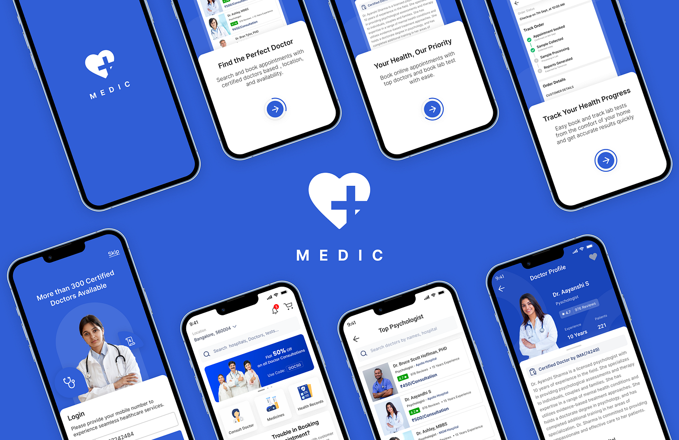
Splash and Onboarding Screens
These screens really create the first impression of the overall App. These screens are the best place to Showcase the data about the app and how this particular app can help them. So I’m trying to highlight the 3 main features of the app which can be attractive to get started with the Medic.

Signup and Login

The above image is the user flow for logging into the platform, as well as the user interface (UI) for the login screen in the below image. The login flow is designed to be seamless and straightforward, with clear instructions and visual cues to guide the user through the process. The login screen is well-designed and visually appealing, making it easy for users to access the platform and start using its features.
One of the key features of the login screen is its simplicity. Users are only asked to enter their Phone number and OTP, making the process quick and hassle-free. I think this is the best way to login for this user segment.

Homescreen Design
After numerous iterations, I have finally created a design for the Homescreen of the App. I understand the significance of this screen, as it serves as the main interface for users to access the App’s features and functions. Therefore, I have designed it with a minimalist approach and incorporated the findings from my research to make it more user-friendly and accessible.
Here is a detailed explanation of each element included in the Homescreen design:

let’s talk about the problem “Old people can’t book the appointment by themselves”.
Well, this is a major problem, and cracking it would make the UX of the whole app better. So, I started understanding the problem deeply and taking a lot of considerations. I have created this user flow.

Why two flows?
Flow 1: This flow is completely normal like any other app where people can book the appointment by themselves and it’s the generic way of booking the appointment.

Flow 2: As I said it’d be too hard for old people to navigate and it’s not that easy to enter a lot of details to book the appointment. So I made a flow where they can literally skip the hard process of the booking. All they can do is call Customer care and book through them. They can ask them all their doubts and then book the appointment.

The flow will be: They can click on call customer care and tell them their registered mobile number > Request them to check the particular hospital or Doctor to consult > Ask them to book the appointment > Fix the slot > Tell all the details that are required to book the slot > Get the payment link to the Mobile number > Do the payment through multiple ways like UPI, Card or Net banking > Get the confirmation and appointment details in Upcoming Appointments page.
Appointments & Appointment preview Screen
On the left-hand side of the screen, you’ll find the Appointments section where users can view their upcoming, completed, and canceled appointments. This section is designed to help you stay organized and keep track of all your scheduled medical appointments.
The Upcoming appointments tab is where you’ll find a list of all your scheduled appointments. Each appointment is represented by a card that displays the doctor’s name, profile picture, area of specialization, and booking information such as the date and time of the appointment. This makes it easy for you to quickly see all the important details about each appointment and stay on top of your schedule.
On the right screen, you’ll find a preview of the Appointment details, displaying the following information:
- Basic information about the doctor, including their image.
- A floating button to initiate a chat with the doctor.
- The date and time of the appointment, along with a call-to-action to add it to your calendar.
- Information on how to join the call.
- Instructions to be followed prior to the consultation.
- A call-to-action leads to further details about the doctor.
- Information on the payment details.
- A call-to-action to download an invoice.

Chat and Video Consultation Screens
The first image on the left showcases a chat conversation between a patient and a doctor. This chat platform is designed to provide patients with instant access to medical advice and support. The second image on the right showcases an online video consultation between a patient and a doctor. This platform provides patients with the opportunity to have a face-to-face consultation with their doctor without having to physically visit the clinic.

Making the App Accessible for Colorblind People
😧 Fact: Overall, approximately 8% of men and 0.5% of women have some form of color blindness.
As an app in the Healthcare industry, it is crucial that it is made accessible for individuals who suffer from color blindness. To make the app user-friendly for these users, we have implemented a text hierarchy throughout the app. This helps to distinguish the different sections and information on the app. Additionally, wherever there is call-to-action texts, we have underlined the text to clearly indicate that it is a button and can be interacted with. This way, everyone, including those with color blindness, can easily navigate and understand the app.

Prototyping the Screens
The following images depict the major screens of the app, which have been prototyped at the component level. As a result, the images are free from clutter and provide a clear visual representation of each screen. This prototyping approach allows for a detailed examination of individual components and helps to ensure that the app has a streamlined, user-friendly design.

Phase 5: Testing
The testing phase is a crucial part of the UX design process, as it provides the opportunity to evaluate the user experience of the app and identify any areas for improvement. The goal of this phase was to assess the usability, functionality, and overall user satisfaction with the online doctor consultation app.
User Recruitment: A total of 8 users were recruited for testing, ranging in age from 25 to 60 years old. Participants were selected based on their prior experience with online doctor consultations, as well as their willingness to provide feedback on their experience with the app.
Test Methods: During the testing phase, participants were asked to perform a series of tasks using the app, like scheduling a consultation, and accessing their medical history. Participants were also asked to answer questions about their experience with the app, including questions about the app’s usability, functionality, and overall satisfaction. The data collected during the testing phase was analyzed using a combination of quantitative metrics, such as task completion rates and time on task, as well as qualitative feedback from the participants.
Results: The results of the testing phase indicated that the majority of participants found the app to be easy to use and effective in scheduling a consultation with a doctor. Participants reported a high level of satisfaction with the app, with a satisfaction rate of 90%. However, some participants reported that they experienced difficulties with the app’s navigation.
User Feedback:
“The app was really easy to use and the appointment scheduling process was quick and straightforward.”
“I liked how the app was able to save my medical history and make it accessible.”
“The design of the app was a bit cluttered and could benefit from a more streamlined navigation.”
Conclusions and Recommendations: The results of the testing phase indicate that the online doctor consultation app is well-received by users, with a high level of satisfaction reported. However, there is room for improvement in terms of the app’s navigation and functionality. Recommendations for improvement.
This completes the sample testing phase for the UX case study of an online doctor consultation app.
What I have learned:
As a UX designer working on a doctor app, I have gained valuable insights and knowledge through the design process. Some of the key things I have learned include:
- Understanding user needs: The design process started with researching and understanding the needs and pain points of users, including both patients and doctors. This helped me to identify the core features and functionalities that needed to be incorporated into the app.
- Importance of simplicity: While designing the app, I realized that it was important to keep the user interface simple and intuitive. A complex and cluttered design could lead to confusion and frustration for users, especially for older individuals who may not be tech-savvy.
- Accessibility considerations: Another important aspect of the design process was ensuring that the app was accessible to all users, including those with disabilities.
- User feedback: Throughout the design process, I received regular feedback from users and made adjustments to the app accordingly. This helped me to ensure that the app was meeting their needs and expectations and to make any necessary changes to improve the overall user experience.
In conclusion, designing a doctor app has been a challenging yet rewarding experience that has allowed me to gain a deeper understanding of the needs of users and develop my skills as a UX Designer.