Tube Buddy Mobile App Redesign — UI/UX Case Study

Now before we get started, I’d like to do a super small plug to one of my highly requested courses!
It’s Free! The Mega Product Design Course for Beginners!
If you’re looking to drastically upskill and change your career trajectory for the better, make sure to check out my Mega Product Design Course for beginners on my YouTube Channel.
I’ve had the good fortune of working with some of the biggest companies and startups and have learned a lot through that. And I share all the knowledge with you all for free on my YouTube Channel.
I cover everything from the core foundations of Product Design, UX Design and so much more. Get to see and learn what it takes to be a skillful product designer which can get you any opportunity you want.
Anyway, let’s get into the case study!
So when I decided to move away from my old career path because I wanted to Pursue my Passion which was Design, I had to, of course, build a portfolio in order to get a job as a UI/UX Designer. So I decided to work on a Website Design and an App Design as well.
When it came to the App Design, I had no idea on what type of app to design. Should I design a brand new app? Should I design an app for an existing company which did not have an app? Or should I redesign an existing app? At first, I did try the first 2 options but then I was running out of time and so I chose the last option of redesigning the app.
To decide what App to Redesign, I opened up all apps on my phone to see which app could need a big redesign and the one that I decided to redesign was Tube Buddy.
What is Tube Buddy?
Tube Buddy is a YouTube Certified Company that helps YouTube Creators to better manage their YouTube Channel. They provide users with a lot of features from SEO, Thumbnail Generation, A/B Testing, Tag Explorer and much more, that YouTube itself does not provide. Tube Buddy is basically a Browser Extension that integrates directly onto YouTube.
A few months back (sometime in 2018) Tube Buddy Released their Mobile App for Android and iOS. As soon as they did, I downloaded it because I too am a YouTuber. I run a Design Channel called Design Pilot where I upload Design Tutorials.
Why Redesign?
To be honest, I was very disappointed with the app as I feel in my opinion that it seems to be a very poorly built app in terms of UI, UX and Code behind it (It is just my opinion as a user). The Main objective of the app was to make managing ones YouTube Channel much easier anywhere the person is without the need of doing it over a computer. But Unfortunately, I feel that the app was not able to accomplish that 100%.
Now, I might not know the exact stats about how well the app is doing or how many users are using the app, but I am a 100% sure, that a Redesign would help the app grow much bigger than before.
Feel free to check out my Behance Project that I made for this Redesign. (While you are at it, please do give it a LIKE, will ya?) :P
Now that you have LIKED my Behance Project, let’s dive deeper.
The Redesign
Splash Screen

- The First thing that I did was to change the color of the splash screen to red color that is there on the Tube Buddy Logo as the splash screen is the first screen the user sees and it is important for the splash screen to showcase the brand’s primary color. It is definitely not a must but it would make more sense than Black.
- The next thing I did was add the YouTube Certified Logo at the bottom of the screen to make the user feel that he is using a trustworthy and well-vetted app. Moreover, Tube Buddy uses the Certified Logo almost everywhere over the internet, so why not have it on the app as well.
Home Screen
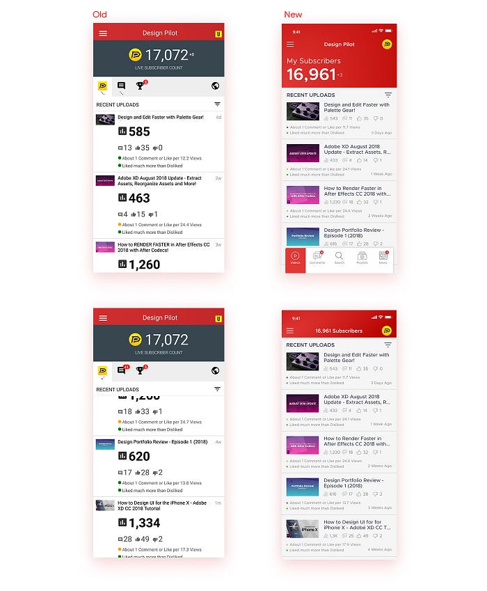
- I decided to change the layout of the Subscriber Count to be left alighted as all the other content was left aligned too. This would ensure a bit of consistency.
- The position of 4 Tabs just below the subscriber counter was a little off in my opinion and so I decided to move it to the bottom and also added labels to it.
- On the Top Right of the screen, you can see a yellow color button which when tapped basically opens up a screen to upgrade to the Ultimate License. I felt that it was something that was not of very much importance for a user to have on the main home screen and so I replaced it with the profile picture of the user and moved the Upgrade Button to the Menu Section.
- It was quite surprising to see that the app did not have a Search option because that is quite an important feature that everyone uses. And so, I added a separate search tab on the bottom Nav Bar.
- On the old screen, the globe icon is actually for news which I never knew because of 2 reasons. Firstly because I never tapped on it as it was too far away from the other 3 icons on the left and secondly, since it was a globe, I thought it had something to do with my location or something similar. And so, to fix that, I changed the Icon to a News Icon and moved it to the Nav Bar.
- I felt that users would like to see stats of their playlists as well and so added a tab for that as well.
- Coming to the Main Content, I made quite a few changes. There was not much of a visual hierarchy as the Views Stats icon and text was very very big, even bigger than the name of the Video. And so, to bring in some visual hierarchy, I made the thumbnail and text a lot bigger and reduced and fit the stats text and icons under the name of the video.
- Now, the bottom 2 screens show the scrolled state. When a user scrolls, it means that he wants to see more, and so we must use as much real estate as we can to show the user as much content as possible. The New Screen was able to show at least 5 videos, unlike the old screen which constricted the scroll area. On the new screen, I moved the Subscriber Counter to the top center and moved the bottom navigation bar out of the screen. To view the navigation bar again, the user would have to scroll back up a bit irrespective of the amount he has scrolled down.
Comments Tab
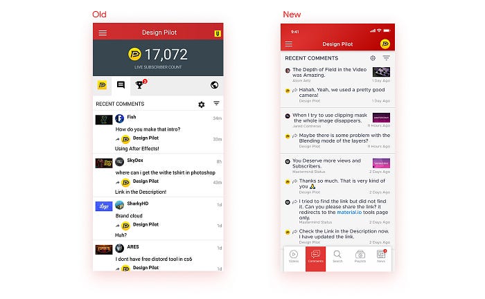
The first thing that a user wants to see when he goes to the comments section are the comments and so I moved the thumbnail to the right side of the screen and made a few tiny changes to the layout to have more content sit inside the screen.
News Tab
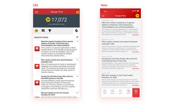
- The Red YouTube Icon on the left of every article really had no purpose and so I scrapped that giving more room for content to fill in.
- I added a simple Read More Call to Action inviting the user to read the full article.
- I also change the date of publishing the article to be the full date and moved it above the Title of the Article. It would look nice to see the actual date of publishing the article.
Navigation Menu

- So for the Navigation Menu, the first thing I did was to make it full screen and not just 75% of the screen. It was just a personal preference.
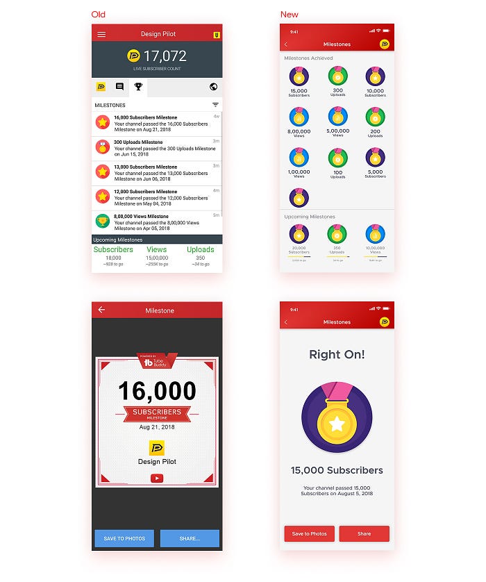
- I brought in the UPGRADE and the MILESTONES from the home screen to the Navigation Bar as these were not the primary functions of the user.
Upgrade License
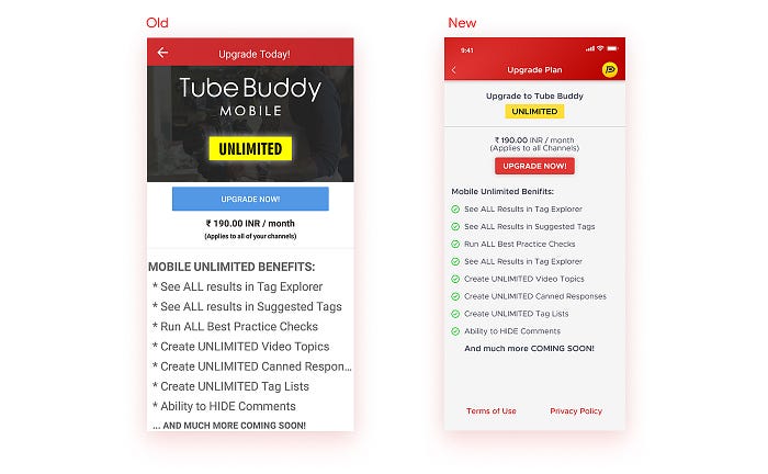
- Right off the bat, you can see that UNLIMITED looks like a Button and UPGRADE NOW seems less like a button in front of the former. But actually, UNLIMITED is not even a button even though its glowing and the UPGRADE NOW is a Real Button. This was a bit deceiving and so had to fix it. I made UNLIMITED smaller without any glow and made UPGRADE NOW look like an actual button.
- All the benefits that are mentioned have an * and so look like Terms and Conditions. The user would definitely know that they are benefits when they read it, but why take the risk of confusion. After all, this is an important screen for the company to make more money. It makes sense to make it very much inviting and trustworthy and so I removed the * and added green ticks instead.
The Rest of the Screens
The screens that I showed above were the main and important ones. Below are the rest of the redesigned screens.
Milestones
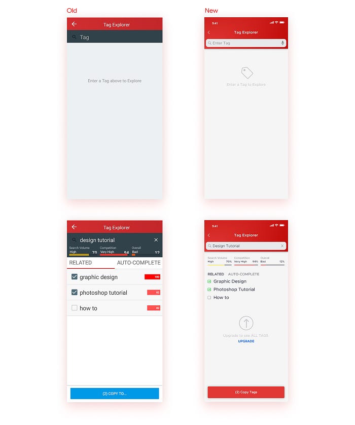
Tag Explorer
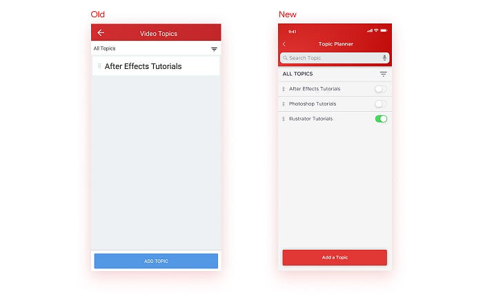
Topic Planner
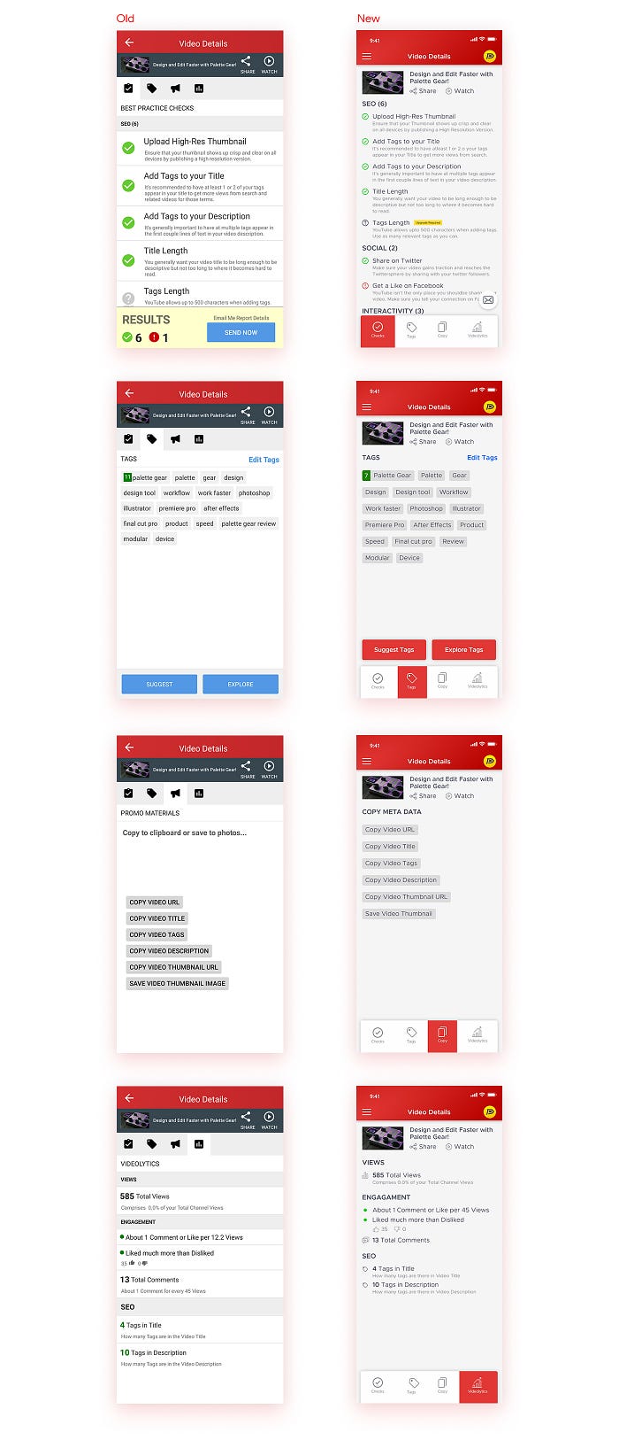
Video Details
Conclusion
So that was pretty much it. Hope you found it useful and interesting. Feel free to follow me to stay in touch and be updated with my works and tutorials.
🔥 2 Free months of Skillshare Premium!
If you want to learn to build a fully functional website from scratch without using a single line of code in Webflow, make sure to check out my Mega Webflow Course for Beginners! You can find the course on Skillshare
Register with my link and get 2 free months of Skillshare Premium and watch it for free.

Did you know?
You can give up to 50 Claps on an article? Just hold the clap button for a few seconds and bamm! Try it out 😋
Check out my other articles
You can follow me on:


