Typography Trends in Web Design 2024

The importance of typography in web design keeps waxing and waning every few years. One year, ‘experts’ will claim that this web design element is no longer as important as it used to be. The next year, the same ‘experts’ will say the opposite.
This year, the latter is proving to be true. In 2023, the web typography world has enjoyed an explosion of creativity. Richer typefaces, 3D styles, bold fonts, and various other interesting typography trends have taken over the world of web design.
These trends have made one thing very clear- in the world of web design, typography is not just about picking pretty fonts. It is about making the information you convey through text more impactful. There is plenty of research to back this claim.
- A study published in the International Design Journal in 2020 demonstrated that typography plays a vital role in how people perceive the information they find on websites.
- In the study, researchers proved that different fonts trigger different cognitive processes in the minds of readers when they are reading a piece of information on a website.
- In other words, the way the human brain learns and retains information is directly impacted by typography.
Now you might say that is nothing to be surprised about. After all, if you deliberately choose hard-to-read fonts for the text on your website, readers will not find it engaging, right? Wrong.

- According to some studies, harder-to-read fonts like Monotype Corsiva or Bodoni are more impactful than their ‘easy-to-read’ counterparts like Arial, Verdana, or Times New Roman. This detail may appear counterintuitive. But, it is true: even for students with dyslexia.
- A study published in the Journal of Education Research in 2013 proved that students with dyslexia retained more info when they were made to read texts in hard-to-read fonts.
- Why? According to the researchers, deciphering hard-to-read fonts requires more mental processing power. Fonts that are difficult to read improve the reader’s ability to retain more information.
Facts like these reinstate the importance of typography in web design. Typography’s impact on the way Internet users explore, learn, and retain info may be hard to notice. But, it is there and web designers must be aware of it. Also, good use of typography in web design can:
- Increase Accessibility: The right use of typography can make your web design appealing to a much wider audience. For example, italicizing or highlighting certain sections of an article can make it easier for people with cognitive disabilities to process the text.
- Direct Reader Attention: Typography is also an easy way to grab or direct the attention of a website user. Web designers can use typography to make certain chunks of information stand out against other visual components. For example, placing a piece of info in a prominent location on a webpage (in the center or at the top) can make it appear more eye-grabbing to readers.
- Establish Visual Hierarchy: Typography is also a vital tool for web designers who want to establish clear visual hierarchies of information on their sites. They can use typography to direct their readers’ eyes to the most important textual elements on their sites, be it headings or subheadings.
- Enhance Branding Efforts: Typography can also be used to set the tone for the brand behind the website. When a brand uses the same typographic elements (fonts, colors, etc.) across all digital marketing channels, consumers notice. After a while, they start associating the brand with those typographic elements. For example, if you look up the font “Avant Garde Gothic Demi” you will instantly think of one brand and one brand only: Adidas. Many factors come together to boost a brand’s recognition amongst the masses or on the Internet and typography is certainly one of them.
If your website’s overall design is attempting to narrate a positive brand story to your target users, the efficient use of typography can make this narrative more convincing. On the contrary, inefficient use of typography can have multiple negative effects on your site’s performance.
So, if you are designing a new website from scratch or refurbishing an old one this year: do not neglect the subtle yet critical importance of typography in web design. Having a clear idea of the most popular typography trends in the world will make this job easier.
So, let us explore the most notable typography trends of 2023!
Popular Trends in Typography in 2024
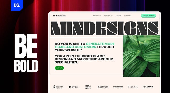
1. Go Bold or Go Home
The number of things vying for our attention keeps growing every year. Amidst all the social media notifications, emails from Amazon, and subscription offers from Netflix, it can get extremely hard for Internet users to pay attention to websites.
That is why bold and brash typography is on the rise. Making a strong impression as soon as users land on the website is the name of the game that many brands, advertisers, and web designers are playing this year. Bold fonts (also described as ‘loud’ fonts) have an “in your face” effect on users.
They help over-amplify brand messages, make instant impressions, and give website designs unique personalities. So, if your web design goal is to make a statement, shifting towards bolder fonts will help your cause in three ways:
- The bold fonts will showcase your brand and website’s personality
- Readers will instantly remember the brand name
- The core brand message will be given center stage on the website
Roquen, JUST Sans, Visby, Broken, Choco Bold, and Sirens are some of the most popular bold typefaces in use today in web design. If you feel that big, bold, and dramatic typography is suitable for your web design, consider using those typefaces.
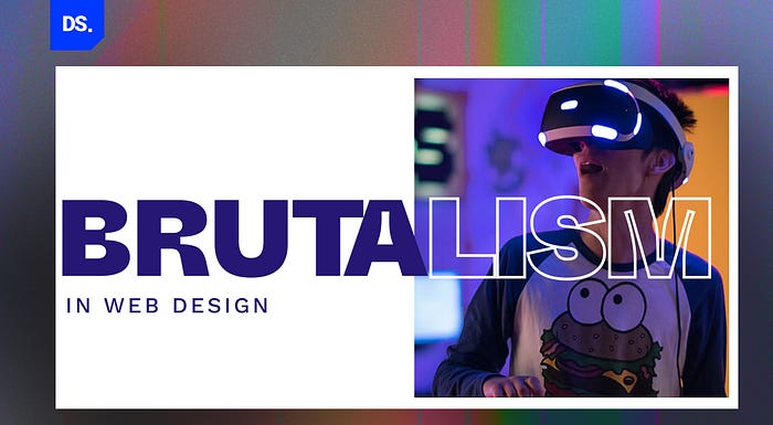
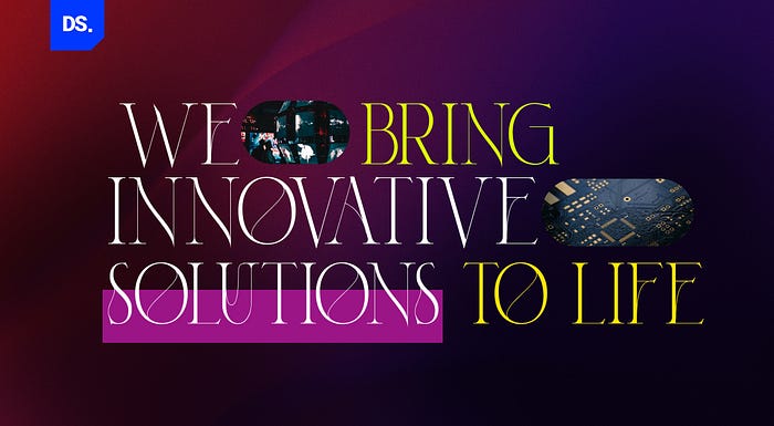
2. Brutalism
We live in a world where all old orders are crumbling right in front of our eyes. New possibilities are emerging as people from all walks of life push limits and break down stereotypes. We are remote workers, flexi-timers, and the vanguards of a technology-driven world.
In short, we are not like our ancestors, and bending the rules of conventionality comes naturally to us. Hence, it is no surprise that ‘brutalism’ is one of the most popular typography trends of this generation.
- Brutalism is a typography style that is typified by the use of bold, geometric fonts, with sharp contrasts.
- When brutalism is used correctly in web design, it conveys a sense of strength and urgency.
- Brutalist fonts are more ‘in your face’ than standard bold typefaces.
- They add a sense of visual tension to the readers’ experience.
These aspects of brutalism are of course subjective. Not every reader will feel ‘hyped up’ after reading a piece of text presented in a brutalist typeface. Similarly, not every industry or brand is suited to this typography style.
But, the brands that do present website content through these lenses of brutalism are ramping up their use of this typography style in 2023. According to them, this typography style is loved by their website visitors. It attracts short-term attention and fosters long-term remembrance.
Here are some examples of popular brands using brutalist typography in their web designs:
Brand: Datalands | Brutalist Font: Surt Light

Designed by Matthieu Salvaggio, Surt is a typeface that has been inspired by Norse mythology and Scandinavian architecture.
Brand: Meredith Hattam | Brutalist Font: Radiant Cond ICG
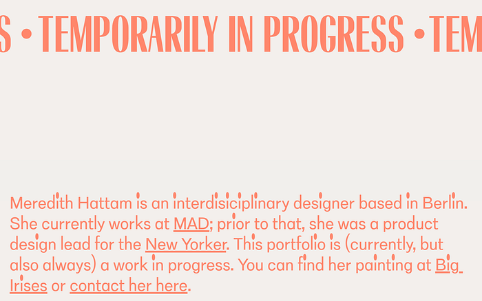
A TrueType font, Radiant Cond ICG is often used in modern brutalist designs.
Brand: Hush Puppies | Brutalist Font: Eksell Display
Eksell Display is a serif typeface that hit the mainstream in 2015. Since then, this brutalist typeface with sharp, triangular serifs has been adopted by many popular websites, including the website of the world-famous shoe brand Hush Puppies.
The great thing about this trend of brutalism in web design typography is that it takes the world back to the initial days of the Internet. Back when web designers had no other choice but to incorporate brutalist typography into their sites.
That is because brutalist typography drew the user attention and they stood out among all the ‘normal’ typefaces that filled the World Wide Web. Today, in this era of hyper-digitization, brutalist typography has a similar effect.
3. Highlighted Text
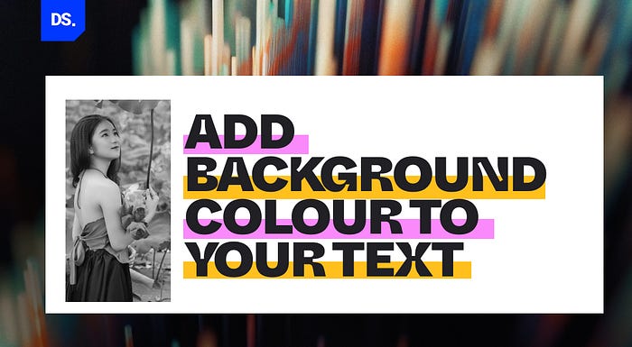
Over ten years ago, Google gave a definitive answer to a question that was on the minds of many web designers, “How long does it take for Internet users to form opinions about a website?” The answer is less than 50 milliseconds.
Your website has less than a second to create an impression on the average Internet user. From this fact, we can assume that most Internet users ‘skim’ through websites instead of exploring them in depth. That’s why the typography trend of using highlighted text is rising in popularity.
Smart web designers highlight the text sections that they really want their target audiences to read. Here are three ways web designers apply this typography technique:
- They use different fonts and font sizes to create a visual hierarchy on their website. The information presented in larger font sizes is easier to scan for users.
- Color is another powerful highlighting tool. Designers use bright colors to make certain regions of their websites stand out. For example, call-to-action messages are often presented in bold and colored typefaces.
- Images and videos can also be used to break up text, and highlight important information on a website.
4. 3D Typography
3D typography is a typography style that involves the use of three-dimensional effects. These effects create a sense of depth, volume, and most importantly: visual appeal. The last one is the most important.
Web designers are constantly in search of design styles that make their creations more visually appealing. 3D typography has the potential to be of immense help in this department. But, visual appeal is not all that 3D typography is good for.
In this world of immersive and experiential technologies like AR, VR, and photo-realistic web graphics, websites with basic designs fail to stand out from the crowd. Incorporating 3D typography in your website design is one of the easiest ways to signal to your target users that your brand is just as future-oriented as the rest.
3D typography might be the most exciting typography trend on this list both in terms of visual appeal and long-term potential. The general consensus in the web design world is that the trend of 3D typography is only just getting started in 2023.
As AR, VR, and other visually transformative technologies make their way into the mainstream, content presented in 3D typefaces will become more pervasive.
5. Animated Typography

Similar to 3D typography, animated typography has the potential to be one of the biggest typography trends of the 2020s. Web designers who are invested in this trend want to deliver interactive and immersive user experiences. Are they succeeding? Let us look at some examples:
- Webflow uses animated text in some of its templates. This sense of movement encourages users to keep exploring the site.
- Google’s Doodles are also great examples of how animation typography can be used to share attention-grabbing content.
- French fashion site Crépin Petit uses animation typography on its homepage to highlight the brand’s historical achievements.
Integrating animated typography into web design is not easy to pull off. But, when done correctly, it’s the most effective tool for making website content appear dynamic, exciting, and unique.
6. Monospaced Fonts

What is the first font that comes to mind when you think of coding or programming? It is probably some version of a monospaced font. These fonts have always been used in tech websites, just because of how popular they are with tech-savvy people.
But, in recent years monospaced fonts have started appearing in websites that have nothing to do with tech. Why? According to researchers, text presented in monospaced fonts is easier to read and skim through, even for people with dyslexia.
7. Color Fonts
The era of using black-colored text on white-colored backgrounds in web design is over. Modern-day web designers design for ‘dark mode.’ When designing for this mode, they are likelier to use color fonts to make their website content stand out.
Final Take
These typography trends have been adopted by many brands in the past few years. If you are struggling to incorporate these design trends into your web design plans, Design Studio’s web and UX/UI design experts are here to help. We can leverage these interesting typography trends to make your website stand out from the crowd!
This article was originally publihsed on design-studio.io.