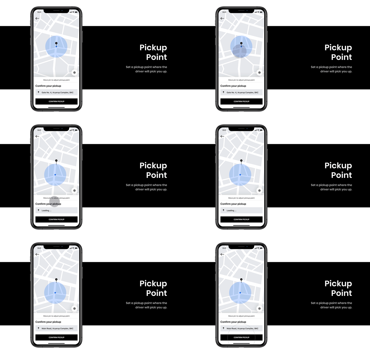
Uber Redesign Concept 2019

Why redesign the Uber App ?
So, I am a regular user of the Uber App. Whenever I need to go somewhere, I prefer Uber mostly.
My goal was to redesign or we can say improve the design and the flow of the app to make it simpler and intuitive by finding inspirations and gaps among existing products and ease the process of booking a cab.
The Process
1. Wireframing
Before jumping into creating high-fidelity interfaces, visualizing the structure of the app which fulfils the users’ needs was more important. So, creating a low-fidelity wireframe of the app, improves productivity and allow you to play with your ideas and avoids any frustration of tweaking the design repeatedly😅
As you wouldn’t build a house without a blueprint, similarly before designing anything start with drawing the wireframes.

“ By finding inspirations and gaps from the existing app and some other apps like Lyft and Grab, I constantly improve my low-fi designs, keeping the end-user in the center of the design-process “
2. Visual Design


The Result
The UI Design and Interaction was completely done in Adobe XD, only the touch gestures were added later using After Effects.
Before starting the project, I chose to design this completely in InVision Studio (Windows Version), but working with InVision studio was very frustrating because of lags even if you’re on a high-performance machine.
The only thing Adobe XD lacks is the prototyping features of InVision Studio (They have dope features for prototyping and animating, but the overall tool sucks because of lags)
Appreciation
After publishing this project on Behance and on other social platforms like Twitter and Dribbble, I received appreciation from Adobe XD on twitter 🕺🕺 . I was completely surprised and overjoyed after reading their tweet.
Check out this project on Behance
Follow me on
Behance Dribbble Instagram Twitter
If you like my work, Buy me a coffee ☕


