Member-only story
UI/UX: Better Typography
How to quickly and easily create type specifications that don’t suck.
Quick-read summary
Spec’ing type manually for UI/UX projects absolutely sucks and can be
time-consuming to get it right.
- Always use 16px as your base UI/UX type-size.
- Use these tools here to make your life infinitely easier:
https://fontjoy.com/
https://type-scale.com/
What is typography
Typography is loosely defined as the study of type, or “the style and appearance of printed matter,” but that doesn’t tell us very much.
In the design industry, typography almost always relates to what typefaces you are using within a given project, their associated type styles, specifications, and context of usage.
Why should you care?
Great, who cares? Your users care. In fact, your users care so much that if you do it WRONG they may not use your product, period.
Still not convinced? Check out these statistics here.
My point is this: good typography is part of good communication, and if you don’t have quality typography, your design is mute point.
As a demonstration
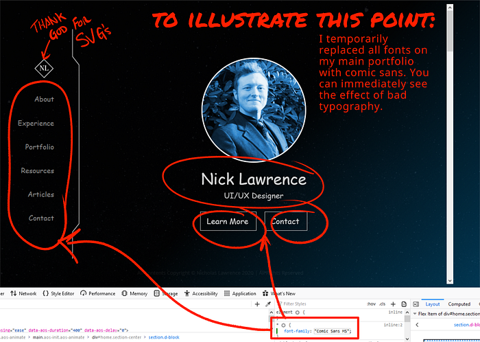
As pictured below, I temporarily replaced all fonts on my main portfolio with comic sans. You can immediately see the effect of bad typography.

How to create good typography specifications
So what can you do to create good typography specifications for your project?
The two most important things you can do are:
1. Select quality font(s).
2. Scale fonts appropriately.
Selecting quality fonts
When selecting fonts, you should focus on fonts that compliment each other and work well within the design as a whole.

