UI&UX Case Study: a better user experience for Trivago app
This article is aimed to focus on the key features of booking & comparing app that directs the customer to the best result easily and quickly with minimum clicks.
Today online consumers want to have quick information and simpler booking processes — which means they prefer to get information in one place instead of looking around at different websites.
General Issues at comparing apps & what I see at Trivago
I wanted to focus on personalisation. My aim was to improve user engagement by understanding more about a user’s personal preferences. I also needed to create a simpler, easier and more structured way to showcase hotel rooms to users. I want to create a simple and clear information hierarchy that users could learn and follow.
Key Quotes directly from user:
- “I’m not very informed about the app.”
- Trivago doesn’t allow look for hotels with hotel criterias. I have to find a hotel with free wifi, Included breakfast, etc features then use Trivago to find the best deal for that hotel. Too time-consuming to be useful to save a few dollars.
- Confirmation emails come twice to users from Trivago and dealer website so they cause users to get confused.
- I just spent 45 minutes trying to book this room on trivago.
- Trivago says they find cheapest price for same accommodation, this is untrue. Trivago works for Expedia not for the traveller.
Current Information Architecture

Information Architecture (IA) is the way of arranging content in Trivago app. The reason why Trivago users are confused or overwhelmed (most of the time) is not because of the user interface design but the disorganized Information. For example there are many kind of sorting types listed in the dialog. As you know that some of them “focus on price, focus on distance, focus on rating”. These kind of sorting types does not look like meaning full for users.
An ideal app that would provide this could have:
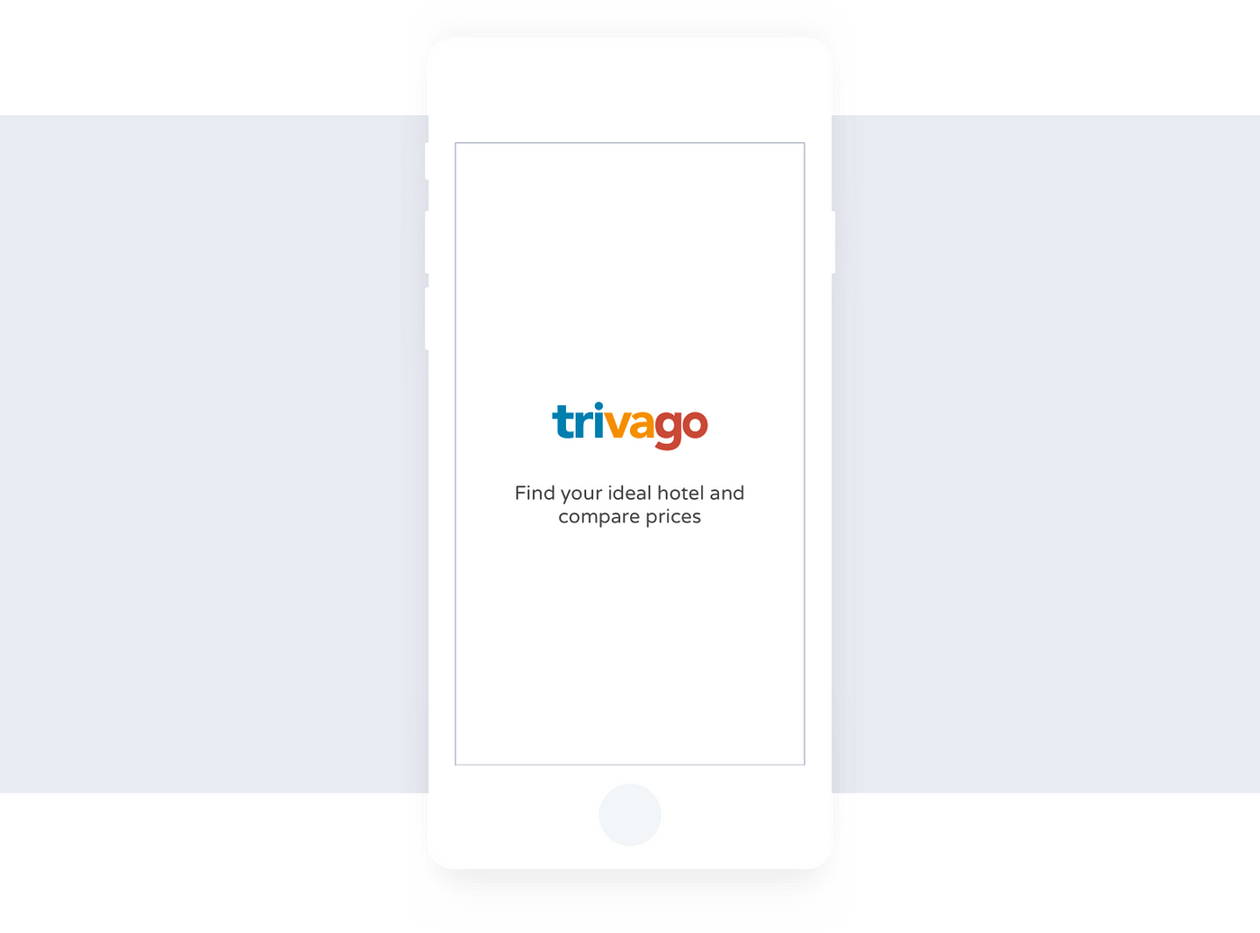
Splash Screen
1- The customer should understand where s/he exactly is and should know what s/he is able to do in the app. All steps for the user should be clear and not give way to surprise from the perspective of the user. So this has to start with the splash screen that includes the main objective of the app.
2- Main screen should give the opportunity of searching city or a specific hotel name depending on the user’s need/decision. And CTA button should be very clear i.e. Find cheapest prices

The initial screen should be divided into 3 main sections:
- Section A: Navbar
- Section B: Map showing the hotels around based on your location
- Section C: Search input and button component
These sections vary according to user history: either newcomer or existing
For the newcomer:
- If the location is on the user is able to see the accomodation options with prices around on the map section.
- Lets take a closer look. It says “I want to go to” and the label says “Region, City, Area or Hotel Name” giving the user a wide range of options to enter. This is particularly useful because lets say I want to go to Paris. I can just enter Pune here and search.
- A recommended city option should be displayed at the search input. The recommended city is shown as an example and is defined as the city which has been searched most from your current location. For instance, “i.e. Paris or hotel name”
For the existing user:
- The existing user sees the accomodation options with prices at the map section for his or her recent search
- In the search input the recent search location or hotel name appears and the button label changes based on user’s choice. For instance, if a city name is entered > Find cheapest hotels or if a hotel name is entered > Find cheapest prices.
- CTA button in this section should direct the user to immediate action with the correct label.
Progress screen:
Section A : The next screen just after the user makes his/her selection is the progress screen. This screen simply should tell the user that all the providers are being searched and best offers are going to be displayed right after according to the user’s search. All the provider logos should be shown in a row.
Section B: At the same time the user’s search criteria will be displayed at the same screen in the bottom line i.e Paris, 2 nights (27–29 Mar)
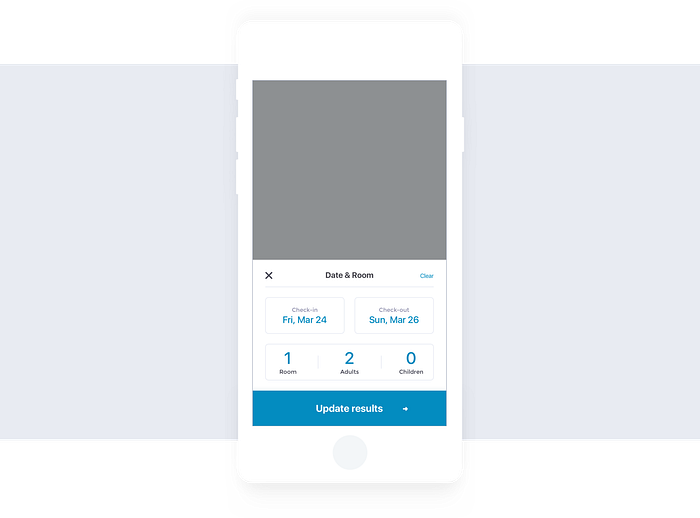
Update Date and Room
A lot of costumers want to travel with their partners. But also there are many kind of groups that travel together. Adding more than one room in the previous system and telling how many people will stay in the room is a bad experience for the user experience. It is easier to change all the criteria together with the entry and check out dates and it is possible to add more rooms more easily and quickly.
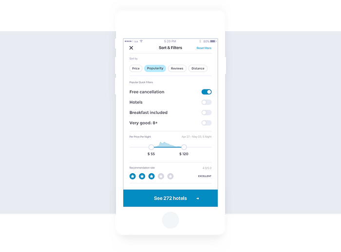
Filter and Sort
The filtering feature in the current user experience is held in the background. Most of the users can find best results easily and faster by smart filter options. I prepared a draft screen that how filter & sort screen should be useful, easy to understand and many more criteria. I have tried to keep the most preferred filters for users, and tried to keep the sorting criteria in the foreground in a simpler and clearer way. I just do not want users try figure out or to think while they are sorting.
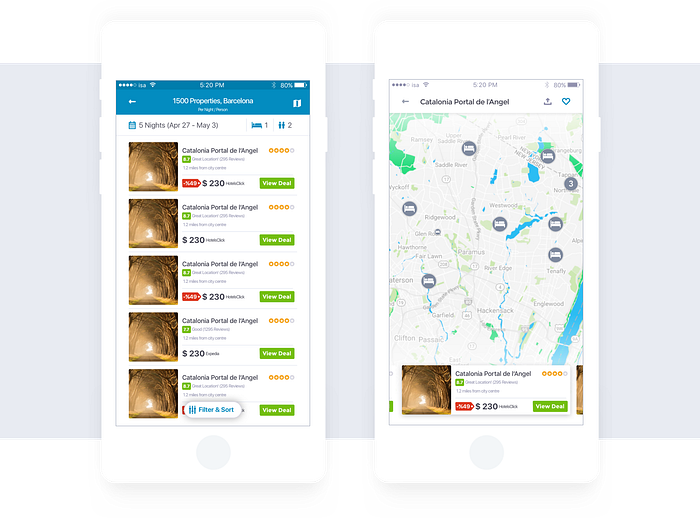
Results and Map
My main purpose is to keep users away from surprises. So I want users here to experience a very familiar useful?? in general. By the way I give them the easy and convenient experience they were accustomed to.
- To show the discounted price in percent with price label.
- Users are able to change Filter & Sort in one screen together.
- Users are able to see the deals per person and per night. So its best way to redirect users to provider.
- to swipe and share with friends easily hotels at map screen.
- IA is most important inside the card items. I ordered and placed them to right location in the cards.
- Why users need to login in results screen. Its not necessary to show users action on this step. so I removed this part from the result screen.
Now, Lets start to talk about “how to make it better?”
Call to Action (CTA)
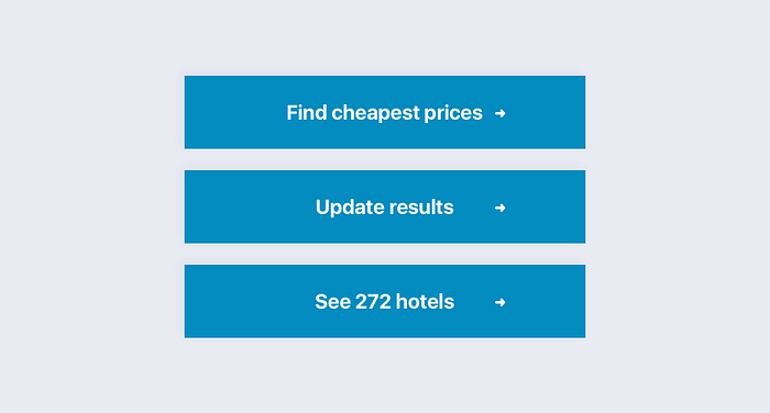
CTA is very important to user happy path and marketing success. As a UX designer, it is not enough (lame) to design the eye-catching CTA and yell at your users everywhere. It is actually like a proposal. You need to hold your users’ hands and give them an irresistible speech at the perfect moment.
So I made a few changes to CTA to put them at the right moment:
- I want to go to —Find cheapest prices — When initial screen on searching
- Update results— update date and room screen
- See [count] hotels — When filtering hotels on Filter & Sort screen
Why Trivago does not provide the “Things to do”
Things to do can be useful to the users who don’t know where to go or what to do at a destination. Things to do guides screen where you can find great information of a destination, like “Activities”, “Best time to visit”, “Average price”, “Weather”, “Transport”, “Food” etc. This screen make users to spend more time and support the end to end user experience.
New feature: Price Alert
If a user visits a search result and leaves without booking or direction to a provider the next time this user comes to the app a price alert for this hotel is displayed. This alert should appear when there is a discount at the prices of this hotel. The discount should be clearly promoted in the search results.
Favorite list or Compare list
The user should able to add the hotels s/he would like to compare and save them as a comparing list. Instead of a favorite list this list provides the user the chance of comparing the ratings, policies and facilities of hotels.
Average hotel prices
The user should be able to see the average prices of a chosen hotel based on the selected dates and availability of the chosen destination in a specific period.
Grouping prices by providers
The user should be able to sort the prices according to the provider. Not only the prices but also the ratings should be listed based on a specific provider’s ratingsystem. Instead of an average including all providers’ rating scores specifically selected provider’s rating can be more meaningful for the user.
Lower rates on mobile apps
Most of the consumers expect to find a good deal, and online hotel booking apps incentivize last-minute bookings by offering lower rates specifically aimed at mobile users.
GPS based hotels
Just like on-demand services like Uber or any of them, We can offer hotel rooms in a user’s vicinity (using GPS). and also filter search results based on price, quality, and other criteria users have set up.
“As you can see this feature is available for newcomer user in initial screen.”
Consumers’s previous behaviors
If consumers have already searched for a hotel through your app before, you can use information about previous searches to offer hotels that meet their preferences. In this way consumers do not have to do the same filtering again and again.
Conversational interfaces
Another way to make great customer experience through your mobile app is by implementing a conversational interface with a bot that can provide instant, automated support.
Virtual travel agents
Weak user experience is one of the biggest drawbacks of the online hotel booking apps. Booking hotel rooms is where many hotel apps’ services end. But a lot of customers today expect more beyond finding the cheapest hotel room. For example Airbnb is growing into a full-service travel company. Airbnb provides two features: experiences and places. So now Airbnb provides us an end to end travel package.
Notification and Alerts
Notifications and alerts need to be used to keep the users up to date such as upcoming events, special deals and offers, best discounts for hotel rooms, etc…. But increasing the notifications will cause deletion of the app or closing the notifications by users so frequency and period is so important.
Unnecessary notifications make users annoys.
Conclusion
As I mentioned above, those solution offers were created not just for solving the whole problems in this area but rather I aimed to display the common problems a user faces in hotel booking and comparing processes.
So as I know, one of the main objectives of any user in hotel comparing processes are to the find best deal for a room and book it with no pain. These are the most objective metrics.
As you can see in the end it is quite simple to use interface as the main focus. It should be easy to use and able to find the best deal for everyone and show the most significant to users. The interfaces of these screens are not the final designs to explain how it exactly look like.

Thank you for reading! If you found this article useful and If you have another idea how to make it better, feel free to share it with me!
Follow me on Dribbble or Behance to get notified when I publish something new. 🎉
I’d love to hear your feedback. How was your impression? What did you like/dislike?

