Booking Ambulances is Just a Swipe Away: a UI/UX Case Study

What is Medicab?
In India, booking an ambulance is a hassle. The interaction on a phone call, explaining your location to the ambulance driver, and exorbitant fares add up to the terrible experience.
Considering the pandemic situation right now, it’s almost next to impossible to find an ambulance on time for those who require it quickly.
Medicab aims to solve this.
Overview
Speeding up the process of booking an ambulance for the families of patients so that the patient receives medical attention on time.
5 Ws
Who?
People who are witnessing someone in need of help, either due to physical injuries or health-related issues.
What?
A solution to the problem of ambulances taking too long to arrive or often not picking up emergency calls.
When?
It can be put to use when people require an ambulance to transport the injured or those who are unwell to the hospital.
Where?
It can be implemented in developing countries, but for now, the focus is on India.
Why?
To assist those in need of immediate hospitalization.
Defining the Problem
I asked 20 people including friends, family, and strangers who have booked ambulances before about the problems faced.
- The ambulance didn’t arrive on time.
- The ambulance was far off when they called.
- Connecting to the ambulance service and explaining the address was a hassle.
- Unable to contact the hospital to prepare everything to take the patient in when they arrive.
These problems were recurring with the 20 people.
Current Solutions

Before diving in and bringing my own solution, I looked through top apps to book ambulances and learned how they currently address the problem. I found that these apps have some nice time-saving features but they were not user-centred. They weren’t intuitive to me. They didn’t bring the best solution to their users’ needs.
My Solution

In my solution, I focussed on four things: basic first aid in case of any incident, booking an ambulance, contacting hospitals, and contacting doctors.
Onboarding

In the onboarding process, the essential data is collected — which is the phone number and OTP. I have also included social login through which their phone numbers can be obtained and the step where OTP is obtained can be skipped.
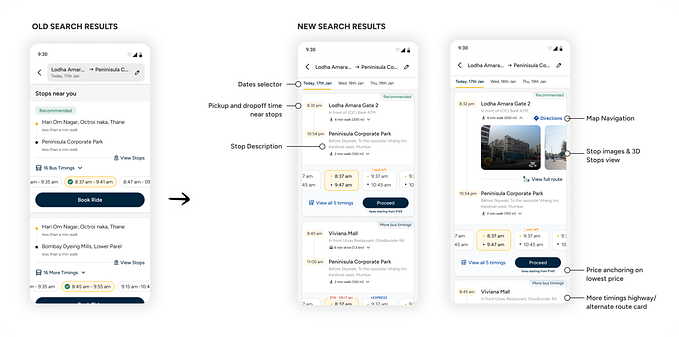
Homescreen and Booking Process


On the home screen, the users can go through the written content of basic first aid in case of any incident and also book an ambulance with a swipe.
I chose to use this CTA method instead of a single tap to avoid accidental touch.

Upon booking, users can see which driver is assigned to them along with their ratings, type of vehicle, and vehicle number. Beneath the information, users can choose to change hospitals, call the driver for extra instructions, or even cancel the booking.
The colour of the dialogue box becomes darker when the driver arrives at the location.
There is also a minimized map to glance at the ETA while the user goes through first aid info as shown below.

Payment Process
Now, coming to payments, it’s a simple process. Nothing extra.

Once the patient arrives at the hospital and the driver ends the trip, the user will be presented with the screen on the right. Yes, the user has the option to pay later or pay then and there.

When the user selects “Pay Later”, this is what they are presented with when they go back to the home screen. The users will see a card on top that reminds them of their pending payment and also contains a CTA to help them complete the payment. Without paying for the previous booking, users will not be able to book an ambulance.
Contacting Hospitals

Users can see a list of hospitals near them and place a call to them or even search for their desired hospital to obtain the phone number and call them.
Contacting Doctors

I also added a feature that enables the users to contact any doctor. Users can filter through various departments like pulmonology, ENT, cardiology, etc. They can also filter doctors based on their availability and even sort by alphabetical order or year of experience.
The sort by alphabetical order filter was added because I have witnessed many people forgetting the correct names of doctors while only remembering the first letter of their name. And of course, people would want the most experienced doctor to treat them, and hence, that filter too.
Why are the filters so few? This was designed keeping Hick’s Law in mind.
Hick’s Law: The time it takes to make a decision increases with the number and complexity of choices.
Users can send photos of any particular injury they have or even upload documents to send to the doctors.
Why does the chat screen look very familiar? 🧐
Well, the answer to that is Jakob’s Law.
Jacob’s Law: Users spend most of their time on other sites and apps. This means that users prefer your site to work the same way as all the other sites they already know.
Profile Screen

The profile section is kept minimal with basic functions like user profile, invite friends, history — which contains previous bookings with the amount paid, payment methods — which lets the user set their default payment method, settings— for notifications, themes, font size, etc., and lastly, help, which guides the user through any problems faced inside the app.
Credits:
- Iconly and TheNounProject for the icons!
- uiFaces
- iOS UI Kit for the status bar, navigation pill, numeric pad, and the keyboard
- Mapsicle for the beautiful maps
And that’s a wrap! If you liked this case study, please give it a clap! :)
You can connect with me on LinkedIn here.
Fun fact: if you hold down the clap button, you can give up to 50 claps! Try it! 😉😬