UI/UX Case Study: Makes Investing with IPOT Become Faster and Easier

IPOT is ‘Indo Premier Sekuritas’ online trading mobile application for stock trading on the Indonesia Stock Exchange with it’s target are trader and investor. I think it will be very important to make improvements to investment and trading applications because recently investing is an activity that is currently in great demand by the public.
Duration
1 Weeks
Methods
User Research — Definition — Market Research — Solution — UX Design — Prototyping

User Research
I did research on user reviews of the IPOT application on the Google Play Store considering the time I have is very limited. However, after editing for a long time, the problems encountered there were too broad, so I decided to narrow down the problem through direct interviews with IPOT users. I conducted interviews through social media by conducting polls and direct question and answer methods.

Analysis
From the user reviews that I have collected through the play store and direct user interviews, there are challanges and opportunities for the current IPOT application.

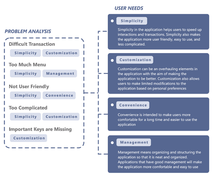
Problem Analysis and User Needs
From the 5 main problems that I found, I concluded and divided them into 4 user needs that could answer these problems, there are :
- Simplicity
- Customization
- Convenience
- Management
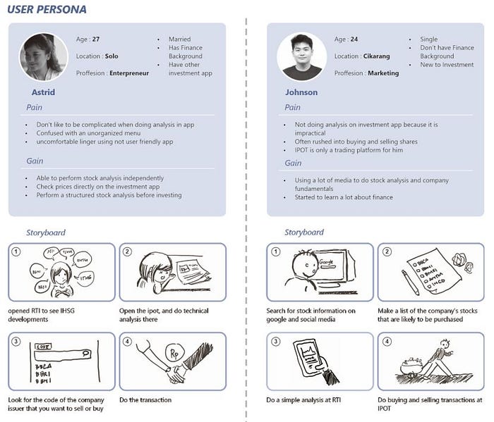
User Persona
In the previous section, I interviewed 11 IPOT users. I took 2 users who I felt could represent the opinions and concerns of the 11 people. I identified who these two people were, their pain and gain, along with the flow they took when they wanted to trade on IPOT
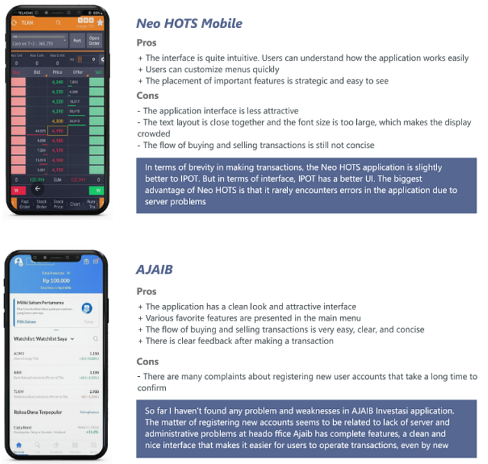
Market Research
After doing research on IPOT users, I did market research. Market research is in the form of research and comparisons of similar products which are the biggest competitors of IPOT. Here I take the Neo Hots Mobile and Ajaib as a comparison. The following is the analysis and conclusions that I learned from the two applications, as well as their comparison with the current IPOT application:
Solution
After done the user research and market research, I conclude there are 4 things that need to be fixed and improved in this IPOT application redesign, there area:
- Relayout Menu
- Shortcut & Customization
- Improve Convenience
- Re-grouping

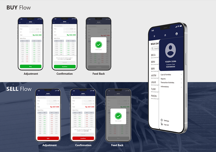
It should be noted that the concluded and selected solutions are limited to solving the problem of the main problem to be resolved, namely speeding up the user in buying and selling shares.
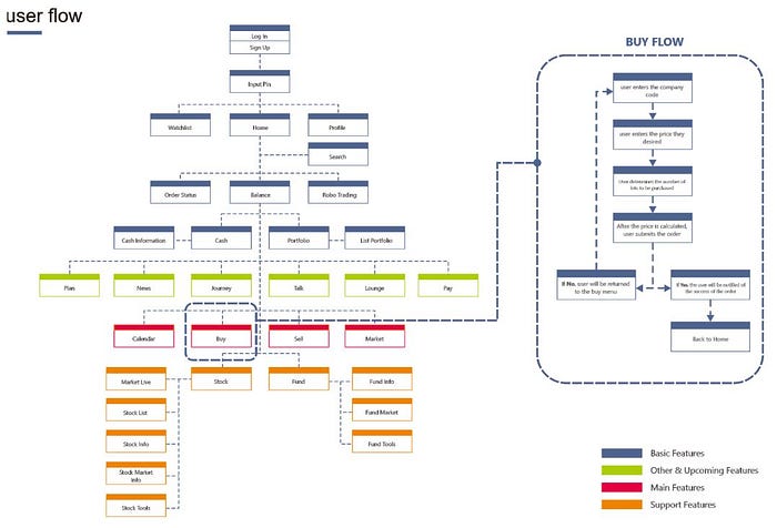
User Flow
I created a user flow using the IPOT application for its main features. I did not go into detail on every part because my focus now is how users can make buying and selling shares practically and quickly.
Wireframe
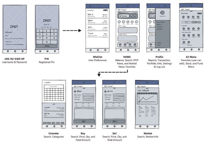
Existing UI
This is the design of the existing IPOT UI. I marked the blue line to show the flow that the user must take to buy shares. From here you can see that there are quite a number of steps that must be taken when a user is about to place a buy and sell order
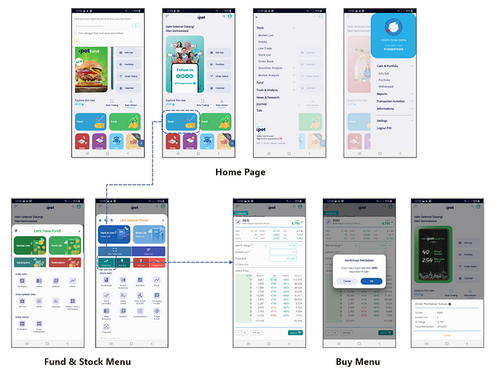
Prototyping
Annndd… here is the new design.
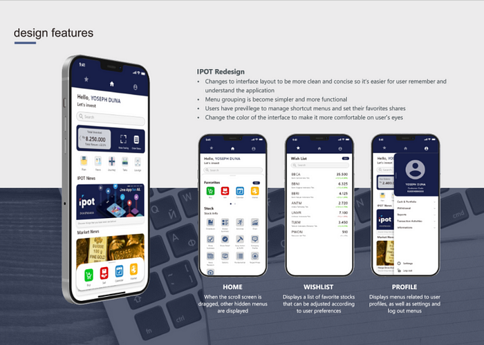
I make the UI become simpler with better colors so that users are more comfortable when using the application because they also do stock analysis there. I created a shortcut menu that can be customized based on user preferences.
What’s Next?
I’m still on my way to do user testing on the people I’ve interviewed before. I will update this case study once all the reviews have been collected as learning material.
Finally, I am grateful to be able to complete this simple case study in less than 1 week amidst all the work I do. If you want to give me suggestions and input, please don’t hesitate to contact me or write them in the comments column. Bye — bye!
Anyway, you can access the prototype through this link:

