Hints: an app that cares about your mental health — UI/UX case study

The Context
Psychological self-care is not easily available today. It’s either expensive or low in quality, and many people are not aware of it. Some people try to open up to their loved ones, but don’t find understanding or acceptance. I often try to develop my own social skills as well, which helps me learn more about myself and other people.
Anyone of us could meet, at some point, with the struggle of a mental health issue, or become trapped in depression or loneliness. Most people also wish they could develop their social skills to build better relationships and truly connect with others. Our approach to finding a solution would normally look something like this: looking for quality resources, finding a psychologist, talking to friends or relatives, or keeping it all inside and hoping that it will pass. These approaches are time-consuming and are not always effective. I realized a better approach could be offered with fast access to qualitative and helpful information.
Understanding the Problem
Problem. Lack of helpful information on social services and mental health for people in Ukraine.
Relevance. Our society has a lot of problems that often leave people in a state of helplessness. In situations where they could have received some help, they just get lost and give up. The primary reason for this is lack of knowledge about the psychology of human behavior. The older generation is facing this problem because they have more freedom to do as they wish. People might be more open to using the services of a therapist, but it is really hard to find a good one, and it is often too expensive for the average Ukrainian.
In Ukraine, the lingering economic crisis and the ongoing war with Russia are fueling an increase in cases of depression. According to the latest research by the World Health Organization, 6.3 percent of Ukrainians, which is over 2.6 million people, suffer from depression. One out of four people in the world will be affected by mental or neurological disorders at some point in their lives. Around 450 million people currently suffer from such conditions, placing mental disorders among the leading causes of ill health and disability worldwide. Depressive disorders are already the fourth leading cause of the global disease burden.
Proposal
I want to create a service that can help everyone in any life situation, such as relationship problems, lack of motivation, challenges in communication, facing aggression, etc. In the app, people will be able to access quality information by topic — including articles, videos, podcasts, and books.
On the other hand, this is going to be a platform for psychologists who want to promote themselves. To post information on the platform, their expertise would need to be verified. They would also be able to share their articles, videos, podcasts or book recommendations. Later on, psychologists and users would be able to communicate via chat rooms where they can share their data or help users solve their problems.
Audience. The target audience is people of 20–75 years old interested in personal growth and facing particular challenges in mental health and development of social skills.
Research
Competitor Analysis
At this stage, I attempted to understand the overall vector of existing psychological support services through analysis using various criteria. I began my research by looking through a few competitors or similar platforms, analyzing UI, UX, user flow, IA, and key features. I discovered that we have too many platforms related to psychological information and health.
Disadvantages of the platforms:
- First of all — it’s really difficult to understand the quality of the content offered.
- Secondly — a lot of them have non-readable content with bad UX/UI components.
- Thirdly — I haven’t found any applications on some of the specific topics I was interested in; therefore, the content is not holistic.
- VerywellMind — An online web platform that helps you to improve yourself through meditation, brain health, ADHD, Anxiety disorder, Addiction, and Psychology. The platform provides users with a wide range of articles.
- PsychologyToday — A live stream of what’s happening in ‘Psychology Today’. Groups of renowned psychologists, academics, psychiatrists, and writers contribute their thoughts on the platform. They provide users with online therapy, articles, and a magazine.
- PsyPractice — International media brand combining magazine, site, mobile applications, and psychological testing. They have online therapy, videos, articles, events, and speaking forums.
- Treatfield — Ukrainian platform offering online therapy, a blog, and videos. They provide only in-house created content.
Scenario
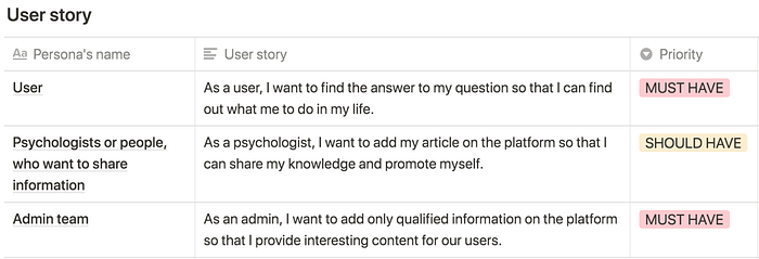
Who’s it for? We have 3 types of users:
- People that need information on mental health/social skills
- Psychologists who want to share their content
- Admin team to manage the application
Potential User Interviews
I decided to conduct interviews rather than use online surveys. This theme is very personal, and people don’t provide enough information in surveys. I chose three individuals that fit the user profile and prepared the interview questions. I had one in-person and two virtual interviews. I have decided to use their native languages to encourage them to fully open up to me in our discussions. I recorded all the answers during the interviews, which enabled me to analyze the responses and take notes afterward.
My goal was to understand what methods people have been using to solve their problems at the moment, how open they are, and what are the disadvantages of their approaches. I also learned what types of problems most people encounter, and what they would like to improve about themselves. The information gathered allowed me to get closer to the root of the problem and its solution.
Users’ Quotes:
I always need to devise a methodology for solving a problem myself, which may not be of good quality.
I will not read an article whose authors I don’t know and trust their authority.
I need to spend less time on finding solutions. Searching for literature takes too much time, and is not always available. Also, it’s hard to understand if it is good or bad literature.
I always solve my problems with the professional literature, speaking with friends,and watching informative lectures.
The literature helps me to understand my inner struggles and to analyze them.
I am embarrassed to talk about my personal problems with other people.
When I solve problems by myself, I can’t see the whole picture.
I haven’t found a source of information I’d be interested in working with.
I can’t find diverse psychological content anywhere that is personalized for me.
Every two weeks, I need someone to talk to about things that my friends and family can’t understand. Friends and parents can make their emotional impressions on the discussion of a problem.
Key Learnings
Understanding the high quality of the content was the key point for everyone. Users need to know who the author of the article is and the author should be a professional in the area. This information should be visible at a glance. Other discoveries I made during this phase:
- Information should be relevant and of high quality.
- People don’t have time to search for quality content.
- Content should be personalized to the user.
- It should be easy to use.
Frankly speaking, research is something that a lot of managers and companies are trying to avoid (yep, still), seeing the only waste of time and resources. But only digging into the research, conducting polls and qualitative interviews can reveal your REAL users and make yourself free from your personal assumptions and tries to predict users’ behavior.
User Persona
The results of my survey revealed that there were several types of users with diverse needs. The accumulation of the different insights and common patterns that came from the users’ answers helped me create three personas, which are the manifestation of that data in a character. At this step, I’ve summarized the common behaviors for each persona to communicate their goals and motivations.
Here, we can see their preferences on how to solve the problems, goals, frustrations, needs, and device usage.

Mind Map
Up until now, I had a vague idea of how the app would function. I decided to build a mind map to understand the architecture of the app. The goal was to organize and structure the content for the platform and understand the amount of data to work with during the design and development processes. This mind map is only suitable for an MVP version, and should be developed further based on the initial testing results. There is an example of a user scenario, as you can see. I first sketched it on paper, then digitally rendered it.

Sketches
This was the first step to help with outlining and visualizing the app.

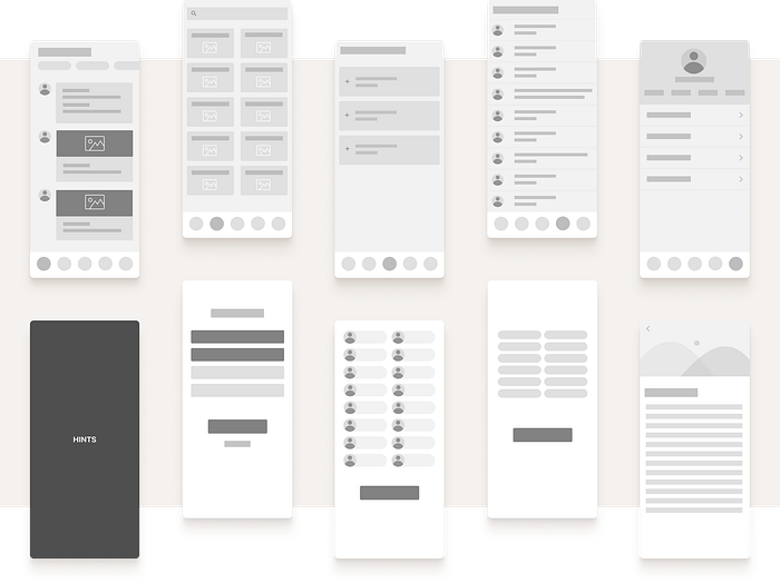
Low Fidelity Wireframes
This visual guide represents the skeletal framework of the app. It helped me arrange the interface elements while I focused on the functionality rather than appearance. I based it on the information from users.
Key Learnings
For some designers, who are skillful and have many years of work experience behind it’s definitely not going to be a huge surprise, but… Right after you’re done with research, you have an idea of what you need to create and for whom, prevent yourself from starting the UI job right away.
What you need at first is a deep breath. And out. Especially in case you’re working on a big and complex project. Start with gathering all the things in a mind map and wireframes before you get to real pixels. Otherwise, you might be trapped in a situation of a constant redesign.
Visual Research
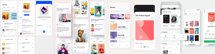
Inspiration Board
Before starting with the visual design, I created an inspiration board to get a foundation for a color scheme and further design decisions.
Color Palette
The color palette for a psychology-related application must be pleasant, trustworthy, fresh, clean, and readable. Therefore, I decided to use a light color palette, with the typography in contrasting colors. The application needs to tell a story to the user, which was achieved by using illustrations that show the emotions that the user can experience.
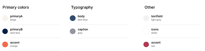
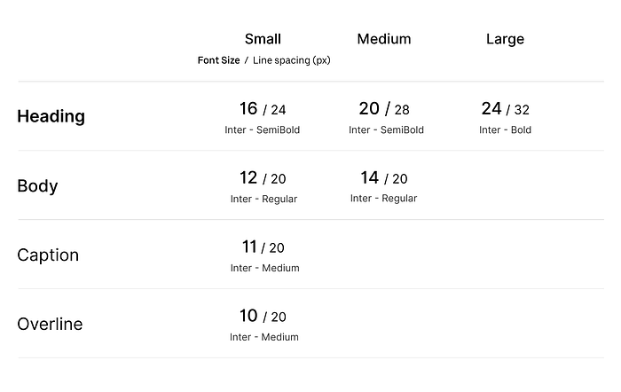
Typography
“Inter” is a typeface carefully crafted and designed for computer screens. It features a tall x-height to aid in the readability of mixed-case and lower-case text.
User Tests
After creating wireframes and choosing a style, I started to do the high fidelity design. I made a prototype of the project and asked respondents to do tasks in order to test it with them. I picked realistic scenarios to engage the respondents in reaching their goals with the app. Then I conducted the desirability test to understand users’ attitudes, and the navigation test to see how the users understood the navigation. After that, I ran a user test to get overall feedback.
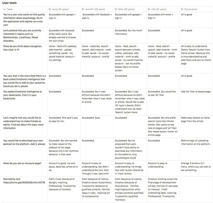
Key Learnings
User research was really valuable, since it provided some good insights for changes and updates in my initial user flows. I had to do away with the navigation bar and the possibility of adding materials to the platform in order to focus on the main purpose of this platform, which is high-quality information from verified sources.
Solutions
- Move the possibility of becoming a publisher to the main menu in the profile. To do so, they will have to pass the registration flow as a psychologist, after which our admins would examine their application and approve or reject it.
- Do only one search on the platform to avoid confusion.
- Add the ability to see “All” saved material on the Saved page, and allow filtering after that.
- Change navigation on the Profile page because some people don’t understand the meaning of certain icons.
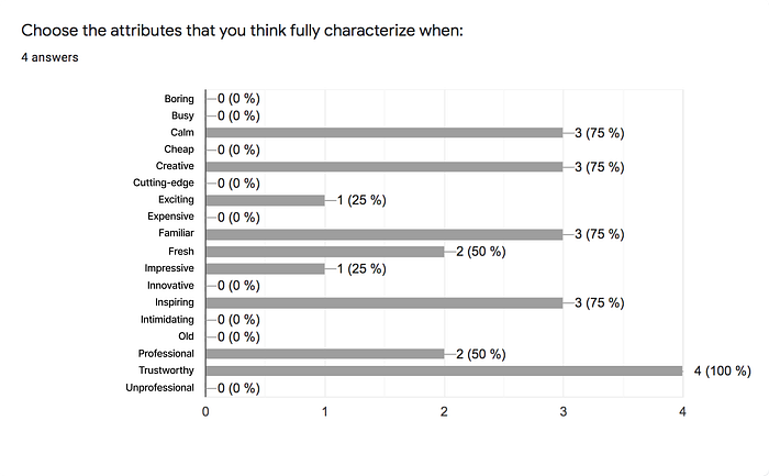
Desirability Test
Visual elements can support a solution’s interaction design, but they can also elicit an emotional response from users. Understanding and exploiting these emotional responses can help us to influence users appropriately. I have already identified that the application should be pleasant, trustworthy, fresh, clean, readable, and easy to use. Let’s see the results.
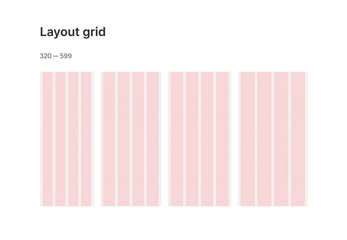
Layout Grid
My layout grid system based on the Material system. Content is placed in the areas of the screen that contain columns. The grid helps me to achieve the consistency of elements, establish connections between them and build a visual system that would look harmonious and help users navigate. On mobile, at a breakpoint of 320–599 dp, this layout grid uses 4 columns.
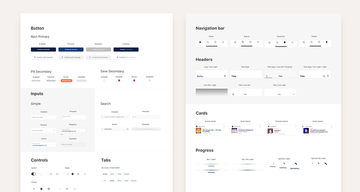
Design System
In order to keep user experience intuitive on the project, I’ve built a consistent design system. To create the components, I used the principles of atomic design. All names of components are clearly labeled, there are many hidden layers inside each of them that add flexibility. For many components, the states are considered, such as: active, inactive, disabled, etc. These states help users understand the interface and help designers use them quickly.
Real Pixels
Onboarding Flow
The goal of the onboarding flow is to collect information about the users’ interests to truly make it tailored to their needs. For this purpose, I obtained information about users’ interests and used it to build their newsfeed. In the future, this can also be used to familiarize the users with the platform’s features.

Newsfeed
On this page, users see their newsfeed. It will have updates about the users’ choices to follow certain types of content. The user can also filter posts by people they are following, and keep posts for themselves in the Saved list.

Search Page
This is the main page for information searching. Here, a user can manually write in a search field, or find information in blocks. Each block contains materials such as books, podcasts, videos, and articles. Also, the user can use filtering. On the right screen, you can see an open article.

Here some examples of the Profile page, Saved list, and one of the steps from the “Become an editor” flow.

Conclusion
What did I learn?
Designing the app has been a challenging and rewarding journey.
Through this project, I realized how important the research stage is. Users can tell you which direction your product should go and what you are missing. Only after in-depth interviews did I understand what was important to users and how to make this application truly valuable for them. I realized that by skipping the research phase, one could end up with a product that no one needs.
It took me one month to reach the point I am at right now, and these are my next steps:
What are the next steps?
- Develop the “Become an editor” flow + App for editors
- Develop the product scaling plan (web version)
- Develop a comprehensive business model
- Improve user flow
- Create a customer journey map
Final Thoughts
“Hints” is a trusted and compassionate online resource that provides the answers you need to improve your mental health and find balance. Our library of more than 4,000 pieces of content, created and refined over the past 20+ years, has been written by more than 100 healthcare professionals and industry experts — including experienced doctors, therapists, and social workers — and then vetted by board-certified physicians.
Take your personal growth journey with us!
Thank you for reading! Hopeful you enjoyed this case study. If you have any feedback, I’d like to hear from you. Say hello at innanichiporenko@gmail.com or connect on LinkedIn.
P.S. Thanks to my mentor Vadim Grin who helped me out with this project.

