UI/UX Design Case Study — Rennt: Bike Rental Mobile App

The UI/UX case study documents the processes and decisions I took, involved in designing of a two-wheeler rental app. The app includes new features for customers to perform verification and self pick-up/drop at specific locations. This design sprint took 20-days to complete.
Project Brief
For this project, I partnered with a bike-rental startup to design and provide the brand identity based on the requirement and need of both my client and the users.
We wish to digitize the two-wheeler rental process in a more efficient and hassle-free manner. I worked to create its brand identity and its application for a startup “Rennt”.

Introduction
The rennt was founded by three college students, who spent several years collaborating to solve the travel and two-wheeler rental problems among their peers. Over many months, they pooled information and knowledge by witnessing the problems and trying to create a better solution.
Rennt is an online marketplace and hospitality service targeted at Indian users, enabling people to lease or rent personal two-wheelers for a short period of time. It focuses on a new experience for bike rental apps.
Research
The new attraction to the vehicle enthusiasts is the self- drive bike rentals. High-end motorbikes such as Harley Davidson, Triumph, and Royal Enfield can be rented in various tourists places for daily rates. Bikes on rent are very common in metropolitan cities like Goa, Bangalore, Delhi, Mumbai, and Pune. It is also available in Delhi/Himalayan quarters for those who drive through the Himalayas in tourist seasons, but bike rents weren’t that known in other cities of India like Jaipur. With stand-out product categories like, customized expedition, lease of biking gears and cameras; Bike rental business has championed the less traveled road of excellent customer experience!
Following our initial client kickoff meeting, I combined the information from the meeting as well as online research to create a list of key points to keep in mind during the app design. I did competitor analysis on other bike rental apps although there was quite a limited range, so we searched dribble, Behance and Pinterest for inspiration for logo design as well as other modern apps designed for rental purposes. The key findings from both the kickoff meeting and online research were:
- Stay true to the roots of minimal renal app design.
- Keep layout clean & simple, and easy to understand for current users/new users.
- Keep cool and safe color palette on physical cards, play with imagery + graphics.
- Design app for the ability to be applied in a corporate environment while remaining aesthetic.
Stakeholders Interview
How you came up with the idea of building this start-up? How your idea is different from already existing products in the market?
We saw a lot of real-life Use Problems like There are 799 Universities, 39,701 colleges, and 11,923 standalone institutions in India. Out of these Colleges and University all over the nation, around 73% of these institutions with hostels are situated on the outskirts of the city or away from the city. The way to and from the city is generally one-two source of transportation facility, that too on fixed time schedules. There is a specific time interval between two consecutive trips, so if someone has an emergency he/she has to wait for the next bus arrival on the schedule that might take 5–6 hours away.
Rennt aim to create consistency, that If anyone has an emergency he don’t have to wait for a bus or a public mode of transportation long enough or spend a lot on taxis, users should not be bound by time schedules.
For instance: If a group is planning some road trip or travel venture or just riding with friends. At the current scenario they have to wait for the bus, with which they have to go to city rent a vehicle there because major of the rental is in the center of the city, then they have to pick a vehicle, come back to college, pick their friends and then move on with their trip planning. It is a very tiring, troublesome and complicated process. It drains time, energy and resources. That’s where Rennt comes in picture.
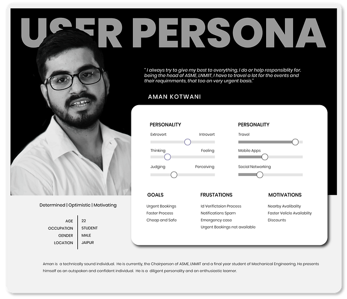
Target Audience/Persona/Users
As a brand strategist, I determined our target audience and user persona as a basis for the rest of the project. User persona inspires team’s design decisions as this is an example of an individual I will be designing the app for. They influence decisions along with other parts of the project including research and test results, which I will explain further on.
The primary target market for the bike rental companies comprises of students and tourists. These days’ sightseers and especially youngsters prefer to take bikes and explore rather than hauling around a car universally. Apart from this, foreigners who come to haunt are also the kind of people who look for adventure on a bike.

Speaking of the market size, A Researcher said, “We estimate the market size to be of all ages from 18 to 55. It is a huge market when it comes to premium motorcycle rentals. Though the quantity of a household having a motorcycle or moped is high, the percentage of penetration in a premium vehicle is negligible and gives a tremendous opportunity. We estimate it to be 3,630 crores keeping the population in the age group 23 to 39 and disposable income of at least 4.5 lakhs per annum.”
Challenges
- How to eliminate hidden costs?
- Providing easy one flow process and reducing options availability.
- Providing better customer support — Users despise the employees’ unsatisfied response on consumer support service. They want things to be smooth and hassle-free, including money taken as caution money or ID verification process.
- Reducing Onsite Procedure — Allowing Users to pick up and drop off vehicle with less intervention and annoyance.
Logo Design
Logo Designing is mostly of a thinking process, which took a lot of time. I wanted to have a simple, elegant yet informative logo. After doing a lot of research, looking through inspirations especially from Yuri Kartashev. And at last, achieving exactly what I thought of. Here is the whole logo designing process:
1st Step — Initial sketches: For the logo design of Rennt, I initially sketched out my rough ideas on a sheet of paper and drew as many options as possible to broaden our range. I kept in mind keywords such as two-wheeler and safety to brainstorm ideas.
2nd Step — Narrowing it Down: The second step of my logo design process consists of selecting three logos for the team, that I felt most suited the company/project as a whole and resonated with the branding. The options I choose all included the general concept of two-wheeler represented in different visual forms.
3rd Step — Logo Evolution and Presentation: The third step in my logo design process was to digitize our three options in black and white on adobe illustrator and present them to the client. After an option was chosen by the client, we adjusted and experimented with the base shape of the logo to make it more lively, appealing, and suiting to the company’s branding.

4th Step — Finalizing: The fourth and final step in our logo design process was finalizing the logo design and presenting it to our client alongside the high fidelity prototype and presentation of the design process. This represents the idea of safety and two-wheeler rental process. The shade of blue color scheme is staying true to the roots of the safety and calmness due to it’s relaxing and is reminiscent nature and the color of the pattern icons.
User Flow Diagram
After I was done with the logo, I proceeded to App’s User Interface designing. After researching competitive analysis and understanding the user’s needs and wants, we created the user flow map, to ease the designing process.

A user flow is a series of steps a user takes to achieve a meaningful goal. User flow diagrams :
- Increase the speed of iterations
- Improve communication across the product team
High Fidelity Wireframe Screens
The challenge was to find a solution standard enough to be easily understood by users, that could function well and still comply with the user requirements. It gives users a step by step flow without overwhelming them.
Features
- Locate nearby vehicle pick-up and drop location.
- Ease the pickup process by eliminating onsite id verification process
- Verify the user based on the driving license.
- Give the user insight about his whole journey with the company.
- Notify user about its upcoming scheduled ride.
Splash Screen: It manifests the inception of the application. This is the first visible screen that pops up.

Login-Sign up the process: We were thinking of quick sign up/ sign in through facebook or google but, keeping the research in mind, we need full fledged information about the user, to build trust when they use the resources of the company. So we created our own sign-up page to store all info.

Resetting Password: The premise of the flow is to take the user into a focused state with one screen at the time, requesting initial information without any clutter, then have the user choose the way they want to confirm their account information. Receive code on the phone or a security question. Input Security Code, reset password and then all set to Login. We allowed the user to Login instantly once their password has been reset. Email and mobile notifications take place to inform the user the change has been made, to ensure they have made the change as a security measure.

We want to keep our user updated about their travel history, so we give them statistics with the app, this is not only informative but also motivates the user to ride more as we give awards when a user achieves a specific milestone. Ride now button marks the inception of the ride-booking process, which leads to pick up and drop date and time, and in next screen it allows the user to select it’s nearest pick-up point. We provide user enough flexibility to drop the vehicle at any of the points’s not necessarily at the pick-up point.

Hidden costs can be eliminated by the simplicity of price per hour or day concept. Users don’t have to constantly worry about how many kilometers are left. It’s just elegant. Ex:- you expect your trip to take 10 hours you pay for 10 hours. You can compare your rides, and choose the best fit for you.

To reduce Onsite Procedure and complete pickup in a hassle-free manner, we give the user an option to verify, using driver’s license through app only. This will give users a better experience while traveling, or in an emergency.

Additional Screens for the drop down Menu and Profile

Conclusion
This app is in building and will be out soon. So that was pretty much it. Hope you found it useful and interesting.
It was my first UX design case study, It was a great experience about writing what you were thinking and all those decisions you took. Thanks for your Support. Feel free to follow me to stay in touch and be updated with my works and tutorials.

