Where did it come from? My non-computer Daily UI. Part 1 (1–20).
That’s the 1st part of my analogue Daily UI. If you want to see the rest, please take a look at my other articles:
I like to think about design as something that has a long history, which dates back to the time when people didn’t focus on the concept of “design” and most of the forms came from functions needed.
Let’s think about something that most of us use every day — the keyboard and its QWERTY layout. This layout appeared already with the first typewriters. At the beginning, characters were arranged alphabetically. However, they were mounted on metal arms or type bars that would collide and jam if neighbouring arms were pressed at the same time or in rapid succession. To avoid the jamming, the keys and the typebars have been arranged so that letters that were frequently used in sequence didn’t come from adjacent typebars. This is how the standard that appears today on keyboards around the world was created. Even though jamming is not a problem with electronic keyboard and the style of typing has changed, we are still committed to this layout.
There are many more such examples, and with computers and digital world their evolution has become even more interesting.
My analogue Daily UI.
Daily UI was created with the user interface of software or computerized devices in mind. In my challenge, I wanted to analyze and reflect on the roots of these elements.
Some elements were (or seemed) obvious, with some I was puzzled. In the world of computers, interaction technology has changed, and there are more possibilities and functions. I think even more will appear in the future, in different dimensions and forms. Our habits and culture changes much slower than technology. This means that although technical progress is constantly introducing new ways of interacting with objects and products, people are unwilling to change their habits. Many of elements of this challenge are based not only on the appearance of objects of the past, but largely on human behavior, possibilities, expectations, habits and mental models.
PART 1 — Daily UI 1-20
1. Sign-up
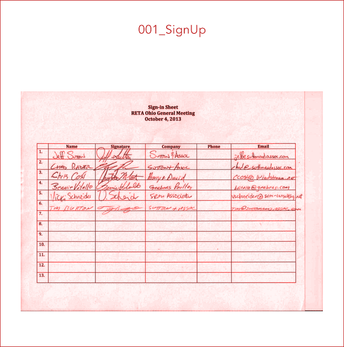
The main purpose of signing up is to get remains to be the contact detail of a certain person. It used to be usually in the form of a list — names, sometimes second names. This may seem obvious, because we use names and surnames to identify someone. The address or telephone number worked as a contact. Today, this process requires less personal data. Still, the most important element remains to be the contact detail, which is our address, but the electronic one, and to enter our electronic home, we need a key — password.
2. Credit Card Checkout

The form itself has not changed much. We still have long series of numbers that our banks and accounts code for. Along with automation, the security of transactions and the control of rationality have improved, so we avoid remains to be the contact detail transactions. We don’t need a signature, because there are other safeguards, e.g. a password. However, your payment options are changing very dynamically. Already now we can pay just with the email address and password — only by signing up. Access to our virtual homes (often with the same address) has more and more possibilities. It was hard to imagine in the past that you can spend money by giving just a contact — address (email) and a key (password).
3. Landing Page

It works like the covers of books and magazines. It announces quickly what it is talking about and what the product has to offer or makes us curious to check it out.
4. Calculator

The design remained the same — the layout of buttons, display, symbols. Some calculator designs even pretend to look like a three-dimensional object.
5. App Icon

The app icon is a symbol that works like a sign of a certain place. The one above or at the entrance to the building or any space tells you what you can expect inside. It can be a symbol used only to indicate the function of the application, or in the case of most companies, their logo.
6. User Profile
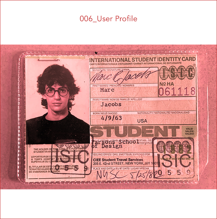
In the past, identifiers, student or membership cards fulfilled this function. Our ID card or passport is also a kind of a user profile. Their content varies depending on the type of such document, just like user profile in online platforms.
7. Settings

There are as many types of settings as there are products. And we have known them for a long time thanks to machines. There are switches, modes, toggles, sliders and many different elements that visually work similarly in both the mechanical and virtual world.
8. 404 Page

Something that rarely happens outside the virtual world — information about the fact that something has been lost or whether we got lost. And with one click we can change these situations, it would be great to receive such information in the “real world”. The equivalent of 404 Page can be returned letter that has been sent to a non-existent address.
9. Music Player

Design of music players are so rooted in our heads that it’s easy to change their patterns (and why should we do it?). While the most important elements remain the same, there are a few new possibilities, e.g. we can arrange playlists of almost infinite number of albums and songs.
10. Social Share
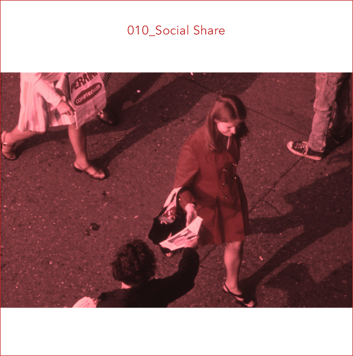
It doesn’t matter whether verbally, by post, leaflets or manifestations — for us, humans, sharing information is something natural. Thanks to the internet, this is faster and has more options.
11. Flash Message

Feedback about whether something went good or wrong appears in our lives all the time. We get it for example from our teachers (good assessment — success, bad — error) and different kind of machines we deal with, e.g. card payments, cars, various code reader. When possible, it’s often highlighted in green and red.
12. E-Commerce Shop (Single Item)

Online shops are trying very hard to provide us with similar experience as we know from ‘normal’ stores. Close-up photos, videos, we even add to the cart! We get the most important information — price, availability, size, color and other depending on the type of product. In the store, most of them can be seen immediately and less written information is needed. Certainly the big advantage of buying online is the ease of searching for what we want, on the other hand, we can’t touch it, check the size, material etc.
13. Direct Messaging
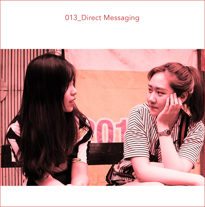
Contact with another person is one of the deepest rooted human needs. This couldn’t be missing in the virtual world.
14. Countdown Timer

First hourglass and a water clock, then a mechanical countdown timer, and today a phone timer. The countdown has been useful a long time ago, in seconds, minutes, hours, days. With each version it became better and more reliable. and more reliable, in addition to better accuracy, had a very important element — an alarm signalling the expiry of the previously set time. The timers in the phone have become even more precise. Today we can set the time with an accuracy of one second.
15. On/Off Switch

Originally, most early power controls consisted of switches that were toggled between two states described by the words On and Off. Later, these two words were replaced with the universal symbols: line and circle. This standard is still used on toggle power switches (like the one in the picture). In the virtual world, it appears mainly as the old known toggle and most often is without symbols, because its appearance (states) shows whether something is enabled or not.
16. Pop-Up / Overlay

In the world of computers they can probably have any content. These are the most common elements that want to grab our attention, ask for input or information, show additional information. It’t difficult to relate them to one situation in a “normal” life. Pop-ups have many different types and can have various content, so they have replaced a few situations in our non-computer world. These are the moments that focus our attention on one specific thing, usually for short time.
Often, without performing a given task, we will not be able to reach the main goal. For example — pop-up requiring login can be compared to entering the house. We must find the key and open the door to complete this task. Pulling out the key, putting it in the door and turning it is the equivalent of providing information that allows us go further.
It can also be a conversation with another person and question, information on which depends its course and final result (e.g. ¨do you sweeten tea?¨)
Another example would be flyers added to a letter, mailbox, magazine, or book. Most often it is about advertising. And just like in the internet, we can look at it for a long time, or immediately crush it and throw it away, but it grabs our attention for a while.
17. Email Receipt

It works just like a normal invoice or bill. It is the customer’s proof that the payment has been made and should provide the customer with all the information he may need about the transaction. Its basic elements are a list of purchased products, total cost, seller data, date. In the electronic version several new elements appeared such as shipping costs, advertising related products, method of payment.
18. Analytics Chart

The forms of the diagrams remain similar, but imagine that they used to be drawn by hand and analyzed without the help of computers!
19. Leaderboard

Summaries, rankings, podiums exist for a long time. The electronic world has significantly improved their speed and readability — all changes are visible immediately, we do not need to calculate anything manually, and This comes from the coinage systems and values of each of the precious metals. The form remains similar and we still have a hierarchy of medals: bronze medal — silver medal — gold medal. This comes from the coinage systems and values of each of the precious metals.
20. Location Tracker

People have been using location tracking for a long time. Mainly for orientation, documentation (important for geographical discoveries!), but also for recording possible routes, or information (useful for treasure hunting 🤓).
It was fun 🤓
It was quite a long journey, but interesting and motivating me to reflect over so many UI elements, both traditional and digital. There are a few things that caught my attention:
🔴 I was aware of that, but now I understand even better why we say the DIGITAL WORLD. A very large part of the real world appears in the internet or in digital version. We can learn, talk, send, receive, buy, sell, read, write, work, find a job, find love, check maps, see almost every place in the world… and more. I tried to avoid saying “the real world”, rather talk about it as a non-computer world, because the internet and digital products are also parts of the real world.
🔴 It’s clear that almost everything that I analyzed became faster, easier to access and generally enables many more possibilities (I don’t say that it is easier to use, because it depends on the level of tech-knowledge).
🔴 With the development of technology, we can do more and more things ourselves. Many activities once required the involvement of a group of people, today they are increasingly replaced by technological solutions.
🔴 I think that the speed of technology development also has a significant impact on generational differences, which will be even bigger than before. At this point, even a few years of difference can affect our way of life, habits, and interactions with other people. Maybe after some time it will be completely normal that people see each other mainly with the help of artificial intelligence and we won’t know the world that relies on a complex system of face-to-face meetings in real-life. I am very curious which products and concepts that we use on a daily basis now will disappear, what will change and how it will change.
🔴 I was a bit disappointed with the tasks of the Daily UI. They often seem underspecified and too general. I’m not sure if drawing screens taken completely out of context is such a valuable exercise. Working on this series of posts, sometimes I felt like skipping something that seemed too general to me, but I just don’t like leaving unfinished things. And without all 100 it would be an unfinished challenge. I think the list could be updated and refined, but it’s great that such things exist!
Thanks!
If you want to see the rest of my analogue Daily UI, you’ll find them in the other articles:
🔴 If you have any comments, suggestions, ideas or just want to say hi, I will be very happy to hear from you — ✉️ julia.a.kuczynska@gmail.com
Pictures were taken by me, unless stated otherwise.


