Redesigning Uniqlo App with Service Design
Uniqlo is a Japanese casual wear designer, manufacturer and retailer that offers high-quality, fashionable everyday items.
Project Brief
Work in a team to identify problems and/or opportunities with an existing mobile application and utilise your knowledge to design a solution.
Group Project/2 weeks.
Role: UX research lead
Tools: Sketch/Invision
Deliverables: Digitised interactive prototype, 15-min client-facing presentation
Background
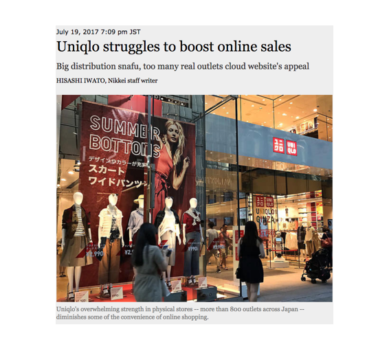
It was mentioned on Nikkei Asian Review that after unveiling a new smartphone optimised site (Uniqlo Japan), online sales took a 20% joyride for a month. Yet online sales are about 6% of total domestic sales — one-fifth the target.
Chief Financial Officer Takeshi Okazaki mentioned in the article that “internet sales should have grown by 30% and that the company could even expect growth of 40% to 50%”.
Thus, our team decided on Uniqlo Singapore’s mobile app to work on for our project, with the aim of creating new opportunities for more online sales.
01. Research
Identifying, addressing and solving issues were crucial in this iterative design process. To first understand the product with deeper insights on the areas of concerns which could be improved, we conducted three methods of initial research: Heuristic Evaluation, Contextual inquiry and User interviews.
Heuristic Evaluation
To scrutinize the structure/layout of the app and identify usability issues of the user interface, we carried out heuristic evaluation.

Contextual Inquiry
To get a deeper insight on the usability issues of the App after carrying out heuristic evaluation, we headed down to the physical store. Where we interacted with customers and conducted contextual inquiry — we had customers try out the current App, and received their feedback — gathering more data.

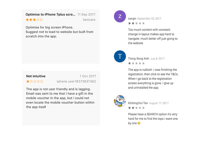
User reviews
Reviews of customers who used the App were obtained from Apple and Google Play App store
Key insights of App store reviews
App is not user friendly and is lagging
Too much content
Hard to navigate / find products
User Interviews
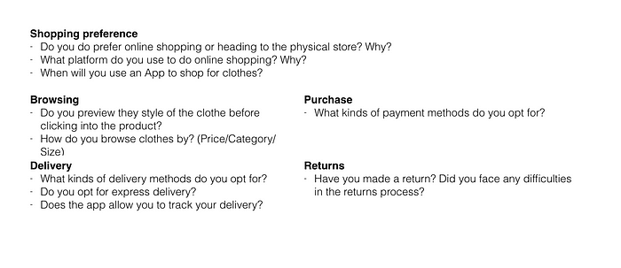
Following the user reviews obtained, we carried out user interviews with 11 participants. The interview questions asked covered the shopping experience of customers which includes:
- Browsing
- Purchase
- Delivery
- Returns
Several interview questions serving as a guideline were created, to prompt and gain more user experiences from our participants.
02. Analyze
In this stage of our process, we analyzed the issues and the journey of the customer.
Issues
From our research findings, we identified several key issues of the usability problems in the design of the app.
1. Low awareness of the current App
Through our contextual inquiry at the physical store, we discovered that most customers did not know of the existence of the App. Customers who knew about they app, used it for the main purpose of browsing items, and rarely goes on the App. They preferred heading down to the physical store to feel the material of the product.
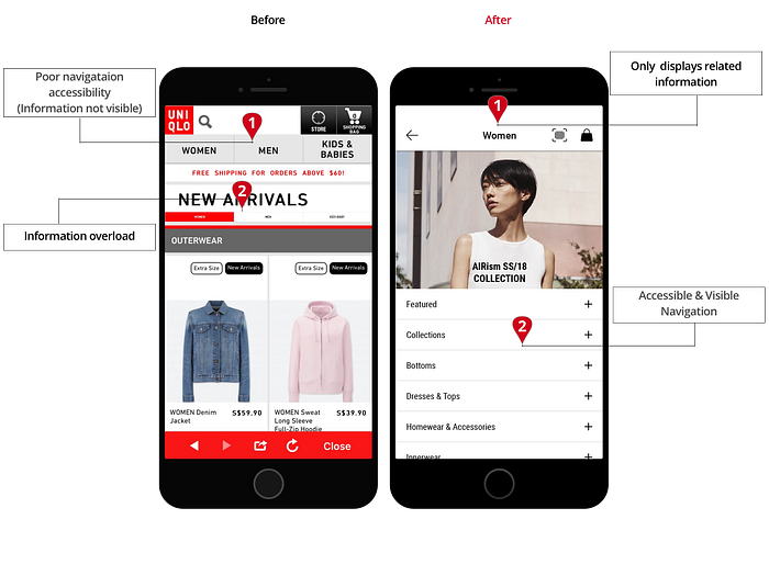
2. Hybrid App (pulls information from website): Information overload
Massive information on the web is being fitted into a significantly smaller screen on the phone.
Users whom tried the App mentioned that they were presented with an overload of information, and a laggy performance.
3. App experience is significantly different from in-store experience
The Uniqlo store brands itself with neatly organized layout. It is easy for customers to locate their items within the different sections of the store — Heat tech, Airism. The different sizes and colors of the clothing are all arranged neatly within the same place.
The App’s cluttered and messy layout however, contradicts the good in-store experience. It is difficult for users to navigate around the app to find the information that they need — especially looking for dresses which was categorized under Tops — due to the messy layout categorization.
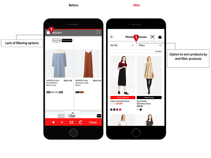
There are also navigational issues mentioned in the heuristic evaluation such as: Clothes categorisation hidden under each gender header, lack of filters and, inconsistencies.
Overall, the learnability and memorability of the App was low.
Affinity Map
Through our research findings, we organized and systhesized our findings through affinity mapping. Grouping responses of the similar experiences together, allowed us to identify themes and patterns.


Personas
From the affinity diagram, we categorised the primary pain points, concerns, and needs of users into two personas.

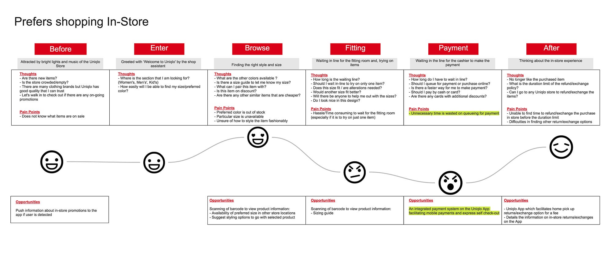
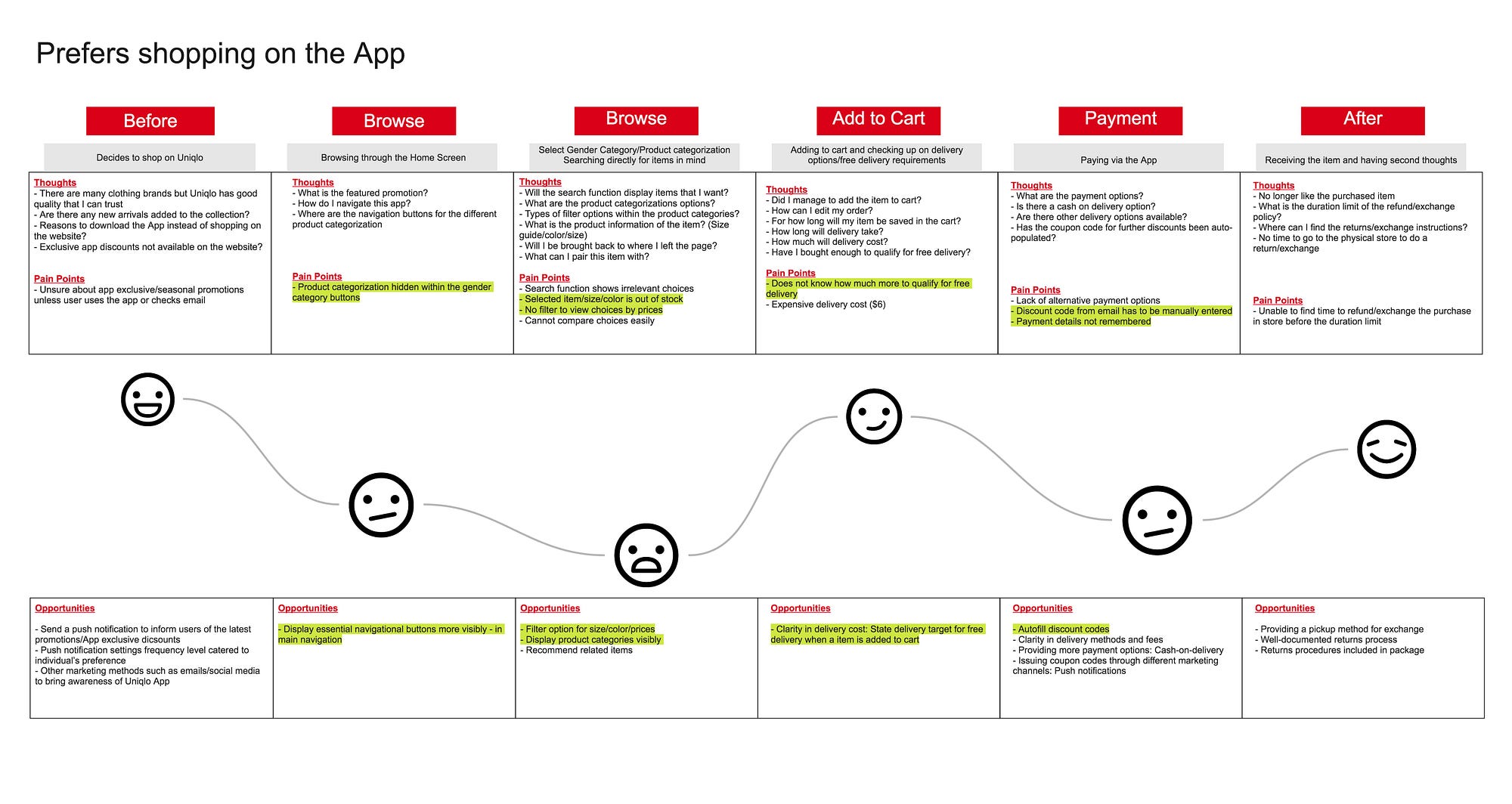
Customer Journey Map
Two customer journey Maps were mapped out based on the Natalie — who prefers shopping in-store and, Katie — who prefers shopping via the App.
Detailing the experiences of customers during the different channels of their interaction with the brand/App, from the process of having a need to their satisfaction after achieving their need.
03. Ideation
Solution/Features
To address and solve the identified problems, an informal design studio workshop was conducted amongst ourselves, where each of us listed down the ideas that came to our minds.
Various feature based solutions were gathered from the design studio process. As there were time constrains, we had to focus only on features which were beneficial and useful to users, while also taking into consideration business impacts. To help us in deciding, an online feature prioritisation survey was carried out. From the gathered responses, we included within our redesign features in the Focus category.

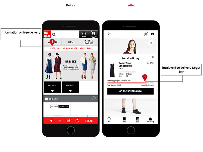
What we noticed also during our physical store visits were the long queues during peak hours. To minimise the unproductive time spent waiting in line, we proposed a mobile payment solution, where users could pay for their purchase via the App. Which, could also help in raising awareness of the App.
As we were coming up with a fresh new idea of integrating mobile payments with the App and a self-checkout feature, we were a little apprehensive about the feasibility and receptiveness of our service design function by users. Gladly, the survey results proved that majority of the users welcomes our ideas. Along side with our interviews during usability testing where users mentioned that in order to skip waiting in line, the self-checkout feature and payment via the app will be useful.


Summarised Solutions

Mid-Fi Wireframe & Feature Test
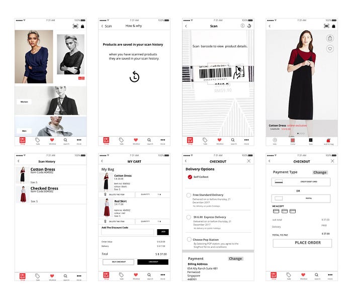
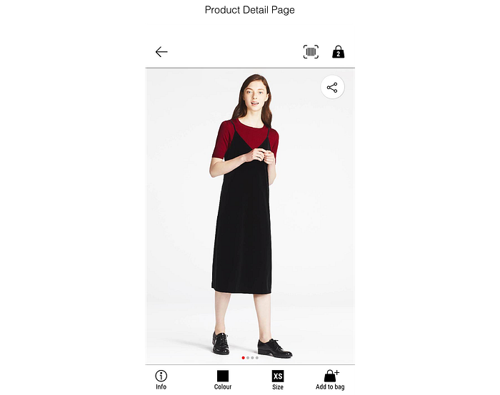
At this stage: We had a product scan feature which allows users to scan the barcode of a product, view product details, and check out via the App.
A mid-fi minimum viable product was made and our team headed down to the store, testing the features of our redesigned app and, gained feedback from users.
The main insights gathered from users were:
- Ablility to understand and identify the barcode scan feature
- Although users were amazed by the barcode scan feature, they questioned the usefulness and need to know more information on the product detail with the physical product on hand.
- Users would use the self-checkout function if there are long queues at the store.
Prototype

A Hi-Fi wireframe taking into consideration the first usability testing from the mid-fi wireframe.
Information for barcode scan re-named

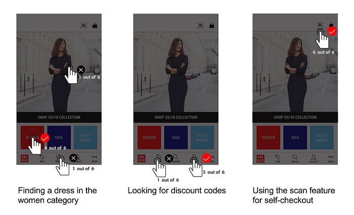
Usability Test
6 Participants were given 4 tasks for usability testing.

They were able to click on the correct buttons to find a dress, look for discount codes and using the scan feature for self checkout.
Iterations
Barcode Scan
One main issue we discovered from our usability test was users were really confused in the product detail page after scanning the barcode. As, they thought that the item was added directly to cart from the scan, which was not the case.
Thus, we decided to make the process more informative for the users by providing feedback of what is happening.
The first feedback, to prompt users if they wanted to add the item to bag after scanning, and the second feedback, to give them the option to continue scanning or, proceed to shopping bag.

Add to bag and continue scanning informative screens added to keep the process informative for users.

Self Checkout
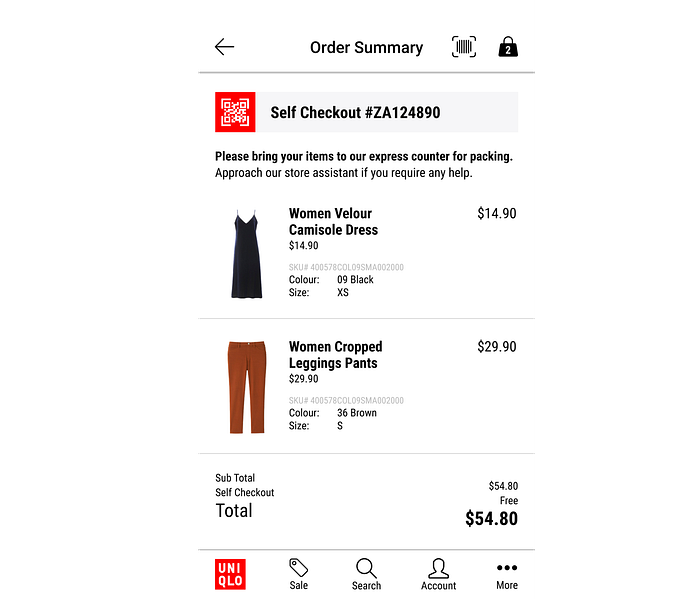
The process does not end here. But users were also confused as they thought oh! this is where everything ends.
Thus we decided to again make it more informative. Whereby after the order summary page, a QR code pop up will be displayed with a notification, letting users know that they should proceed to the counter to get their items packed before leaving the store.
Why new Design?
Time
From testing results, the average time taken for users to find a dress and, proceed to checkout on the new app is 1.26mins, almost half the time compared to the current app which took users 3.01mins.

System Usability Score
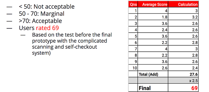
Although users rated the redesign of our App as a marginal score of 69, these results came before the final iterations of an improved barcode scan self-checkout flow, which confused users the most. As there was insufficient time to conduct new system usability score on our improved iterations, we did not manage to obtain a new score from the iterations.
Within 2 weeks we managed to redesign the App with newly incorporated fresh and unconventional ideas. Given more time, we will be able to gather more feedback and make further improvements!
Raising Awareness
Through our app redesign, we created opportunities where users can use the app within the physical store. Hence, to encourage the usage, we propose various promotional materials be placed around the stores.
For example, the clothes tag can include a line to inform users that they can scan and perform a self-checkout with the Uniqlo App. This can also be included in the signages found throughout the store. As we are introducing self-checkout, posters can also inform users about our new app feature.


Adding on, as users have to get their items packed and security sensors removed, we propose setting up express checkout lanes that will be quicker in serving these customers.
04. Further Ideas
Beyond this design, I want to share ideas to extend to the Uniqlo brand and its customers.
1. To conduct image searches
Having an image search feature, rather than have users typing/browsing through the list of items. The image search will allow users to view similar items of the product. This helps in saving time in searching for a product which users want or, users wanting to know if Uniqlo carries similar items as what was viewed online on other sources.
2. Personalised Style
For users who are signed into the App, they will receive recommendations on the types of styles of clothes that are based on their browsing and purchasing habits.
05. Refelctions
Design studio is a really effective way to gather more ideas and from the process, incorporate ideas which brings about a better product, and combine and adapt other ideas into a stronger solution.

